SlideShare a Scribd company logo
1 of 9
Cover Title-                                                Plug-
                                          This cover title tells us more about what the main          Placed right in the
                                                                                                      centre of the magazine
    MASTHEAD –                            image is about and what will be the story behind the
                                                                                                      to attract the reader. It
    The masthead is slightly              main subject, which is Lana Del Rey.
                                                                                                      grabs the magazine. It’s
    covered by the image of
                                                                                                      a buzz word to make
    Lana Del Rey. Iconic
                                                                                                      readers think that
    title is covered because
                                                                                                      everything they need to
    it is already well known
                                                                                                      know about this whole
    to the public, it doesn’t
                                                                                                      year is in this magazine
    need to be fully shown
                                                                                                      and if you don’t get
    as we know who this
                                                                                                      it, you don’t know
    magazine is by.
                                                                                                      anything about 2012.
                                                                                                   Main Image-
Layout-                                                                                            This image is of Lana Del
The background layout of the                                                                       Rey wearing a bright colour
magazine is very simple and it shows                                                               flowered covered top to
that this shot was taken outside as                                                                attract the readers and for
you can see the grass and the lighting                                                             her to stand out from the
is natural. Represents the magazine                                                                background and texts. She is
because it is so simplistic and not too                                                            put right in the centre of the
colourful or full of bright images.                                                                magazine to suggest that
Looking at the overall layout of the                                                               she is the main topic of the
magazine, we can suggest that this is                                                              magazine. Not looking
one of the more pricey magazines                                                                   directly at the camera, can
because it doesn’t have a lot of things                                                            show it was a candid shot.
to focus at once.
Price- The pricing is placed
right at the bottom and not
                                                                                                 Headline-
very visible which could mean                                                                    Draws readers in. gives them
that it may be expensive so                                                                      an idea what is going to be in
they don’t want to push their                                                                    the magazine. The use of the
readers away because of the                                                                      word ‘Best’ tells the readers
price                                                                                            that nothing else can beat it

Barcode-                                                                                Secondary Lead-
A common
                                                                                        This shows the readers what else is
convention used on
                                                                                        going to be in the magazine. It is
the front cover of
                                                                                        pretty long so the readers are
any magazine for the
                                                                                        getting more for their money
consumer to
                                                                                        because there is so much
purchase this
                                                                                        information.
product.
Price/ Date-
Secondary Lead-                              In very small font. Can suggest that
The other main story of the                  it is expensive and its small to try        Masthead-
magazine. Makes the magazine                 not to push away readers because            Covered a little by the main
more interesting and the story               of its price.                               image. Not a big deal as it is a
this magazine chose to talk                                                              world know magazine and
about makes the magazine                                                                 everyone recognises its
look more important with such                                                            name, even though its covered.
an important subject to talk
about. The alliteration used at
                                                                                                    Preview-
the start makes the story more                                                                      A preview of what else is going
comical and fun so it shows                                                                         to be in the magazine- more for
that it is an easy read for the                                                                     the readers money. It also shows
audience.                                                                                           the biggest names in music
                                                                                                    industry to bring in the readers.
     Extra Stories-
     Extra stories to fill the
     magazine up and giving the                                                                      Plug-
     readers more for their money
                                                                                                     Buzz words used to grab
     as this magazine is quite
                                                                                                     readers attention with words
     expensive. Again the headings
                                                                                                     like ‘New’ and ‘Plus’ to show
     are short and to the point.
                                                                                                     that this magazine has a lot
     Main colours of red and
                                                                                                     of contents to read about.
     black, like the masthead. Also
     very simplistic and easy to read
     and not distracting to anything
     else on the page.

Cover Title-                                                                                       Layout-
The main story of the magazine                                                                     The background in this front cover
linking with the main image of the                                                                 is very simple. Nothing to flashy or
magazine. The font is bold and                                                                     filled with colours to show its
simplistic so it gets straight to the                                                              simplicity. This could suggest that
point. Using the words ‘Kick-Ass’                                                                  this magazine is more of the high
attracts the readers because they                                                                  end magazines because of its
would want to find out more about        Main Image-                                               sophistication of the layout of the
this rebellious actress and the use of   Jennifer Lawrence is placed right in the                  magazine background. We can tell
‘sweetheart’ is an oxymoron the          centre of the magazine cover to show that                 that the image is of the outside
word kick-ass to show her innocent       she is the main subject of the magazine.                  because of the clear blue sky and
side as well.                            Wearing simple clothes to show that this                  what looks like hills. More casual
                                         shoot is casual. Her hair is messy which                  background. The layout of the
                                         suggests that she doesn’t mind what she                   words are simple so it doesn’t
                                         looks like and the natural light from the sun             distract the readers from the main
                                         makes her almost look like she is glowing.                story.
Price/Date-                 Banner-
                                                      Using the word ‘Exclusive’, NME is
                          The pricing and date is
                                                      telling the readers that this is the   Extra-
                          again in very small print
                                                      only magazine where you can get
                          so it suggests that it                                             An extra story to draw the
                                                      an interview with one of the
                          may be quite expensive.                                            audience’s attention with the
 Masthead-                                            biggest rap artist’s of all
                                                                                             heading the ‘Ultimate Guide’.
                                                      time, Drake. Grabs readers
 Bright red masthead for                                                                     Tells everyone that this
                                                      attention.
 NME. Covered a little by the                                                                magazine is the only magazine
 main image. For the                                                                         that has this guide and it gives
 magazine to allow that to                                                                   the best advice for the readers.
 be done shows that even                                                                     This also gives more for the
 though it is covered, the                                                                   price the audience has to pay.
 readers still know what the
 magazine is.

Menu Strip-
Long list of big band names to
show what the magazine will be
discussing about in the
magazine. With such a long list                                                                        Subheadings-
gives readers more for their                                                                           More main stories quite
money and especially such                                                                              eye catching to readers
famous                                                                                                 with buzz words like
                                                                                                       ‘Plus’ and ‘special’.
                                                                                                       More stories for the
Headline-                                                                                              readers, more worth
The font looks like handwritten                                                                        their money.
so it make it look like the artists
themselves wrote it, more
personal. It is quite big as well so
it shows that it is the main story
of the magazine. Messy
writing, shows that the                                                                       Barcode-
magazine is quite a casual                                                                    A common
magazine.                                                                                     convention
    Main Image-
                                                                                              used on the
    Main image is of a man, most probably an
                                                                                              front cover of
    artist, holding an old record, which links to
                                                                                              any magazine
    the headline. He is looking straight at the
                                                                                              for the
    camera with a dozed look which shows that
                                                                                              consumer to
    he doesn’t look very bothered. Colours of his
                                                                                              purchase this
    outfit fits with the masthead and the texts
                                                                                              product.
    surrounding him.
Layout:
                                Masthead:                                                   The layout of the contents page is very
                                Magazine name right on                                      simplistic. Not many bright colours to
                                the top of the magazine                                     distract the readers away from the main
                                so that the audience                                        images or stories. Its simplicity can also
                                knows that this music                                       tell us readers that this is on of the more
                                chart is by the same                                        high end magazines, not too childish.
                                company.
                                                                                                          Main Story:
This tells the readers and                                                                                The main stories in the magazine. Right
the audience that this is the                                                                             in the centre of the page which can
most important number one                                                                                 show their importance in the
chart in the entertainment                                                                                magazine. The fonts are a little bit
world. Nothing else can                                                                                   bigger than the other texts around the
compare to this and if you                                                                                page so it stands out. Bright blue text
need to know anything bout                                                                                that stands out from the white
music, you come here.                                                                                     background.
                                                                                                                Main Images:
                                                                                                                These are the main images on the
                                                                                                                page to let the readers know who
                                                                                                                the main stories will be on in the
  The music chart is in every                                                                                   magazine and if the readers don’t
  Billboard magazine as their                                                                                   know who the magazines are
  key aspect of the contents                                                                                    talking about, the images give
  page. The readers expect                                                                                      them an idea what they look like
  this chart to be there so                                                                                     or who they are. The picture of
  this is what makes                                                                                            Charice is the bigger image which
  Billboard different than                                                                                      can suggest that she is the main
  other music magazines.                                                                                        subject of the magazine.


                                                                                                            More Information:
                                                                                                            Gives the audience more
                                                                                                            information about what else is
                                                                                                            happening in the
                                                                                                            music/entertainment world.


                                                  Extras:
                                                  Promoting their online resources.
                                                  Telling the audience that there is more
                                                  information found on their website.
                                                  More for the readers money, 2
                                                  resources for the price of 1 magazine.
Masthead:                                                                       Slogan:
         The magazine name in the corner                                                 A slogan that the magazine has
         in quite large font. Reminds the                                                made up to go with their brand.
         readers what magazine they are                                                  Something short to summarise
         reading. The number beside is                                                   what the magazine is about and
         how many magazine the Rolling                                                   it is short so it gets in to the
         Stone has published. They may                                                   readers mind and its catchy.
                                                                                                                                       Main Image:
                                                                                                                                       This is the main image of
         have put it there to show the
                                                                                                                                       the contents page, which
         audience how popular this
                                                                                                                                       can suggest that it will be
         magazine to have to have been
                                                                                                                                       the main story of the
         able to have published to almost
                                                                                                                                       magazine. This picture
         1000 magazines. Shows its
                                                                                                                                       takes up about more than
         popularity. It is also in pink font to
                                                                                                                                       a half of the magazine
         stand out and bring out the big
                                                                                                                                       which stands out from the
         amount.
                                                                                                                                       rest of the other texts
                                                                                                                                       surrounding it. Black and
  Secondary Image:                                                                                                                     white image which could
  The second image on the page for the                                                                                                 tell the audience it’s a
  secondary article. A smaller image so                                                                                                story about the past and
  it won’t overshadow the main image.                                                                                                  about the musical
  This shows that this article is less                                                                                                 celebrities way back when.
  important than the big black and
  white image. The picture shows image
  of Beyoncé with messy hair and
  singing out loud shows that the article
  may be on how she performs in a
  concert. The only coloured image on
  the page to separate and stand out
  from the main image. It may also be in
  colour to show that this story about                                                                                              Main Story:
  music in our time.                                                                                                                The heading for this story is
                                                                                                                                    in big black bold letters and
                                                                                                                                    much bigger font size than
Menu Strip:                                                                                                                         the other texts on the
A list of all the other stories and                                                                                                 contents page contrasting
articles in the magazine. No images                                                                                                 with the big image to back
attached to each story so it shows it                                                                                               this story up. The page
is less important than the 2 main                 Layout:                                                                           number is also in a big fonts.
images on the page. Not a long list of            A very simplistic layout and background of the contents page. Black and white
choices to show that this magazine is             seem the main colours on the page with a touch of pink. Very subtle layout.
quite sophisticated and doesn’t just              Nothing too bright to distract the reader from the main article. Its simplicity
cram a lot of different irrelevant                shows that the magazine is trying to target an older audience from the ages 18-
stories in the magazine.                          35.
Masthead:
                                                                              Name of the magazine and what page it is right on
                                                                              the top of the page. It is placed in the centre and
                                                                              in the largest font of the page to attract the
                                                                              audience and inform them what this page
                                                                              contains.
                                                                                                                                        Menu Strip:
  Band Index:                                                                                                                           A strip of all the other news and
  A very long list of band names                                                                                                        gossip in the magazine in order of
  that are featured in this                                                                                                             page numbers. The sub headings
  magazine. Gives the readers a                                                                                                         are in quite large texts to pop out
  choice of which of their favourite                                                                                                    to the readers to tell them that
  bands are doing now in the                                                                                                            there is where to look to check
  entertainment industry. With                                                                                                          what article they want to read.
  such a long list of names, it also
  gives the readers more for their
  money because there are so
  many different articles to read in                                                                                                        Buzz Word:
  the magazine.                                                                                                                             Using words such as Features!
                                                                                                                                            Draws the readers in and
                                                                                                                                            makes the consumer feel
                                                                                                                                            more involved as if they are
                                                                                                                                            the first ones to read the
                                                                                                                                            news

Main Story/Image:
The main story comes with the main
image, which also happens to be the only
image on the page which can show its
importance in the magazine. The texts are
much bigger than the other texts
surrounding it. The image and text are
placed right in the centre of the page to
grab the readers attention immediately.
The page number is very visible as if to tell
the audience to turn to that particular page
straight away.
                                                                                                                                    Plug:
                                         Anchor:                                                                                    Stands out in the contents page
                                         This anchor is used to as if tell the readers that                                         because of its bright red colour to
                                         if they carry on reading and buying a                                                      draw the audiences in to look at ‘UK’s
                                         subscription to this magazine and it is a smart                                            No 1 Gig Guide’
                                         choice to keep buying this magazine. A smart
                                         way to attract more consumers.
Main Image:
                                 The main image of the double page spread that takes up more than half of the 2 pages combined.
                                 This gives the consumers an idea of who this article is about and more about what this big band
                                 looks like. This picture has very dull colours that doesn’t stand out much with colours like
                                 black, white and brown and a bit of dark red but nothing bright like pink which can suggest that this
                                 band attracts the older young adult audiences and not teenage girls. Everyone in the picture is
                                 staring directly at the camera with a blank look and not really posing which can show that they are
                                 not trying to show off. Very modest look. The clothes they are wearing look quite old and simple.


                                                                                                                                   Headline:
                                                                                                                                   The name of the band in very big
                                                                                                                                   text. Informs the audience who this
                                                                                                                                   article is about.


                                                                                                                                   Main Story:
                                                                                                                                   The main story of the
                                                                                                                                   magazine about the specific
                                                                                                                                   band on the page.


                                                                                                                                    Quote:
                                                                                                                                    The magazine has take a quote
                                                                                                                                    from the main band member.
Layout:                                                                                                                             This gives the consumer a feel
The layout and background                                                                                                           like they were in the magazine
of the page is very simplistic                                                                                                      with them too listening to what
which compliments the band                                                                                                          they are talking about.
themselves because they are
very simple too. Nothing
pops up and its not filled
with bright colours.
Main Image:
This main image of Lana Del Rey looks very seductive and
attracts the older male and female. Her eyes are closed
and her facial expression and her nails show that she wants
something really badly and she looks scary in a seductive     Headline:
way because of the dark colours and the glitter and the       The name of the artist this
sharp nails. With limited colours on the page shows that      article is on. Also gives the
maybe she has a dark personality.                             readers an idea of what kind
                                                              of artist she is from the
                                                              main image.


                                                               Large Drop Cap:
                                                               Mirrors Lana Del Rey’s
                                                               personality that she is larger
                                                               than life because the letter ‘S’
                                                               is much larger than the other
                                                               texts.


Pull Quote:
A quote right in the middle of the
text as if she writing the article
herself. Gets the readers
engaged in the article as if they
are part of the interview with her.
Main Image:
                                        The main image od the band this article is writing about. Taking up more than
                                        half the double page spread. The image again is quite dull. Not many bright
                                        colours such as red or pink but more dull colours such as brown, black and white.
                                        The band members are looking directly at the camera in a casual manner which
                                        shows that they don’t show off too much about their fame. Very simple
                                        background where they are taking the picture, again not showing they need
                                        fancy props to take a picture. Very simplistic. As If they only care about the
                                        music they make and not how they look. The picture goes through the
                                        gutter, which is the spine of the middle part of the two pages.
Headline:
The name of the band this Q&R is
about. This also helps link the image
together giving the readers a visual
image of what the band looks like.

More Related Content

What's hot

Double page spreads for analysis
Double page spreads for analysisDouble page spreads for analysis
Double page spreads for analysisamybrackenridge
 
Music Magazine Covers
Music Magazine CoversMusic Magazine Covers
Music Magazine Coverstaylzz1
 
Graphic media language magazine double page spread analysis
Graphic media language magazine double page spread analysisGraphic media language magazine double page spread analysis
Graphic media language magazine double page spread analysisRafaelPerezOlivan
 
Analysing magazine front covers
Analysing magazine front coversAnalysing magazine front covers
Analysing magazine front coverswillsamuel97
 
Codes and conventions of a magazine contents page
Codes and conventions of a magazine contents pageCodes and conventions of a magazine contents page
Codes and conventions of a magazine contents pageRachLou96
 
Media magazine cover, contents, double page spread analysis- complete, addi...
Media  magazine cover, contents, double page spread analysis-  complete, addi...Media  magazine cover, contents, double page spread analysis-  complete, addi...
Media magazine cover, contents, double page spread analysis- complete, addi...Heather Hutchinson
 
Annotations of double page spreads
Annotations of double page spreadsAnnotations of double page spreads
Annotations of double page spreadslucyvh
 
Codes and Conventions of Magazines
Codes and Conventions of MagazinesCodes and Conventions of Magazines
Codes and Conventions of MagazinesJordanLiddell
 
GCSE Media Studies Magazine Production
GCSE Media Studies Magazine ProductionGCSE Media Studies Magazine Production
GCSE Media Studies Magazine ProductionMrs Downie
 
Media magazine, banners puffs and pugs
Media magazine, banners puffs and pugsMedia magazine, banners puffs and pugs
Media magazine, banners puffs and pugsoliviamedia
 
Template for magazine analysis
Template for magazine analysisTemplate for magazine analysis
Template for magazine analysisRafaelPerezOlivan
 
Textual analysis of magazines
Textual analysis of magazinesTextual analysis of magazines
Textual analysis of magazinesMahnoor Tariq
 
Magazine Cover Analysis
Magazine Cover AnalysisMagazine Cover Analysis
Magazine Cover AnalysisSianLynes
 
Magazine conventions and_terminology
Magazine conventions and_terminologyMagazine conventions and_terminology
Magazine conventions and_terminologyVicky Casson
 
Annotation of two magazines front cover’s
Annotation of two magazines front cover’sAnnotation of two magazines front cover’s
Annotation of two magazines front cover’sJessieGee14
 
Conventions of newspapers
Conventions of newspapersConventions of newspapers
Conventions of newspapersnicolecoltman
 
Front cover analysis essay and labelled analysis
Front cover analysis essay and labelled analysisFront cover analysis essay and labelled analysis
Front cover analysis essay and labelled analysisLizRose2012
 
Magazine Cover Analysis
Magazine Cover AnalysisMagazine Cover Analysis
Magazine Cover AnalysisNeill Ford
 
Codes and Conventions of a magazine contents page
Codes and Conventions of a magazine contents pageCodes and Conventions of a magazine contents page
Codes and Conventions of a magazine contents pageliam-lim-horgan
 

What's hot (20)

Double page spreads for analysis
Double page spreads for analysisDouble page spreads for analysis
Double page spreads for analysis
 
Music Magazine Covers
Music Magazine CoversMusic Magazine Covers
Music Magazine Covers
 
Graphic media language magazine double page spread analysis
Graphic media language magazine double page spread analysisGraphic media language magazine double page spread analysis
Graphic media language magazine double page spread analysis
 
Analysing magazine front covers
Analysing magazine front coversAnalysing magazine front covers
Analysing magazine front covers
 
Codes and conventions of a magazine contents page
Codes and conventions of a magazine contents pageCodes and conventions of a magazine contents page
Codes and conventions of a magazine contents page
 
Media magazine cover, contents, double page spread analysis- complete, addi...
Media  magazine cover, contents, double page spread analysis-  complete, addi...Media  magazine cover, contents, double page spread analysis-  complete, addi...
Media magazine cover, contents, double page spread analysis- complete, addi...
 
Annotations of double page spreads
Annotations of double page spreadsAnnotations of double page spreads
Annotations of double page spreads
 
Codes and Conventions of Magazines
Codes and Conventions of MagazinesCodes and Conventions of Magazines
Codes and Conventions of Magazines
 
GCSE Media Studies Magazine Production
GCSE Media Studies Magazine ProductionGCSE Media Studies Magazine Production
GCSE Media Studies Magazine Production
 
Media magazine, banners puffs and pugs
Media magazine, banners puffs and pugsMedia magazine, banners puffs and pugs
Media magazine, banners puffs and pugs
 
Template for magazine analysis
Template for magazine analysisTemplate for magazine analysis
Template for magazine analysis
 
Textual analysis of magazines
Textual analysis of magazinesTextual analysis of magazines
Textual analysis of magazines
 
Magazine Cover Analysis
Magazine Cover AnalysisMagazine Cover Analysis
Magazine Cover Analysis
 
Magazine conventions and_terminology
Magazine conventions and_terminologyMagazine conventions and_terminology
Magazine conventions and_terminology
 
Annotation of two magazines front cover’s
Annotation of two magazines front cover’sAnnotation of two magazines front cover’s
Annotation of two magazines front cover’s
 
Conventions of newspapers
Conventions of newspapersConventions of newspapers
Conventions of newspapers
 
Magazine Cover Terminology
Magazine Cover TerminologyMagazine Cover Terminology
Magazine Cover Terminology
 
Front cover analysis essay and labelled analysis
Front cover analysis essay and labelled analysisFront cover analysis essay and labelled analysis
Front cover analysis essay and labelled analysis
 
Magazine Cover Analysis
Magazine Cover AnalysisMagazine Cover Analysis
Magazine Cover Analysis
 
Codes and Conventions of a magazine contents page
Codes and Conventions of a magazine contents pageCodes and Conventions of a magazine contents page
Codes and Conventions of a magazine contents page
 

Similar to Magazine cover analysis

Magazine cover analysis worksheet the big cheese
Magazine cover analysis worksheet  the big cheeseMagazine cover analysis worksheet  the big cheese
Magazine cover analysis worksheet the big cheeseadamtimms22
 
Analysing Music Magazines
Analysing Music  Magazines Analysing Music  Magazines
Analysing Music Magazines asmediaf12
 
Research & planning music magazine
Research & planning   music magazineResearch & planning   music magazine
Research & planning music magazinebarrettlasharn
 
Conventions of a music magazine
Conventions of a music magazineConventions of a music magazine
Conventions of a music magazinephillipsrebecca
 
Front cover analysis
Front cover analysisFront cover analysis
Front cover analysislbj1995
 
Magazine cover analysis_worksheet nme
Magazine cover analysis_worksheet nmeMagazine cover analysis_worksheet nme
Magazine cover analysis_worksheet nmekruane95
 
Magazine cover analysis_worksheet nme
Magazine cover analysis_worksheet nmeMagazine cover analysis_worksheet nme
Magazine cover analysis_worksheet nmekruane95
 
Analysing nme dizzee cover prep for blog ppt
Analysing  nme dizzee cover prep for blog pptAnalysing  nme dizzee cover prep for blog ppt
Analysing nme dizzee cover prep for blog pptasmediac12
 
Question 1-7
Question 1-7Question 1-7
Question 1-7shaqsuave
 
Case study music_magazine
Case study music_magazineCase study music_magazine
Case study music_magazineniamhlees
 

Similar to Magazine cover analysis (20)

1st contents page
1st contents page1st contents page
1st contents page
 
NME
NMENME
NME
 
Media mags
Media magsMedia mags
Media mags
 
Rolling stones analysis
Rolling stones analysisRolling stones analysis
Rolling stones analysis
 
Magazine cover analysis worksheet the big cheese
Magazine cover analysis worksheet  the big cheeseMagazine cover analysis worksheet  the big cheese
Magazine cover analysis worksheet the big cheese
 
Front cover anylsis
Front cover anylsisFront cover anylsis
Front cover anylsis
 
conventions
conventionsconventions
conventions
 
Analysing Music Magazines
Analysing Music  Magazines Analysing Music  Magazines
Analysing Music Magazines
 
Research & planning music magazine
Research & planning   music magazineResearch & planning   music magazine
Research & planning music magazine
 
Mixmag analysis 2
Mixmag analysis 2Mixmag analysis 2
Mixmag analysis 2
 
Conventions of a music magazine
Conventions of a music magazineConventions of a music magazine
Conventions of a music magazine
 
Front cover drawn annotated 2
Front cover drawn annotated 2Front cover drawn annotated 2
Front cover drawn annotated 2
 
Front cover analysis
Front cover analysisFront cover analysis
Front cover analysis
 
Magazine cover analysis_worksheet nme
Magazine cover analysis_worksheet nmeMagazine cover analysis_worksheet nme
Magazine cover analysis_worksheet nme
 
Magazine cover analysis_worksheet nme
Magazine cover analysis_worksheet nmeMagazine cover analysis_worksheet nme
Magazine cover analysis_worksheet nme
 
Magazine Analysis
Magazine AnalysisMagazine Analysis
Magazine Analysis
 
Analysing nme dizzee cover prep for blog ppt
Analysing  nme dizzee cover prep for blog pptAnalysing  nme dizzee cover prep for blog ppt
Analysing nme dizzee cover prep for blog ppt
 
Question 1-7
Question 1-7Question 1-7
Question 1-7
 
Case study music_magazine
Case study music_magazineCase study music_magazine
Case study music_magazine
 
Task 1.pttx
Task 1.pttxTask 1.pttx
Task 1.pttx
 

Magazine cover analysis

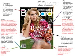
  • 1. Cover Title- Plug- This cover title tells us more about what the main Placed right in the centre of the magazine MASTHEAD – image is about and what will be the story behind the to attract the reader. It The masthead is slightly main subject, which is Lana Del Rey. grabs the magazine. It’s covered by the image of a buzz word to make Lana Del Rey. Iconic readers think that title is covered because everything they need to it is already well known know about this whole to the public, it doesn’t year is in this magazine need to be fully shown and if you don’t get as we know who this it, you don’t know magazine is by. anything about 2012. Main Image- Layout- This image is of Lana Del The background layout of the Rey wearing a bright colour magazine is very simple and it shows flowered covered top to that this shot was taken outside as attract the readers and for you can see the grass and the lighting her to stand out from the is natural. Represents the magazine background and texts. She is because it is so simplistic and not too put right in the centre of the colourful or full of bright images. magazine to suggest that Looking at the overall layout of the she is the main topic of the magazine, we can suggest that this is magazine. Not looking one of the more pricey magazines directly at the camera, can because it doesn’t have a lot of things show it was a candid shot. to focus at once. Price- The pricing is placed right at the bottom and not Headline- very visible which could mean Draws readers in. gives them that it may be expensive so an idea what is going to be in they don’t want to push their the magazine. The use of the readers away because of the word ‘Best’ tells the readers price that nothing else can beat it Barcode- Secondary Lead- A common This shows the readers what else is convention used on going to be in the magazine. It is the front cover of pretty long so the readers are any magazine for the getting more for their money consumer to because there is so much purchase this information. product.
  • 2. Price/ Date- Secondary Lead- In very small font. Can suggest that The other main story of the it is expensive and its small to try Masthead- magazine. Makes the magazine not to push away readers because Covered a little by the main more interesting and the story of its price. image. Not a big deal as it is a this magazine chose to talk world know magazine and about makes the magazine everyone recognises its look more important with such name, even though its covered. an important subject to talk about. The alliteration used at Preview- the start makes the story more A preview of what else is going comical and fun so it shows to be in the magazine- more for that it is an easy read for the the readers money. It also shows audience. the biggest names in music industry to bring in the readers. Extra Stories- Extra stories to fill the magazine up and giving the Plug- readers more for their money Buzz words used to grab as this magazine is quite readers attention with words expensive. Again the headings like ‘New’ and ‘Plus’ to show are short and to the point. that this magazine has a lot Main colours of red and of contents to read about. black, like the masthead. Also very simplistic and easy to read and not distracting to anything else on the page. Cover Title- Layout- The main story of the magazine The background in this front cover linking with the main image of the is very simple. Nothing to flashy or magazine. The font is bold and filled with colours to show its simplistic so it gets straight to the simplicity. This could suggest that point. Using the words ‘Kick-Ass’ this magazine is more of the high attracts the readers because they end magazines because of its would want to find out more about Main Image- sophistication of the layout of the this rebellious actress and the use of Jennifer Lawrence is placed right in the magazine background. We can tell ‘sweetheart’ is an oxymoron the centre of the magazine cover to show that that the image is of the outside word kick-ass to show her innocent she is the main subject of the magazine. because of the clear blue sky and side as well. Wearing simple clothes to show that this what looks like hills. More casual shoot is casual. Her hair is messy which background. The layout of the suggests that she doesn’t mind what she words are simple so it doesn’t looks like and the natural light from the sun distract the readers from the main makes her almost look like she is glowing. story.
  • 3. Price/Date- Banner- Using the word ‘Exclusive’, NME is The pricing and date is telling the readers that this is the Extra- again in very small print only magazine where you can get so it suggests that it An extra story to draw the an interview with one of the may be quite expensive. audience’s attention with the Masthead- biggest rap artist’s of all heading the ‘Ultimate Guide’. time, Drake. Grabs readers Bright red masthead for Tells everyone that this attention. NME. Covered a little by the magazine is the only magazine main image. For the that has this guide and it gives magazine to allow that to the best advice for the readers. be done shows that even This also gives more for the though it is covered, the price the audience has to pay. readers still know what the magazine is. Menu Strip- Long list of big band names to show what the magazine will be discussing about in the magazine. With such a long list Subheadings- gives readers more for their More main stories quite money and especially such eye catching to readers famous with buzz words like ‘Plus’ and ‘special’. More stories for the Headline- readers, more worth The font looks like handwritten their money. so it make it look like the artists themselves wrote it, more personal. It is quite big as well so it shows that it is the main story of the magazine. Messy writing, shows that the Barcode- magazine is quite a casual A common magazine. convention Main Image- used on the Main image is of a man, most probably an front cover of artist, holding an old record, which links to any magazine the headline. He is looking straight at the for the camera with a dozed look which shows that consumer to he doesn’t look very bothered. Colours of his purchase this outfit fits with the masthead and the texts product. surrounding him.
  • 4. Layout: Masthead: The layout of the contents page is very Magazine name right on simplistic. Not many bright colours to the top of the magazine distract the readers away from the main so that the audience images or stories. Its simplicity can also knows that this music tell us readers that this is on of the more chart is by the same high end magazines, not too childish. company. Main Story: This tells the readers and The main stories in the magazine. Right the audience that this is the in the centre of the page which can most important number one show their importance in the chart in the entertainment magazine. The fonts are a little bit world. Nothing else can bigger than the other texts around the compare to this and if you page so it stands out. Bright blue text need to know anything bout that stands out from the white music, you come here. background. Main Images: These are the main images on the page to let the readers know who the main stories will be on in the The music chart is in every magazine and if the readers don’t Billboard magazine as their know who the magazines are key aspect of the contents talking about, the images give page. The readers expect them an idea what they look like this chart to be there so or who they are. The picture of this is what makes Charice is the bigger image which Billboard different than can suggest that she is the main other music magazines. subject of the magazine. More Information: Gives the audience more information about what else is happening in the music/entertainment world. Extras: Promoting their online resources. Telling the audience that there is more information found on their website. More for the readers money, 2 resources for the price of 1 magazine.
  • 5. Masthead: Slogan: The magazine name in the corner A slogan that the magazine has in quite large font. Reminds the made up to go with their brand. readers what magazine they are Something short to summarise reading. The number beside is what the magazine is about and how many magazine the Rolling it is short so it gets in to the Stone has published. They may readers mind and its catchy. Main Image: This is the main image of have put it there to show the the contents page, which audience how popular this can suggest that it will be magazine to have to have been the main story of the able to have published to almost magazine. This picture 1000 magazines. Shows its takes up about more than popularity. It is also in pink font to a half of the magazine stand out and bring out the big which stands out from the amount. rest of the other texts surrounding it. Black and Secondary Image: white image which could The second image on the page for the tell the audience it’s a secondary article. A smaller image so story about the past and it won’t overshadow the main image. about the musical This shows that this article is less celebrities way back when. important than the big black and white image. The picture shows image of Beyoncé with messy hair and singing out loud shows that the article may be on how she performs in a concert. The only coloured image on the page to separate and stand out from the main image. It may also be in colour to show that this story about Main Story: music in our time. The heading for this story is in big black bold letters and much bigger font size than Menu Strip: the other texts on the A list of all the other stories and contents page contrasting articles in the magazine. No images with the big image to back attached to each story so it shows it this story up. The page is less important than the 2 main Layout: number is also in a big fonts. images on the page. Not a long list of A very simplistic layout and background of the contents page. Black and white choices to show that this magazine is seem the main colours on the page with a touch of pink. Very subtle layout. quite sophisticated and doesn’t just Nothing too bright to distract the reader from the main article. Its simplicity cram a lot of different irrelevant shows that the magazine is trying to target an older audience from the ages 18- stories in the magazine. 35.
  • 6. Masthead: Name of the magazine and what page it is right on the top of the page. It is placed in the centre and in the largest font of the page to attract the audience and inform them what this page contains. Menu Strip: Band Index: A strip of all the other news and A very long list of band names gossip in the magazine in order of that are featured in this page numbers. The sub headings magazine. Gives the readers a are in quite large texts to pop out choice of which of their favourite to the readers to tell them that bands are doing now in the there is where to look to check entertainment industry. With what article they want to read. such a long list of names, it also gives the readers more for their money because there are so many different articles to read in Buzz Word: the magazine. Using words such as Features! Draws the readers in and makes the consumer feel more involved as if they are the first ones to read the news Main Story/Image: The main story comes with the main image, which also happens to be the only image on the page which can show its importance in the magazine. The texts are much bigger than the other texts surrounding it. The image and text are placed right in the centre of the page to grab the readers attention immediately. The page number is very visible as if to tell the audience to turn to that particular page straight away. Plug: Anchor: Stands out in the contents page This anchor is used to as if tell the readers that because of its bright red colour to if they carry on reading and buying a draw the audiences in to look at ‘UK’s subscription to this magazine and it is a smart No 1 Gig Guide’ choice to keep buying this magazine. A smart way to attract more consumers.
  • 7. Main Image: The main image of the double page spread that takes up more than half of the 2 pages combined. This gives the consumers an idea of who this article is about and more about what this big band looks like. This picture has very dull colours that doesn’t stand out much with colours like black, white and brown and a bit of dark red but nothing bright like pink which can suggest that this band attracts the older young adult audiences and not teenage girls. Everyone in the picture is staring directly at the camera with a blank look and not really posing which can show that they are not trying to show off. Very modest look. The clothes they are wearing look quite old and simple. Headline: The name of the band in very big text. Informs the audience who this article is about. Main Story: The main story of the magazine about the specific band on the page. Quote: The magazine has take a quote from the main band member. Layout: This gives the consumer a feel The layout and background like they were in the magazine of the page is very simplistic with them too listening to what which compliments the band they are talking about. themselves because they are very simple too. Nothing pops up and its not filled with bright colours.
  • 8. Main Image: This main image of Lana Del Rey looks very seductive and attracts the older male and female. Her eyes are closed and her facial expression and her nails show that she wants something really badly and she looks scary in a seductive Headline: way because of the dark colours and the glitter and the The name of the artist this sharp nails. With limited colours on the page shows that article is on. Also gives the maybe she has a dark personality. readers an idea of what kind of artist she is from the main image. Large Drop Cap: Mirrors Lana Del Rey’s personality that she is larger than life because the letter ‘S’ is much larger than the other texts. Pull Quote: A quote right in the middle of the text as if she writing the article herself. Gets the readers engaged in the article as if they are part of the interview with her.
  • 9. Main Image: The main image od the band this article is writing about. Taking up more than half the double page spread. The image again is quite dull. Not many bright colours such as red or pink but more dull colours such as brown, black and white. The band members are looking directly at the camera in a casual manner which shows that they don’t show off too much about their fame. Very simple background where they are taking the picture, again not showing they need fancy props to take a picture. Very simplistic. As If they only care about the music they make and not how they look. The picture goes through the gutter, which is the spine of the middle part of the two pages. Headline: The name of the band this Q&R is about. This also helps link the image together giving the readers a visual image of what the band looks like.