
Recommended
More Related Content
What's hot
What's hot (20)
Similar to Front, back and CD design for digipak
Similar to Front, back and CD design for digipak (20)
More from evie webb
More from evie webb (11)
Recently uploaded
Recently uploaded (20)
Front, back and CD design for digipak
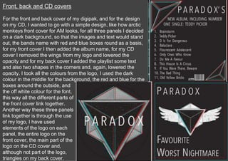
- 1. Front, back and CD covers For the front and back cover of my digipak, and for the design on my CD, I wanted to go with a simple design, like how arctic monkeys front cover for AM looks, for all three panels I decided on a dark background, so that the images and text would stand out, the bands name with red and blue boxes round as a basis, for my front cover I then added the album name, for my CD cover I removed the wings from my logo and lowered the opacity and for my back cover I added the playlist some text and also two shapes in the corners and, again, lowered the opacity. I took all the colours from the logo, I used the dark colour in the middle for the background, the red and blue for the boxes around the outside, and the off white colour for the font, this way all the different parts of the front cover link together. Another way these three panels link together is through the use of my logo, I have used elements of the logo on each panel, the entire logo on the front cover, the main part of the logo on the CD cover and, although not part of the logo, triangles on my back cover.
- 2. Band photos For these photos I wanted to keep the same simplicity as I had on the other panels therefore I only slightly edited them, I turned them black and white and changed the exposure and contrast slightly, this still fits with the colour scheme of black and white with red and blue. I also included the boxes around the outside like in the other panels to keep it consistent throughout, this makes sure that all my panels link together. It also means that my digipak as a whole links with my other products that share this same colour scheme. All three products link through the black and white theme, I have kept the colours as close a possible between my digipak and website, taking the colours straight from the bands logo.