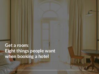
Get a room: Eight things people want when booking a hotel
•
5 j'aime•1,069 vues

How hotel websites can improve the booking experience.

Recommandé
Contenu connexe
En vedette
En vedette (16)
Plus de Turistenístico
Plus de Turistenístico (20)
Dernier
Dernier (16)
Get a room: Eight things people want when booking a hotel
- 1. Get a room: Eight things people want when booking a hotel
- 2. Introduc)on Booking a hotel room. No two journeys are alike. The average person visits 38 websites searching for the best hotel, in the best loca?on, with the best room and of course at the best price. The travel journey may start on a search engine, but where it ends depends on a number of factors. For hoteliers though, the ul?mate goal though is to make sure this search ends on their website. Surveying over 1,000 travellers, as well as filming some actually carrying out a booking, we iden?fied the eight things people want most when they book. We ventured past the inspira?on phase and focused on what happens once someone has decided on where to stay. The findings are fascina?ng. SoGware providers have adopted all manner of different approaches, and below we iden?fy which sites and booking engines we think are doing it best. You might think that going via a third party is what the guest wants, but our research found that there is a desire to book direct if possible. In fact, 72% of people would book directly with the hotel if they could be sure that they were ge;ng the best deal. It’s now up to hoteliers to prove the direct site is best and our eight ?ps will help you do just that. So read on and find out what people want when they book a hotel… This white paper would not have been possible without some special contributors: James Bland – Director, Hotels & Hospitality, BDRC Lennert de Jong – Commercial Director, Ci)zenM 1 Charlie Osmond -‐ Chief Tease, Triptease
- 3. 2 Photos, photos, photos 2 Show me lots of dates 3 The price isn’t right if it’s not in my currency 4 Reassure me 5 Tell me what more I could have 6 Shorten the delay in gra)fica)on 7 Let me use my Facebook log in 8 Make it simple, short and clean 1 The eight things
- 4. Once someone has decided on a hotel, they want booking to be simple and speedy. This means they expect the process to give them what they want easily. And what they want is to be able to find the ‘book’ buQon quickly, to be offered concise informa?on that helps them make a decision, and to be able to get through the payment in as few clicks as possible. 1. Make it simple, short and clean I'm very busy and I need clear concise informaDon, I don't want to spend ten hours booking my hotel. Colour, size and loca?on can all be used make the ‘book’ buQon stand out. The trick is making it as obvious as possible while staying on brand and consistent with the look and feel of your website. Once a guest is in the booking process, there’s no need to wax lyrical about a room. Our bookers liked bullet points, which are used by the BeBeQer booking engine and Starwood Hotels ,or the click to expand for addi?onal informa?on format used by Availpro. Keeping things short and punchy also means details of mul?ple rooms can be viewed on one page, helping to keep the click count down. As a general rule of thumb, avoid cluQer – too many words, ?ny photos or informa?on hidden behind clicks which open new tabs, all make people feel like they’re having to work too hard to get what they want. And if people aren’t geXng what they want they will move on. 94% of people have abandoned a booking online recently largely because of the website they’re using. 3 For them, either the process was too long or complicated or there were technical or payment issues. Doing this well: Push the buIon -‐ Big buWons encourage guests to the next step
- 5. Photos really do say a thousand words. Many of our bookers found too much text overwhelming and off-‐puXng. Photos should be a hotelier’s best friend and ‘show don’t tell’ should be the general rule. 70% of people told us they rely on photos to learn about a hotel, and once in the booking process pictures really help them understand the room and get excited about staying in it. Pop-‐up galleries, as used by Avvio and Availpro, are a good way of displaying mul?ple photos (and we’ll say it again, more really is more when it comes to photos). 2. Photos, photos, photos It’s easier to absorb a picture than read four paragraphs of words… I think a picture paints a thousand words. Larger hotel brands are turning to social media. Starwood’s website for W Hotels has a curated gallery of guests’ photos from Instagram. These photos provide candid, true-‐to-‐life impressions of the experience a guest can expect, with the added bonus of Instagram’s flaQering filters. Virtual tours are also a good op?on. Google Business View, which provides fully interac?ve virtual tours of business interiors, claimed that restaurants using its services during NYC Restaurant Week had a 30% higher click through to bookings compared to those that did not. All said, it’s important hoteliers inves?gate new ways of bringing proper?es to life online. Doing this well: 4 Snap happy -‐ Guests rely heavily on hotels to learn about a hotel
- 6. Transparency is a key factor in building beQer rela?onships with guests. An excellent way to demonstrate this is to provide guests with a clear view on all the informa?on they need to accurately compare choices when booking. Our bookers par?cularly valued being shown availability results in a table format so they could see the prices of rooms and dates either side of their search. In our survey, 71% of people agreed that being shown prices on dates either side of the ones they’ve selected is useful to them. 3. Show me lots of dates When it's in a big table, where you've just got prices and rooms against dates, that's really clear and easy to use… it's more easy to compare." “I love this, if I want [I can] shiT my stay by a day and save 20 bucks This transparency gives the guest a feeling of control and builds the idea that you as a hotelier are on their side and have their best interests at heart. Before showing prices, make it easy to select dates in the first place -‐ our bookers some?mes ?ed themselves in knots. 5 No maQer how much they like that clicky calendar, people don’t really want to go through it again. This one’s got the clicky calendar which I like… clicking is so much beIer. There’s so much potenDal for typing it in wrong. Doing this well: Calendars with drop downs for month (as used by RegaQa) or a grid format (Simple Booking), were well-‐received as they cut down the number of clicks a consumer has to make. Simply making the check-‐out date auto-‐complete aGer selec?ng a check-‐in date can save so much ?me and should be a standard experience. First dates -‐ Clicking through dates helps making a decision easier
- 7. Plenty of websites use the loca?on of the visitor to tailor content. It may seem obvious, but some of the sites we tested don’t show prices in the right currency – 53% of people told us that they are frustrated by being shown prices in currencies other than their own. 4. The price isn’t right if it’s not in my currency Our bookers found themselves confused by prices that switched currency from one page to the next, or when they were unable to locate a buQon to switch to the currency they wanted. On one site we tested the currency selector made finding the Bri?sh Pound quite a bit more difficult than was necessary – the currency was named the ‘UK Pound’ but posi?oned alphabe?cally between currencies star?ng with F and H (we assume this was a reflec?on of ‘GBP’, as an alternate name for the currency). Think about the ordering of informa?on in dropdown menus to make things as simple as possible for your consumers. The perfect solu?on is to use autoloca?on soGware so that any poten?al guest is shown the website in their own language and with prices in their own currency. However, where this is not possible, be sure to have a clear and simple currency selector which is easy to find on the page. When it comes to mobile, where autoloca?on is more easily possible with GPS tracking, this technology is even more valuable as it removes a poten?ally fiddly step from the process. 6 Doing this well: Money, money, money -‐ Guests want ease when looking for their currency
- 8. Reassurance is something OTAs focus heavily on. The ‘book’ buQon will read ‘show deals’, percentage discounts are referenced repeatedly and our bookers were shown up to five messages reassuring them that they were geXng the best price. Some booking engines do a great job with this – WebHotelier, Simple Booking and RegaQa both show before and aGer discount prices and use colour and design to draw the consumer’s aQen?on. 5. Reassure me It's telling me how much I'm saving, which is good to know. Lennert de Jong of Ci?zen M says “[Hoteliers tell me their] website is like a bou?que, this is where you find the best products… well that might be true… but you need to have the best deal available.” Ci?zen M has a very interes?ng approach to this; they show the prices of alternate hotels, complete with links for the guest to book there if they wish to. Lennert says that this is key to their strategy of puXng the guest first. “We do this by offering transparency… by showing what other [nearby] hotels are charging. It’s something that we have done for some ?me… that’s really when you help the guest to posi?on the brand and the concept, and we are in charge there not Booking.com, not Expedia, not Google, we are in charge to let the guest know on our page, these the hotels we compete with, this is our price, here is the link if you want to book elsewhere.” 7 Your bouDque -‐ Transparency shows confidence and encourages booking Doing this well:
- 9. Personalisa?on is a growing trend and 68% of people said it is useful when they are shown what upgrades they can pay for during the booking process. Some bookers liked sites which gave them op?ons for add-‐ons, such as massages or airport transfers but it’s not for everyone. Make sure lists are short and easy to skip if necessary. 6. Tell me what more I could have There are two things to consider when offering upgrades and add-‐ons. First, make the value of what they’re paying for clear to the guest. For example, think carefully before making early check-‐in or late check-‐out a paid-‐for service. Our bookers told us that they would expect this free of charge, or to at least be offered bag storage if there addi?onal ?me in the room was not possible. Slapping prices on these services at this stage can make the hotel seem a liQle mercenary. Second, make sure any upgrades or add-‐ons are relevant and affordable -‐ one of our bookers was shown a $2,100 upgrade on a $400 room! Our bookers also rapidly got frustrated when they didn’t know what was included in a certain package. OGen this was because the ?tle of the package wasn’t that informa?ve and details were hard to find. 8 Doing this well: Upgrade me -‐ Guests like to get excited before they’ve finished booking
- 10. 7. Shorten the delay in gra)fica)on I like the fact that it keeps the format of the original website, the banner is the same as the page before." “It felt sophisDcated, it does what it needs to do in a classy way. Becoming trusted starts with ensuring that people have a strong sense of your brand. In some instances the change between a hotel’s website and the booking engine can be quite pronounced – our bookers gave posi?ve feedback for booking engines that carried through elements of the brand, either through design or photos. It helped keep the levels of energy and an?cipa?on high throughout the booking process. 9 With the introduc?on of Booking Suite and Synxis’ InstaSite and Booking Engine in context suite, the reward for consistency is becoming clear. Although we didn’t analyse them in any depth, booking confirma?on e-‐mails can provide a good opportunity to improve the direct rela?onship. A confirma?on email can suggest following the hotel on Facebook or Instagram, and these channels can be used to communicate far more than just special offers. Informa?on about local events builds the rela?onship and your posi?on as a trusted guide. For example, W Hotels operate Instagram profiles for each of their hotels with content on events, special offers and sugges?ons for ac?vi?es. James Bland of BDRC suggests that there is nothing wrong with asking guests a few ques?ons about themselves first to help when offering content that might be useful. Doing this well: Give me more -‐ Payment doesn’t spell the end. Content gets guests even more excited
- 11. Social login is a core facet of Airbnb. It both speeds up the process of logging-‐in and provides them with powerful social data. Booking.com have also started provided a Facebook login op?on. 26% of people told us they would use a Facebook log in if it was available on a hotel booking site and it comes as no surprise that this was higher among younger age groups. 8. Let me use my Facebook log in If there was an opDon to log in on Facebook I probably would, I can’t be bothered to remember a new password every Dme. Social login will only expand as people look for an easier way to manage their online lives. For hoteliers the value lies in capturing accurate and useful social data, and social sign for loyalty schemes is a temp?ng way to en?ce consumers to part with it. As our youngest booker said, this makes her life just that liQle bit easier. 11 Doing this well: Plugging in a social API makes the idea of logged in rates even more en?cing for hoteliers in the drive to garner more direct bookings. Early adop?on will provide considerable compe??ve advantage in the years to come as Facebook becomes the portal to the internet for millions. Like -‐ Social log-‐in saves )me and provides valuable data to hotels