10 Mobile Forms Dos and Don'ts

This document provides dos and don'ts for designing mobile forms. It recommends labeling fields clearly, dividing long forms into chunks, using the right control types sized appropriately for mobile, connecting errors to the problematic field, accounting for the keyboard, indicating progress in wizards, and avoiding useless popups, duplicate navigation, wrong controls, and designs that don't consider limitations of mobile use. Guidelines include using inline labels, combining related fields, dividing forms into sections, right-sizing buttons and selecting appropriate date pickers, connecting errors to fields, remembering the keyboard, marking wizard progress circles carefully, indicating drag affordance, always showing loading progress, and avoiding popups, duplicates, wrong controls and designs ignoring finger limitations.

Recommandé
Recommandé
Contenu connexe
En vedette
En vedette (12)
Dernier
Dernier (20)
10 Mobile Forms Dos and Don'ts
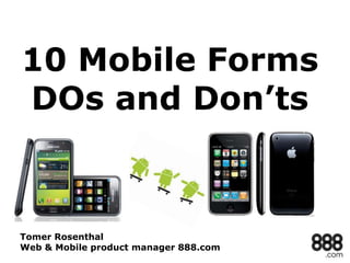
- 1. 10 Mobile Forms DOs and Don’ts Tomer Rosenthal Web & Mobile product manager 888.com
- 2. "There is NO MOBILE WEB people. That is a f#$%ing bunch of hype. It is merely the Web." Molly E. Holzschlag 2
- 4. 4
- 5. 5
- 6. INLINE LABELS ARE ALSO A VALID MOBILE OPTION. (KEEP IN MIND TO HAVE THE INLINE TEXT REMAIN IN THE FIELD UNTIL FIRST KEYSTROKE) 6
- 8. 8
- 9. 9
- 10. 3. Divide 10
- 11. 11
- 12. 12
- 15. RADIO BUTTONS ARE IMPOSSIBLE TO PRESS 15
- 16. 16
- 17. SMALL BUTTONS ARE IMPOSSIBLE FOR “FAT FINGER SYNDROME” 17
- 18. BUT WHY NOT USE THE BUILT-IN DATE FUNCTIONALITY OF HTML 5? 18
- 19. BUTTONS LOOK DIFFERENT IN DIFFERENT MOBILE DEVICES. DON’T JUST STRETCH THEM TO 100% 19
- 20. 20
- 22. CONNECT ERROR TO ERRORENOUS FIELD 22
- 23. 23
- 24. REMEMBER THE KEYBOARD LOCATION & SIZE 24
- 25. ANOTHER GREAT EXAMPLE OF “REMEMBERING THE KEYBOARD” 25
- 26. 26
- 27. 7. Wizarding 27
- 28. INDICATE WHERE WE ARE IN THE WIZARD TRAIL 28
- 29. USUALLY CIRCLES MARK THE SPOT 29
- 31. 8. Drag 31
- 32. DRAG AFFORDANCE IS INDICATED BY 3 HORIZONTAL LINES 32
- 33. 9. Loading… 33
- 34. THE RETURN OF THE SPLASH SCREEN 34
- 35. 35
- 36. DON’T GET STUCK, ALWAYS SHOW PROGRESS 36
- 37. 10.Don’ts 37
- 39. 39
- 40. 40
- 43. THE MANY FACES OF LINKEDIN 43
- 44. 44
- 46. I’M BLIND!!! 46
- 47. 47
- 48. Appendix: Registration & Cashier Patterns “Mobile Design Pattern Gallery / Theresa Neil” (www.theresaneil.com) 48
- 49. 49
- 50. 50
- 51. 51
- 52. 52
- 53. 53