
Recommended
More Related Content
What's hot
Viewers also liked
Similar to Results of my questionnaire
Similar to Results of my questionnaire (20)
Results of my questionnaire
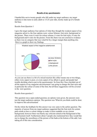
- 1. Results of my questionnaire I handed this out to twenty people who fall under my target audience; my target audience is late teens to early adult so 13-25 year olds, mostly made up of a female fan base. Results from Question 1 I gave the target audience four options of what they thought the weakest aspect of my magazine advert is, the four options were: colour Scheme, font style, background or the picture. There were 4 votes for colour scheme, 6 votes for font style, 4 votes for background and 6 votes for the picture. From this there was not conclusive evidence as there was no category that was voted for by a larger margin than anything else. Here is a graph to show my findings. Weakest aspect of the magazine advertisment 20% 30% colour Scheme font style background the picture 30% 20% As you can see there is a bit of a mixed reaction this either means one or two things, either every aspect is poor, or every aspect of my album is good, and people had trouble deciding what to put in the questionnaire. So from this I have decided out of all the aspects of my magazine advertisement I am going to change the font style and in particular the colour of some of the font, but all these suggestions will be covered in the next question. Results from question 2 This question was a open ended question, no options were given, the answers were just the target audiences opinion. The question was 'What do you think could be done to improve this advertisement' On the whole the feedback for this answer was very same to the earlier question. The majority of answer from my target audience suggested that the font style for certain parts needs to have a colour change to make it more readable on my current background, however there was barely any criticism aimed at the background of the advertisement itself. Furthermore about 3 people also metnioned how they would like me to change the smoothness of the picture of the badn at the bottom of the add, I am taking all of this into consideration.
- 2. Results from Question 3 This question was another multiple choice one, the question was ' What genre would you say this advertisement is trying to represent? (If you picked other please state what in the blank are below) For this section they could tick as mant boxes as they wanted and felt were right. The options I gave the target audience for this question were as followed: Rock, Indie Pop, Rap and other. For other the would write down what they meant by other at the bottom of the page where there was a small blank space. Here is a graph to show my results What genre they thought the magazine advert represented Genre Rock Indie Pop Rap Other As you can see from this graph the overwhelming majority thought my music was Rock, this is good as my music is a mixture of Rock music and Indie, this is useful as it shows I am trying to represent the band in the right way. For other people wrote the music genre Alternative, which is a category that the music the advertisement I am representing sometimes goes in. This feed back has been useful as it shows that I am heading in the right direction, and since no one ticked the boxes Rap and Pop, it also shows I am definitely not representing the band seriously wrong. This shows that when I edit the album cover for my final draft I should not change it to excess as I may lose the interest of my target audience . Conclusion from my results. From my results I have decided not to change the advert too much as at the moment it is going to hit my target audience. However I may tamper ever so slightly with the edges of my picture, the colour of my font and may possibly change the background colour scheme if only ever so slightly. The reuslts have been most useful as I now know how to finish off my advert to make it more ideal for my target audience. Furthermore the results I am not going in the wrong direction so I just need to improve on what is already done.