Communicating Science (or anything else) Online
•
293 likes•19,307 views

Advice on writing for the web, a discussion of the special considerations of the medium, and some best practices for developing and delivering online content.

Recommended
Recommended
More Related Content
What's hot
What's hot (20)
Viewers also liked
Viewers also liked (20)
Similar to Communicating Science (or anything else) Online
Similar to Communicating Science (or anything else) Online (20)
Recently uploaded
Recently uploaded (20)
Communicating Science (or anything else) Online
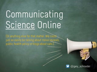
- 1. Communicating Science Online @gary_schroeder (Or anything else for that matter. We could just as easily be talking about movie reviews, public health policy or blogs about cats.)
- 2. Hi. I’m Gary Schroeder @gary_schroeder
- 3. The ‘Death’ of Paper With apologies to Jacques-Louis David
- 4. The world is split into websites that work with Instapaper, and stuff that has now been rendered irrelevant to me. @killdozr
- 5. How is writing for the web different than writing for print media?
- 7. https://www.flickr.com/photos/mrlomo/5855888939/ https://www.flickr.com/photos/85671648@N03/15467473149/ FOCUSED READING INFO GATHERING
- 10. 25% slower Reading on desktop screens: https://www.flickr.com/photos/teosaurio/8857853963/
- 11. Get rid of half the words on each page, then get rid of half of what’s left. -Krug’s Third Law of Usability Omit needless words
- 13. 500 – 700 words 10 – 15 words 50 words Sentence target: Paragraph target: Total length target: https://www.flickr.com/photos/erodzen/8083808978/
- 14. CHUNKING
- 16. ‘Happy talk must die’ If you’re not sure whether something is happy talk, there’s a sure-fire test: if you listen very closely while you’re reading it, you can actually hear a tiny voice inside your head saying… -Steve Krug:
- 17. 89% 94% Combining visuals with text increases comprehension by Press releases containing photos and videos receive more views than those without by
- 18. SHARE Make it easy to
- 19. Why the brain craves infographics: http://neomam.com/interactive/13reasons/
- 21. Spectrum of Sophistication Readers who are only interested in the punchline, e.g., “Higgs Boson Found” Reporter who wants to know everything there is to know about the topic • Backgrounders • Links to all previous articles about the topic • Links to scientist bios • Links to high-res images suitable for print • Link to the full published paper Program Manager checking on how the work is being publicly portrayed
- 22. <H1>Stick to HTML whenever possible</H1>
- 23. PDFs(avoid them)
- 25. Make discovery easy Like pulling a thread on a sweater…
- 26. Content strategy plans for the creation, publication, and governance of useful, usable content. Kristina Halvorson www.flickr.com/photos/45923218@N00/4835160197
- 27. The content strategist defines not only which content will be published, but why it’s being published in the first place. Without a strategy, we’re just running a production line for content that nobody needs or wants. www.shorpy.com/node/15585
- 28. Publishing Criteria Why are you publishing this? Info Architecture Is it logically arranged, findable? Content Strategy Messages What do you want them to know? ID Audiences Who are you trying to reach? (And why?) Work Flow Routine process for scheduling, producing, publishing Measure success (or lack of it) Metrics
- 29. ORG CHART Death by Your target audience doesn’t care about internal fiefdoms
- 31. Read these!
Editor's Notes
- I’m Gary Schroeder. I manage the online communications program at Brookhaven National Laboratory and I’ve been in this business for about 14 years. Rick asked me to speak to you about writing for the web, what the special considerations are for this medium, and what some of the best practices are in developing and delivering online content.
- The internet severely disrupted the conventional methods of communication 15 years ago, but some institutions are _still_ adjusting. Commercial companies adjusted rapidly because there’s money at stake, but others have taken a bit longer. Only the largest newspapers are surviving this shift…many big name magazines have either died or have hemorrhaged subscribers and are shadows of their former selves. For corporate communicators, this change impacts everything once distributed on wood pulp including brochures, flyers, tri-folds, newsletters, annual reports…everything. And the expectation is that you’ll be able to go to the internet and find out everything you want to know about any given topic. Your job as an online writer is to fill the user’s expectation.
- This shift is real and huge. This picture shows how many people are now reading your content. Even folks in the communications industry may be blissfully unaware of it because this type of reading is foreign to their own patterns of media consumption. My advice is to not let your own personal biases influence your electronic communications strategy. Prepare and deliver content the way your audience expects it, not the way you would necessarily choose to consume it. Folks that want to stick with the safety of familiar waters in this regard are taking a real career risk. I know that you’ve probably heard these sorts of frightening statements before. I’m not saying it to be provocative, I’m saying it because it’s true. And at times it makes me as uncomfortable as it may make you.
- Before I answer the question of how writing for online is different, let’s talk about how READING online is different than it is in print.
- One enormous difference from print: you cannot know on which platform or device your content will appear. You MUST be prepared for readers who will be staring at your content on a tiny screen while waiting in an airport or riding on the Metro. Your content might be read on a conventional desktop, OR a smart phone, OR an iPad or other tablet, OR something else that hasn’t even been invented yet…but which will be two years from now. Let’s talk a bit about people’s reading habits when they’re using one of these devices…
- In general, website visitors are not reading like we used to in newspapers (that is, relatively long reading times where attention is focused), Online readers are often just gathering information, moving from page-to-page or site-to-site. They click and forage in search of information that leads them towards some goal The visitor often knows broadly what they want, but not specifically. They might just be passing through…often they’ve arrived through a Google search never intending to come to your specific website at all. You don’t have a lot of time with these visitors. Your content has to deliver in that brief window.
- Online readers won’t stick with content on screen as long as they will in print. There are just built-in expectations for print and online media. If the page doesn’t load in 2 seconds…gone! If the content breaks across multiple pages…gone! Etc. Only the most intensely compelling content will hold an online reader for anything beyond a few paragraphs. (You might remember Snow Fall: the Avalanche at Tunnel Creek, the internet sensation that everyone’s been trying to repeat ever since it appeared back in 2012.) Few stories lend themselves to that extended format; certainly not the kind of content we prepare for the DOE.
- This is what reading online is like. Reading online has often been compared to reading billboards at 60 mph. To be read, your web content has to be more like a billboard, and less like a polished, stand-alone work of art. Which is probably the type of content you’ve been trained to write. Online readers SCAN the page, PICK OUT key words and phrases and in SHORT bursts. Info gatherers are going to grab their target content and LEAVE as soon as they find it (unless you’re good enough to tease them with other goodies of related information that cause them to want to hang around).
- Another reason to be brief and come to the point quickly: screen reading is up to 25% slower than reading paper. (Sun Microsystems study) (Not sure that this applies to devices other than desktop screens. This study predates iPads, Kindles, smart phones, etc.)
- SO if you’re dealing with short attention spans coupled with reduced on-screen reading speeds, it’s time to look at reducing word counts. Omitting needless words has several benefits, including: Reducing “noise” level on a page Makes useful content more prominent Makes pages shorter, allows the reader to see more w/o scrolling, which increases the chance they’ll scan the whole piece.
- The more words you cut out, the shorter the piece will be, and the more likely it is to be read at all. Some websites like The Daily Beast have added progress meters to let the reader gauge their time investment. Sites like medium.com actually provide an estimated reading time for each article their users post. (Presumably based on word count only.) I don’t know if this sort of length indicator is really going to catch on but that fact that they exist at all tells you that certain content providers are very aware of the reader’s short attention span (and you might even say that they’re being respectful of their time).
- Here are some good rules of thumb for length: [ sentence / paragraph, / whole piece ] I realize that getting science stories down to this short of a length is really tough. Often, the science taking place within the Department is very esoteric and requires a lot of words to set the stage to even explain WHY the scientific result is noteworthy. And scientists resist short summaries that leave out detail…because to them, that’s like lying. Their colleagues would burn them for taking such short-cuts. But it’s the science communicator’s challenge to strike that balance.
- Because we’re dealing with a speed/scan medium, you can help your reader out by breaking up the wall of text into small units with plenty of subheads. This is called “chunking”. Chunking can include lists, bullets, small factoid call-outs or anything else that breaks up text into scannable, navigable sections. Don’t force your reader to stuff a giant brownie in their mouths, be a good host and give them smaller bites.
- Chunked vs. non-chunked. Without chunking, you’re really forcing the reader to finish the whole thing to know if they’ve found everything that’s important to them. If they’re really impatient, they may just bail. If you chunk it, they can quickly scan to determine which parts are what they want and which ones aren’t. They may only need to read one-third of this text to get the information they’re looking for. I could have gone further with this example by adding bullet points, pull quotes, or little factoids—three other good ways to break up the wall of text.
- Here’s something else to get rid of…Happy Talk. We all know happy talk when we see it. It’s the introductory text that’s supposed to welcome us to a web site and tell us how great it is, or to tell us what we’re about to see in the section we just entered. Online, this is completely unnecessary…if it was ever necessary at all in print. If you’re not sure whether something is happy talk, there’s a sure-fire test: if you listen very closely while you’re reading it, you can actually hear a tiny voice inside your head saying “blah, blah, blah…” “Welcome to our site! We hope you’ll find the content here useful and interesting…” Blah, blah, blah…
- The web is highly visual. Images and videos affect how likely your content is read and understood. Combining visuals with text in communications increases comprehension by 89% Press releases with photos and videos receive 48 to 94% more views than those without (depending on which source you cite). Of course, videos can’t be replicated in print. Take advantage of this by including short videos featuring interviews with researchers or demonstrations of how something works. It’s likely that if a video is present, and the visitor feels they got the gist, the text will never be read. When including photos, use pictures of the actual people, data and hardware associated with the story. Readers can spot stock photography a mile a while. It actually has an odor that people can detect; it says “fake.”
- Make it easily shareable. Sharing spreads your content to parts of the internet that may surprise you. When content resonates, it spreads without any effort on your part. It means more than just carrying social icons on your site. It also means things like embedding videos that can be shared directly simply by using the ‘share’ feature attached to the player. Public platforms like YouTube and Vimeo make this easy and it’s functionality that users routinely expect. In fact, if you don’t offer easy sharing, it may frustrate the user and you lose an opportunity to spread good content.
- …then produce content that people will want to share, like infographics. The brain craves infographics because: The brain is wired to be visually stimulated It’s a way to deal with information overload Audiences have been shown to be more convinced by an argument with a presentation that had visuals vs. verbal alone Easy to digest and generally have a sense of “fun”, not as tedious or off-putting as plain text See http://neomam.com/interactive/13reasons/
- Be aware that THIS is how people are finding your content. The days of going to an organization’s home page and starting a content search there ended years ago…which is why most web strategists know that the home page is far less important than Management probably thinks it is. For this reason, your content should be as self-contained as possible. When the reader finds your content, they may know nothing about you or even what website they’re on; it was just the first search hit that looked like it was related to what they wanted.
- Offer layers of information all the way from “Punch Line”-only to in-depth background and biographical sketches.
- Always stick to showing your content as HTML when you can. It renders downloads and renders almost instantly and will work in every device, from desktop to smart phone.
- Avoid using PDFs as your main source of content. Use it as background only or if it’s important that the source be seen in its original, unexpurgated version. It used to be that you sometimes had to provide a PDF to offer a print-friendly version. If your web team is building websites according to best practices, that’s no longer true. Your site should be inherently print-friendly. (And how often do you print web pages out anyway?) Throwing a PDF at your visitor is like saying “here, go read the book, I don’t have time to summarize it for you.” Guess what, they don’t have the time to read it…off to the next website! Other reasons to avoid: it might spawn a new app and it’s just slow to open. Even 2 seconds is long enough to cause someone to bail out. If it’s an image-based PDF, it can’t be indexed by search engines and it won’t be easily readable on a smart phone. It’s going to be a devil to deal with if the reader is on a mobile device If you do link to a PDF, always warn the user that’s what they’re getting so they can decide whether or not they want to deal with it.
- Have a well thought out taxonomy. For those who aren’t familiar with taxonomies, it’s a pre-set dictionary of words that allows you to fully describe and consistently classify all content. They are information that describes information, or so-called “meta data”.
- Taxonomies makes the discovery of related content easy for your reader. Depending on where they fall on the Spectrum of Sophistication, they may want to follow that thread a lot farther than a single page. If you’re lucky, they’ll want to research the entire topic that your original piece is categorized in Of course, this requires a content management system. Hopefully, you have one. Now let’s just briefly touch on the topic of content strategy.
- Because the heart of all websites is CONTENT, doesn’t it make sense to start with a strategy for creating that content? How many times have we been asked to ‘build a website’ and when we ask ‘where’s your content?” we’re told that, oh that’s simple, we’ll get that to you after you start building the website. I’ll bet your old website grew organically, with no master controller at the top, no Big Plan as to what the big areas of the site were going to be or how they would relate to each other. Well, NO MORE. This time we’re going to have an actual plan BEFORE we build. Content Strategy started to become a buzzword around 2007 (Rachel Lovinger) or 2008 (Kristina Halvorson). Web professionals everywhere started to say hey, our website stinks because it’s just a giant lump of junk that nobody reads. It’s not serving it’s intended purpose. Too many people are subscribing to the Cult of Volume in which leaders feel the more crap we stuff into the website, the better it is!
- content strategy is largely about discipline…the discipline to not publish content just because you have it, but to only publish what’s needed to make your website useful to the people you’re trying to reach or serve. CS makes you ask ‘WHY have this on our website’ at every turn. It seems obvious now, but we never used to do that. It used to be all about VOLUME! Get more stuff posted!! No one asked why. Everyone treated the web like a race to see who could post more stuff.
- The elements of content strategy
- There’s a big temptation to arrange and structure your content according to the org chart. Don’t do it; no one outside of your organization cares about it. Not at all. It’s just a killer for a website. It makes your audience feel like an outsider at worst and confused at best. Organize by logical topics. Try to imagine what would appear logical to your target audience. How well you serve your target audience determines how effective your online communications program…or isn’t. Arranging by org chart usually just soothes the ego of someone who’s not even part of your target audience. You know who that person is, don’t you? (Of course, there are political realities that can’t be so easily ignored.)
- Content strategy also defines the tone that your content should consistently have. Content must work for members of the science-interested public as well as other audiences. In Brookhaven’s case, we want titles, navigation labels, and content that uses terminology that is intelligible to non-scientists. Plain-language, no-nonsense labels are the goal. Examples: Big Bang Physics instead of QCD Physics and Light as a Discovery Tool instead of Photon Sciences. We won on some of these, but lost on others because out of fear that scientists would reject this and that getting approval would take too long.
- Know these books! “Don’t Make Me Think” by Steve Krug “Content Critical” by Gerry McGovern (or just follow his blog, which is pretty good) “Content Strategy for the Web” by Kristina Halvorson