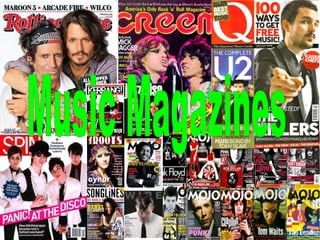

Recommandé
Contenu connexe
Tendances
Tendances (19)
En vedette
Similaire à Kirsty Evaluation
Similaire à Kirsty Evaluation (20)
Plus de guestb423290d
Dernier
Dernier (20)
Kirsty Evaluation
- 2. Front Cover Analysis A very common colour scheme. Red, white and black are the main colours used. They all stand out from each other and work well. The logo is in the top left corner, so it is easy to see, but doesn't take up the whole front cover. It also blends with the colour scheme. Main picture is big, so it stands out. It fits in with the colour scheme. The coverline that goes with the picture, is the biggest writing, so it stands out. List of other coverlines and artists included in the magazine. Another smaller picture at the bottom, with coverline next to it, showing an example of what is inside the magazine. There is a badge at the side of the magazine, with an extra colour of blue, to stand out on the page, because it is only small. The bar code with the price and date is placed at the side of the magazine, so it is easy to find but not in the way of anything. Selling line is used to attract the audience
- 3. Double Page Analysis Common Colour Scheme – Red, White, Black and Grey Big picture in the middle of the page – band included in page. Little quotes or description of what is in the picture Main Title Name of band Quotes from the text Text separated with different colours Smaller separate pictures of each member
- 4. Contents Page Analysis Main Story Title – Contents and date Magazine Features – Page numbers bolder to stand out from the writing. Coverline is also bolder to stand out from the summary Magazine Features which are usually in each issue Pictures showing what is in the magazine. More features. With the page numbers to stand out from the picture
- 5. Pictures I used this photo for the front cover, because it is clearer and it shows new music, which might attract more people to read it. It shows what type of music, because of the style of clothing and the instrument I used this photo for my main picture on the double page, because it is interesting and the reader can see the 3 main band members I used this picture, because it shows the energy used at the concert and I think it will attract the younger, energetic audiences I liked this photos and used them to show the different atmospheres and lights that were used on the stage. I think they will attract attention, because they are interesting pictures.
- 6. LAYOUTS I have looked at many different music magazine front covers and I have seen the different layouts which have been used. I have used various different aspects of these layouts to make a couple of mine own. I liked different parts of these layouts and needed to decide on my final idea. I liked the layout on the left most, so I used a couple of these ideas for my final piece.
- 7. Light Red – Joy, Sexuality, Passion, Sensitivity, Love Pink – Romance, Love, Friendship Dark Red – Vigour, Willpower, Rage, Anger, Leadership, Courage, Longing, Malice, Wrath Brown – Stability Dark Orange – Deceit, Distrust Red Orange – Desire, Sexual Passion, Pleasure, Domination, Aggression Gold – Prestige, Illumination, Wisdom, Wealth Dull Yellow – Caution, Sickness, Decay, Jealousy Light Yellow – Intellect, Freshness, Joy Dark Green – Ambition, Greed, Jealousy Yellow Green – Sickness, Cowardice, Discord, Jealousy Olive Green – Peace Light Blue – Health, Healing, Tranquillity, Understanding, Softness Dark Blue – Knowledge, Power, Integrity, Seriousness Light Purple – Romantic and Nostalgic Feelings Dark Purple – Gloom, Sad Feelings White – Light, Goodness Innocence, Purity, Virginity, Perfection Black – Power, Elegance, Formality, Death, Evil, Mystery C O L O U R C O N N O T A T I O N S
- 8. Bauer Media is a division of the Bauer Publishing Group, Europe’s largest privately owned publishing Group. The Bauer Publishing Group is a worldwide media empire offering over 230 magazines in 15 countries, as well as a web page, TV and radio stations. Bauer Media joined the Bauer Publishing Group in January 2008 after taking over Emap. Publishers Bauer Media The National Magazine Company is one of luxury consumer magazine publishers in the UK, reaching 14.4 million adults every year. NatMag currently publish 20 magazines and 61% of all ABC1 magazine reading women aged 15-55 engage with a NatMag brand. NatMags My magazine would be published by mainstream publishers, because it has music from different parts of the world for all people to read. It could be published in different languages for different countries. I think it would attract a wide variety of audiences. It has a wider range of music genres, for all different tastes. I don't think it is aimed at a specific gender, because he can be enjoyed by both. My Magazine
- 9. P I C T U R E S I took this picture on my phone at a concert. I used Photoshop to cut the person out of the picture, because I wanted to focus on the music being played and I think the background is too distracting. I picked this blue/ purple colour, because I think it makes the picture stand out from the back. It was difficult to cut out the guitar easily, so I missed the fretboard out. I cut out part of his legs and where I had missed the fretboard, because I wanted it to focus on him playing the guitar and I didn't think his legs were really important.
- 10. Comparing 2 Magazines I think I have improved the quality of my work from the school magazine to the music magazine. Although they are different subjects, I think the music magazine looks more realistic. The school magazine is minimalistic and doesn't have much on the front about what is inside. I like the picture because it is simple, however is doesn't show school features, like uniform. The music magazine has a wider range of colours to interest the audience and a variety of coverlines to explain about what is inside, without going into too much detail. There is more then one picture which would also attract the audience and both pictures show that it is a music magazine, because they are both from concerts. The masthead is more noticeable on music magazine. On The school magazine it seem unsure whether the magazine is called 'SHS' or 'SHS Sixth Form'. If I could remake my music magazine, I would put the title behind the person in the main picture, so it doesn't cover up too much of the picture, but is also easy to see. I would also make the bar code smaller, because it is a bit big and noticeable compared to the other colours on the magazine.