
Recommended
More Related Content
What's hot
What's hot (19)
Similar to Magazine cover analysis3
Similar to Magazine cover analysis3 (20)
More from heatherjanew
More from heatherjanew (20)
Recently uploaded
Recently uploaded (20)
Magazine cover analysis3
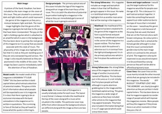
- 1. Main image- A picture of the band, Kasabian, has been included as the main image on the cover of this issue. They are situated in a contrast of dark and light clothes which could represent the genre of the magazine as they are a mixture between light and dark. The main image highlights that the genre of this magazine is going to be rock due to the props that have been incorporated. The guy on the right is holding a guitar which is attached to an amplifier which is seen in the background. This has been done to portray the rock genre of this magazine as it is a prop that you would associate with this style of music. The physicality of this image also highlights the fact that it is rock as they are standing up as if they are very overpowering and serious. The image is also equally balanced as they are positioned in the middle of the cover. This image has been used to immediately catch the attention of fans of Kasabian. Design principals - The primary optical area of this cover includes the logo of the magazine along with an image of the main focus of the issue. This is to catch the attention of potential buyers when looking for a magazine in the shop as they can immediately get a sense of what the issue is going to consist of. The strong fallow area - this magazine includes an image and text which makes it clear that Jeff Buckley is going to appear in this issue. His name is in bold black lettering which highlights him as another main artist that will be staring in the magazine. Genre and target audience- I would say the target audience for this magazine would be for people over the age of 25. This is because it is well laid out and put together. It looks like something that would appeal to an older audience due to the type of music that is included on the cover. I would say the genre of tis magazine is rock because of the prop that are used, the band that are on the front are also a well-known rock group. He colour pink is usually a colour that is aimed at the female gender although it is clear that this issue is aimed at both genders due to the main image which is in contrast to the amount of pink. The magazine is also quite expensive so you would not expect it to be purchased by a young person as they will not be able to afford buying every issue. Masthead- the masthead of this magazine has been created to fit the genre of the magazine as the font is quite formal and posh looking. The masthead is situated in the corner of the magazine in a square red box. This has been done to catch the audience’s attention as it is in contrast from the light pink background. It is in the primary optical area which is the first place the audience will look. Cover lines- the cover lines on this issue mainly include the other musical artists that are going to be included in this magazine. The words ‘ JEFF BUCKLEY’ ‘COURTNEY LOVE’ AND ‘THE HORRORS’ are clearly brought t attention as they are written in bold capital letters. This has been done so that he magazine appeals to a wider range of people which will improve the magazines income. More people will buy the magazine if they know there is an artist involved in it that they are a fan of. Model credit- the model credit of this magazine is KASABIAN “IT’S OUR TURN!” this has been written in bold capital letters which attracts attention of potential readers. This gives a little bit of information about what people will be expected to see in tis magazine. It is clear that there is going to be an exclusive interview with the band somewhere in the magazine as it is written in quotations. This is enticing to fans of the bad as they will want to know what the quote is referring to. House style- the house style of Q magazine is usually relatively similar for each issue. The layout is very formal. It always includes the masthead at the top of the cover along with a music artist situated in the middle. This particular cover may differ from others because the background colours are different along with the image as there are two people. Strong fallow area- the strong fallow area of this magazine includes an image of another musical artist named Jeff Buckley. This has been put in this area as it is not initially the first place people will look although it is quite attention grabbing due to the image and the bold black capital writing. This gives the magazine a wide range of audience as they have included other artists to the magazine that may appeal to people. They have also included information being that it is a 17 page special which could entice them more.