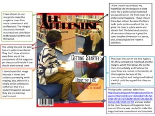
1. I have chosen to construct my masthead like this because it looks more like a professional masthead you would see on the front cover of a professional magazine. I have chosen these two colours because the black looks quite professional and the red gives the cover a subtle warm and vibrant feel. The Masthead consists of two colours because it gives the cover another dimension in a sense, also, it would grab the reader’s attention. I have chosen to use margins to make the magazine cover look more conventional and professional. The margins also match the thick masthead and contribute to the colour scheme and the layout. The selling line and the date line are quite conventional. They don’t draw attention away from any of the components of the magazine yet they are still visible if one should want to read them. The cover lines are in the font ‘Agency FB’, they contrast the masthead and the margins which then draws the eye to them immediately and I believe the cover lines are central to the identity of this magazine because of the contrasting font and background behind it which could be argued that they are seen first. I have chosen this image because it shows two students conversing while reading, also, they’re in a library which contributes to the fact that it’s a student magazine because they are in a learning environment. The barcode I used was taken from http://www.bing.com/images/search?q=magazine+Barcode&view=detail&id=C81A2ED94C1AE641C67E8DAEC9823732638762A4&first=0&FORM=IDFRIR and was added to the cover because all magazines have one and this one was needed to make the magazine look conventional and complete.
2. I have chosen to use margins to make the magazine cover look more conventional and professional. The margins also match the thick masthead and contribute to the colour scheme and the layout. I have chosen to construct my masthead like this because it looks more like a professional masthead you would see on the front cover of a professional magazine. I have chosen these two colours because the black looks quite professional and the red gives the cover a subtle warm and vibrant feel. The Masthead consists of two colours because it gives the cover another dimension in a sense, also, it would grab the reader’s attention. The selling line and the date line are quite conventional. They don’t draw attention away from any of the components of the magazine yet they are still visible if one should want to read them.