[ia] Infogram workshop en DataViz day Hacks&Hackers
•
6 likes•1,379 views

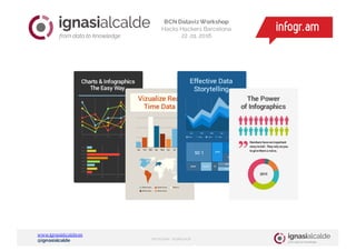
Materiales del taller introductorio a Infogram DataViz day Hacks&Hackers

Recommended
More Related Content
More from Ignasi Alcalde
More from Ignasi Alcalde (20)
Recently uploaded
Recently uploaded (20)
[ia] Infogram workshop en DataViz day Hacks&Hackers
- 1. www.ignasialcalde.es @ignasialcalde INFOGRAM WORKSHOP Generem coneixement BCN Dataviz Workshop Hacks Hackers Barcelona 22 .o1. 2016
- 2. www.ignasialcalde.es @ignasialcalde INFOGRAM WORKSHOP Generem coneixement BCN Dataviz Workshop Hacks Hackers Barcelona 22 .o1. 2016
- 3. www.ignasialcalde.es @ignasialcalde INFOGRAM WORKSHOP Have a look at the speechby infogr.am co-founderUldis Leiterts Human brain process visual information 60,000 times faster then textual DATAVIZ DAYWORKSHOP
- 4. www.ignasialcalde.es @ignasialcalde INFOGRAM WORKSHOP The New York City metropolitan area is home to the largest Jewish community outside Israel. It is also home to nearly a quarter of the nation's Indian Americans and 15% of all Korean Americans and the largest Asian Indian population in the Western Hemisphere; the largest African American community of any city in the country; and including 6 Chinatowns in the city proper, comprised as of 2008 a population of 659,596 overseas Chinese, the largest outside of Asia. New York City alone, according to the 2010 Census, has now become home to more than one million Asian Americans, greater than the combined totals of San Francisco and Los Angeles. New York contains the highest total Asian population of any U.S. city proper. 6.0% of New York City is of Chinese ethnicity, with about forty percent of them living in the borough of Queens alone. Koreans make up 1.2% of the city's population, and Japanese at 0.3%. Filipinos are the largest southeast Asian ethnic group at 0.8%, followed by Vietnamese who make up only 0.2% of New York City's population. Indians are the largest South Asian group, comprising 2.4% of the city's population, and Bangladeshis and Pakistanis at 0.7% and 0.5%, respectively. / Demographics of New York, Wikipedia DATAVIZ DAYWORKSHOP
- 6. www.ignasialcalde.es @ignasialcalde INFOGRAM WORKSHOP DATAVIZ DAYWORKSHOP “There is a magic in graphs. The profile of a curve reveals in a flash the whole situation - the life history of an epidemic, a panic or an era of prosperity. The curve informs the mind, awakens the imagination, convinces." Henry D. Hubbard /1939/ National Bureau of Standards Washington D.C
- 7. www.ignasialcalde.es @ignasialcalde INFOGRAM WORKSHOP DATAVIZ DAYWORKSHOP Internal study by DC Thomson Interactive charts increase reader engagement by over 60%
- 9. www.ignasialcalde.es @ignasialcalde INFOGRAM WORKSHOP DATAVIZ DAYWORKSHOP press releases industry reports explain/instruct
- 10. www.ignasialcalde.es @ignasialcalde INFOGRAM WORKSHOP DATAVIZ DAYWORKSHOP
- 11. www.ignasialcalde.es @ignasialcalde INFOGRAM WORKSHOP DATAVIZ DAYWORKSHOP Bar Comparing things like income? Line Get some lengthy data like oil prices? Area Want to show contents of e.g. exports? Map Need to show a country comparison? More Choose yours! Data Visualization 101 DATA VIZ CHARTS
- 12. www.ignasialcalde.es @ignasialcalde INFOGRAM WORKSHOP DATAVIZ DAYWORKSHOP One dimension Two dimensions Three+ dimensions Bar LineAreaPie Picto Scatterplot Bubble Comparison Tendency/Relations Map Comparison/Relationship
- 13. www.ignasialcalde.es @ignasialcalde INFOGRAM WORKSHOP DATAVIZ DAYWORKSHOP
- 14. www.ignasialcalde.es @ignasialcalde INFOGRAM WORKSHOP DATAVIZ DAYWORKSHOP BAR CHARTS
- 15. www.ignasialcalde.es @ignasialcalde INFOGRAM WORKSHOP DATAVIZ DAYWORKSHOP Most often the best choice. Good to show differences in values that don’t add up to 100%. Poor choice for showing time- series data, as the line charts have a smoother representation. Bar Comparing things like income?
- 16. www.ignasialcalde.es @ignasialcalde INFOGRAM WORKSHOP DATAVIZ DAYWORKSHOP 3,6° = 1% PIE CHARTS
- 17. www.ignasialcalde.es @ignasialcalde INFOGRAM WORKSHOP DATAVIZ DAYWORKSHOP Good for showing contrast when two or three components of something differ greatly in size. Bad choice if you have more than three variables or if their values are similar in size. Pie Need to show a country comparison?
- 18. www.ignasialcalde.es @ignasialcalde INFOGRAM WORKSHOP DATAVIZ DAYWORKSHOP PICTOGRAM 1 icon = x 7x 4x 6x
- 19. www.ignasialcalde.es @ignasialcalde INFOGRAM WORKSHOP DATAVIZ DAYWORKSHOP Works well with 2-3 groups of people compared and when differences are significant. A line chart is a better option with more than three groups and when differences are small. Picto Need to show a country comparison?
- 20. www.ignasialcalde.es @ignasialcalde INFOGRAM WORKSHOP DATAVIZ DAYWORKSHOP LINE CHARTS
- 21. www.ignasialcalde.es @ignasialcalde INFOGRAM WORKSHOP DATAVIZ DAYWORKSHOP Best choice for time-series data and highlighting trends, with not more than three sets per chart. May be visually misleading when attempting to show data that is not based on time-series. Line Get some lengthy data like oil prices?
- 22. www.ignasialcalde.es @ignasialcalde INFOGRAM WORKSHOP DATAVIZ DAYWORKSHOP AREA CHARTS
- 23. www.ignasialcalde.es @ignasialcalde INFOGRAM WORKSHOP DATAVIZ DAYWORKSHOP Good to show how a certain variable grows/drops relative to others over a period of time. Careful when choosing between basic and stacked layouts, as they give different impressions. Area Want to show contents of e.g. exports?
- 24. www.ignasialcalde.es @ignasialcalde INFOGRAM WORKSHOP DATAVIZ DAYWORKSHOP SCATTERPLOT https://infogr.am/Scatterplot-sleepenergymood
- 25. www.ignasialcalde.es @ignasialcalde INFOGRAM WORKSHOP DATAVIZ DAYWORKSHOP Scatter Detect what is more profitable Good to find out how much one variable depends on other e.g. how strongly does it correlate. Careful when choosing variables that don’t correlate, as result can be meaningless.
- 26. www.ignasialcalde.es @ignasialcalde INFOGRAM WORKSHOP DATAVIZ DAYWORKSHOP BUBBLE https://infogr.am/grade-distributions-bubble https://infogr.am/eczema-bubble-map
- 27. www.ignasialcalde.es @ignasialcalde INFOGRAM WORKSHOP DATAVIZ DAYWORKSHOP Bubble Compare values and show relationships The best to understand social, economical, medical, and other scientific relationships. Make sure your audience can read the chart.
- 28. www.ignasialcalde.es @ignasialcalde INFOGRAM WORKSHOP DATAVIZ DAYWORKSHOP MAPS http://www.euronews.com/2015/09/16/which-european-countries-offer-the- most-social-benefits-to-migrants/
- 29. www.ignasialcalde.es @ignasialcalde INFOGRAM WORKSHOP DATAVIZ DAYWORKSHOP Heatmap Grouping Points Compare between max and min values Group countries according to essential criteria Compare all the values assigned to particular territories https://www.transparency.it/monitoriamo/ http://www.euronews.com/2015/05/ 25/who-gets-the-most-public- holidays-in-the-eu http://www.politico.com/magazine/st ory/2015/08/democratic-blues-121561
- 30. www.ignasialcalde.es @ignasialcalde INFOGRAM WORKSHOP DATAVIZ DAYWORKSHOP ¿ Some practice? https://infogr.am/
- 31. www.ignasialcalde.es @ignasialcalde INFOGRAM WORKSHOP DATAVIZ DAYWORKSHOP
- 32. www.ignasialcalde.es @ignasialcalde INFOGRAM WORKSHOP DATAVIZ DAYWORKSHOP http://ialcalde.es/dataseteleccions
- 33. www.ignasialcalde.es @ignasialcalde INFOGRAM WORKSHOP DATAVIZ DAYWORKSHOP https://infogr.am/dataviz_day_hh_bcn
- 34. www.ignasialcalde.es @ignasialcalde INFOGRAM WORKSHOP DATAVIZ DAYWORKSHOP http://ialcalde.es/datasetparlament
- 35. www.ignasialcalde.es @ignasialcalde INFOGRAM WORKSHOP DATAVIZ DAYWORKSHOP https://infogr.am/infogram_feat
- 36. www.ignasialcalde.es @ignasialcalde INFOGRAM WORKSHOP DATAVIZ DAYWORKSHOP https://tutorials.infogr.am/
- 37. www.ignasialcalde.es @ignasialcalde INFOGRAM WORKSHOP DATAVIZ DAYWORKSHOP PromoCode: IGAT_IAlcalde_friend Gràcies @ignasialcalde www.ignasialcalde.es