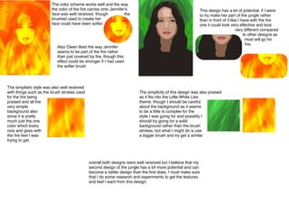
1. The color scheme works well and the way
the color of the fire carries onto Jennifer's
face was well received, though
the
brushed used to create her
face could have been softer.
This design has a lot of potential, if I were
to try make her part of the jungle rather
than in front of it like I have with the fire
one it could look very effective and look
very different compared
to other designs as
most will go for
fire.
Also Owen liked the way Jennifer
seems to be part of the fire rather
than just covered by fire, though this
effect could be stronger if I had used
the softer brush
The simplistic style was also well received
with things such as the brush strokes used
for the fire being
praised and all the
very simple
background also
since it is pretty
much just the one
color which looks
nice and goes with
the fire feel I was
trying to get.
The simplicity of this design was also praised
as it fits into the Little White Lies
theme, though I should be careful
about the background as it seems
to be a little to complex for the
style I was going for and possibly I
should try going for a solid
background rather than the brush
strokes, but what I might do is use
a bigger brush and try get a similar
overall both designs were well received but I believe that my
second design of the jungle has a lot more potential and can
become a better design than the first does, I must make sure
that I do some research and experiments to get the textures
and feel I want from this design.