You Suck At PowerPoint!
•
2,526 likes•1,429,321 views

This document provides tips to avoid common mistakes in PowerPoint presentation design. It identifies the top 5 mistakes as including putting too much information on slides, not using enough visuals, using poor quality or unreadable visuals, having messy slides with poor spacing and alignment, and not properly preparing and practicing the presentation. The document encourages presenters to use fewer words per slide, high quality images and charts, consistent formatting, and to spend significant time crafting an engaging narrative and rehearsing their presentation. It emphasizes that an attractive design is not as important as being an effective storyteller.

Recommended
More Related Content
What's hot
What's hot (20)
Viewers also liked
Viewers also liked (20)
Similar to You Suck At PowerPoint!
Similar to You Suck At PowerPoint! (20)
More from Jesse Desjardins - @jessedee
More from Jesse Desjardins - @jessedee (17)
Recently uploaded
Recently uploaded (20)
You Suck At PowerPoint!
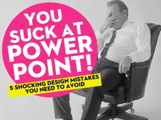
- 1. Suck at Power Point! You 5 shocking design Mistakes you need to avoid
- 12. Ifyou’regoingtoputwordforwordwhat you’rearegoingtosay,handovertheslides andtakeaseatinstead. BLAH BLAH BLAH BLAH BLAH BLAH BLAH BLAH BLAH BLAH BLAH BLAH BLAH BLAH BLAH BLAH BLAH BLAH BLAH BLAH BLAH BLAH BLAH BLAH BLAH BLAH BLAH BLAH BLAH BLAH BLAH BLAH BLAH BLAH BLAH
- 13. If your audience is reading what you’re saying, then what’s the point of you being there? YOU’RE NOT GIVING A DOCUMENT, YOU’RE GIVING A PRESENTATION.
- 33. Tahoma Microsoft Sans Serif Arial Verdana Courier New Times New Roman Trebuchet MS Lucida Console Comic Sans MS... are$!*#&fonts
- 41. Having a consistent use of colors, images & alignment gives a cohesive look to your presentation. It also helps to separate your presentation into recognizable sections.
- 43. ColorLovers.comisagreat sourceofcolorschemes and always stick to a color scheme.
- 44. And the most shocking design mistake...
- 46. Most presentations suck because not enough time went into making them. Period. Youneedtocrafttheperfectstory, createbeautifullookingslidestosupportit andthenrehearse,rehearse,rehearse. ...andnotthenightbefore.
- 48. Ya,exactly.
- 51. Source: www.distinction-services.com Yetonly25% Spendmorethan2hours on‘high-stakes’presentations
- 59. (yousignhere) I promise to never design a presentation that sucks ever again.
- 60. Now go on tiger, we need you to not suck.
Editor's Notes
- \n
- \n
- \n
- \n
- \n
- \n
- \n
- \n
- \n
- \n
- \n
- \n
- \n
- \n
- \n
- \n
- \n
- \n
- \n
- \n
- \n
- \n
- \n
- \n
- \n
- http://www.flickr.com/photos/herzogbr/3264820893/sizes/o/in/photostream/\n
- http://www.flickr.com/photos/herzogbr/3264820893/sizes/o/in/photostream/\n
- http://www.flickr.com/photos/herzogbr/3264820893/sizes/o/in/photostream/\n
- \n
- \n
- \n
- \n
- \n
- \n
- \n
- \n
- \n
- \n
- \n
- \n
- \n
- \n
- \n
- \n
- \n
- \n
- \n
- \n
- \n
- \n
- \n
- \n
- \n
- \n
- \n
- \n
- \n
- \n
- \n
- \n
- \n
- \n
- \n
- \n
- \n
- \n