2. Based on the live seminar
Mediocre to Memorable
Effectively designing slides for science
Originally created for
University of Pennsylvania
School of Medicine
Faculty and Postdocs
(Lisa’s client for over 15 years)
(She’s also the host of The Public Speaker podcast which has earned over 11 million downloads)
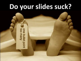
3. Do you know
what happens
to your attention
during a presentation?
18. Pathogenesis of HIT
1. Caused by ultralarge immune complexes composed of
IgG antibodies against complexes between platelet factor 4
secreted from activated platelets and heparin
or glyscosaminoglycans
2. Thrombocytopenia and thrombosis arise as a result of
platelet activation through FcgRIIA, activation of monocytes,
and endothelium which together generates a
thrombin-mediated feed-forward pathway.
3. Treatment with direct thrombin inhibitors provides incomplete
benefit and is associated with major bleeding that approximates
1% per day.
19. Pathogenesis of HIT
1. Caused by ultralarge immune complexes composed of
IgG antibodies against complexes between platelet factor 4
secreted from activated platelets and heparin
or glyscosaminoglycans
Yes, this is a REAL slide
from someone
here at Penn!
2. Thrombocytopenia and thrombosis arise as a result of
platelet activation through FcgRIIA, activation of monocytes,
and endothelium which together generates a
thrombin-mediated feed-forward pathway.
3. Treatment with direct thrombin inhibitors provides incomplete
benefit and is associated with major bleeding that approximates
1% per day.
22. Pathogenesis of HIT
• Caused by ultralarge immune complexes
• Thrombocytopenia and thrombosis arise
from platelets, monocytes, and endothelium
• Treatment with direct thrombin inhibitors
provides incomplete benefit
24. Observation/Hypothesis
Observation: Platelets from patients with HIT carry
increased C3, the third component of
complement, and HIT plasma contains complement
fixing anti-endothelial cell antibodies that induce
expression of tissue factor (NEJM, 1987).
Hypothesis: Inhibition of complement will attenuate
thrombocytopenia and thrombosis, increase the benefit
of direct thrombin inhibitors, and permit lower and
safer doses to be used.
25. Observation/Hypothesis
Observation: Platelets from patients with HIT carry
increased C3, the third component of
complement, and HIT plasma contains complement
fixing anti-endothelial cell antibodies that induce
expression of tissue factor (NEJM, 1987).
Hypothesis: Inhibition of complement will attenuate
thrombocytopenia and thrombosis, increase the benefit
of direct thrombin inhibitors, and permit lower and
safer doses to be used.
27. Observation/Hypothesis
Observation: Platelets from patients with HIT carry increased
C3, the third component of complement, and HIT plasma
contains complement fixing anti-endothelial cell antibodies
that induce expression of tissue factor (NEJM, 1987).
Hypothesis: Inhibition of complement will attenuate
thrombocytopenia and thrombosis, increase the benefit
of direct thrombin inhibitors, and permit lower and
safer doses to be used.
33. Complement staining appears to be specific and
correlates with binding of platelets and KKO
Anti-CD41 (Platelets)
Anti-C3b
KKO
HIT Mouse: Uninvolved Vessels, 20 Min. Post-KKO
39. NKCC1 and olfactory transduction (I)
Nkcc1 Is Expressed in
50mM [Cl]ex
150mM [Cl]ex
Rat Olfactory Epithelium
Determination of [Cl]in in dendritic knobs
using 2P-FLIM in rat OE
Changes of [Cl]in in dendritic knobs of mouse OE
Cl uptake mechanism happens in the cilia
Kaneko et al., 2004
40. CL uptake mechanism happens in cilia
50mM [Cl]ex
150mM [Cl]ex
Kaneko et al., 2004
92. What is the best font for science?
The quick brown fox…Georgia
The quick brown fox…Times New Roman
The quick brown fox...Verdana
The quick brown fox…Tahoma
The quick brown fox…Arial
The quick brown fox...Trebuchet
The quick brown fox…Calibri
The quick brown fox...Century Gothic
The quick brown fox…Comic Sans
93. What is the best font for science?
The quick brown fox…Georgia
The quick brown fox…Times New Roman
The quick brown fox...Verdana
The quick brown fox…Tahoma
The quick brown fox…Arial
The quick brown fox...Trebuchet
The quick brown fox…Calibri
The quick brown fox...Century Gothic
The quick brown fox…Comic Sans
99. Observation/Hypothesis
Observation: Platelets from patients with HIT
carry increased C3, the third component of
complement, and HIT plasma contains
complement fixing anti-endothelial cell
antibodies that induce expression of tissue
factor (NEJM, 1987).
Hypothesis: Inhibition of complement will attenuate
thrombocytopenia and thrombosis, increase the benefit
of direct thrombin inhibitors, and permit lower and
safer doses to be used.
101. Complement staining appears to be specific and
correlates with binding of platelets and KKO
Anti-CD41 (Platelets)
Anti-C3b
KKO
HIT Mouse: Uninvolved Vessels, 20 Min. Post-KKO
103. Example of bad graph
from Jean-Luc Dumount, Principae
(Principae, 2009)
104. Principae pruning process
• Data lines better contrasted
• Non-data lines grey
• Position labels near data
• Relevant ticks marks only
(Principae, 2009)
108. Platelet activation in WB with KKO agonist
16000
P sel MFI
120
P sel % +
Ann % +
Annexin MFI
14000
100
12000
80
10000
8000
60
6000
40
4000
20
2000
0
0
Control
PF4
ADP 10ul
TRAP 6 Convulxin PF4 + KKO
Control
PF4
ADP 10ul
TRAP 6
Convulxin PF4 + KKO
109. What is the relative strength KKO in presence of PF4
compared to other established platelet agonists?
Mean fluorescence
Percent Positivity
16000
120
14000
12000
P Sel
100
P Sel %
10000
80
8000
6000
4000
60
40
2000
0
20
0
Control
PF4
ADP 10ul
TRAP 6
PF4/KKO second to Convulxin
Convulxin PF4 + KKO
112. Meet the PcG Complexes
PRC 2
~600 kDa
Points speaker made:
PRC 1
~ 2MDa
RPD3
•
Su(z)12
Each protein complex is made up
E(z)
Pc
Ph
N55
Psc
of multiple distinct subunits
zeste
• All subunits are required
Pcl
Scm
Esc
• Silencing requires both Sce
complexes
(this was the main point)
Initiation
Maintenance
121. 4EBP1 acts as a switch between cap-dependent and capindependent mRNA translation
eIF4G
eIF4E
cap
growth factors
mitogenic signals
hormones, cytokines
AAAAAAA
eIF4G
40S
Akt (kinase)
mTOR (kinase)
eIF4E
Active
4E-BP
Rapamycin/hypoxia
4E-BP
eIF4E
sequestered
cap-dependent mRNA
translation
P
P Inactive 4E-BP
P
cap-dependent mRNA
translation inhibited
40S
Cap
AUG
UAA
AAAAAn
cap-independent mRNA translation
stimulated (e.g., VEGF, FGF, Bcl2, HIF1)
122. 4EBP1 acts as a switch between cap-dependent and capindependent mRNA translation
eIF4G
eIF4E
cap
growth factors
mitogenic signals
hormones, cytokines
AAAAAAA
eIF4G
40S
Akt (kinase)
mTOR (kinase)
eIF4E
Active
4E-BP
Rapamycin/hypoxia
4E-BP
eIF4E
sequestered
cap-dependent mRNA
translation
P
P Inactive 4E-BP
P
cap-dependent mRNA
translation inhibited
40S
Cap
AUG
UAA
AAAAAn
cap-independent mRNA translation
stimulated (e.g., VEGF, FGF, Bcl2, HIF1)
123. 4EBP1 acts as a switch
eIF4G
eIF4E
cap
growth factors
mitogenic signals
hormones, cytokines
AAAAAAA
eIF4G
40S
Akt (kinase)
mTOR (kinase)
eIF4E
Active
4E-BP
Rapamycin/hypoxia
4E-BP
P
P
P
Inactive 4E-BP
cap-dependent mRNA translation
124. 4EBP1 acts as a switch
eIF4G
eIF4E
cap
growth factors
mitogenic signals
hormones, cytokines
AAAAAAA
eIF4G
40S
Akt (kinase)
mTOR (kinase)
eIF4E
Active
4E-BP
Rapamycin/hypoxia
4E-BP
eIF4E
sequestered
cap-dependent mRNA
translation inhibited
P
P
P
Inactive 4E-BP
40S
Cap
AUG
UAA
AAAAAn
cap-independent mRNA translation stimulated (e.g., VEGF, FGF, Bcl2, HIF1)
125. Cap-independent mRNA translation
stimulated (e.g., VEGF, FGF, Bcl2, HIF1α)
eIF4G
eIF4E
cap
growth factors
mitogenic signals
hormones, cytokines
AAAAAAA
eIF4G
40S
Akt (kinase)
mTOR (kinase)
Active
4E-BP
eIF4E
Rapamycin/hypoxia
4E-BP
eIF4E
sequestered
P
P
P
Inactive 4E-BP
cap-dependent mRNA
translation inhibited
40S
Cap
AUG
UAA
AAAAAn
126.
127.
128.
129.
130.
131. Experimental Design
Aversive Olfactory learning
Session 1
Olfactory
Screening
Specific
anosmia
Anxiety
STICSA
Baseline
Set Shock
State–Trait Inventory for Cognitive and Somatic Anxiety
(Ree et al., 2000)
132. Experimental Design
Aversive Olfactory learning
Session 1
Olfactory
Screening
Specific
anosmia
Anxiety
STICSA
Baseline
Set Shock
State–Trait Inventory for Cognitive and Somatic Anxiety
(Ree et al., 2000)
133. State-Trait inventory for
cognitive and somatic anxiety
Session1
Olfactory
Screening
(Ree et al., 2000)
Specific
anosmia
Anxiety
STICSA
Baseline
Set Shock
134. Visual analogous scale used
to collect perceptual ratings
Session1
Olfactory
Screening
Specific
anosmia
Anxiety
STICSA
Baseline
Set Shock
135. Visual analogous scale used
to collect perceptual ratings
Session1
Olfactory
Screening
Specific
anosmia
Anxiety
STICSA
Baseline
Set Shock
136.
137.
138.
139.
140.
141.
142. Multi-scale dispersal patterns
of Triatoma infestans
Corentin M. Barbu, Karthik Sethuraman, Jen Manne,
Javier E. Quintanila Calderon, Michael Z. Levy
University of Pennsylvania – Universidad Peruana Cayetano-Heredia
143. The fear of smelling
Odors and Anxiety
Charles Marshall
144. The fear of smelling
Odors and Anxiety
Charles Marshall
145. The fear of smelling
Odors and anxiety
Charles Marshall
Monell Chemical Senses Center
150. HIT needs more therapeutic modalities
•
•
•
•
Mortality 10-20%
Amputations 10%
New thromboembolic events 20-75%
Therapy reduces new events by 60%
does not reduce amputations
or increase survival
158. How we added enzymatic function
to de novo proteins
1. Review analysis of the structure
2. How we created the active site by trimming
side chain residues
3. How we stabilized our design by reengineering
the turn
160. How we added enzymatic function
to de novo proteins
1. Review analysis of the structure
2. How we created the active site by trimming
side chain residues
3. How we stabilized our design by reengineering
the turn
161. How we added enzymatic function
to de novo proteins
1. Review analysis of the structure
2. How we created the active site by trimming side
chain residues
3. How we stabilized our design by reengineering
the turn
162. How we added enzymatic function
to de novo proteins
1. Review analysis of the structure
2. How we created the active site by trimming
side chain residues
3. How we stabilized our design by reengineering
the turn
163. How we added enzymatic function
to de novo proteins
1. Review analysis of the structure
2. How we created the active site by trimming
side chain residues
3. How we stabilized our design by reengineering
the turn
164. How we added enzymatic function
to de novo proteins
1. Review analysis of the structure
2. How we created the active site by trimming
side chain residues
3. How we stabilized our design by reengineering
the turn
165.
166. Disrupting vector-borne disease transmission
in complex environments
1. To improve accuracy of maps of disease vectors
based on imperfect and incomplete surveys
2. To improve vector advance through a divided
landscape
3. To improve detection of emerging or re-emerging
vector-borne disease transmission through
sequential spatial sampling strategy
167.
168.
169.
170.
171.
172.
173. Computer-aided detection in DOT
drbusch@physics.upenn.edu
• Automated, fast data analysis scheme
• Improved diagnosis uses multiple
– Measurements
– Subjects
– Chromophores
• Pilot study of chemotherapy monitoring trending
174. Computer-aided detection in DOT
drbusch@physics.upenn.edu
• Automated, fast data analysis scheme
• Improved diagnosis uses multiple
– Measurements
– Subjects
– Chromophores
• Pilot study of chemotherapy monitoring trending
• Therapy monitoring
• Adding healthy subjects
• DOT and other data
– DCS blood flow
– MRI: T1 and Gd-Uptake
• Expand data set
194. Lisa would be delighted
to deliver a full seminar
for your organization.
Contact us for details.
195. Programs for science /engineering:
Art of Speaking Science 1
Art of Speaking Science 2
Designing Science Slides
Networking for Academics
Interviewing Skills
Poster Presentations
More…
Of course, we don’t really die from too many bullet points, but what does happen to audience attention during a talk in important. So I if you look at this graph of audience interest, we have audience interest on the y-axis and time on x-axis….What this graph represents is the attention level of the audience when a speaker is being introduced. Not everyone is paying attention yet, but a good majority are….some people are still thinking about the last speaker, some people are still entering the room, some people may be thinking about lunch or dinner…
Of course, we don’t really die from too many bullet points, but what does happen to audience attention during a talk in important. So I if you look at this graph of audience interest, we have audience interest on the y-axis and time on x-axis….What this graph represents is the attention level of the audience when a speaker is being introduced. Not everyone is paying attention yet, but a good majority are….some people are still thinking about the last speaker, some people are still entering the room, some people may be thinking about lunch or dinner…
Of course, we don’t really die from too many bullet points, but what does happen to audience attention during a talk in important. So I if you look at this graph of audience interest, we have audience interest on the y-axis and time on x-axis….What this graph represents is the attention level of the audience when a speaker is being introduced. Not everyone is paying attention yet, but a good majority are….some people are still thinking about the last speaker, some people are still entering the room, some people may be thinking about lunch or dinner…
Of course, we don’t really die from too many bullet points, but what does happen to audience attention during a talk in important. So I if you look at this graph of audience interest, we have audience interest on the y-axis and time on x-axis….What this graph represents is the attention level of the audience when a speaker is being introduced. Not everyone is paying attention yet, but a good majority are….some people are still thinking about the last speaker, some people are still entering the room, some people may be thinking about lunch or dinner…
Of course, we don’t really die from too many bullet points, but what does happen to audience attention during a talk in important. So I if you look at this graph of audience interest, we have audience interest on the y-axis and time on x-axis….What this graph represents is the attention level of the audience when a speaker is being introduced. Not everyone is paying attention yet, but a good majority are….some people are still thinking about the last speaker, some people are still entering the room, some people may be thinking about lunch or dinner…
Of course, we don’t really die from too many bullet points, but what does happen to audience attention during a talk in important. So I if you look at this graph of audience interest, we have audience interest on the y-axis and time on x-axis….What this graph represents is the attention level of the audience when a speaker is being introduced. Not everyone is paying attention yet, but a good majority are….some people are still thinking about the last speaker, some people are still entering the room, some people may be thinking about lunch or dinner…
Of course, we don’t really die from too many bullet points, but what does happen to audience attention during a talk in important. So I if you look at this graph of audience interest, we have audience interest on the y-axis and time on x-axis….What this graph represents is the attention level of the audience when a speaker is being introduced. Not everyone is paying attention yet, but a good majority are….some people are still thinking about the last speaker, some people are still entering the room, some people may be thinking about lunch or dinner…
Of course, we don’t really die from too many bullet points, but what does happen to audience attention during a talk in important. So I if you look at this graph of audience interest, we have audience interest on the y-axis and time on x-axis….What this graph represents is the attention level of the audience when a speaker is being introduced. Not everyone is paying attention yet, but a good majority are….some people are still thinking about the last speaker, some people are still entering the room, some people may be thinking about lunch or dinner…
Of course, we don’t really die from too many bullet points, but what does happen to audience attention during a talk in important. So I if you look at this graph of audience interest, we have audience interest on the y-axis and time on x-axis….What this graph represents is the attention level of the audience when a speaker is being introduced. Not everyone is paying attention yet, but a good majority are….some people are still thinking about the last speaker, some people are still entering the room, some people may be thinking about lunch or dinner…
Of course, we don’t really die from too many bullet points, but what does happen to audience attention during a talk in important. So I if you look at this graph of audience interest, we have audience interest on the y-axis and time on x-axis….What this graph represents is the attention level of the audience when a speaker is being introduced. Not everyone is paying attention yet, but a good majority are….some people are still thinking about the last speaker, some people are still entering the room, some people may be thinking about lunch or dinner…
Of course, we don’t really die from too many bullet points, but what does happen to audience attention during a talk in important. So I if you look at this graph of audience interest, we have audience interest on the y-axis and time on x-axis….What this graph represents is the attention level of the audience when a speaker is being introduced. Not everyone is paying attention yet, but a good majority are….some people are still thinking about the last speaker, some people are still entering the room, some people may be thinking about lunch or dinner…
Of course, we don’t really die from too many bullet points, but what does happen to audience attention during a talk in important. So I if you look at this graph of audience interest, we have audience interest on the y-axis and time on x-axis….What this graph represents is the attention level of the audience when a speaker is being introduced. Not everyone is paying attention yet, but a good majority are….some people are still thinking about the last speaker, some people are still entering the room, some people may be thinking about lunch or dinner…
To find out why we begin to lose attention, we can turn to surveys of audiences. My favorite survey which mirrors the results of most of them is from my colleague Dave PardiEvery year he surveys audiences to find out what annoys people the most about presentations “Annoying PowerpoInt survey”http://www.thinkoutsidetheslide.com/free-resources/latest-annoying-powerpoint-survey-results/I thought I share with you the top 5 annoyances, and interestingly the the top 3 spots haven’t changes since last year. Let’s take a quick look at them.
72% of respondents (out of 682) - say that reading a slide aloud is by far the most annoying thing a presenter can do…The Redundancy PrincipleLearners can learn better with just graph and narrationText that is presented verbally at the same time creates cognitive overload EXCEPTIONS: When there is no graphics and the text is very limited When there is enough time to process the graphic and the text is very limited If audio is difficult to understand (foreign language) In case you don’t think this applies to you…https://sites.google.com/site/cognitivetheorymmlearning/redundancy-principle
The Redundancy PrincipleLearners can learn better with just graph and narrationText that is presented verbally at the same time creates cognitive overload EXCEPTIONS: When there is no graphics and the text is very limited When there is enough time to process the graphic and the text is very limited If audio is difficult to understand (foreign language) In case you don’t think this applies to you…https://sites.google.com/site/cognitivetheorymmlearning/redundancy-principle
People read the slide often because they want to be sure they get the words right. Or they want to be sure they don’t skip anything.Put the details the notes section if necessary, but don’t put it on the slide. When you do that you are being YOU focused and not audience focused.
Text is too small (and there’s to much)Relative size of the fonts is also not right
Text is too small (and there’s to much)Relative size of the fonts is also not right
I believe this is primarily result of business presentations—not academic presentations (Many people in industry are moving toward using presentation software to create documents – academia/science create a paper)However, I have seen some fonts that just weren’t readable -- If they can’t see it , there is no point in putting it on the slide Only exception for small fonts are the references which should be small, but readable font for reference.
Text is too small (and there’s to much)Relative size of the fonts is also not right
This was a submitted slide – good use of contrast and color – BACKGROUND ONLY - CLICKCLICK
This was a submitted slide – good use of contrast and color – BACKGROUND ONLY - CLICKCLICK
Background:High Contrast – Light on dark, dark on light – highest contrast light on dark (some say better for large conference halls)Take science into consideration CLICK– florescence or micrographs then black may be better -- combination is OK—just realize the transition will be jarring so use that to your advantage
Again, this is the same mouse 20 minutes post infusion of KKO. These are uninvolved vessels. Note that the complement staining appears to be specific and correlates with the binding of platelets and KKO.HIT(hPF4+/FcyRIIA+) mouse post KKO injuriesmPlatelets(CD41) – Blue, KKO-568 – Red, mC3b-488 - Green
– florescence or micrographs then black may be better -- combination is OK—just realize the transition will be jarring so use that to your advantage
Psychology of color – colors have meaningColor blindness - most common is red/green – doesn’t meant they see it in black and white or don’t see at all, just can’t distiguish between the twoAre are final top annoyance….CLICK
And this is what we are going to be spending a good amount of our time on…How to data slides
Minimum essential data– you need to focus on ONLY what is necessary to make your pointRemember the paper is repository for all the data- the presentation is to generate interest and discussionEXAMPLE to PROCESS
Minimum essential data– you need to focus on ONLY what is necessary to make your pointRemember the paper is repository for all the data- the presentation is to generate interest and discussionEXAMPLE to PROCESS
Minimum essential data– you need to focus on ONLY what is necessary to make your pointRemember the paper is repository for all the data- the presentation is to generate interest and discussionEXAMPLE to PROCESS
Minimum essential data– you need to focus on ONLY what is necessary to make your pointRemember the paper is repository for all the data- the presentation is to generate interest and discussionEXAMPLE to PROCESS
Minimum essential data– you need to focus on ONLY what is necessary to make your pointRemember the paper is repository for all the data- the presentation is to generate interest and discussionEXAMPLE to PROCESS
Minimum essential data also means only point per slide – you can make as many slides as you need to make your points…don’t worry about how many slides you have ultimately as long don’t go over your time. You’ll need to create slides that are SEPARATE from the data you collect or the figures that you create for your paper. Keeping in mind the purpose of the presentation…
Like a billboard design (I’ve been teaching billboard design for close to 20 years here at Penn)What can we learn from the billboard? Headline title and/or takeaway that expresses the one main idea – The message is very clear, Tailgaiting isn’t worth it – and if that’s not enough, it’s against the law. Guides eyes to important stuff (in this case the crash is what we look at)Mixture of text and images (notice it’s mostly image and just a little bit of text)Uses color for text and background well (clear while backgound – notice the colors work together)Fonts are reading from distance (chose a clear readable font that was readable from distance)
Like a billboard design (I’ve been teaching billboard design for close to 20 years here at Penn)What can we learn from the billboard? Headline title and/or takeaway that expresses the one main idea – The message is very clear, Tailgaiting isn’t worth it – and if that’s not enough, it’s against the law. Guides eyes to important stuff (in this case the crash is what we look at)Mixture of text and images (notice it’s mostly image and just a little bit of text)Uses color for text and background well (clear while backgound – notice the colors work together)Fonts are reading from distance (chose a clear readable font that was readable from distance)
Like a billboard design (I’ve been teaching billboard design for close to 20 years here at Penn)What can we learn from the billboard? Headline title and/or takeaway that expresses the one main idea – The message is very clear, Tailgaiting isn’t worth it – and if that’s not enough, it’s against the law. Guides eyes to important stuff (in this case the crash is what we look at)Mixture of text and images (notice it’s mostly image and just a little bit of text)Uses color for text and background well (clear while backgound – notice the colors work together)Fonts are reading from distance (chose a clear readable font that was readable from distance)
Like a billboard design (I’ve been teaching billboard design for close to 20 years here at Penn)What can we learn from the billboard? Headline title and/or takeaway that expresses the one main idea – The message is very clear, Tailgaiting isn’t worth it – and if that’s not enough, it’s against the law. Guides eyes to important stuff (in this case the crash is what we look at)Mixture of text and images (notice it’s mostly image and just a little bit of text)Uses color for text and background well (clear while backgound – notice the colors work together)Fonts are reading from distance (chose a clear readable font that was readable from distance)
Like a billboard design (I’ve been teaching billboard design for close to 20 years here at Penn)What can we learn from the billboard? Headline title and/or takeaway that expresses the one main idea – The message is very clear, Tailgaiting isn’t worth it – and if that’s not enough, it’s against the law. Guides eyes to important stuff (in this case the crash is what we look at)Mixture of text and images (notice it’s mostly image and just a little bit of text)Uses color for text and background well (clear while backgound – notice the colors work together)Fonts are reading from distance (chose a clear readable font that was readable from distance)
Like a billboard design (I’ve been teaching billboard design for close to 20 years here at Penn)What can we learn from the billboard? Headline title and/or takeaway that expresses the one main idea – The message is very clear, Tailgaiting isn’t worth it – and if that’s not enough, it’s against the law. Guides eyes to important stuff (in this case the crash is what we look at)Mixture of text and images (notice it’s mostly image and just a little bit of text)Uses color for text and background well (clear while backgound – notice the colors work together)Fonts are reading from distance (chose a clear readable font that was readable from distance)
Like a billboard design (I’ve been teaching billboard design for close to 20 years here at Penn)What can we learn from the billboard? Headline title and/or takeaway that expresses the one main idea – The message is very clear, Tailgaiting isn’t worth it – and if that’s not enough, it’s against the law. Guides eyes to important stuff (in this case the crash is what we look at)Mixture of text and images (notice it’s mostly image and just a little bit of text)Uses color for text and background well (clear while backgound – notice the colors work together)Fonts are reading from distance (chose a clear readable font that was readable from distance)
Like a billboard design (I’ve been teaching billboard design for close to 20 years here at Penn)What can we learn from the billboard? Headline title and/or takeaway that expresses the one main idea – The message is very clear, Tailgaiting isn’t worth it – and if that’s not enough, it’s against the law. Guides eyes to important stuff (in this case the crash is what we look at)Mixture of text and images (notice it’s mostly image and just a little bit of text)Uses color for text and background well (clear while backgound – notice the colors work together)Fonts are reading from distance (chose a clear readable font that was readable from distance)
Like a billboard design (I’ve been teaching billboard design for close to 20 years here at Penn)What can we learn from the billboard? Headline title and/or takeaway that expresses the one main idea – The message is very clear, Tailgaiting isn’t worth it – and if that’s not enough, it’s against the law. Guides eyes to important stuff (in this case the crash is what we look at)Mixture of text and images (notice it’s mostly image and just a little bit of text)Uses color for text and background well (clear while backgound – notice the colors work together)Fonts are reading from distance (chose a clear readable font that was readable from distance)
The assertion is a sentence headline that states the main message of the slideThe evidence is NOT a bulleted list, but instead visual evidence: photos, drawings, diagrams, graphs, films, or equationsThe main assumption of the assertion-evidence structure assumes the primary purpose of the slide is the help the audience understandRemember the content rather than provide talking points for the speaker.
Here’s an example:The headline is the assertion – image shows the evidence
In 2013, Michael Alley did a study and the results showedThis style of presentation vs. the topic and bullet point list lead to better better recall and comprehension of complex dataInternational Journal of Engineering Education (accepted 2013)
In the same study he found that people who were exposed to the assertion-evidence slides had fewer major misconceptions about the material
In a separate study, by team, [add in picture of a college student)Students that use this approach to present in class think and learn more deeply about the topic
It’s important to notice using this structure for slides evidence is NOT a bulleted list, but instead visual evidence: photos, drawings, diagrams, graphs, films, or equationsSo let’s say this is your evidence is this photo….What I see (not as much, but still I see it) is the “structure” type of title CLICK
Structure titles do not communicate any meaning…and they simply repeat…Don’t waste valuable real estate on the slide with meaningless words. So in coaching I’ll push someone and say – what are you communicatingAh, I’ve got…CLICK
Although it’s slightly better, the meaning is still missing, rightThe audience can SEE the what! They don’t need text to tell them that! They want to know the meaning…
Although it’s slightly better, the meaning is still missing, rightThe audience can SEE the what! They don’t need text to tell them that! They want to know the meaning…
It could be….
It could be….
So the headings always need to communicate the so what
Minimum essential data– you need to focus on ONLY what is necessary to make your pointRemember the paper is repository for all the data- the presentation is to generate interest and discussionEXAMPLE to PROCESS
Here’s an example of something that is close, but not quite enough…it’s almost a cross between the two…You see the topic heading and the bulleted list in red, but you also see the graphs underneath. It was like the person understood they should be there, but felt like they also had to keep the old structure
Here’s an example of something that is close, but not quite enough…it’s almost a cross between the two…You see the topic heading and the bulleted list in red, but you also see the graphs underneath. It was like the person understood they should be there, but felt like they also had to keep the old structure
When you have an assertion in the title it lets you know what to go looking for in the graph.
When you have an assertion in the title it lets you know what to go looking for in the graph.
Once you have your assertion, add in your images.Then add in labels on the image.Transition: Why should we use this structure?
Minimum essential data– you need to focus on ONLY what is necessary to make your pointRemember the paper is repository for all the data- the presentation is to generate interest and discussionEXAMPLE to PROCESS
Here’s another example from the same presentation – notice the assertion-evidence structure The title is the sentence assertion and the images below are what support it. However, my friend (and colleague) Jean-Luc Lebrun questions the sequence…assertion then evidence or is it better to go with evidence then assertion. Certainly in the opposite direction it more closely models the scientific process: Hypothesis, observation, assertionHe suggest that some might feel more engaged if they were actively involved in probing the visual evidence for answers –he suggest that it the mind is in a moe active let-me-see mode The idea is that the under the guidance of the presenter, they discover the yet-to-appear assertion. When I work with clients I suggest they use upside down evidence-assertion when they want to use a story telling style and use the research questions to guide them through. I also think it’s useful to use the upside structure when you have a controversial result and you want to walk through your observations step-by-step before revealing the assertion.
Here’s another example from the same presentation – notice the assertion-evidence structure The title is the sentence assertion and the images below are what support it. However, my friend (and colleague) Jean-Luc Lebrun questions the sequence…assertion then evidence or is it better to go with evidence then assertion. Certainly in the opposite direction it more closely models the scientific process: Hypothesis, observation, assertionHe suggest that some might feel more engaged if they were actively involved in probing the visual evidence for answers –he suggest that it the mind is in a moe active let-me-see mode The idea is that the under the guidance of the presenter, they discover the yet-to-appear assertion. When I work with clients I suggest they use upside down evidence-assertion when they want to use a story telling style and use the research questions to guide them through. I also think it’s useful to use the upside structure when you have a controversial result and you want to walk through your observations step-by-step before revealing the assertion.
So here is an example, that although it’s not controversial –this would be the example of a more story telling style approach. Notice the question is at the top and the evidence walks through how the question was addressed…this slide then works in conjunction with the second one we already saw…CLICK
So here is an example, that although it’s not controversial –this would be the example of a more story telling style approach. Notice the question is at the top and the evidence walks through how the question was addressed…this slide then works in conjunction with the second one we already saw…CLICK
So here is an example, that although it’s not controversial –this would be the example of a more story telling style approach. Notice the question is at the top and the evidence walks through how the question was addressed…this slide then works in conjunction with the second one we already saw…CLICK
Here’s another example from the same presentation – notice the assertion-evidence structure The title is the sentence assertion and the images below are what support it. However, my friend (and colleague) Jean-Luc Lebrun questions the sequence…assertion then evidence or is it better to go with evidence then assertion. Certainly in the opposite direction it more closely models the scientific process: Hypothesis, observation, assertionHe suggest that some might feel more engaged if they were actively involved in probing the visual evidence for answers –he suggest that it the mind is in a moe active let-me-see mode The idea is that the under the guidance of the presenter, they discover the yet-to-appear assertion. When I work with clients I suggest they use upside down evidence-assertion when they want to use a story telling style and use the research questions to guide them through. I also think it’s useful to use the upside structure when you have a controversial result and you want to walk through your observations step-by-step before revealing the assertion.
Start with the basic rules
Size difference -- overall size -- underline
It means editing down the picture and thinking about color, making it readable and labelling properly
Again, this is the same mouse 20 minutes post infusion of KKO. These are uninvolved vessels. Note that the complement staining appears to be specific and correlates with the binding of platelets and KKO.HIT(hPF4+/FcyRIIA+) mouse post KKO injuriesmPlatelets(CD41) – Blue, KKO-568 – Red, mC3b-488 - Green
What is the absolute least amount of data you need to present?
This graph is directly from Jean-Luc Doumont, from his book Trees, Maps, and theoremsYou can find a download from wwww.treesmapsandtheorems.com
This graph is directly from Jean-Luc Doumont, from his book Trees, Maps, and theoremsYou can find a download from wwww.treesmapsandtheorems.com
JUST FOR A SECOND TO SEE THE CHANGE – Then click to see the stuff that changed….
Minimum essential data– you need to focus on ONLY what is necessary to make your pointRemember the paper is repository for all the data- the presentation is to generate interest and discussionEXAMPLE to PROCESS
We wanted to assess the relative strength of KKO in the presence of PF4 as an activator compared to other established platelet agonists. As you can see when comparing the mean fluorescence intensity and percent positivity, PF4/KKO is second only to convulxin as a platelet activator.
I would have put them in the order of increasing – not just random orderTo make my redo process more efficient and because I didn’t have the original data – I just put boxes over stuff to Not sure how I feel about the only relevent tick marks – also since it’s not me, I wasn’t sure which were relevant
What is the absolute least amount of data you need to present?
Minimum essential data– you need to focus on ONLY what is necessary to make your pointRemember the paper is repository for all the data- the presentation is to generate interest and discussionEXAMPLE to PROCESS
Notice the direction that that moves Notice there aren’t any wipes or animated transitions
23 participants were tested: 11 LA and 12 HA. Participants’ olfactory abilities, anxiety vulnerability and, the presence of recordable SCR response were tested. One participant was excluded from the final analyses because she did not demonstrate a SCR. Participants set their own shock level subsequently used in Session 2. During session two we simultaneously recorded perceptual ratings, physiological arousal, and neural activations. Perceptual ratings were collected on a Visual analogous scale ranging from not at all to very much. Participants had to answer the questions how intense was the odor. Arousal was measured via skin conductance, or the ease with which electrical current pass through the skin. Skin conductance changes for a variety of reasons mostly tied to how much you're sweating. The more anxious someone becomes, the more he sweats, the higher the amplitude of her skin conductance response.An event-related design was used to collect neural responses. In order to account for temporal autocorrelations in time series, a 1st order polynomial expansion regressor was applied.
23 participants were tested: 11 LA and 12 HA. Participants’ olfactory abilities, anxiety vulnerability and, the presence of recordable SCR response were tested. One participant was excluded from the final analyses because she did not demonstrate a SCR. Participants set their own shock level subsequently used in Session 2. During session two we simultaneously recorded perceptual ratings, physiological arousal, and neural activations. Perceptual ratings were collected on a Visual analogous scale ranging from not at all to very much. Participants had to answer the questions how intense was the odor. Arousal was measured via skin conductance, or the ease with which electrical current pass through the skin. Skin conductance changes for a variety of reasons mostly tied to how much you're sweating. The more anxious someone becomes, the more he sweats, the higher the amplitude of her skin conductance response.An event-related design was used to collect neural responses. In order to account for temporal autocorrelations in time series, a 1st order polynomial expansion regressor was applied.
I wasn’t sure exactly whey the process was there? Perhaps it was to orient the person to where they were in the process?If the process was an important part of the slide, then move it horizontal…our minds more easily process a process horizontallyFirst thing to notice is that the process moves horizontally. Often there are slides that simply don’t let themselves to much of an image—and turning them horizontal will add a visual elementOK- -NOW BACK to the inventory that you couldn’t read…I see this with surveys or variable lists. Show the entire list, but then use animation to highlight the key examples
Now I’m going to cover rules that are associated with certain types of slides that you all create—title slides, aknowledgment slides, etc.
Asnake rattlesnakeappears at your feet. Most likely you’d freeze and start sweating ― a quick, automatic sequence of arousing physical reactions. We areclearly experiencing fear.
Asnake rattlesnakeappears at your feet. Most likely you’d freeze and start sweating ― a quick, automatic sequence of arousing physical reactions. We areclearly experiencing fear.
For those of you not familiar with Heparin induced thrombocytopenia and thrombosis designated HITT, the sentinel clinical features are shown on this slide. This is the leg from someone who donated their saphenous vein for coronary bypass and subsequently developed HITT. Heparin induced thrombocytopenia is a prothrombotic disorder seen in patients receiving heparin approximately 5 days to 14 days after the initiation of heparin therapy. The overall mortality in patients diagnosed with HIT is 10-20%. Approximately 10% of patients suffer amputations and new thromboembolic events occur in 20-75% of people with HIT. Current therapies such as direct thrombin inhibitors or anti-Factor Xa drugs reduce new events by approximately 60%, but do not reduce amputations or increase survival indicating the clear need for additional therapeutic modalities.
For those of you not familiar with Heparin induced thrombocytopenia and thrombosis designated HITT, the sentinel clinical features are shown on this slide. This is the leg from someone who donated their saphenous vein for coronary bypass and subsequently developed HITT. Heparin induced thrombocytopenia is a prothrombotic disorder seen in patients receiving heparin approximately 5 days to 14 days after the initiation of heparin therapy. The overall mortality in patients diagnosed with HIT is 10-20%. Approximately 10% of patients suffer amputations and new thromboembolic events occur in 20-75% of people with HIT. Current therapies such as direct thrombin inhibitors or anti-Factor Xa drugs reduce new events by approximately 60%, but do not reduce amputations or increase survival indicating the clear need for additional therapeutic modalities.
The title is what, not a so what and at the start there may not yet be a so what…better to use the image at the attention getter
Motor neurons are specialized cells, consisting of a soma with short dendrites and a single axon that might extend over one meter in length to reach its targets (show on the figure). Motor neurons directly link the nervous system and muscles and each motor neuron with its associated muscle fibers constitutes a functional entity called the motor unit (show on the figure). Damage to motor neuron cell bodies or their peripheral axons results in paralysis or weakness of the affected muscles and as later effect atrophy due to denervation and disuse of the affected muscles.
CLICK THROUGH JUST TO SEE IT….
TitleSections are numberedKeywords are highlightedOrienting “home” image
TitleSections are numberedKeywords are highlightedOrienting “home” image
TitleSections are numberedKeywords are highlightedOrienting “home” image
TitleSections are numberedKeywords are highlightedOrienting “home” image
TitleSections are numberedKeywords are highlightedOrienting “home” image
Here’s an example from the submitted slidesSpecific Aim or subaim?
For longer presentations using this sort of orienting slide can be helpful
This was created
In this case this slide is pretty good, but the main equation is at the very bottom. May get missed.
What is the absolute least amount of data you need to present?
What is the absolute least amount of data you need to present?
What is the absolute least amount of data you need to present?
And this is what we are going to be spending a good amount of our time on…How to data slides
What is the absolute least amount of data you need to present?
Expert. Practical. Authentic.Most people know Lisa B. Marshall as the host of The Public Speaker podcast which has earned over 9 million downloads. However, primarily she delivers professional development consulting, workshops, and speeches. She specializes in transformations - financial, personal and professional – throughdeveloping and enhancing communication. She's helped organizations build stronger teams, manage conflict, create stronger, more effective messages, and deliver better presentations. In addition, she's coached many senior leaders one-on-one to develop stronger executive communication skills. She’s author of Smart Talk, Ace Your Interview, and Expert Presenter.Her clients include Johns Hopkins Medicine, Harvard University, NY Academy of Science, University of Pennsylvania, Genentech, and Roche among many others. Her work has been featured in diverse media: CBS Money Watch, Ragan.com, Woman's Day, Cosmopolitan, etc. She holds masters with duel degrees in interpersonal/intercultural communication and organizational communication. Visit www.lisabmarshall.com to learn more about Lisa and www.smarttalksuccess.com for info on her latest book.Head Shot (plus bio): http://bit.ly/LisaBInfoPodcast Information: www.morefromlisa.comText Excerpt of Smart Talk: http://bit.ly/STSampleAudio Excerpt of Smart Talk: http://bit.ly/STAudioSmart Talk Challenge: http://bit.ly/STChallengeSmart Talk Cartoons: http://bit.ly/STCartoonsSmart Talk "Difficult People" Info graphic: http://bit.ly/STInfographicSmart Talk "Marvelous" Trailer: http://bit.ly/STTrailerPrimary Website Links:http://www.lisabmarshall.com (for lisa)http://www.smarttalksuccess.com (for Smart Talk book)http://www.morefromlisa.com (for Public Speaker podcast)Social Media Links:Facebook = http://www.facebook.com/ThePublicSpeakerGoogle+ = http://gplus.to/LisaBMarshallTwitter = http://twitter.com/lisabmarshallLinkedIn = http://linkedin.com/in/lisabmarshallPinterest = http://pinterest.com/SmartTalkLBM/
Of course, we don’t really die from too many bullet points, but what does happen to audience attention during a talk in important. So I if you look at this graph of audience interest, we have audience interest on the y-axis and time on x-axis….What this graph represents is the attention level of the audience when a speaker is being introduced. Not everyone is paying attention yet, but a good majority are….some people are still thinking about the last speaker, some people are still entering the room, some people may be thinking about lunch or dinner…
Of course, we don’t really die from too many bullet points, but what does happen to audience attention during a talk in important. So I if you look at this graph of audience interest, we have audience interest on the y-axis and time on x-axis….What this graph represents is the attention level of the audience when a speaker is being introduced. Not everyone is paying attention yet, but a good majority are….some people are still thinking about the last speaker, some people are still entering the room, some people may be thinking about lunch or dinner…
Of course, we don’t really die from too many bullet points, but what does happen to audience attention during a talk in important. So I if you look at this graph of audience interest, we have audience interest on the y-axis and time on x-axis….What this graph represents is the attention level of the audience when a speaker is being introduced. Not everyone is paying attention yet, but a good majority are….some people are still thinking about the last speaker, some people are still entering the room, some people may be thinking about lunch or dinner…