Don't dread the poster
•Download as PPTX, PDF•
0 likes•462 views

Supporting slides for a session I gave on 16 April 2021 to my colleagues at REC to talk about scientific posters

Recommended
More Related Content
Similar to Don't dread the poster
Similar to Don't dread the poster (20)
More from Manuel Frias
More from Manuel Frias (20)
Recently uploaded
Recently uploaded (20)
Don't dread the poster
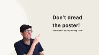
- 1. Don’t dread the poster! Some ideas to stop hating them
- 2. How do I feel when I see a poster
- 4. Well, there are people who literally do copy-paste
- 5. This a section of a real poster presented in a real conference Thanks Seraina!
- 6. I asked some people their feelings about posters Time-consuming I hate them Difficult Overcrowded with info Ugly Boring Missed opportunity A very distant second place at conferences. What a colourful and nice thing that nobody remembers after all..
- 8. 1999 2017 2021 Only three books about posters… Compared to dozens (or hundreds?) about presentations
- 10. What’s then the PURPOSE of a poster?
- 11. The purpose of posters is… networking! “We make posters to foster discussions and promote selective, efficient and meaningful interactions” Jean-luc Doumont, Effective research posters
- 12. How to design a poster NOT
- 14. Example of a packed suitcase poster
- 15. Let’s design a better poster
- 16. A good poster must… be readable Jean-luc Doumont: Effective research posters 0,5 – 1,5 m
- 17. A good poster must… be inviting Jean-luc Doumont: Effective research posters
- 18. A good poster must… make the audience care Jean-luc Doumont: Effective research posters
- 19. ALL posters have the same structure… WHY Intro – methods – results/conclusions
- 21. Jean-luc Doumont: Effective research posters
- 22. What Make audience care (context, need and action to address the need) Messages (convince the audience of what you did) Jean-luc Doumont: Effective research posters
- 23. What Who Context (make audience care) Express the need (in first person) Express what you did to address the need Jean-luc Doumont: Effective research posters
- 24. State and develop messages Do it visually Jean-luc Doumont: Effective research posters
- 25. Jean-luc Doumont: Effective research posters
- 26. The visual design is also important
- 27. Let’s learn four basic design principles with which you can go pretty far ..and with a memorable acronym
- 29. Let’s apply them to this poster
- 30. Contrast “If two items are not exactly the same, then make them different. Really different” This captions have the same font size as the body copy.
- 31. Repetition “Repeat some aspect of the design throughout the entire piece” Add some design element that helps create unity. For example, boxes around text or around headings
- 32. Alignment “Nothing should be placed on the page arbitrarily. Every item should have a visual connection with something else on the page” This logo is floating and not aligned anywhere This picture is not aligned with the text above
- 33. Proximity “Group related items together” Does RESULT belong to the table above or below?
- 34. And don’t forget: grids are your friend
- 35. This poster does not use any grid so it looks like rather messy
- 36. This poster uses a grid so it looks clean and neat. It helps that there is a lot of white space (designers LOVE white space, that is, empty space around elements)
- 37. Wrap-up
- 38. They are definitely… But with a little effort we can make them first-rate!
- 39. The main purpose of posters is… networking!
- 41. Simple memorable acronym to imporve your design skills… CRAP
Editor's Notes
- Overcrowded, Too much text, Lack of space, Lack of grid
- Readable: form a distance of 0,5 1,5 m away Inviting: avoiding clutter and adding visuals. Being selective Make the audience care: state the “so what” and elaborate
- Readable: form a distance of 0,5 1,5 m away Inviting: avoiding clutter and adding visuals. Being selective Make the audience care: state the “so what” and elaborate
- Readable: form a distance of 0,5 1,5 m away Inviting: avoiding clutter and adding visuals. Being selective Make the audience care: state the “so what” and elaborate
- Overcrowded, Too much text, Lack of space, Lack of grid
- Overcrowded, Too much text, Lack of space, Lack of grid