ALERT! 7 TOP USER FRUSTRATIONS ON WEB & HOW TO RESOLVE THEM
•
0 likes•20 views

Read the full blog here: https://bit.ly/3b9L3HO Connect with us through: Contact us : https://bit.ly/2IpPX7w Facebook : https://www.facebook.com/PixelCrayons Twitter : https://twitter.com/pixelcrayons LinkedIn : https://www.linkedin.com/company/pixelcrayons Instagram : https://www.instagram.com/pixelcrayons/ Pinterest : https://in.pinterest.com/pixelcrayons/

Recommended
Recommended
More Related Content
What's hot
What's hot (20)
Similar to ALERT! 7 TOP USER FRUSTRATIONS ON WEB & HOW TO RESOLVE THEM
Similar to ALERT! 7 TOP USER FRUSTRATIONS ON WEB & HOW TO RESOLVE THEM (20)
More from Pixel Crayons
More from Pixel Crayons (20)
Recently uploaded
Recently uploaded (20)
ALERT! 7 TOP USER FRUSTRATIONS ON WEB & HOW TO RESOLVE THEM
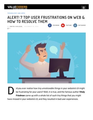
- 1. Privacy - Terms T E C H N O L O G Y AN D AP P S ALERT! 7 TOP USER FRUSTRATIONS ON WEB & HOW TO RESOLVE THEM B Y A M Y R A S H E L D O N D E C E M B E R 3 0 , 2 0 2 0 1 F A C E B O O K Y O U T U B E I N S T A G R A M D id you ever realize how tiny unnoticeable things in your website’s UI might be frustrating for your users? Well, it is true, and the famous author Vitaly Friedman came up with a whole list of such tiny things that you might have missed in your website’s UI, and they resulted in bad user experiences.
- 2. Taking inspiration from the same and mixing it with my personal bad UI experiences, I have come up with a list of the 7 top user frustrations and how to resolve them. WITHOUT CREATING ANY FURTHER SUSPENSE, LET’S GET STARTED. Table of Contents 1. Without creating any further suspense, let’s get started. 1.1. 1) Grab Your Glasses Cuz The Text Is Too Small 1.1.0.1. Give A Read: CONVERT YOUR INNOVATIVE MOBILE APP IDEA INTO REAL-WORLD APP- INFOGRAPHIC 1.2. 2) Either My Fingers Are Too Fat Or Your Website Has Tiny Clickable Elements 1.2.0.1. Take A Glance Over: Looking To Develop A Food Delivery App Like DoorDash? The Complete Rundown 1.3. 3) No!! Did I Click On An Ad Again? (Read it in a grumpy voice) 1.4. 4) If This Form Loses My Data Again, I’m Gonna Bang My Screen On The Wall 1.4.0.1. Also Read: 12 EXCLUSIVE TOOLS WHERE ENTREPRENEURS MUST SIGN UP IN 2020- INFOGRAPHIC 1.5. 5) Is The Internet Connection Slow? Why Isn’t This Back Button Working? 1.6. 6) My Life Is Already Out Of Control. At Least Let Me Control The Page Scrolling. 1.7. 7) Boy! This Autoplay Video Thing That Too With Sound Can Be Embarrassing 1.7.0.1. Also Read: TOP 10 WEB APPLICATION IDEAS FOR A SUCCESSFUL ONLINE BUSINESS
- 3. 1) GRAB YOUR GLASSES CUZ THE TEXT IS TOO SMALL I want to ask you how frustrated are you while reading this? Or did you just skip this part? Well, I hope now you know what I’m talking about. Such texts make me feel like a 92-year-old granny who holds the newspaper right up to her face to read. Therefore, such small text for web content is a BIG NO! The key takeaway from this point is “Good readability and legibility are important to create a good user experience.” How to resolve this issue? For an ideal website, the minimum font size should be 16 pixels. 16 pixels for a body text is considered to be a good place to start but the fact that ‘bigger the screen, larger the text’ should not be neglected. When you hire web designers, you must ask them to aim for line-height 1.5 em or 1.6 em for optional readability. This one is a pro tip (and also a secret which should stay between us). Always, I repeat, always test the website on an actual device for which it has been 1.8. That’s All Folks!
- 4. designed. G IVE A R EAD: C ON VER T YOUR IN N OVATIVE MOB IL E AP P IDEA IN TO R EAL-WOR L D AP P- IN FOG R AP H IC 2) EITHER MY FINGERS ARE TOO FAT OR YOUR WEBSITE HAS TINY CLICKABLE ELEMENTS Once I was on a shopping website looking for some stuff to buy. After I added all the required stuff to my eCart I targeted the ‘buy’ button and that’s when I got frustrated with the tiny size of the clickable elements on that website. 2000 years later I was nally able to click that teeny tiny buy button and checkout from that website swearing that I’ll never visit this site again. As you know the percentage of mobile users is more than desktop users; thus considering this as an issue on your website is a must. In case your website also has a similar problem of tiny elements then you must consider changing that because that, my friend, is not at all attractive. The key takeaway here is “Do not play ‘Find The Button’ with your visitors.”
- 5. How to resolve this issue? Connecting a mouse pointer to mobile devices is kind of impractical therefore make sure that all the clickable buttons on your website are nger-friendly. The average size is 9mmX9mm and material designs state that website development companies must try to keep the size of touch targets 48X48px. According to Microsoft’s guidelines, you must add a minimum of 10 mm padding between the touch elements. TAK E A G L AN C E OVER : L OOK IN G TO DEVEL OP A FOOD DEL IVER Y AP P L IK E DOOR DASH ? TH E C OMP L ETE R UN DOWN 3) NO!! DID I CLICK ON AN AD AGAIN? (READ IT IN A GRUMPY VOICE) You land on a website with too many popups and every time you try to do something productive you end up getting one popup window and most of the time it is inappropriate stuff (I hope you get what I mean).
- 6. Generally, if you hire web developers in India, the chances of such a clustered and untidy website are x→0 (in short zero) as they have the best sense of website and web app development. But if somehow you landed up with a website this dirty, then you are contributing to the ‘top user frustrations and how to resolve them’ list and need to get it xed ASAP. There is another clause in this section which is the content shift. For instance, you are trying to click cancel and end up clicking buy because of the ‘content shift’. This is a result of dynamically loading content. The key takeaway from this point is “Make sure your content is not jumping jack!” How to resolve these issues? To avoid popups get in touch with a quali ed and top web designing company. To prevent content shifting, try measuring the height of the dynamic content, and hardcode it as a ‘min-height’ for the container in the CSS. 4) IF THIS FORM LOSES MY DATA AGAIN, I’M GONNA BANG MY SCREEN ON THE WALL
- 7. Has this ever happened with you that you lled an entire form online and as you click submit the page reloads and all you see is a blank form with an error message on top? Well, it has happened with me several times, and my desktop’s screen is still safe because I started taking anger management classes after the very rst time a three-paged form lost all my data and asked me to ll it again. Yes, it is one of the most frustrating issues, and this is why it made it to the ‘top user frustrations on the web and how to resolve them’ list. The key takeaway from here is “User data is sacred”. How to resolve this issue? Well for starters, try using local storage and session storage to store key-value pairs. Pre- ll data that has been already provided by the users in their previous visits into relevant elds and do not let the data go even if the user accidentally clicks the refresh button (it’s the shortcut to users’ hearts).
- 8. AL SO R EAD: 1 2 EX C L USIVE TOOL S WH ER E EN TR EP R EN EUR S MUST SIG N UP IN 2 0 2 0 - IN FOG R AP H IC 5) IS THE INTERNET CONNECTION SLOW? WHY ISN’T THIS BACK BUTTON WORKING? The frustration level is OP when the back button on a web page doesn’t work. I can literally feel the Hulk inside me overpowering my body. According to Jacob Nielsen, a famous web usability consultant, “Users need a clearly marked emergency exit to leave the unwanted pages without having to go through an extended process.” And the emergency exit, in this case, is the back button. But wait, isn’t there a chance that the user clicked the back button by mistake and didn’t want to leave the data he lled, as discussed in point four. Well, there is a huge possibility for this situation if a user is clumsy like me. So when you hire web designers in India, here’s what you can ask them to do: How to resolve this issue? First, make sure the back buttons on every page of your website are working.
- 9. Second, if the page is a form then give a warning before going back which tells the user that the action might result in loss of data. 6) MY LIFE IS ALREADY OUT OF CONTROL. AT LEAST LET ME CONTROL THE PAGE SCROLLING. Scroll hijacking or the automatic scrolling is seen as one of the most frustrating UI design trends from users’ point of view. I agree there is a teeny tiny possibility that few, usually offshore web designers, might be able to create a good scrolljacking based Ul design, but generally, users don’t seem to like this trend. You must be wondering what is scroll hijacking exactly? Simply put, scroll hijacking is an interface design that allows websites to control how you scroll down a web page, for example, the scroller moves automatically or runs animations instead of scrolling down a page. Now, I personally like to scroll down a webpage at my own pace. I enjoy reading content in my own time, and I don’t want a website scroller messing with my scroll rate telling me to “keep scrolling!”
- 10. How to resolve this issue? If you still desire to use scroll-jacking or scroll hijacking in your website, then the thumb rule is “Use a proper layout.“ Find a balanced approach and make sure that the content on the page is designed in the form of individual slides or elements so that the person may feel that they are switching the slides as the scroll. 7) BOY! THIS AUTOPLAY VIDEO THING THAT TOO WITH SOUND CAN BE EMBARRASSING It happens with me a lot. You must have also experienced this at least once. What happens here is when the user arrives at a page, they don’t expect the audio/video contents to start playing without their consent. Chances are users, like me, will immediately leave your website. Those who plan to stay will have to put in extra efforts to turn down the volume or hunt for the mute button if your website has tiny clickable buttons. How to resolve this issue?
- 11. Well, rst of all, it is totally ne to add videos that autoplay, but the thing that needs to be taken care of is it should be on mute by default. AL SO R EAD: TOP 1 0 WEB AP P L IC ATION IDEAS FOR A SUC C ESSFUL ON L IN E B USIN ESS THAT’S ALL FOLKS! With this, we come towards the end of this blog, and I hope I didn’t make it to the ‘top user frustrations on the web and how to resolve them’ list ؉ By now, you must have understood that basically, the key to understanding user frustration and handling it effectively requires in-depth research and monitoring. Try keeping track of users’ online behaviours and analyze them in order to nd where you can improve. Sounds like too much work? Well, here’s another secret pro tip exclusively for you. Get in touch with a web designing company in India, and the rest will be taken care of by them. I hope you enjoyed reading this blog and if you found anything relatable or have any suggestions, please feel free to comment below. Till then, that’s all folks!
- 12. Tagged: 7 Top User Frustrations On Web biggest challenges UX designers face biggest design trends in the UX design industry difference between UI and UX frustrations and how to resolve them hire web developers in India web designing company in India AM YRA SHEL DON I’m Amyra Sheldon, a technical writer, and IT analyst at ValueCoders. I am profound in writing on all the latest technologies such as Android (Kotlin), React Native, Flutter, Xamarin, IoT, AI, ML, Blockchain, AR/VR, Arti cial Intelligence, and much more.
- 13. GET IN TOUCH Request a free consultation and get a no obligation quote for your project within 8 Business hours Your Name Contact Number Email Id Your Requirements No file chosenChoose File S E N D Y O U R R E Q U E S T V I E W C O M M E N T ( 1 ) INDIA + 9 1 7 0 4 2 0 2 0 7 8 2 USA + 1 4 0 4 4 1 0 2 3 9 7 UK + 4 4 1 6 1 8 7 0 6 4 4 3 AUS + 6 1 2 8 3 1 0 4 6 0 8
- 14. Copyright © 2004 - 2020. All Rights Reserved. ValueCoders.com