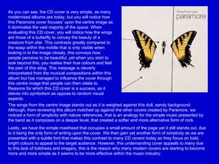
1. As you can see, the CD cover is very simple, as many modernised albums are today, but you will notice how this Paramore cover focuses’ upon the centre image as it dominates the vast majority of the space. When evaluating this CD cover, you will notice how the wings are those of a butterfly to convey the beauty of a creature from afar. This contrasts greatly compared to the wasp within the middle that is only visible when looking in to the image closely, this conveys how people perceive to be beautiful, yet when you start to look beyond this, you realise their true colours and feel the pain of this sting. This message is cleverly interpretated from the musical compositions within this album but has managed to influence the cover through this centre image that people can then relate to. Reasons for which this CD cover is a success, as it delves into symbolism as oppose to random visual aspects. The wings from the centre image stands out as it is weighed against this dull, sandy background. Although, from reviewing this album matched up against the other covers created by Paramore, we noticed a form of simplicity with nature references, that is an analogy for the simple music presented by the band as it composes on a deeper level, that created a softer and more alternative form of rock. Lastly, we have the simple masthead that occupies a small amount of the page yet it still stands out, due to it being the only form of writing upon the cover. We then gain yet another form of simplicity as we are presented with a subtle font that makes this contrast to many CD covers today as they focus on bold, bright colours to appeal to the target audience. However, this undemanding cover appeals to many due to this lack of boldness and imagery, this is the reason why many modern covers are starting to become more and more simple as it seems to be more effective within the music industry.
2. Usually, when it comes to lighting, many photo shoots focus on how they can enhance the room by making it seem luminescent. This is completely altered as the cover manipulates the lack of light in order to emphasize the face of the artist, as well as the gems upon the side of her face, where the source of light seems to be coming from. This instantly makes the audience assume that Lady Gaga has supreme authority as well as the fact that she seems to be wearing black, a domineering colour that suggests power. This notion of looking is then taken further as we notice the glasses, with this we depict an element of cool as the diamonds edited upon her shades imply wealth and supremacy. This use of mise-en-scene fulfils this strong, independent ideology that has been enhanced within the musical aspect of the album. We then have the written aspect of silver, ‘The fame’, imprinted upon the shades that stands out upon the black shiny surface. However, this does not compare to the size of font used to write the name of the artist, ‘LADY GAGA’, this reiterates her dominance as she seems to be the up most significance, this concludes in the reason why the letters are written in complete capitals to engage and influence the target audience of pop lovers, and alternative genres.
3. When evaluating Flo Rida’s album in comparison to the others, we seem to notice a greater attention to overall mise-en-scene as the others focus on two main elements, the masthead and the centre image. Immediately we gain a sense of dominance through the futuristic elements of machinery exhibited in the general background where the target audience can clearly see volts of metal containing money and valuables. Immediately, like Lady Gaga, we gain a sense of wealth through riches that reiterate a form of overall dominance. This is then taken a step further when looking at the space consuming masthead, ‘FLO RIDA’, that happens to be in the form of a gun to convey this masculine outlook that women are appealed to whilst men aspire to gain this sense of authority and respect. To reinforce this dominance, the rebellious target audience are engaged due to the little symbol regarding parental guidance. From this, the target audience feel that they must listen to this music as it is restricted to certain individuals, taking this into account, they then feel supreme as they are able to gain access to this exclusive form of hip hop music. Finally, when looking at the centre image of the artist, we feel that he has this essence of cool, once again reflected through the connotation of the sunglasses. Along with this, there is the ‘bling’ and overall mise-en-scene that allows viewers to understand which target audience/social group this specific artist is appealing to. This is also manifested through the harsh body language that integrates this masculine dominance that reigns over the target audience of hip hop and RNB lovers as well as rappers that aspire to be in his position someday.
4. When looking at this modernised CD cover, once again we see a main focus upon the centre image and masthead that is distinct compared to Flo Rida’s album cover. When looking at the actual centre image, we come across luminescent, neon lights that make this CD cover standout when placed against this plain, black background. We then focus upon his stylish, and professional outlook that appeal to teenage girls whom look at this dominant CD cover. This along with the intense look on the artist’s face suggests that he is serious when it comes to his music and the messages that he portrays to his adoring fans. Similar to that of Flo Rida, there is yet another analogy to wealth through the ‘bling’ that once again generates a form of notion of looking that suggests governance and control. This is illustrated through the city landscape that seems to be within the hands of the artist, suggesting power over a whole nation, as his popularity spreads among his grime target audience. Then, when advancing with the mast head, we notice the edgy font that coincides with the modernised outlook and style presented to the target audience. This has been optimized via the use of editing upon the light orbiting around the artist through electric volts, which add to this power and control presented by the artist. Lastly, when looking at the overall colour combinations throughout the CD cover, the main colour that dominates throughout happens to be black to signify the intense motives of the artist and his overall supremacy that shines throughout (use of electric light effects).