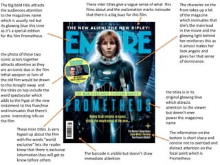
1. The big bold title attracts
the audiences attention
to the magazines name
which is usually red but
its glowing blue this time
as it’s a special edition
for the film Prometheus
The character on the
front takes up a lot
of the magazine
which insinuates that
she’s the main lead
in the movie and the
glowing light behind
her reinforces this as
it almost makes her
look angelic and
gives her that sense
of dominance.
The information on the
bottom is short sharp and
concise not to overload and
distract attention on the
focal point which is
Prometheus
the titles is in its
original glowing blue
which attracts
attention to the viewer
but doesn’t over
power the magazines
name
These inter titles give a vague sense of what this
films about and the exclamation marks insinuate
that there is a big buzz for this film.
These inter titles is very
hyped up about the film
with the words “world
exclusive” lets the reader
know that there is exclusive
information they will get to
know before others
the photo of these two
iconic actors together
attracts attention as they
are an iconic duo in the film
lethal weapon so fans of
the old film would be drawn
to this straight away and
the titles on top include the
word spectacular which
adds to the hype of the new
instalment to this franchise
and insinuates that there’s
some interesting info on
the film.
The barcode is visible but doesn’t draw
immediate attention
2. The magazine
titles are bold
and white
which makes
it sharp These bold
titles are
short and
sharp and
also give
incite to what
the info is for
each of its
inter-titles
The character is
the main focus
point on the mag
but I find that his
face draws the
most attention
the little smirk
also insinuates
that his character
might be witty
and fun ??
The words “10
coolest movies” is
bold and blue to
attract the readers
attention the word
“coolest” adds to
the whole buzz
The name Sherlock
Holmes is also bold to
attract the readers
attention and that
this magazine has a
special article on the
movie ?
These 3 characters are next to
the mag name which also
draws attention to the reader
also there next to the words
“10 coolest movies” which
means that these movies
might be quite important in
the list.
The barcode is visible but doesn’t draw
immediate attention
This quote explains
that the film is almost
complete without
giving away to much
to get the viewer to
want to read more.
3. Magazine title is in bold to
attract attention and is in
white to stand out against
the dark background there
is also a gritty effect on the
font relating within the
horror/slasher genre
The blood splats relate
within the themes of
murder and death which is a
common theme within the
horror/slasher genre
These three characters
are iconic villains within
the horror/slasher genre
attracting audiences who
are fond of these
characters and the genre
The slash marks are
connotation to murder
from weapons or even
the claws from Freddy
Kruger
the header fight is the
biggest out of them all and
placed in the centre
The word horror is biggest out of the words in the title
once again highlighting the genre
The Headers have info
appealing to all types of
fans of the horror genre
mentioning up coming films
but also notable actors of
the genre e.g. Robert
Englund the words in bold I
assume are most important
The ‘6 free gift’s is in
bold to attract viewers
that there's gifts inside