SlideShare a Scribd company logo
1 of 9
In what ways does your media product use, develop or challenge forms and conventions of real media products?  Like real media products,  my masthead is the name of my magazine. I have placed it to the left copying the conventions of magazines such as Kerrang and Q.  I decided to do this as it allows the picture to be the main point of focus and therefore attract an audience who will be interested in that particular band/ artist. However,  to create my own brand identity I have layered the masthead to create texture and so that the title stands out to my audience so it is easily identified.  I have one main image as my focus point, which I took myself. This is a common convention of real media products and I feel works well in relation to my other features such as texts and the smaller image I have to show a main article of the magazine.  For my typeface I decided to stick to three main fonts; Maximus BT, Dark half BTN and Times new roman.  Like most music magazines I decided to stick to a limited amount of fonts to show brand identity and to convey the bold sans-serif text, representing my hard rock music. Using buzzwords such as ‘WIN’ or ‘EXCLUSIVE’ attract the audience and involve them personally. I have decided to do this as from personal experience it is a contributing factor as to why I would buy a magazine and used regularly with music magazines. I added this shape to advertise another buzzword as it breaks up the front cover, making it more attractive to the eye.  I took this shape off of Kerrang magazine as  my magazine represents the same genre of music. It creates a wild, informal feel to it , which is what I feel my audience will be interested in.  I have merged this smaller image in to my main image to show the exclusivity of the interview I have with this artist and to attract the reader with a picture of her.  I have taken this idea off of NME, where they use a picture of Pete Doherty to advertise the interview, the photo of my artist shows she is an iconic star. I have challenged the forms and conventions of real media products by  putting my headline at an angle. This adds diversity to my front cover and makes my magazine informal, which is ideal as I discovered  from my ideal readership that my main audience is from around 16-20. Following the conventions, I added the price and date in small print as well as a bar code. This shows that this magazine is part of an edition . Like Kerrang magazine, I decided I would like a regular skyline which includes bands which will be used in the magazine. I decided to do this as it will be specific to the genre of music I am interested in- rock. Therefore it will attract my target audience.
For my contents page I decided to follow many of the forms and conventions of what NME uses. Instead of using the standard contents for the masthead of the page I decided that ‘This Week’ was much more affective as it shows the exclusivity to that particular issue and also there are ‘regulars’  which would be specified for the readers who are interested in subscription to my magazine. Another similarity between my contents and NME’s is the paragraph underneath the image to give a brief description of the article included in my magazine. I also have a box with details on how to subscribe as I discovered it was a great way other music magazines use to advertise their magazine and giving a deal such as 20% off attracts customers. Similarly, with my subtitles I have used the same way  using subheads to break up different sections of my features which makes it easier to find what you are looking for, this is useful as I am aiming at a younger audience who are likely to have a short attention span.  However there are differences between my contents page and NME’s such as I have my text on the left and my pictures on the right, unlike NME. I decided to do this as it is proven  that when flicking through a magazine you tend to look at the right, this is why I have chosen to use the picture on this side as I feel a picture is much more attractive to the eye than text.  To make my readers feel like they are personally involved with the making of the magazine I have added a letter from  the editor with a signature at the bottom to add a personal touch. I have used the circle shape to stand out from the rest of the black and grey background and have used the house colour of dark purple to stick to my brand identity. This is similar to the paragraph under the NME picture of Oasis. However, I used the pun ‘The moment when The Sizzlers tried Ecstasy.’ As ecstasy is the name of the magazine in literal terms it means they have been interviewed, but it could also be percieved in a dangerous, exciting way with connotations of drugs, which will catch the attention of the reader. I was happy with my decision to use white on black text or ‘wob’ as it is eye catching  and the dark background reflects the dark music in which I am trying to represent.
For my title of the features page I decided to use a newspaper cut out effect, which I found on Google and then cut them each out individually and placed on my page. I decided to do this as I feel it  brings attention to this particular article and shows a rough image of my artist. This usually isn’t used in music magazines but I found NME has used this on it’s front cover in an interview with Lily Allen. The white on black makes it easy to read yet gives it a sort of mysterious feel which represents my rock artist very well. For my body copy I used white on black  as this  follows my house style. I  used two fonts to separate the questions from the answer in the interview to make it easy to follow.  I have extracted this text from a double page spread from a Kerrang issue as it has a similar target audience to the audience I am trying to represent. I have broken the conventions by fading  the edges of my  pictures, I haven’t seen this occur in many magazines but I decided to do this as I feel either adding a border to photographs or fading the edges allows the pictures to blend in better with the article making it look more together. Like many music magazine i have used pull quotes and I have done this in the house colour of dark purple. This accentuates the exciting features of the double page spread grabbing the readers attention.
How does your media product represent particular social groups? I based my girl group ‘the Sizzlers’ on a similar group ‘The Veronicas’ based in Australia. I made this decision as the music they create is Rock- Pop which is similar to the music I want my girl band ‘The Sizzlers’  to represent. I have placed my models in similar positions to The veronica’s in this photo shoot and have made the jackets of my artists a main focus.  Both artists have similar features with the striking features and dark hair.  This represents a social group which  I am trying to appeal to with my magazine. My target audience is a younger generation from about 16-25  who are interested in rock music.  These girls represent a cheeky, rebellious idea which interests and excites readers in to buying the magazine to find out more about them.  I made my models pose in  a mysterious yet cheeky way  as it is sexy but not explicit. My target audience is from 16- 25 of a pretty mixed  variety of both genders. This allows me to create an image which will appeal to them, the dark hair symbolises the darkness of their music and their pale dainty figures accentuate their beauty. Girls such as The veronicas attract both boys and girls. Girls tend to follow the fashion that they see in magazines and this rock punk look represents the social group of rock chick .  Boys will be physically attracted to this stereotype  of ‘emo’. Through the dark  costume I have portrayed the eerie image these artists represent. The kaki green colour represents the natural surroundings and the real image these young women show.
The busy front cover represents  my particular target audience well; it is busy. By aiming at younger people I have to be able to grab the attention of my target audience with the cover, and fast.  The bold sans-serif typography catches the eye quickly and at the unusual angle the  headline is at shows the edgy side to my artists and therefore my audience.  My magazine is at quite a cheap price of £2.49-  therefore showing it is something worth buying yet not at a ridiculous price, making it easier for students to afford. I have included features in it such as ‘2011s greatest bands to watch this year’. There is a stereotype of bands that it is usually towards rock or hardcore music and by interesting them with festivals  it is the perfect way to present my social group as music festivals are filled with the majority of younger adults.  The costume of my model in this picture represents clearly the younger type of audience I am trying to attract by the dark clothes, dark hair and the nose piercing. Piercing have connotations of pain which is usually connected to emotional, rock music making the stereotype of ‘Emo’.  The plain background emphasizes him as an artist and the natural pose he is showing makes the audience feel they can connect to the artist on a more personal, real level.
What kind of institution might distribute your media product and why? As my magazine follows many of the same conventions as Kerrang magazine I did some research as to which institution distributes this magazine. A distribution named the Bauer Media Group have taken a great interest in Kerrang’s features such as it’s print based format, music channel and radio and feel this would be appropriate for my own magazine.  Bauer media group is also involved with Q magazine which has now also expanded to radio and television. Ideally, I would love to get the same publicity for my own magazine and feel this would be the institution which would represent my genre of music the best.   Bauer Media owns more than eighty influential media brands spanning a wide range of interests, including heat, GRAZIA, Closer, MCN, FHM, Parker's, MATCH, Magic 105.4, Kiss 100, Kerrang!, Q and the Big City Network, our group of twenty local radio stations.  www.bauermedia.co.uk We were also introduced to other media institutions such as  www.ipcadvertising.com   which distributes magazines such as Uncut Magazine and NME magazine. However, I decided to go against this institution as I felt it was too focussed on a rock-indie audience and not specific enough for my genre of music I am trying to represent.
Who would be the audience for your media product? Before creating the finished piece of my Media product I created  a reader profile my ideal readership. The ‘key stats’ show that there are more male readers of ‘ECSTASY’ than females- but only just.  Because of this I have tried to keep it a uni-sex magazine which will interest both.  The picture of the bacardi breezer shows that my audience are a fun loving group who are very social. To include this In my reader profile shows I know that because they are interested in going out they will be interested in features which include socialising and that I appreciate their busy lifestyle This picture of Hayley Williams captures the concept of my magazine, she is a strong woman who is the leader of a very popular rock band and the fact it is an action shot shows I know how my audience are interested in live music and getting behind the scenes. My audience are particularly interested in live music and festivals, because of this I have offered the chance to win tickets to their favourite gigs on my front cover.  As the median age is 19, the articles featured in my magazine need to interest a young audience to keep it fresh and exciting. These van shoes with this wacky  pattern shows the unique sense in fashion and their need to express themselves.
The dark hair and dainty features are very similar to the artists I have used on my front page. The tiara symbolises her feminine side yet the heavy make-up expresses her feelings, she is stereotypically an ‘emo’. The guy on the right has the dark long hair and the dark clothing like the model used with the black vest top.  My  ideal reader will most likely be a student studying at either college, sixth-form or university so my magazine has to be interesting enough to grab the attention of them.  My reader will be interested in technology and social networking sites such as facebook and myspace, giving me a great opportunity to advertise my magazine on the internet.  They have a unique taste in style so would be interested in shopping at places such as Candem market  and boutique shops giving them edge, much like my magazine. However, for high street shops I would associate my reader with places such as h&m as they do patterned skinny jeans, fitting the look they portray very well. They are interested in drama shows such as misfits and skins as they like reality but with a twist which is why I have included lots of real stories about artists which will cause excitement.
How did you attract/address your audience? I have taken this off the front cover of my magazine. To attract my audience I have used the buzzword ‘WIN’ catching the eye at the prospect of getting something for free. The ‘your’ makes it Personal  to the reader, making them feel comfortable with the magazine and the fact it is ‘favourite bands’ shows it is a music based magazine and has some bands and artists involved in the magazine which are idols in the music industry. Using the white on black writing makes it easily visible but by mixing it up with the newspaper cut out look it makes it stand out from other articles. ‘all access’ makes the reader feel like they are getting a personal insight on the life of my star Roxy Rouge and throughout the interview I have used colloquial language to make Roxy seem friendly and intimate with the reader.  Adding pull quotes emphasizes the interesting parts of the article and breaks up an interview making it easier to read. By using direct address I appeal to my target audience as they will feel personally connected to the interview and therefore the artist. The slanted headline attracts the audience as it is breaking the conventions of most media products. This is ideal for my audience as the need to feel different and for my magazine to stand out.

More Related Content

What's hot

How i challenged the norms and conventions of the typical norms of a music ma...
How i challenged the norms and conventions of the typical norms of a music ma...How i challenged the norms and conventions of the typical norms of a music ma...
How i challenged the norms and conventions of the typical norms of a music ma...etaylorchs
 
Evaluation Question 1
Evaluation Question 1Evaluation Question 1
Evaluation Question 1emmathomsonn
 
Media studies magazine evaluation
Media studies   magazine evaluationMedia studies   magazine evaluation
Media studies magazine evaluationjessiemc
 
Evaluation powerpoint
Evaluation powerpointEvaluation powerpoint
Evaluation powerpointAlice Bates
 
Evaluation powerpoint
Evaluation powerpointEvaluation powerpoint
Evaluation powerpointAlice Bates
 
Evaluation powerpoint
Evaluation powerpointEvaluation powerpoint
Evaluation powerpointAlice Bates
 
Music magazine evaluation
Music magazine evaluationMusic magazine evaluation
Music magazine evaluationJazz
 
Music Magazine Survey: Analysis of results
Music Magazine Survey: Analysis of resultsMusic Magazine Survey: Analysis of results
Music Magazine Survey: Analysis of resultstashaay27
 
Music magazine evaluation 3
Music magazine evaluation 3Music magazine evaluation 3
Music magazine evaluation 3Kiran Jandu
 
Media evaluation presentation
Media evaluation presentationMedia evaluation presentation
Media evaluation presentationmuminab
 
Music magazine analysis
Music magazine analysisMusic magazine analysis
Music magazine analysisdncA2media
 
Music Magazine Evaluation (Finished)
Music Magazine Evaluation (Finished)Music Magazine Evaluation (Finished)
Music Magazine Evaluation (Finished)ChrisDarby2010
 
Music magazine
Music magazine Music magazine
Music magazine melcrny1
 
Evaluation of my own music magazine product
Evaluation of my own music magazine productEvaluation of my own music magazine product
Evaluation of my own music magazine productASmediastudies12
 

What's hot (18)

Question 5
Question 5Question 5
Question 5
 
How i challenged the norms and conventions of the typical norms of a music ma...
How i challenged the norms and conventions of the typical norms of a music ma...How i challenged the norms and conventions of the typical norms of a music ma...
How i challenged the norms and conventions of the typical norms of a music ma...
 
Evaluation Question 1
Evaluation Question 1Evaluation Question 1
Evaluation Question 1
 
Media studies magazine evaluation
Media studies   magazine evaluationMedia studies   magazine evaluation
Media studies magazine evaluation
 
Evaluation powerpoint
Evaluation powerpointEvaluation powerpoint
Evaluation powerpoint
 
Evaluation powerpoint
Evaluation powerpointEvaluation powerpoint
Evaluation powerpoint
 
Evaluation powerpoint
Evaluation powerpointEvaluation powerpoint
Evaluation powerpoint
 
Music magazine evaluation
Music magazine evaluationMusic magazine evaluation
Music magazine evaluation
 
Evaluation
EvaluationEvaluation
Evaluation
 
Music Magazine Survey: Analysis of results
Music Magazine Survey: Analysis of resultsMusic Magazine Survey: Analysis of results
Music Magazine Survey: Analysis of results
 
My evaluation
My evaluationMy evaluation
My evaluation
 
Music magazine evaluation 3
Music magazine evaluation 3Music magazine evaluation 3
Music magazine evaluation 3
 
Media Evaluation
Media EvaluationMedia Evaluation
Media Evaluation
 
Media evaluation presentation
Media evaluation presentationMedia evaluation presentation
Media evaluation presentation
 
Music magazine analysis
Music magazine analysisMusic magazine analysis
Music magazine analysis
 
Music Magazine Evaluation (Finished)
Music Magazine Evaluation (Finished)Music Magazine Evaluation (Finished)
Music Magazine Evaluation (Finished)
 
Music magazine
Music magazine Music magazine
Music magazine
 
Evaluation of my own music magazine product
Evaluation of my own music magazine productEvaluation of my own music magazine product
Evaluation of my own music magazine product
 

Viewers also liked

The Following Frames
The Following FramesThe Following Frames
The Following Framesdanokane1991
 
Entropic characteristics of quantum channels and the additivity problem
Entropic characteristics of quantum channels and the additivity problemEntropic characteristics of quantum channels and the additivity problem
Entropic characteristics of quantum channels and the additivity problemwtyru1989
 
Sasha Hodjati AS media evaluation
Sasha Hodjati AS media evaluationSasha Hodjati AS media evaluation
Sasha Hodjati AS media evaluationAnne Horne
 
Super mario user interface 1
Super mario user interface 1Super mario user interface 1
Super mario user interface 1Andrew Goddard
 
Media studies coursework evaluation
Media studies coursework evaluationMedia studies coursework evaluation
Media studies coursework evaluationchargerrard
 
Treatment of Advanced Portfolio
Treatment of Advanced PortfolioTreatment of Advanced Portfolio
Treatment of Advanced PortfolioMediawork100
 
チームマイナス6%「私のチャレンジ宣言」
チームマイナス6%「私のチャレンジ宣言」チームマイナス6%「私のチャレンジ宣言」
チームマイナス6%「私のチャレンジ宣言」Takamorry slideshare
 
IScico Module 3 - Let's collaborate!
IScico Module 3 - Let's collaborate!IScico Module 3 - Let's collaborate!
IScico Module 3 - Let's collaborate!Miquel Duran
 
Principles of effective communication
Principles of effective communicationPrinciples of effective communication
Principles of effective communicationJames Moore
 
CakeRequest::onlyAllow() について
CakeRequest::onlyAllow() についてCakeRequest::onlyAllow() について
CakeRequest::onlyAllow() についてYuya Takahashi
 

Viewers also liked (20)

The Following Frames
The Following FramesThe Following Frames
The Following Frames
 
Ryan lock
Ryan lockRyan lock
Ryan lock
 
Darkknight
DarkknightDarkknight
Darkknight
 
Entropic characteristics of quantum channels and the additivity problem
Entropic characteristics of quantum channels and the additivity problemEntropic characteristics of quantum channels and the additivity problem
Entropic characteristics of quantum channels and the additivity problem
 
20131006 h10 lecture3_matiyasevich
20131006 h10 lecture3_matiyasevich20131006 h10 lecture3_matiyasevich
20131006 h10 lecture3_matiyasevich
 
Sasha Hodjati AS media evaluation
Sasha Hodjati AS media evaluationSasha Hodjati AS media evaluation
Sasha Hodjati AS media evaluation
 
第12回WordBench福井
第12回WordBench福井第12回WordBench福井
第12回WordBench福井
 
Super mario user interface 1
Super mario user interface 1Super mario user interface 1
Super mario user interface 1
 
Jump
JumpJump
Jump
 
Luke smith
Luke smithLuke smith
Luke smith
 
Attack
AttackAttack
Attack
 
Media studies coursework evaluation
Media studies coursework evaluationMedia studies coursework evaluation
Media studies coursework evaluation
 
Treatment of Advanced Portfolio
Treatment of Advanced PortfolioTreatment of Advanced Portfolio
Treatment of Advanced Portfolio
 
チームマイナス6%「私のチャレンジ宣言」
チームマイナス6%「私のチャレンジ宣言」チームマイナス6%「私のチャレンジ宣言」
チームマイナス6%「私のチャレンジ宣言」
 
IScico Module 3 - Let's collaborate!
IScico Module 3 - Let's collaborate!IScico Module 3 - Let's collaborate!
IScico Module 3 - Let's collaborate!
 
Principles of effective communication
Principles of effective communicationPrinciples of effective communication
Principles of effective communication
 
Eco
EcoEco
Eco
 
Evaluation
EvaluationEvaluation
Evaluation
 
Sam's run
Sam's runSam's run
Sam's run
 
CakeRequest::onlyAllow() について
CakeRequest::onlyAllow() についてCakeRequest::onlyAllow() について
CakeRequest::onlyAllow() について
 

Similar to Media evaluation

Ramarna's Media Evaluation
Ramarna's Media EvaluationRamarna's Media Evaluation
Ramarna's Media Evaluationramarnax
 
Evaluation of Media Magazine
Evaluation of Media Magazine Evaluation of Media Magazine
Evaluation of Media Magazine Eleanore Ramsey
 
Media evaluationnnn
Media evaluationnnnMedia evaluationnnn
Media evaluationnnnParishti1993
 
Media Evaluation
Media EvaluationMedia Evaluation
Media EvaluationJennieTott
 
Evaluation all
Evaluation allEvaluation all
Evaluation allHollyHayne
 
My evaluation!
My evaluation!My evaluation!
My evaluation!chlozfox
 
Evaluation 1 in what ways does your media product use, develop or challenge ...
Evaluation 1  in what ways does your media product use, develop or challenge ...Evaluation 1  in what ways does your media product use, develop or challenge ...
Evaluation 1 in what ways does your media product use, develop or challenge ...FrancoisAli
 
Emma whitehand 2
Emma whitehand 2Emma whitehand 2
Emma whitehand 2afrench14
 
Media as evaluation
Media as evaluationMedia as evaluation
Media as evaluationjoshfoo
 

Similar to Media evaluation (20)

Ramarna's Media Evaluation
Ramarna's Media EvaluationRamarna's Media Evaluation
Ramarna's Media Evaluation
 
Evaluation
Evaluation Evaluation
Evaluation
 
Evaluation of Media Magazine
Evaluation of Media Magazine Evaluation of Media Magazine
Evaluation of Media Magazine
 
Evaluation
EvaluationEvaluation
Evaluation
 
Evaluation
EvaluationEvaluation
Evaluation
 
Media evaluationnnn
Media evaluationnnnMedia evaluationnnn
Media evaluationnnn
 
Media Evaluation
Media EvaluationMedia Evaluation
Media Evaluation
 
Evaluation all
Evaluation allEvaluation all
Evaluation all
 
Evaluation 1
Evaluation 1Evaluation 1
Evaluation 1
 
My evaluation!
My evaluation!My evaluation!
My evaluation!
 
Evaluation 1 in what ways does your media product use, develop or challenge ...
Evaluation 1  in what ways does your media product use, develop or challenge ...Evaluation 1  in what ways does your media product use, develop or challenge ...
Evaluation 1 in what ways does your media product use, develop or challenge ...
 
Evau
EvauEvau
Evau
 
Media eval
Media evalMedia eval
Media eval
 
Media Evaluation
Media EvaluationMedia Evaluation
Media Evaluation
 
My evaluation
My evaluationMy evaluation
My evaluation
 
Evaluation
EvaluationEvaluation
Evaluation
 
Emma whitehand 2
Emma whitehand 2Emma whitehand 2
Emma whitehand 2
 
My evaluation
My evaluationMy evaluation
My evaluation
 
Evaulation
EvaulationEvaulation
Evaulation
 
Media as evaluation
Media as evaluationMedia as evaluation
Media as evaluation
 

More from megan

Actual evaluation
Actual evaluationActual evaluation
Actual evaluationmegan
 
Presentation1
Presentation1Presentation1
Presentation1megan
 
Doc3
Doc3Doc3
Doc3megan
 
Doc2
Doc2Doc2
Doc2megan
 
Doc2
Doc2Doc2
Doc2megan
 
Kerrang! powerpoint
Kerrang! powerpointKerrang! powerpoint
Kerrang! powerpointmegan
 
Kerrang! powerpoint
Kerrang! powerpointKerrang! powerpoint
Kerrang! powerpointmegan
 
Kerrang! powerpoint
Kerrang! powerpointKerrang! powerpoint
Kerrang! powerpointmegan
 

More from megan (8)

Actual evaluation
Actual evaluationActual evaluation
Actual evaluation
 
Presentation1
Presentation1Presentation1
Presentation1
 
Doc3
Doc3Doc3
Doc3
 
Doc2
Doc2Doc2
Doc2
 
Doc2
Doc2Doc2
Doc2
 
Kerrang! powerpoint
Kerrang! powerpointKerrang! powerpoint
Kerrang! powerpoint
 
Kerrang! powerpoint
Kerrang! powerpointKerrang! powerpoint
Kerrang! powerpoint
 
Kerrang! powerpoint
Kerrang! powerpointKerrang! powerpoint
Kerrang! powerpoint
 

Recently uploaded

“Oh GOSH! Reflecting on Hackteria's Collaborative Practices in a Global Do-It...
“Oh GOSH! Reflecting on Hackteria's Collaborative Practices in a Global Do-It...“Oh GOSH! Reflecting on Hackteria's Collaborative Practices in a Global Do-It...
“Oh GOSH! Reflecting on Hackteria's Collaborative Practices in a Global Do-It...Marc Dusseiller Dusjagr
 
CARE OF CHILD IN INCUBATOR..........pptx
CARE OF CHILD IN INCUBATOR..........pptxCARE OF CHILD IN INCUBATOR..........pptx
CARE OF CHILD IN INCUBATOR..........pptxGaneshChakor2
 
Incoming and Outgoing Shipments in 1 STEP Using Odoo 17
Incoming and Outgoing Shipments in 1 STEP Using Odoo 17Incoming and Outgoing Shipments in 1 STEP Using Odoo 17
Incoming and Outgoing Shipments in 1 STEP Using Odoo 17Celine George
 
BASLIQ CURRENT LOOKBOOK LOOKBOOK(1) (1).pdf
BASLIQ CURRENT LOOKBOOK  LOOKBOOK(1) (1).pdfBASLIQ CURRENT LOOKBOOK  LOOKBOOK(1) (1).pdf
BASLIQ CURRENT LOOKBOOK LOOKBOOK(1) (1).pdfSoniaTolstoy
 
Grant Readiness 101 TechSoup and Remy Consulting
Grant Readiness 101 TechSoup and Remy ConsultingGrant Readiness 101 TechSoup and Remy Consulting
Grant Readiness 101 TechSoup and Remy ConsultingTechSoup
 
POINT- BIOCHEMISTRY SEM 2 ENZYMES UNIT 5.pptx
POINT- BIOCHEMISTRY SEM 2 ENZYMES UNIT 5.pptxPOINT- BIOCHEMISTRY SEM 2 ENZYMES UNIT 5.pptx
POINT- BIOCHEMISTRY SEM 2 ENZYMES UNIT 5.pptxSayali Powar
 
microwave assisted reaction. General introduction
microwave assisted reaction. General introductionmicrowave assisted reaction. General introduction
microwave assisted reaction. General introductionMaksud Ahmed
 
Industrial Policy - 1948, 1956, 1973, 1977, 1980, 1991
Industrial Policy - 1948, 1956, 1973, 1977, 1980, 1991Industrial Policy - 1948, 1956, 1973, 1977, 1980, 1991
Industrial Policy - 1948, 1956, 1973, 1977, 1980, 1991RKavithamani
 
The Most Excellent Way | 1 Corinthians 13
The Most Excellent Way | 1 Corinthians 13The Most Excellent Way | 1 Corinthians 13
The Most Excellent Way | 1 Corinthians 13Steve Thomason
 
mini mental status format.docx
mini    mental       status     format.docxmini    mental       status     format.docx
mini mental status format.docxPoojaSen20
 
Accessible design: Minimum effort, maximum impact
Accessible design: Minimum effort, maximum impactAccessible design: Minimum effort, maximum impact
Accessible design: Minimum effort, maximum impactdawncurless
 
Employee wellbeing at the workplace.pptx
Employee wellbeing at the workplace.pptxEmployee wellbeing at the workplace.pptx
Employee wellbeing at the workplace.pptxNirmalaLoungPoorunde1
 
A Critique of the Proposed National Education Policy Reform
A Critique of the Proposed National Education Policy ReformA Critique of the Proposed National Education Policy Reform
A Critique of the Proposed National Education Policy ReformChameera Dedduwage
 
Arihant handbook biology for class 11 .pdf
Arihant handbook biology for class 11 .pdfArihant handbook biology for class 11 .pdf
Arihant handbook biology for class 11 .pdfchloefrazer622
 
Hybridoma Technology ( Production , Purification , and Application )
Hybridoma Technology  ( Production , Purification , and Application  ) Hybridoma Technology  ( Production , Purification , and Application  )
Hybridoma Technology ( Production , Purification , and Application ) Sakshi Ghasle
 
Presiding Officer Training module 2024 lok sabha elections
Presiding Officer Training module 2024 lok sabha electionsPresiding Officer Training module 2024 lok sabha elections
Presiding Officer Training module 2024 lok sabha electionsanshu789521
 

Recently uploaded (20)

“Oh GOSH! Reflecting on Hackteria's Collaborative Practices in a Global Do-It...
“Oh GOSH! Reflecting on Hackteria's Collaborative Practices in a Global Do-It...“Oh GOSH! Reflecting on Hackteria's Collaborative Practices in a Global Do-It...
“Oh GOSH! Reflecting on Hackteria's Collaborative Practices in a Global Do-It...
 
CARE OF CHILD IN INCUBATOR..........pptx
CARE OF CHILD IN INCUBATOR..........pptxCARE OF CHILD IN INCUBATOR..........pptx
CARE OF CHILD IN INCUBATOR..........pptx
 
Model Call Girl in Bikash Puri Delhi reach out to us at 🔝9953056974🔝
Model Call Girl in Bikash Puri  Delhi reach out to us at 🔝9953056974🔝Model Call Girl in Bikash Puri  Delhi reach out to us at 🔝9953056974🔝
Model Call Girl in Bikash Puri Delhi reach out to us at 🔝9953056974🔝
 
Incoming and Outgoing Shipments in 1 STEP Using Odoo 17
Incoming and Outgoing Shipments in 1 STEP Using Odoo 17Incoming and Outgoing Shipments in 1 STEP Using Odoo 17
Incoming and Outgoing Shipments in 1 STEP Using Odoo 17
 
BASLIQ CURRENT LOOKBOOK LOOKBOOK(1) (1).pdf
BASLIQ CURRENT LOOKBOOK  LOOKBOOK(1) (1).pdfBASLIQ CURRENT LOOKBOOK  LOOKBOOK(1) (1).pdf
BASLIQ CURRENT LOOKBOOK LOOKBOOK(1) (1).pdf
 
Grant Readiness 101 TechSoup and Remy Consulting
Grant Readiness 101 TechSoup and Remy ConsultingGrant Readiness 101 TechSoup and Remy Consulting
Grant Readiness 101 TechSoup and Remy Consulting
 
POINT- BIOCHEMISTRY SEM 2 ENZYMES UNIT 5.pptx
POINT- BIOCHEMISTRY SEM 2 ENZYMES UNIT 5.pptxPOINT- BIOCHEMISTRY SEM 2 ENZYMES UNIT 5.pptx
POINT- BIOCHEMISTRY SEM 2 ENZYMES UNIT 5.pptx
 
microwave assisted reaction. General introduction
microwave assisted reaction. General introductionmicrowave assisted reaction. General introduction
microwave assisted reaction. General introduction
 
Industrial Policy - 1948, 1956, 1973, 1977, 1980, 1991
Industrial Policy - 1948, 1956, 1973, 1977, 1980, 1991Industrial Policy - 1948, 1956, 1973, 1977, 1980, 1991
Industrial Policy - 1948, 1956, 1973, 1977, 1980, 1991
 
The Most Excellent Way | 1 Corinthians 13
The Most Excellent Way | 1 Corinthians 13The Most Excellent Way | 1 Corinthians 13
The Most Excellent Way | 1 Corinthians 13
 
mini mental status format.docx
mini    mental       status     format.docxmini    mental       status     format.docx
mini mental status format.docx
 
Accessible design: Minimum effort, maximum impact
Accessible design: Minimum effort, maximum impactAccessible design: Minimum effort, maximum impact
Accessible design: Minimum effort, maximum impact
 
Employee wellbeing at the workplace.pptx
Employee wellbeing at the workplace.pptxEmployee wellbeing at the workplace.pptx
Employee wellbeing at the workplace.pptx
 
Model Call Girl in Tilak Nagar Delhi reach out to us at 🔝9953056974🔝
Model Call Girl in Tilak Nagar Delhi reach out to us at 🔝9953056974🔝Model Call Girl in Tilak Nagar Delhi reach out to us at 🔝9953056974🔝
Model Call Girl in Tilak Nagar Delhi reach out to us at 🔝9953056974🔝
 
A Critique of the Proposed National Education Policy Reform
A Critique of the Proposed National Education Policy ReformA Critique of the Proposed National Education Policy Reform
A Critique of the Proposed National Education Policy Reform
 
Código Creativo y Arte de Software | Unidad 1
Código Creativo y Arte de Software | Unidad 1Código Creativo y Arte de Software | Unidad 1
Código Creativo y Arte de Software | Unidad 1
 
Arihant handbook biology for class 11 .pdf
Arihant handbook biology for class 11 .pdfArihant handbook biology for class 11 .pdf
Arihant handbook biology for class 11 .pdf
 
Hybridoma Technology ( Production , Purification , and Application )
Hybridoma Technology  ( Production , Purification , and Application  ) Hybridoma Technology  ( Production , Purification , and Application  )
Hybridoma Technology ( Production , Purification , and Application )
 
Staff of Color (SOC) Retention Efforts DDSD
Staff of Color (SOC) Retention Efforts DDSDStaff of Color (SOC) Retention Efforts DDSD
Staff of Color (SOC) Retention Efforts DDSD
 
Presiding Officer Training module 2024 lok sabha elections
Presiding Officer Training module 2024 lok sabha electionsPresiding Officer Training module 2024 lok sabha elections
Presiding Officer Training module 2024 lok sabha elections
 

Media evaluation

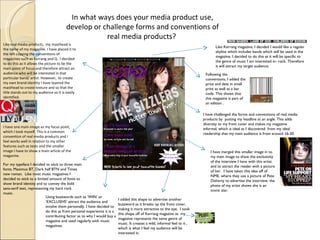
  • 1. In what ways does your media product use, develop or challenge forms and conventions of real media products? Like real media products, my masthead is the name of my magazine. I have placed it to the left copying the conventions of magazines such as Kerrang and Q. I decided to do this as it allows the picture to be the main point of focus and therefore attract an audience who will be interested in that particular band/ artist. However, to create my own brand identity I have layered the masthead to create texture and so that the title stands out to my audience so it is easily identified. I have one main image as my focus point, which I took myself. This is a common convention of real media products and I feel works well in relation to my other features such as texts and the smaller image I have to show a main article of the magazine. For my typeface I decided to stick to three main fonts; Maximus BT, Dark half BTN and Times new roman. Like most music magazines I decided to stick to a limited amount of fonts to show brand identity and to convey the bold sans-serif text, representing my hard rock music. Using buzzwords such as ‘WIN’ or ‘EXCLUSIVE’ attract the audience and involve them personally. I have decided to do this as from personal experience it is a contributing factor as to why I would buy a magazine and used regularly with music magazines. I added this shape to advertise another buzzword as it breaks up the front cover, making it more attractive to the eye. I took this shape off of Kerrang magazine as my magazine represents the same genre of music. It creates a wild, informal feel to it , which is what I feel my audience will be interested in. I have merged this smaller image in to my main image to show the exclusivity of the interview I have with this artist and to attract the reader with a picture of her. I have taken this idea off of NME, where they use a picture of Pete Doherty to advertise the interview, the photo of my artist shows she is an iconic star. I have challenged the forms and conventions of real media products by putting my headline at an angle. This adds diversity to my front cover and makes my magazine informal, which is ideal as I discovered from my ideal readership that my main audience is from around 16-20. Following the conventions, I added the price and date in small print as well as a bar code. This shows that this magazine is part of an edition . Like Kerrang magazine, I decided I would like a regular skyline which includes bands which will be used in the magazine. I decided to do this as it will be specific to the genre of music I am interested in- rock. Therefore it will attract my target audience.
  • 2. For my contents page I decided to follow many of the forms and conventions of what NME uses. Instead of using the standard contents for the masthead of the page I decided that ‘This Week’ was much more affective as it shows the exclusivity to that particular issue and also there are ‘regulars’ which would be specified for the readers who are interested in subscription to my magazine. Another similarity between my contents and NME’s is the paragraph underneath the image to give a brief description of the article included in my magazine. I also have a box with details on how to subscribe as I discovered it was a great way other music magazines use to advertise their magazine and giving a deal such as 20% off attracts customers. Similarly, with my subtitles I have used the same way using subheads to break up different sections of my features which makes it easier to find what you are looking for, this is useful as I am aiming at a younger audience who are likely to have a short attention span. However there are differences between my contents page and NME’s such as I have my text on the left and my pictures on the right, unlike NME. I decided to do this as it is proven that when flicking through a magazine you tend to look at the right, this is why I have chosen to use the picture on this side as I feel a picture is much more attractive to the eye than text. To make my readers feel like they are personally involved with the making of the magazine I have added a letter from the editor with a signature at the bottom to add a personal touch. I have used the circle shape to stand out from the rest of the black and grey background and have used the house colour of dark purple to stick to my brand identity. This is similar to the paragraph under the NME picture of Oasis. However, I used the pun ‘The moment when The Sizzlers tried Ecstasy.’ As ecstasy is the name of the magazine in literal terms it means they have been interviewed, but it could also be percieved in a dangerous, exciting way with connotations of drugs, which will catch the attention of the reader. I was happy with my decision to use white on black text or ‘wob’ as it is eye catching and the dark background reflects the dark music in which I am trying to represent.
  • 3. For my title of the features page I decided to use a newspaper cut out effect, which I found on Google and then cut them each out individually and placed on my page. I decided to do this as I feel it brings attention to this particular article and shows a rough image of my artist. This usually isn’t used in music magazines but I found NME has used this on it’s front cover in an interview with Lily Allen. The white on black makes it easy to read yet gives it a sort of mysterious feel which represents my rock artist very well. For my body copy I used white on black as this follows my house style. I used two fonts to separate the questions from the answer in the interview to make it easy to follow. I have extracted this text from a double page spread from a Kerrang issue as it has a similar target audience to the audience I am trying to represent. I have broken the conventions by fading the edges of my pictures, I haven’t seen this occur in many magazines but I decided to do this as I feel either adding a border to photographs or fading the edges allows the pictures to blend in better with the article making it look more together. Like many music magazine i have used pull quotes and I have done this in the house colour of dark purple. This accentuates the exciting features of the double page spread grabbing the readers attention.
  • 4. How does your media product represent particular social groups? I based my girl group ‘the Sizzlers’ on a similar group ‘The Veronicas’ based in Australia. I made this decision as the music they create is Rock- Pop which is similar to the music I want my girl band ‘The Sizzlers’ to represent. I have placed my models in similar positions to The veronica’s in this photo shoot and have made the jackets of my artists a main focus. Both artists have similar features with the striking features and dark hair. This represents a social group which I am trying to appeal to with my magazine. My target audience is a younger generation from about 16-25 who are interested in rock music. These girls represent a cheeky, rebellious idea which interests and excites readers in to buying the magazine to find out more about them. I made my models pose in a mysterious yet cheeky way as it is sexy but not explicit. My target audience is from 16- 25 of a pretty mixed variety of both genders. This allows me to create an image which will appeal to them, the dark hair symbolises the darkness of their music and their pale dainty figures accentuate their beauty. Girls such as The veronicas attract both boys and girls. Girls tend to follow the fashion that they see in magazines and this rock punk look represents the social group of rock chick . Boys will be physically attracted to this stereotype of ‘emo’. Through the dark costume I have portrayed the eerie image these artists represent. The kaki green colour represents the natural surroundings and the real image these young women show.
  • 5. The busy front cover represents my particular target audience well; it is busy. By aiming at younger people I have to be able to grab the attention of my target audience with the cover, and fast. The bold sans-serif typography catches the eye quickly and at the unusual angle the headline is at shows the edgy side to my artists and therefore my audience. My magazine is at quite a cheap price of £2.49- therefore showing it is something worth buying yet not at a ridiculous price, making it easier for students to afford. I have included features in it such as ‘2011s greatest bands to watch this year’. There is a stereotype of bands that it is usually towards rock or hardcore music and by interesting them with festivals it is the perfect way to present my social group as music festivals are filled with the majority of younger adults. The costume of my model in this picture represents clearly the younger type of audience I am trying to attract by the dark clothes, dark hair and the nose piercing. Piercing have connotations of pain which is usually connected to emotional, rock music making the stereotype of ‘Emo’. The plain background emphasizes him as an artist and the natural pose he is showing makes the audience feel they can connect to the artist on a more personal, real level.
  • 6. What kind of institution might distribute your media product and why? As my magazine follows many of the same conventions as Kerrang magazine I did some research as to which institution distributes this magazine. A distribution named the Bauer Media Group have taken a great interest in Kerrang’s features such as it’s print based format, music channel and radio and feel this would be appropriate for my own magazine. Bauer media group is also involved with Q magazine which has now also expanded to radio and television. Ideally, I would love to get the same publicity for my own magazine and feel this would be the institution which would represent my genre of music the best. Bauer Media owns more than eighty influential media brands spanning a wide range of interests, including heat, GRAZIA, Closer, MCN, FHM, Parker's, MATCH, Magic 105.4, Kiss 100, Kerrang!, Q and the Big City Network, our group of twenty local radio stations. www.bauermedia.co.uk We were also introduced to other media institutions such as www.ipcadvertising.com which distributes magazines such as Uncut Magazine and NME magazine. However, I decided to go against this institution as I felt it was too focussed on a rock-indie audience and not specific enough for my genre of music I am trying to represent.
  • 7. Who would be the audience for your media product? Before creating the finished piece of my Media product I created a reader profile my ideal readership. The ‘key stats’ show that there are more male readers of ‘ECSTASY’ than females- but only just. Because of this I have tried to keep it a uni-sex magazine which will interest both. The picture of the bacardi breezer shows that my audience are a fun loving group who are very social. To include this In my reader profile shows I know that because they are interested in going out they will be interested in features which include socialising and that I appreciate their busy lifestyle This picture of Hayley Williams captures the concept of my magazine, she is a strong woman who is the leader of a very popular rock band and the fact it is an action shot shows I know how my audience are interested in live music and getting behind the scenes. My audience are particularly interested in live music and festivals, because of this I have offered the chance to win tickets to their favourite gigs on my front cover. As the median age is 19, the articles featured in my magazine need to interest a young audience to keep it fresh and exciting. These van shoes with this wacky pattern shows the unique sense in fashion and their need to express themselves.
  • 8. The dark hair and dainty features are very similar to the artists I have used on my front page. The tiara symbolises her feminine side yet the heavy make-up expresses her feelings, she is stereotypically an ‘emo’. The guy on the right has the dark long hair and the dark clothing like the model used with the black vest top. My ideal reader will most likely be a student studying at either college, sixth-form or university so my magazine has to be interesting enough to grab the attention of them. My reader will be interested in technology and social networking sites such as facebook and myspace, giving me a great opportunity to advertise my magazine on the internet. They have a unique taste in style so would be interested in shopping at places such as Candem market and boutique shops giving them edge, much like my magazine. However, for high street shops I would associate my reader with places such as h&m as they do patterned skinny jeans, fitting the look they portray very well. They are interested in drama shows such as misfits and skins as they like reality but with a twist which is why I have included lots of real stories about artists which will cause excitement.
  • 9. How did you attract/address your audience? I have taken this off the front cover of my magazine. To attract my audience I have used the buzzword ‘WIN’ catching the eye at the prospect of getting something for free. The ‘your’ makes it Personal to the reader, making them feel comfortable with the magazine and the fact it is ‘favourite bands’ shows it is a music based magazine and has some bands and artists involved in the magazine which are idols in the music industry. Using the white on black writing makes it easily visible but by mixing it up with the newspaper cut out look it makes it stand out from other articles. ‘all access’ makes the reader feel like they are getting a personal insight on the life of my star Roxy Rouge and throughout the interview I have used colloquial language to make Roxy seem friendly and intimate with the reader. Adding pull quotes emphasizes the interesting parts of the article and breaks up an interview making it easier to read. By using direct address I appeal to my target audience as they will feel personally connected to the interview and therefore the artist. The slanted headline attracts the audience as it is breaking the conventions of most media products. This is ideal for my audience as the need to feel different and for my magazine to stand out.
  • 10. Due to my survey monkey I discovered that my target audience are interested in rock music and are willing to pay up to £2.50 which is why I made my magazine £2.49 to get a decent profit but considering my target audience which will be students. My target audience is mainly from 16 to 20, applying to my student audience. Due to my survey I learnt that images are very important in my magazine and they are interested in both posed and spontaneous shots depending on the article. However, I have decided to use more spontaneous looking shots to get the live feel of the music in which my target audience are so interested in. I published a link to my survey on facebook allowing my friends easy access to the survey. This taught me that social networking sites are a great way to advertise media products and with my magazine I would intend to use them to advertise.
  • 11. What have you learnt about technologies from the process of constructing this product? Throughout creating my media product I have used the programme of serif-page plus 11 to create my finished product. I found this easiest as it allows options for font for my text, allows me to move my text and pictures at different angles and allows me to change the shape and size of images. I used slideshare to put the pictures I had taken for my magazine on to a PowerPoint, allowing me to upload it on to my b log. Blogger enabled me to upload my work whilst creating my media product. This allowed me to access my work over the internet at home as well as to keep up to date with my product. I have used paint throughout my product and learnt this was the best way to make documents or other features in to pictures by print screening them, allowing me to access them as images and place through my media. I decided to write up my evaluation on powerpoint as it has access to arrows making annotations to my final product easier and therefore giving me better explanations as to why I decided to follow or break the conventions of media product.
  • 12. Throughout the creation of my media product I have realised the power of social networking sites and just how much they will help advertise a particular media product. All over sites such as facebook there are adverts enabling you to click to the link and subscribe to a media product. I published a link to my surveymonkey on facebook and had a great response and it also allowed me to post links to my blog to help give advice. This is useful as the friends I have on facebook are very close to the age of my target audience and was good to get opinions of my audience.
  • 13. Looking back at your preliminary task, what do you feel you have learnt in the progression from it to full product? The difference from the cover of my preliminary task to my final cover is obvious- my preliminary task is much more basic without any editing of pictures such as the contrast I added to the main image of my front cover of my final piece. Both are for a different audience and are trying to advertise different things, my preliminary task has much more ‘white space’ making it clean cut and appropriate for a school magazine. For my final product I tried to specify it for young people interested in rock music and I feel my front cover represents this with the large bold fonts, articles advertised on the front cover and the shape I used for ‘free poster of Hayley Williams’. I have learnt the importance of using different programmes whilst creating the media product which I have discussed in the previous question and the attention to detail when it comes to things such as colour and the connotations those colours have behind them, which is something I didn’t consider during my preliminary task. The photos used in my preliminary task were rushed and although you can see it is for a school magazine the effort between my preliminary task and final task is great. I have included a limited variety of shots in my preliminary task which I tried to increase during my final piece. On my front cover of the final task I have advertised features which will be included in the magazine, following the conventions of real media products, unlike my preliminary task of my school magazine.
  • 14. One thing I was happy with in my preliminary task is the contents page, I like the use of all the images and the page reference above it. However, when researching music magazines I found the contents page would often have just a few images and the articles separated in to sections such as ‘regulars’ or ‘on the cover’ which I decided to use for my final piece. Unlike my preliminary where I used ‘contents’ as the headline I used ‘This Week’ for my final piece, of which I used the idea from NME’s this week . Throughout my whole final piece it was much more personal piece using colloquial language and using words such as ‘you’ to make my audience feel like they were involved, in comparison to the formal feel of my preliminary task. On my contents I used a letter from the editor to represent the personal involvement I wanted my audience to have with the magaazine and therefore the editor. When using the idea of a post-it note for my contents page I didn’t consider the confusing of the slanted text written like notes which doesn’t really fit the forms and conventions of a school magazine which is to inform. I had to consider how to attract the right audience for my final piece following the conventions of other real media products,
  • 15. Throughout the production of my final piece I have noticed the importance of making it specific to the target audience through ways such as colours which have connotatations that are appropriate to who you are trying to represent. Also the font used and how many fonts should be used to create a house style with brand identity making it easily identified attracting the target audience which is in my case students who are interested in rock music. I feel I have progressed a great deal from the priliminary task with the use of programmes on computers to the understanding of attracting the niche or mass audience you are interested in and how to do that through pictures, text and colours.