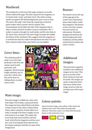
The masthead uses bold, loud font in black on a white background to stand out. The magazine's name, Kerrang!, comes from the sound of an electric guitar and links to the music featured inside. Additional images and cover lines about punk music complement the main image of Greenday singer Billie Joe, edited in black and white to match the limited color palette of yellow, white, black, and pink used throughout to look bold and fit the magazine's punk theme.
Call Girls Service In Old Town Dubai ((0551707352)) Old Town Dubai Call Girl ...
Kerrang cover
1. Masthead:
Banner:
The masthead is at the top of the page, and goes across the
whole width of the page. The font is good for the magazine, as The banner across the top
it is bold, looks ‘rocky’ and looks ‘loud’. The white writing of the page gives the
stands out against the black background, and is easy to read. reader extra information
The name ‘Kerrang!’ come from the sound that an electric about what will be inside
guitar makes when a power chord is played. This this magazine. The banner
onomatopoeia word makes the title of the magazine link to is thin, and only contains
what is inside, and also it makes it easy to remember. The ‘!’ two more pieces of
makes it sound as though it is read loudly, and this also links to information. The black
the music that s featured. The main image overlaps the middle background matches the
few letters of the masthead. This suggests that the magazine is black background of the
so well known that the readers already know the title of it, and masthead, and the yellow
that it doesn’t matter that some letters are unreadable. and pink font matches the
colour scheme.
Cover lines:
‘The ultimate guide to Additional
punk’ cover line links
perfectly to the font and images:
colours used on this
particular rock This particular magazine
magazine. The font looks includes a few additional
bright and bold, and ‘in images on its cover. This
your face’ which suits gives us an idea of the
the article that it is kind of features that will
talking about, as punk be inside. The images are
music is this. small, so that they don’t
take focus off the main
image, however they do
overlap some of the main
image.
Main image:
The main image is of Billie Joe, who is the
lead singer of Greenday, a pop-punk band. Colour palette:
The image has been edited black and white,
Apart from the images, only yellow, white, black and
so that it stays to the colour scheme black, pinkhave been used. This makes the page look
white, yellow and pink. It looks effect as it effective. These four colours are bold and fit the punk
looks as though it has been roughly cut out theme on this particular cover.
and stuck on at an angle. This makes the
cover look more busy and full, and look
‘loud’ which fits the magazine and the cover
line. Lots of writing has been layered over
the image, making it look like it is part of the
background.