Tiger Moms, Ninjas and Chips - Oh My! Uncovering the story in the data - @mrogati's talk at Ignite Google I/O 2011
•
2 j'aime•1,016 vues

These are the (slightly edited) slides for my 2011 Ignite Google I/O talk. See comments for video. About Ignite: ignite.oreilly.com

Recommandé
Recommandé
Contenu connexe
Dernier
Dernier (20)
En vedette
En vedette (20)
Tiger Moms, Ninjas and Chips - Oh My! Uncovering the story in the data - @mrogati's talk at Ignite Google I/O 2011
- 1. @mrogati
- 4. Smirnov Kolesnikov Romanova Kumar Verma Rao Oliveira Barbosa da Silva
- 5. Smirnov Kolesnikov Romanova Kumar Verma Rao Oliveira Barbosa da Silva
- 10. 1999 software engineer web developer now-ish social media game artists 2001 research assistant PhD student analytics & data science
- 14. Normalize
- 15. Dig!
- 20. ? @mrogati
Notes de l'éditeur
- MonicaRogati – data scientist at LinkedIn. “Tiger Moms, Ninjas and Chips, Oh My! Uncovering the story in the data”
- A few months ago there was this huge “tiger mom” controversy on parenting styles and outcomes. As a data geek, my first instinct was – let’s look at the data! But what kind of data do we have?
- There are 100Mil people on LinkedIn – and their public profiles include their last name, location and job title.
- What this means is, we can look at people’s last names & their region, sprinkle some machine learning, and have a reasonable guess on the origin of the name.
- We can then look at the United States & look at which job titles are *over-represented*for a particular name origin.
- So, going back to the Tiger Moms, it turns out that the Tiger Cubs do value scholastic achievement and statistics – but they’re not the only ones. We can run this analysis for any name origin.
- it turns out Eastern European names look quite similar…
- … we can contrast them with Western European names who seem to optimize for different metrics.
- So what else is on LinkedIn? People’s career histories going back to the 70s – and this allows us to ask questions like “Where are people going?” “What’s the hottest industry?”, “What are the fastest growing job titles?”
- What were the fastest growing titles in a given year? We can see the tech boom in 1999 and the bubble bursting as people go back to grad school. Today, we see the rise in social media & of course, data scientists
- ..and, finally, we can see fads in job titles goingfrom “gurus” to “ninjas” to “rock stars”. So HOW do we find stories like these in the data?
- There are 3 simple ingredients. We have to aggregate across interesting dimensions, normalize the raw data, and dig. Let’s see a few examples of what this means.
- Looking at job promotions by month and country reveals interesting patterns, like rediscovering India’s fiscal year.
- Normalizing raw data is essential -- there is always a denominator. Look for what is over-indexed, not just popular. To see the trend here, we looked at the relative change.
- Finally, ask why . For the promotions data, we took a look at when people were born. And here is our explanation for the trend: Millenials don’t care what month it is, they want their promotions.
- Let’s take another example. What first names are over-represented among CEOs? You might look at the list and say – well, those are just popular baby names 50 years ago. But that’s not the whole story – you have to dig.
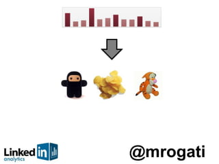
- Look at the length of the names – now that’s an interesting story! There’s Chip, Todd and Trey - the quintessential sales guys. The CEO distribution is not as skewed – but they still want to be your friend -- so they use nicknames. It turns out, the media loved this stuff. So how do you COMMUNICATE the data stories? Infographics are awesome – but the story itself has to be…
- … interesting – to get people talking about it; It has to be accessible, so it’s easy to understand by a large number of people; and it has to be relatable – Howard Stern covered it because Howard was one of the names.
- So obviously there are a lot of interesting stories in the data. We all love data & want more of it –that’s IS my license plate. But raw data isn’t enough – you have to DIG to find the real story.
- If you love discovering stories & big data, let’s talk!