
Recommended
More Related Content
Viewers also liked
Recently uploaded
Recently uploaded (20)
Nicholas O'Leary FWD Project 4
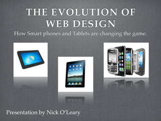
- 1. THE EVOLUTION OF WEB DESIGN How Smart phones and Tablets are changing the game. Presentation by Nick O’Leary
- 2. GROWTH OF USE Smartphones Smartphone sales have passed PC Computers 500 million smartphones sold in 2011 1 billon by 2013
- 3. GROWTH OF USE Tablets 60 % CAGR 2010-2015 By 2015, 82 million consumers will be using Tablets
- 4. EFFECTS ON WEB DESIGN Websites and applications are being design for mobile before computer Resolution sizes are changing from computer’s (1024 x 768) to mobile devices (320 x 480) Mobile Internet Users are more focused.
- 5. TECHNOLOGY Google’s Conversion Utility MoFuse Wapple Architect
- 6. GOOD EXAMPLE Orbitz website website mobile
- 7. GOOD EXAMPLE Best Buy mobile website
- 8. BAD EXAMPLES Adler Fels
- 9. BAD EXAMPLES Fox News website mobile
- 10. REFERENCES Overton, Gail. "Smartphones, media tablets drive steady semiconductor industry growth - OptoIQ." OptoIQ Home - your destination for the latest information on optical technologies and applications. OptolIQ, 18 July 2011. Web. 31 July 2011. <http://www.optoiq.com/index/ photonics-technologies-applications/lfw-display/lfw-article-display.articles.optoiq2.photonics- technologies.news.business-news.2011.7.Semicon-West-2011-review.html>. Ma, Shanshan. "10 Ways Mobile Sites Are Different from Desktop Web Sites :: UXmatters." UXmatters :: Insights and inspiration for the user experience community. UXmatters, 21 Mar. 2011. Web. 31 July 2011. <http://www.uxmatters.com/mt/archives/2011/03/10-ways-mobile-sites-are- different-from-desktop-web-sites.php>. Tofel, Kevin C.. " 5 Biggest Losers as Smartphone Sales Surpass PCs — Mobile Technology News ." GigaOM — Tech News, Analysis and Trends . Mobilze, 13 Jan. 2011. Web. 1 Aug. 2011. <http:// gigaom.com/mobile/5-biggest-losers-as-smartphone-sales-surpass-pcs/>. Rotman, Sarah . "US Tablet Sales Will More Than Double This Year | Forrester Blogs."Forrester Blogs | Making Leaders Successful Every Day. Sarah Rotman, 4 Jan. 2011. Web. 1 Aug. 2011. <http:// blogs.forrester.com/sarah_rotman_epps/11-01-04- us_tablet_sales_will_more_than_double_this_year>. Abanesis, Chloe. "Smartphone Shipments Surpass PCs for First Time. What's Next? | News & Opinion | PCMag.com."Technology Product Reviews, News, Prices & Downloads | PCMag.com | PC Magazine. PCMag.com, 8 Feb. 2011. Web. 1 Aug. 2011. <http://www.pcmag.com/article
Editor's Notes
- Hello everyone, my name is Nicholas O&#x2019;Leary and today I would like to discuss how both smartphones and tablets are rapidly changing the way web sites are being designed. \n
- 2010 marked the first time that smartphone sales surpassed those of PC computers, with Smartphones selling 100.9 million in the fourth quarter, while PC sales were only at 92.1 million. Bob Johnson, VP of research at Gartner (Stamford, CT; www.gartner.com, stats that 500 million smartphones are said to be sold in 2011, and that number will rise to 1 billon BY 2013.\n
- Since the emergence of the iPad, tablet sales have nearly doubled in 2011. The Compound Annual Growth Rates for tablets are estimated to have a 60% growth between 2010 and 2015. Forrester also reported their tablet forecast back in January, and said by 2015 82 million consumers will be using Tablets to access the internet, which is nearly 1/3 of the US online consumer market.\n
- Luke Wroblewski wrote in his netmagazine.com article that websites and application need to be developed for mobile firsts. This, along with many other factors is whats changing the website design industry. One of the biggest issues is size, screen resolutions are dramatically decreasing, making the designer focus more on content rather than creative design. Another factor is that mobile internet users are much more focused, using their smartphone to get needed information, not concentrating on browsing or surfing the internet.\n
- There are countess applications and websites available to convert your website to mobile devices. Google&#x2019;s Conversion Utility is one of the easiest, allowing the user to just have to enter the URL address of the site, and decide if they would like the option to show the websites pictures or not and your finished. Others like MoFuse also are user friendly while offering more services to the user, like customizing their mobile site to their particular needs. If you are running your site or blog of a CMS like WordPress, there is also the option of using plug-ins like Wapple Architect, which transfers your page or blog to a mobile freindly template.\n
- Orbitz has done a wonderful job of translating their page to mobile devices. As discussed earlier, mobile users are concerned with getting needed information, and Orbitz does a great job of getting that information to the user by prioritizing their content.\n
- Best Buy runs into an issue, because unlike most mobile sites, users do want to be able to browse to some degree. What Best Buy has done by reducing their global and contextual navigation is accommodate for lack of screen space, while still delivering a quality experience to the user. \n
- Adler Fels, a California based winery, has yet to develop their site for mobile users, which is a poor choise since they have just started printing QR codes on their wine bottle labels. This means when the user goes to the webpage, there is know adaptation of the site to the new device, so users have to zoom out, or frantically search all over the screen to try and find the menu or any content they are seeking.\n
- Although Fox News does have a mobile site available, its lack of polish reflects poorly on the news organization. Their website to begin with is rather cut and dry, but the mobile site is so bland, it takes away from the users interest. \n
- \n