

Recommandé
Recommandé
Contenu connexe
Tendances
Tendances (20)
Similaire à Email design guide
Similaire à Email design guide (20)
Plus de Pieter Deprouw
Plus de Pieter Deprouw (8)
Dernier
Dernier (20)
Email design guide
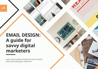
- 1. Learn how to design emails that work on every level. Particularly your audience’s. EMAIL DESIGN: A guide for savvy digital marketers 1
- 2. Your newsletter’s design does more than just contain your company’s offers or content. When you think about the format, layout and appearance of your emails, remember 3 key facts: • Email design impacts your immediate results. The number of people clicking on your offers and content also depends on how you present that offer or content. • Email design impacts awareness. We’ve seen how email contributes to brand awareness and the customer relationship. Your presentation plays an important role here, too. • Email design is not the same as other kinds of design. If you design an email like you would a piece of direct mail or a web page, it won’t always work. The different ways email software and webmail services display email has led to email design having its own rules and principles. / EMAIL DESIGN: WHAT IS IT?
- 3. Good email design is a vital part of successful email marketing. In general, though, it’s considerably more limited than modern web design. Unlike a web browser, email clients cannot handle all the clever design elements, code and functionality you get on web pages. This applies both to installed software like Microsoft Outlook and web-based solutions like Hotmail or Gmail. When you design a website, you only have four major web browsers to consider, so many website design elements have become standardised. Email, on the other hand, has a much bigger range of client software and far fewer standardised solutions. And even if all software worked the same: an email newsletter isn’t a website, just like a movie trailer isn’t an entire film. A trailer attracts and creates interest, which the film follows up. So your email design is not about making a poorer (or simpler) version of your website. It’s about creating a vehicle that drives email response. Fortunately, there are some simple guidelines that will help you easily overcome this challenge!
- 4. Sometimes marketers design an email template, test it in an email client like Outlook and then use it for their newsletter. Good plan, isn’t it? Unfortunately it’s not just email software that behaves differently than a web browser. Many of the different email clients have their own unique display rules and ways of handling images and design code. A template might look great in Apple Mail, but odd in Outlook 2016. It might look fine in Gmail, but strange in Yahoo Mail. Your newsletter can look completely different depending on which system your recipients use. Anything that goes wrong with the design might affect their perceptions and, ultimately, your results. A well-designed email template works everywhere. The only way to find out if your template belongs to that group is by testing. However, there’s no need to set up dozens of different systems in your office and check your emails in each one: instead, you can use standalone email design preview tools or the preview tool built into many modern email marketing solutions. TEST PROPERLY!
- 5. WHICH FORMAT? Why don’t more organisations send text-only emails to sidestep these design issues? It’s all about the first two facts we mentioned at the start of this chapter. HTML marketing emails (emails featuring pictures, colours, different font sizes etc.) present a much more attractive, brand-friendly image to subscribers. THEY ALSO GET BETTER RESULTS. HTML email also lets you include tracking codes that tell you much more about how people respond to your email. So should you never send email that is only text? Certainly, plain text email comes across as more personal. As a result, some types of messages can occasionally work better when they are mainly text. (Like a “personal” note from your CEO, for example!) But even then, it makes more sense to send a HTML-like email, which looks like plain text but may still contain colours, small logos or emphasis.
- 6. / DESIGNING HTML EMAIL Many designers take their inspiration from their company website, letterhead or brochures when designing a newsletter for the first time. It’s tempting to use entire sections from your website or stylish, spectacular graphics from earlier print materials. You have to be careful though: like we said before, email is a form of communication all its own. Generally speaking, you should always use a clear and simple graphical form with at least some text. Have a lot to say? Don’t put it all in the email. Instead, tease the reader into clicking on a link and visiting your website. Provide a clear and easy path to where an action can take place.
- 7. (All participants in the study first read emails in the preview window, which we’ll talk about on page 9.) The left-hand column gets 80% more attention than the right-hand column. You only have a matter of seconds to grab and engage the reader, so eye- catching headlines, images and text need to be near the top of the email. Almost 40% of the viewing time is spent on headlines! To give you some idea of what to focus on, consider the results of an APSIS eye-tracking study, which looked at how people read emails on a computer: 40% 80%
- 8. / A TYPICAL NEWSLETTER LAYOUT There is no single approach to the look of an email. What works for one sender and their subscriber list may not be appropriate for another. It’s always important to test what you do yourself, rather than blindly follow what others are doing. That said, our example here is typical of many successful newsletters: Ever wondered about how triggered emails work? Open this email in your browsern Maximize results with smart triggers Boost your sales through leads The best emails aren’t just relevant: they speak to your head and your heart. With APSIS Pro Trigger, you can personalise emails based on your subscribers’ behaviours and preferences – and fully automate the process going forward. Discover the ways of Trigger Taking care of your leads is important. This is why we’ve developed our APSIS Lead solution. Time to boost your sales APSIS International AB Stormgatan 11, 211 20 Malmö, Sweden This newsletter is sent to john.doe@apsis.com, if you wish to stop receiving our sendings – please unsubscribe here. 2 3 4 5 6 7 8 9 10 1
- 9. Ever wondered about how triggered emails work? Open this email in your browsern 2 3 1 1. Preheader The preheader is the first item to appear in the newsletter. It should be used to get the email’s main message across or invite further reading. It’s often displayed in the inbox itself (at Gmail for example, or in many smartphone email clients), so it’s also like an extension of the subject line. Preheaders can provides useful clues as well if your images are blocked, so it’s quite important. 2. Link to a online version of the newsletter This links to a copy of the newsletter on a web page. Some people like reading emails in their web browser. (It’s also a fall-back option for when your design gets messed up by your subscriber’s email client.) Whatever happens, they can usually still click on this link and see the email as you wanted it to look like. 3. Header/sender An email is more likely to get attention when the reader knows and trusts the sender. Help them recognise your emails by putting your company name and/or logo in the header; but don’t go to extremes, since it’s the actual content that’s important they’ll be interested in.
- 10. 4. Headlines and subheadings These are real attention-grabbers, and very important for getting people to read more, or click on something. It’s well worth spending a bit of time to find the right wording for every one of your headlines and subheadings. 5. Teaser/lead text The lead text under your headlines grabs your readers’ interest and sets the tone for what will happen after they click to read more. Remember: a short, clear teaser is usually better at capturing clicks than a long, rambling summary. (You can also build links into this text as an added bonus!) 6. CTA link This is your clear call-to-action. Many marketers don’t bother to think too hard about these links, and simply put ”click here” or indeed just ”read more” as the button text. Stand out by taking time to test more appealing versions, like ”save now” or ”discover the answer”. 7. Image Newsletters with images look and work better than plain text mails - provided you use the right images, of course! Even so, images are one of email designers’ biggest challenges, because email clients don’t always display them properly. We’ll examine this issue in more detail on page 11. Maximize results with smart triggers The best emails aren’t just relevant: they speak to your head and your heart. With APSIS Pro Trigger, you can personalise emails based on your subscribers’ behaviours and preferences – and fully automate the process going forward. Discover the ways of Trigger 4 5 6 7
- 11. 8. Background colour or image Images that frame the email often look nice on a sketchpad, but it’s quite tricky to make them work properly in email. It’s best to stick to a colour or minimal pattern instead. 9. Links for unsubscribing, sharing and contact information Unsubscribe links, sharing links (to social networks or a tell-a-friend email form) and contact links can go in email footers, sidebars or near the top of the content. Whatever you do, it’s important to clearly show how a recipient can cancel a subscription. That’s also a legal requirement! 10. Footer Quite a few of your subscribers will read all the way down to the end of the newsletter. This is a good place for important administrative information, such as clear contact details that say you are a serious sender who would like to invite others into a dialogue. Boost your sales through leads Taking care of your leads is important. This is why we’ve developed our APSIS Lead solution. Time to boost your sales APSIS International AB Stormgatan 11, 211 20 Malmö, Sweden This newsletter is sent to john.doe@apsis.com, if you wish to stop receiving our sendings – please unsubscribe here. 8 9 10
- 12. / PREVIEW PANE – THINK ABOUT YOUR EMAIL’S TOP LEFT SIDES! Many people read emails in their installed email client’s preview pane. This is a small window that displays part of the email, so people can decide if they want to scroll further or open the message in full. Many email clients, like Outlook or Apple Mail, offer such a preview - often as the default display. The preview pane normally shows the top and left sides of your email. This doesn’t mean you should cram everything into that area, but it does mean you should think about what will show up there. Remember that most readers are wondering whether they should bother looking at your email. The preview pane plays an important role here, in combination with the “from” field (who sent the email?) and subject line (what’s in the email?). So the preview should help people recognise that the message is coming from you (hopefully they’re looking forward to your new offer or content!), and give them further reason to pay attention. This is why many marketers put a logo or slogan up in the top left corner and use a preheader to entice people into reading further. Of course, if you keep your logo and preheader small, then some of your actual content should show up in the preview too, which is also a useful tactic!
- 13. USE OF HTML AND CSS Many email clients can’t handle popular design features you find on websites, since they lack support for the relevant HTML and CSS code. If you’re used to working with modern HTML and CSS, you may be a little disappointed when you begin working with email design. Some say it’s like going back ten years in time... Our main tip for you is to keep things as simple as possible. The further you move away from basic HTML and CSS, the more likely you are to run into trouble with poor support from one or more email clients. Of course, sometimes you can come up with clever solutions to get some feature to work in a particularly difficult email client. Unfortunately, email software and webmail services constantly change their way of handling email display. So a workaround that solves a problem today might not work six months later. The good news? If you don’t want to design your own emails from scratch, there are many templates, tools, services or designers that can take care of them for you. Most professional email marketing solutions come with their own email templates, built specifically to work with most email clients or webmail service, so you can simply adapt it to your own needs.
- 14. USE WEB-SAFE FONTS There is mixed support for special fonts in email clients. It’s best to stick to web-safe fonts like Arial or Verdana. If you really need a special font, you can display the text as an image - the only problem is the risk of image blocking, which we discuss on the next page. AVOID FLASH, JAVASCRIPT, FORMS ETC. Scripts are not suited to email. If you design an email with Flash animations, few recipients will see them properly. Although there is support for JavaScript in some clients, such scripts are often blocked for security reasons. Traditional survey, registration, search and login forms do not always work in all the popular email clients. The bottom line: avoid Flash at all costs and use links to take people to relevant forms on your website. TEST, TEST, TEST Even if you’re using a pre-built, professional template, it still pays to run every newsletter through a design preview testing tool before you send it out. There are so many small differences between clients that even the best templates can sometimes cause display problems.
- 15. / PREPARE FOR IMAGE BLOCKING As you’ve probably noticed, many email clients and webmail services block images from displaying by default. Users can activate images manually, or set up rules that mean images from particular senders are displayed, but the ugly truth is that a proportion of your readers are probably not seeing your lovely images. This has two consequences for your email design: • You need to make sure the email still does its job when images aren’t displayed. • Since you put those images in there for a reason, you need to encourage readers to unblock images. INCLUDE HEIGHT, WIDTH AND ALT ATTRIBUTES If you want to keep the layout the same with images blocked, then ensure your image code includes height and width information. That way, most software will at least display something of the same size as your original image, even if it’s only a blank rectangle. In the email code used to specify which image to display, you can also define a so-called ”alt attribute”. This tells the email client what text should be displayed in place of the blocked image, and most clients will comply with this instruction. This alt text is very important, as you can use it to compensate for the blocked image. You can describe the picture or use this text to encourage readers to unblock those images.
- 16. BALANCE IMAGES WITH TEXT Where possible, important information like headlines, calls to action, links etc. should be in the form of HTML text, not (just) an image. This means your readers still have access to this information when images are blocked. Just look at the examples on the next pages...
- 17. With grilled shrimps and Parmesan bread. A Caesar salad without chicken? We seek inspiration from the archipelago and offer salad with seafood delicacies. A pasta salad without chicken? We seek inspiration from the archipelago and offer salad with seafood delicacies. Here’s a newsletter that isn’t optimised for image blocking. See how the large top banner, blank image- based headlines and lack of alt text mean a lot of the impact is lost.
- 18. Here’s the same email with text headlines and alt text. The impact is much nicer. You could even revise the layout completely to account for image blocking by placing the images on the right, for example. If they don’t show up, it’s not such a big deal. All the text is still prominently displayed on the left. With grilled shrimps and Parmesan bread. A Caesar salad without chicken? We seek inspiration from the archipelago and offer salad with seafood delicacies. A pasta salad without chicken? We seek inspiration from the archipelago and offer salad with seafood delicacies. CAESAR SALAD PASTA SALAD Here’s our great and tasty salad! Tasty Caesar salad with grilled shrimps and Parmesan bread. Our Tasty Pasta salad, yet again!
- 19. ANIMATION Perhaps surprisingly, many email clients and webmail services support animation and video. OPTION 1: GIF ANIMATIONS Standard GIF animations work in the vast majority of email clients. Please note though that Outlook 2007 and 2010 only display the first frame of the animation. This means that animated GIFs are safe to use, provided you make sure the first frame looks meaningful and conveys the message you want to express, in case it’s displayed as a static image. Done well, a small, smooth GIF animation can also look like a video, which will please your recipients even more! OPTION 2: THE LINKED VIDEO SCREENSHOT Another option is to use an image to encourage people to click through to the video: • Capture a static shot of your video playing in a video player. Make sure the captured image is one that looks interesting and engaging. • Place a clear ”play” icon in the middle of the picture. • Put the image in the email and link it to the web page hosting the video. If someone clicks on the ”play” button, they will go to the appropriate web page where they can watch the video. Give the image a good headline and call-to-action. Include a text link and alt text for when the video image is blocked.
- 20. When you design an email, make sure the unsubscribe link is easy to find and use. Giving readers the opportunity to unsubscribe easily from your newsletters is an integral part of permission-based email marketing. It’s also a requirement of every anti-spam law we’ve ever come across. A clear link for unsubscribing creates trust: the knowledge that you can quickly and easily unsubscribe is important. Otherwise you can feel trapped or imposed upon. Plus, if someone cannot easily find or use your unsubscribe link but want to stop getting your newsletters, they will simply mark your emails as spam or junk mail. If this happens enough, it can lead to your emails being blacklisted. In particular, avoid putting the unsubscribe link in an image, since it won’t appear if your images are blocked. Most subscribers expect to find the link in your footer. Some senders have found placing a second, more prominent unsubscribe link nearer the top of the email also has a positive effect, but this is something you should definitely test first. / DON’T HIDE THE UNSUBSCRIBE LINK!
- 21. DESIGN FOR MOBILE, TOO The latest challenge for email marketing is the growth of mobile email. According to analysts, more than 1.4 billion smartphones were sold in 2015, and email is a hugely popular smartphone activity. For example, a Google survey found that 63% of Swedish smartphone owners check their email daily. Smartphones and other email-friendly mobile devices are spreading so fast that it’s hard to find up-to-date statistics about their use. What we do know is that a lot of your subscribers will view at least some of your email newsletters on a smartphone, an iPad or similar. This is important because increased mobile email use means: • People are viewing emails on small screens and a greater variety of software systems (as if we didn’t have enough issues with traditional email clients!), and • People are viewing email in different places and at different times: not just in the office between 9am and 5pm, but in bed, the bathroom, the train, etc.
- 22. OPTION 1: DO NOTHING Doing nothing is an option because smartphones, iPads etc. are all actually very good at displaying email. A few years ago, mobile phones were notorious for how badly they handled HTML email, but this is no longer the case. Standard email design assumes people are sitting in front of a decent-sized monitor and using a mouse. A more mobile-friendly email design that accounts for smaller screens and touchscreen control will get a better response from mobile email users. Doing nothing is actually a missed opportunity. Emails that aren’t mobile-optimised display accurately on small mobile screens, but hardly make a good first impression. And first impressions count even more for mobile email users, who often flip quickly through their emails in a spare five minutes. SO HOW DO YOU ACCOUNT FOR MOBILE EMAIL USE IN YOUR NEWSLETTER DESIGN?
- 23. OPTION 2: MOBILE-FRIENDLY DESIGN A pragmatic solution would be to make your email template more mobile-friendly. The aim is to get the template to work fine, whether viewed on a desktop or a mobile device. What makes an email mobile- friendly, though? • The narrower the better. Consider using one-column layouts, not exceeding 500-600 pixels in width. • Make sure the email opens strongly. Small screens may only display a small portion of the email, so the preheader, logo and topmost content should take up as little space as possible, but still grab and encourage attention. • Use larger fonts and ensure contrast between text and background colours, so words are easier to read. • Keep content to a minimum, so it’s easy for readers to grasp the important material and then take the required action. • Put plenty of space around links and make them clear and easy to notice.
- 24. This last point is especially important because mobile users don’t have a mouse. They manipulate your email on a touchscreen, using their fingers and thumbs, which are much less precise than a mouse. If you place links too close together, it’s hard to ”click” one without accidentally touching the wrong one. Apple recommends a target area for each link of about 44 x 44 points. People can’t tell when something is a link by hovering over it with their finger, either (unlike when you hover over a link with your mouse cursor). That’s why links have to be very clearly, obviously marked. Of course, there’s one problem with making your template mobile- friendly. You’ll never have the perfect mobile email experience, because you still want a template that exploits the advantages of desktop email. You’ll never have the perfect desktop email experience, either, because you’re trying to make your template mobile-friendly.
- 25. To sum up: this solution is pragmatic, but not ideal. What we really need is a single email template that adapts to the display environment. It should take a mobile-friendly format when viewed on a mobile device, but a desktop-friendly format on a traditional PC monitor. Responsive design makes this possible.
- 26. If you have access to professional design resources, you can build your email using responsive design principles. This means that your email design will automatically adjust to the viewing environment. So the email might use a one-column format when viewed on a small screen, but a wider format on a bigger screen. Designing emails for this kind of flexibility does, however, require a solid understanding of such things as @media queries, CSS and the special requirements of different email clients and systems. Fortunately, at APSIS, we have two options if you want to create newsletters for mobile users: Mobile Headlines and Mobile-Optimised Template. OPTION 3: RESPONSIVE DESIGN
- 27. / MOBILE HEADLINES This approach displays a ”for mobile” message that is only seen when recipients open the newsletter using the default email clients on their iPhones or Android phones. Other recipients would see your ”normal” newsletter. The mobile-only message consists of a single, clickable call-to-action image, which you could choose to link in one of three different ways: A click might open a website in the phone’s browser, activate a phone call to a specified number, or create a new email to a specified email address. This approach is especially suitable for email and newsletter campaigns that are informative and action- oriented, since the image is always linked to a specific, linked call-to-action.
- 28. / MOBILE-OPTIMISED TEMPLATE Our Mobile-Optimised Template service automatically adapts your email for mobile devices. It customises any newsletter to a single column layout, making it easy to read even on a small screen. This is especially useful if you know that a large percentage of your recipients open your email on their mobile devices. A great new feature of this service is the possibility to use non-web-safe fonts. This means that it is possible to use fonts that previously were impossible to use – giving mobile readers a great visual experience. Non-responsive Mobile Headline Responsive
- 29. BE ACCESSIBLE One aspect of design many people forget is the need to make your newsletter accessible to everyone, including those with an impaired ability to view or read your email. A lot of our suggestions for mobile-friendly design and image blocking also help with accessibility, for example: • Clearly mark and label links. • Choose colours that provide high contrast to improve readability. • Use large, readable fonts. • Avoid text in images, which are hard for text- to-voice readers to understand. Make sure you have alt text in your images, too. Include a link to a web version of your newsletter, so that anyone who wants to can read your mail in their browser. That makes it easier for them to change font size or use a text-to-speech tool.
- 30. SUMMARY Email design: what you need to know. • The main challenge of email design is that email clients and webmail services have their own ways of displaying emails. This means that many features and design tricks available to website designers don’t work in email design. • Design your email to grab attention - help people find and click on your links. • A typical newsletter design consists of: – Preheader – Link to an online version – Unsubscribe/sharing/contact links – A header area with a logo or title – Headlines – Teaser/leads – Links – Images – Background colours or images – Footer area
- 31. • Make sure the top left area of your email contains sufficient information or design elements to let people recognise your email and grasp why they should look at it more closely. • Design the email to still get your message across when images are blocked from displaying. In particular, ensure images are coded with an alt attribute: the text that shows up instead of the blocked image. Use that alt text to describe the image or encourage the reader to unblock the images. • Make sure the unsubscribe link is easy to find and use. • Consider adjusting your design to account for mobile email users, for example: – If you have the know-how (or can access the know-how), use responsive design, so the email adjusts automatically to the viewing environment. – Use a narrower layout, with key information right at the top of the email. – Increase font size and ensure good contrast between text and background colours. – Make sure links have plenty of space around them so people can use them easily when viewing on a touchscreen.
- 32. We hope you’ve found this whitepaper useful! For more tips and trends in email design, sign up for our newsletter at www.apsis.com. As well as practical insights and inspiration, you’ll also learn about our seminars, webinars and other events, as well as our latest product updates. GOOD LUCK AND GOOD EMAILING! LOOKING FOR MORE EMAIL DESIGN INSPIRATION? CHECK OUR BLOG! WE’D LOVE TO SHOW YOU MORE... Discover how simple digital marketing can be. Contact us directly at hello@apsis.com, and one of our experts will demonstrate all the email design possibilities of APSIS Pro for you. Phone: APSIS HQ +46 40 24 97 70
- 33. APSIS.COM GET APSIS MORE Want to stay updated? Sign up for our newsletter: