SlideShare une entreprise Scribd logo
1  sur  15
In what ways does my media
product use, develop or challenge
  form and conventions of real
        media products?
Front cover-Masthead
Convention                                          My Product
The first convention of a magazine is the           My magazine has a conventional Masthead, It is at
   masthead, which is usually at the top of the        the top of my magazine cover and spreads out
                                                       across the page from left to right. The title of
   magazine. This is the title of the product and      ‘Optimiste’ means in French to be optimistic
   indicates to the audience what the product          and upbeat. As my target audience is a high-
   is called. The Name should connote the              class group of people, I thought that using
   genre and content of the magazine, such as          another language for the title would make it
   ‘Jazz Magazine’ which is all about Jazz             seem more sophisticated and attract more of a
                                                       higher-class audience. The font I have decided
   music. Furthermore this title masthead is           to use is slab serif which means the text has
   conventionally larger than most of the other        serifs on the ‘S, P and I’ which helps to create
   text on the page to attract its audience into       the sense of an old-style, traditional magazine
   picking it up. The colours of this masthead         which will appeal to a B , 40-55 year olds,
                                                       unisex aspires who want to be ambitious into
   usually contrasts well with the background          achieving something such as knowing the latest
   colour, text or the boost image which has           music artists in the chosen genre and learning
   been used.                                          more about the genre culture. The colour used
                                                       a gold/brown colour which contrasted with the
                                                       colour of the saxophone my model was holding
                                                       in my boost picture. The fact that it contrasted
                                                       with the boost image helped the cover to
                                                       connote a sophisticated look Furthermore when
                                                       looking at my cover, The masthead is
                                                       significantly larger than everything else on the
                                                       page, and is the focus centre apart from the
                                                       boost image which I have used.
Front cover- Cover Stories
Convention                                            My Product
The majority of Music magazines, mainstream        On my front cover, I challenged the conventions of a
   and independent use a large number of              typical magazine by only using a few cover-lines. In
   cover stories to interest their audience into      total I wrote 6 cover-stories and used no reversed
                                                      out cover-lines , which were just names and simple
   picking up the magazine to read. Also the
                                                      sentences such as ‘Music study’ and ‘Herp Alpert’ to
   use of reversed out cover-lines are also
                                                      attempt to attract my audience. They are in a small
   used to stand out above the boost image            list with font size of 14, so it is almost impossible to
   which also attracts the audience as it is          read them without picking the magazine up. There
   different to the image. These are used to          is main focus in the middle of the magazine which
   attract the audience to their magazine and         relates to the boost image model. This is the one
   try to fit all the good information onto the       cover-line which is larger than the others to
   cover in order to make more sales.                 reinforce the nature of a magazine and to connote a
                                                      traditional magazine of the main focus point of the
                                                      bigger cover line. I have used very few cover-lines
                                                      to connote an older audience and that through my
                                                      research, this type of audience do not particularly
                                                      mind what is on the cover, but the content inside is
                                                      more interesting and what matters to them most.
                                                      The use of the simple sentences and names shows a
                                                      sophisticated and mature audience because they
                                                      are people who would look past the cover and the
                                                      short cover-stories to what is actually inside the
                                                      magazine.
Front cover- Other Cover Content
Convention                                           My Product
All magazines should have the date, price and        My Magazine has again challenged the conventions
                                                        of the other cover content. As stated, all
    a barcode on the front to indicate how              magazines have the price, date and barcode on
    much it is and so it can be put through the         the front, and mine is no exception. I have
    scanner at the till. A lot of other magazines       priced my magazine at £3.99. This will appeal
                                                        to a higher-class audience because they will
    also use screamers, pull-quotes, sell,              potentially be able to afford this price and will
    splash and banners to attract their                 seem more stereotypical for them to pick up a
    audience. This connotes a mainstream                more expensive magazine and seem above
                                                        everyone than picking up a mainstream price of
    audience that that they are looking for             £1.99. I have also included a barcode which is
    what is on the front before they buy, an            situated at the bottom of the page which is a
                                                        conventional situation as when it is on the
    example of this is a younger audience who           shelf, the barcode is hidden and the audience
    look to see what is on the front to see what        can see the more important aspects of the
    is inside, and if the cover is not interesting      magazine. Furthermore I have not included any
                                                        screamers, Sells or splashes to my cover as My
    enough then they will not pick it up or buy         audience, from research shows that they are
    it.                                                 more interested into the content of the
                                                        magazine and not what is on the cover.
                                                        However a few cover-lines, such as ‘ Mark P’
                                                        (as I have included) will give them a brief idea
                                                        of what to expect inside.
Front cover- Boost Image
Convention                       My Product
A Boost image is the main        For my magazine i have used a pull page image of
                                     my model, Mark which spreads a variety
  image which is seen on the         amount of messages out to my target
                                     audience. The use of the glasses are natural as
  cover of the magazine              he naturally needs them to see and also match
  which usually fills up the         well with the other colours in the image. The
                                     use of the hat shows the ideology of a
  whole cover and represents         stereotype of a Jazz artist. The image has not
                                     be altered or photo-shopped, sp the detail of
  one of the main aspects the        the skin is all natural, which connotes an
                                     honest Magazine which is not interesting in the
  magazine covers and writes         way the artists who feature in in look. The
  upon. These images are             Magazine is about the talent and music and not
                                     how they look. The use of the Saxophone prop
  usually stereotypical of the       shows a stereotypical look at the Jazz genre as
                                     this is the instrument which is most associated
  person or of the genre of          with this genre. However In my double page
                                     spread, I challenge these instruments by using
  magazine and are often             a ukulele as the main instrument used by the
  thought of role models for         artist, which is something you would not
                                     normally see in this type of magazine and
  people.                            incorporate it within the genre of Jazz.
                                     Through my research I noticed that a
                                     considerable amount of models in boost
                                     pictures use direct contact to engage with the
                                     audience. I used a different approach with a
                                     indirect contact with the audience. The soft
                                     eyes and the fact he is not looking into the
                                     camera makes the magazine look less
                                     intimidating
Contents Page- Numbers
Convention                 My Product
Magazine contents pages    I have written the page numbers
 traditionally have page      fairly large so it is easier to
                              see and read where each
 numbers by the side of       article or page is. They are too
 the text to indicate         the top right of each little
 where about in the           section of text . They are size
                              9 font and cover up to pages
 magazine that                32, This connotes a traditional
 particular article or        target audience who like
                              everything to be traditional
 page is. The amount of       and orginised in the correct
 pages in magazines           order, which I have created so
                              the page numbers go from the
 vary from styles and         smallest at the front of the
 genres.                      magazine to the larger
                              numbers at the back.
Contents page- Text
Convention                           My Product
Contents pages have the main         The main heading of each
  sub-heading of the page or
  article and then either a little     article/page is a size 9 serif
  or no information about what         font which connotes an older
  is on those pages, along with        style which will attract an
  the page number.                     older audience. Furthermore
                                       the text underneath is
                                       significantly smaller and as i
                                       a targeting class B people,
                                       then I am sure they will
                                       consider reading this before
                                       they carry on throughout the
                                       magazine to engage in what
                                       is going to be in this issue.
Double page- Images
Convention                              My product
Double pages usually have
  images to illustrate the text      Within my double page spread I have used two
  which has been written,               images of my model Matt. The first one is of
  whether it is of the artists or       the side of his face with him looking straight
                                        into the distance wearing a wool hat. This is
  albums which they have been           on a white background with the words ‘My
  promoting. Sometimes,                 Moment,’ which is promoting an album cover.’
  magazines may have little             The fact that he is looking straight into the
                                        distance connotes the seriousness of the
  images of the writer who              music which he creates and that he is aiming
  wrote the article which is a          for a higher-class audience to enjoy his
  good technique to use for             music. Although he is male, he is not gender
  recognition and if the audience       specific. The pieces he creates attract both
                                        males and females and are liked by both
  like the piece then they will go      genders. The second image is of Matt sat
  back to them to read more of          down holding the instrument which the article
  their work.                           is about. The look on his face is very
                                        concentrated which further connotes how
                                        serious he is taking his music business. He is
                                        sat with his legs crossed which shows a
                                        relaxed approach and independent which
                                        connotes that it is what he likes to do and the
                                        way he is dressed also shows his
                                        independence as he does not like to follow
                                        the crowd.
Double page- Columns and language
Convention                      My Product
Usually in magazines and        I have written my article in
  particularly in newspapers      four columns spreading
  the text is written in          across the two pages
  columns across either the       which shows a more
                                  professional look as it
  one or two pages. The           looks more neat and
  font is rather small which      easier to read. The
  allows the writers to write     language i have used is of
  significant amounts of          a higher standard which
  text. The language used         connotes a more
  in magazines varies from        sophisticated, higher-class
  the type of magazine and        audience who will be able
  the audience it is aimed        to follow the more mature
                                  language which is suitable
  at.                             for this type of magazine.
How does my cover look like a
        real magazine?
My magazine cover of ‘Optimiste’ Looks like a real
 magazine in many ways. I feel there is a gap in the
 market for an upper-class music magazine for this genre
 as alot of them are mainstream and look cheaply sold
 with a price below £2.50. The use of a saturated image
 shows a more sophisticated cover which will appeal to
 my target audience as it looks more mature and
 connotes a more upmarket audience. The price of which i
 have chosen also furthers the ideology of a higher-class
 audience as they will be able and more willing to pay the
 higher price as they potentially will have the money too.
 Furthermore the use of cover-stories on the front give
 the audience an idea of what is in the magazine which
 may influence then to buy the magazine.
How does my Contents look like
      a real magazine?
As a typical magazine would         I have also included one main
  feature, my magazine has a list      picture, so it is easy to look at
  of all the aspects in which my       and read. As I aim to target
  magazine features, such as           more higher-classed people, I
  articles with artists, and           felt that one picture was
  festival tours. The contents         sufficient as then they could
  which I decided to write about       read the rest of the page with
  are from research into the           ease, rather than it being too
  genre and similar magazines to       busy and filled with pictures
  the one I have created. Many         and them not able to know
  mainstream and individual            what is inside the magazine
  music magazines have a large         which is what my target
  amount of articles, reviews and      audience would rather look at
  interviews on artists which i        and read. I have also included
  have included and furthermore        the page numbers so it is easy
  festival dates of the less           to locate where each feature is
  popular festivals which would        easily. This connotes an
  only appeal to these types of        organised feel which is easy to
  people.                              use and to locate the different
                                       articles and pages within the
                                       magazine.
How does my Double page look
     like a real magazine?
I have arranged my double page       Buy the album. Typically in a
   spread in columns, with text at     higher-class audience aimed
   8pt which is typically found in     magazine, you would normally
   magazines as it allows more         find the older generation
   writing and information to be       artists featured in there. I
   placed on the pages. I have         have challenged this
   included two images, one of         convention by writing about a
   which is an album cover of the      14 year old boy. The article
   artist I am writing about which     shows that it is not about your
   is illustrating a new album         age which should prevent your
   which he is bring out. Normally     target audience for the music
   in a magazine an article is         you are creating come after
   either about the artist or          your age. The type of music
   promoting their new album. I        the artist i wrote about shows
   have challenged these               that he is alot more mature for
   conventions by writing about        his age and knows what he is
   both the artist and the album       doing and who he is targeting,
   which works well as because he      which is something who many
   is young, people may want to        artists do not know.
   know about him before they
How is it recognisable as belonging to
          my Jazz sub-genre?
The main aspect which allows my magazine to
 be recognised as a Jazz genre is the use of
 the stereotypical instrument of the
 saxophone, used by my model in my front
 cover boost picture, and as a prop for my
 contents page image. The fact that the article
 for my double page spread is about a ukulele
 which is often thought to be associated with
 Folk music, challenged the stereotypical view
 on this genre i have chosen. It is allowing
 new people to come up with new ideas to
 involve other instruments in other genres.
Have you done anything to challenge
  the conventions of a existing Jazz
            Magazines?
I have challenged a few of the conventions of my researched
   existing magazines. The first convention which I have challenged
   is the amount of cover-stories on the cover. Existing magazine
   covers are filled with cover-stories to try and engage the
   audience. I have taken a different approach with this convention,
   I have opposed the traditionalist of cramming the cover with all
   the good stories which are inside my magazine and replaced
   them with a few names/simple statements such as ‘Music Study.’
   as I have mentioned before, this is because the audience who I
   am targeting are not really interested in what information is on
   the front, but it is what is in the magazine and the written
   information which will really interest them. Furthermore I have
   challenged the convention of using a unfamiliar instrument for
   this particular genre in my magazine. The usual instrument you
   would expect to see is the traditional saxophone which is widely
   associated with the genre of Jazz. I have challenged this by
   writing about a Ukulele in my double page spread which is a
   musical instrument you would not expect to find in a magazine
   like this. I have told the story about a boy who has used this
   instrument and incorporated it into his own compositions to crate
   jazz which is well liked by the audience.
This quote works well with my magazine as
 I have incorporated a new idea into my
 magazine by writing about something
 which has not yet been brought forward
 into the music business. No artist in the
 genre of Jazz has used a Ukulele in a Jazz
 composition, and with Matt doing so have
 evolved the Jazz genre more and made it
 more broad with it using new instruments
 to create its sounds.

“Genres are not static but shifting
and slippery, evolving over time”

Contenu connexe

Tendances

Q1
Q1Q1
Q1bol4
 
Evaluation
EvaluationEvaluation
EvaluationAmy Moss
 
Media studies evaluation
Media studies evaluationMedia studies evaluation
Media studies evaluationpoppydodgsonx
 
Question 1 - Evaluation
Question 1 - EvaluationQuestion 1 - Evaluation
Question 1 - EvaluationKaylee1234
 
Personal learning and reflection
Personal learning and reflectionPersonal learning and reflection
Personal learning and reflectionbronnie93
 
Magazine cover analysis main coursework
Magazine cover analysis   main courseworkMagazine cover analysis   main coursework
Magazine cover analysis main courseworksarah123ashcroft
 
Question 1)
Question 1)Question 1)
Question 1)12L1491
 
Kerrang evaluation
Kerrang evaluationKerrang evaluation
Kerrang evaluationsophiex
 
As media coursework evaluation
As media coursework evaluationAs media coursework evaluation
As media coursework evaluation06esmith
 
Media magazine evaluation
Media magazine evaluationMedia magazine evaluation
Media magazine evaluationemilydavi
 
Media magazine evaluation
Media magazine evaluationMedia magazine evaluation
Media magazine evaluationemilydavi
 
Evaluation
EvaluationEvaluation
Evaluationdriss123
 
Evaluation
EvaluationEvaluation
Evaluationhassan
 

Tendances (18)

Q1
Q1Q1
Q1
 
Case study notes
Case study notesCase study notes
Case study notes
 
Evaluation
EvaluationEvaluation
Evaluation
 
Media studies evaluation
Media studies evaluationMedia studies evaluation
Media studies evaluation
 
Evaluation
EvaluationEvaluation
Evaluation
 
Question 1 - Evaluation
Question 1 - EvaluationQuestion 1 - Evaluation
Question 1 - Evaluation
 
Personal learning and reflection
Personal learning and reflectionPersonal learning and reflection
Personal learning and reflection
 
Magazine cover analysis main coursework
Magazine cover analysis   main courseworkMagazine cover analysis   main coursework
Magazine cover analysis main coursework
 
Question 1)
Question 1)Question 1)
Question 1)
 
EVALUATIONQ1
EVALUATIONQ1EVALUATIONQ1
EVALUATIONQ1
 
Kerrang evaluation
Kerrang evaluationKerrang evaluation
Kerrang evaluation
 
As media coursework evaluation
As media coursework evaluationAs media coursework evaluation
As media coursework evaluation
 
Question 1
Question 1Question 1
Question 1
 
Media magazine evaluation
Media magazine evaluationMedia magazine evaluation
Media magazine evaluation
 
Media magazine evaluation
Media magazine evaluationMedia magazine evaluation
Media magazine evaluation
 
Evaluation q5
Evaluation q5Evaluation q5
Evaluation q5
 
Evaluation
EvaluationEvaluation
Evaluation
 
Evaluation
EvaluationEvaluation
Evaluation
 

En vedette

Insect classification lab21
Insect classification lab21Insect classification lab21
Insect classification lab21Hama Nabaz
 
Electronic waste
Electronic wasteElectronic waste
Electronic wasteHama Nabaz
 
Insect classification lab24
Insect classification lab24Insect classification lab24
Insect classification lab24Hama Nabaz
 
Lab.7 determination of different organic matter
Lab.7 determination of different organic matterLab.7 determination of different organic matter
Lab.7 determination of different organic matterHama Nabaz
 
Lab13 entomology
Lab13 entomologyLab13 entomology
Lab13 entomologyHama Nabaz
 
Lab12 entomology (1)
Lab12 entomology (1)Lab12 entomology (1)
Lab12 entomology (1)Hama Nabaz
 
Plant ecology
Plant ecology Plant ecology
Plant ecology Hama Nabaz
 
Insect classification lab16
Insect classification lab16Insect classification lab16
Insect classification lab16Hama Nabaz
 
Lab 12 (yeasts and erysiphales)
Lab 12 (yeasts and erysiphales)Lab 12 (yeasts and erysiphales)
Lab 12 (yeasts and erysiphales)Hama Nabaz
 
Lab.11 methods for estimating denitrification process
Lab.11 methods for estimating denitrification processLab.11 methods for estimating denitrification process
Lab.11 methods for estimating denitrification processHama Nabaz
 
Insect classification lab23
Insect classification lab23Insect classification lab23
Insect classification lab23Hama Nabaz
 
Lab.8 isolation of nitrogen fixer bacteria
Lab.8 isolation of nitrogen fixer bacteriaLab.8 isolation of nitrogen fixer bacteria
Lab.8 isolation of nitrogen fixer bacteriaHama Nabaz
 
Lab 10 cryptosporidiosis
Lab 10  cryptosporidiosisLab 10  cryptosporidiosis
Lab 10 cryptosporidiosisHama Nabaz
 
Lab 7 trypanosomiasis
Lab 7  trypanosomiasisLab 7  trypanosomiasis
Lab 7 trypanosomiasisHama Nabaz
 
Water microbiology
Water microbiologyWater microbiology
Water microbiologyHama Nabaz
 

En vedette (18)

1
11
1
 
Taxon.c.b.
Taxon.c.b.Taxon.c.b.
Taxon.c.b.
 
Insect classification lab21
Insect classification lab21Insect classification lab21
Insect classification lab21
 
Electronic waste
Electronic wasteElectronic waste
Electronic waste
 
Insect classification lab24
Insect classification lab24Insect classification lab24
Insect classification lab24
 
Lab.7 determination of different organic matter
Lab.7 determination of different organic matterLab.7 determination of different organic matter
Lab.7 determination of different organic matter
 
Lab13 entomology
Lab13 entomologyLab13 entomology
Lab13 entomology
 
Lab12 entomology (1)
Lab12 entomology (1)Lab12 entomology (1)
Lab12 entomology (1)
 
Plant ecology
Plant ecology Plant ecology
Plant ecology
 
Insect classification lab16
Insect classification lab16Insect classification lab16
Insect classification lab16
 
Lab 12 (yeasts and erysiphales)
Lab 12 (yeasts and erysiphales)Lab 12 (yeasts and erysiphales)
Lab 12 (yeasts and erysiphales)
 
Lab.11 methods for estimating denitrification process
Lab.11 methods for estimating denitrification processLab.11 methods for estimating denitrification process
Lab.11 methods for estimating denitrification process
 
Lab soil
Lab soilLab soil
Lab soil
 
Insect classification lab23
Insect classification lab23Insect classification lab23
Insect classification lab23
 
Lab.8 isolation of nitrogen fixer bacteria
Lab.8 isolation of nitrogen fixer bacteriaLab.8 isolation of nitrogen fixer bacteria
Lab.8 isolation of nitrogen fixer bacteria
 
Lab 10 cryptosporidiosis
Lab 10  cryptosporidiosisLab 10  cryptosporidiosis
Lab 10 cryptosporidiosis
 
Lab 7 trypanosomiasis
Lab 7  trypanosomiasisLab 7  trypanosomiasis
Lab 7 trypanosomiasis
 
Water microbiology
Water microbiologyWater microbiology
Water microbiology
 

Similaire à Question 1

Similaire à Question 1 (20)

Media question 1 (1)
Media question 1 (1)Media question 1 (1)
Media question 1 (1)
 
Task 9
Task 9 Task 9
Task 9
 
Task 8
Task 8Task 8
Task 8
 
Q1
Q1Q1
Q1
 
Media Magazine Evaluation
Media Magazine EvaluationMedia Magazine Evaluation
Media Magazine Evaluation
 
Evaluation
EvaluationEvaluation
Evaluation
 
Evaluation q1)
Evaluation q1)Evaluation q1)
Evaluation q1)
 
Music magazine evaluation
Music magazine evaluationMusic magazine evaluation
Music magazine evaluation
 
Music magazine evaluation
Music magazine evaluationMusic magazine evaluation
Music magazine evaluation
 
Evaluating my music magazine
Evaluating my music magazineEvaluating my music magazine
Evaluating my music magazine
 
Question 1
Question 1Question 1
Question 1
 
Evaluative presentation of my artefacts
Evaluative presentation of my artefactsEvaluative presentation of my artefacts
Evaluative presentation of my artefacts
 
Evaluation
EvaluationEvaluation
Evaluation
 
Music magazine evaluation
Music magazine evaluationMusic magazine evaluation
Music magazine evaluation
 
Evaluation
EvaluationEvaluation
Evaluation
 
Question 1-7
Question 1-7Question 1-7
Question 1-7
 
Magazine Analysis
Magazine AnalysisMagazine Analysis
Magazine Analysis
 
Preminilary task
Preminilary taskPreminilary task
Preminilary task
 
Evaluation
EvaluationEvaluation
Evaluation
 
Experimenting for magazine covers
Experimenting for magazine coversExperimenting for magazine covers
Experimenting for magazine covers
 

Dernier

complaint-ECI-PM-media-1-Chandru.pdfra;;prfk
complaint-ECI-PM-media-1-Chandru.pdfra;;prfkcomplaint-ECI-PM-media-1-Chandru.pdfra;;prfk
complaint-ECI-PM-media-1-Chandru.pdfra;;prfkbhavenpr
 
15042024_First India Newspaper Jaipur.pdf
15042024_First India Newspaper Jaipur.pdf15042024_First India Newspaper Jaipur.pdf
15042024_First India Newspaper Jaipur.pdfFIRST INDIA
 
Global Terrorism and its types and prevention ppt.
Global Terrorism and its types and prevention ppt.Global Terrorism and its types and prevention ppt.
Global Terrorism and its types and prevention ppt.NaveedKhaskheli1
 
16042024_First India Newspaper Jaipur.pdf
16042024_First India Newspaper Jaipur.pdf16042024_First India Newspaper Jaipur.pdf
16042024_First India Newspaper Jaipur.pdfFIRST INDIA
 
Rohan Jaitley: Central Gov't Standing Counsel for Justice
Rohan Jaitley: Central Gov't Standing Counsel for JusticeRohan Jaitley: Central Gov't Standing Counsel for Justice
Rohan Jaitley: Central Gov't Standing Counsel for JusticeAbdulGhani778830
 
Experience the Future of the Web3 Gaming Trend
Experience the Future of the Web3 Gaming TrendExperience the Future of the Web3 Gaming Trend
Experience the Future of the Web3 Gaming TrendFabwelt
 
57 Bidens Annihilation Nation Policy.pdf
57 Bidens Annihilation Nation Policy.pdf57 Bidens Annihilation Nation Policy.pdf
57 Bidens Annihilation Nation Policy.pdfGerald Furnkranz
 
IndiaWest: Your Trusted Source for Today's Global News
IndiaWest: Your Trusted Source for Today's Global NewsIndiaWest: Your Trusted Source for Today's Global News
IndiaWest: Your Trusted Source for Today's Global NewsIndiaWest2
 

Dernier (8)

complaint-ECI-PM-media-1-Chandru.pdfra;;prfk
complaint-ECI-PM-media-1-Chandru.pdfra;;prfkcomplaint-ECI-PM-media-1-Chandru.pdfra;;prfk
complaint-ECI-PM-media-1-Chandru.pdfra;;prfk
 
15042024_First India Newspaper Jaipur.pdf
15042024_First India Newspaper Jaipur.pdf15042024_First India Newspaper Jaipur.pdf
15042024_First India Newspaper Jaipur.pdf
 
Global Terrorism and its types and prevention ppt.
Global Terrorism and its types and prevention ppt.Global Terrorism and its types and prevention ppt.
Global Terrorism and its types and prevention ppt.
 
16042024_First India Newspaper Jaipur.pdf
16042024_First India Newspaper Jaipur.pdf16042024_First India Newspaper Jaipur.pdf
16042024_First India Newspaper Jaipur.pdf
 
Rohan Jaitley: Central Gov't Standing Counsel for Justice
Rohan Jaitley: Central Gov't Standing Counsel for JusticeRohan Jaitley: Central Gov't Standing Counsel for Justice
Rohan Jaitley: Central Gov't Standing Counsel for Justice
 
Experience the Future of the Web3 Gaming Trend
Experience the Future of the Web3 Gaming TrendExperience the Future of the Web3 Gaming Trend
Experience the Future of the Web3 Gaming Trend
 
57 Bidens Annihilation Nation Policy.pdf
57 Bidens Annihilation Nation Policy.pdf57 Bidens Annihilation Nation Policy.pdf
57 Bidens Annihilation Nation Policy.pdf
 
IndiaWest: Your Trusted Source for Today's Global News
IndiaWest: Your Trusted Source for Today's Global NewsIndiaWest: Your Trusted Source for Today's Global News
IndiaWest: Your Trusted Source for Today's Global News
 

Question 1

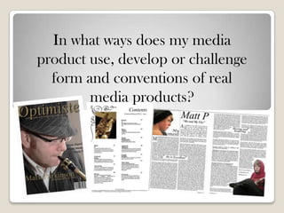
  • 1. In what ways does my media product use, develop or challenge form and conventions of real media products?
  • 2. Front cover-Masthead Convention My Product The first convention of a magazine is the My magazine has a conventional Masthead, It is at masthead, which is usually at the top of the the top of my magazine cover and spreads out across the page from left to right. The title of magazine. This is the title of the product and ‘Optimiste’ means in French to be optimistic indicates to the audience what the product and upbeat. As my target audience is a high- is called. The Name should connote the class group of people, I thought that using genre and content of the magazine, such as another language for the title would make it ‘Jazz Magazine’ which is all about Jazz seem more sophisticated and attract more of a higher-class audience. The font I have decided music. Furthermore this title masthead is to use is slab serif which means the text has conventionally larger than most of the other serifs on the ‘S, P and I’ which helps to create text on the page to attract its audience into the sense of an old-style, traditional magazine picking it up. The colours of this masthead which will appeal to a B , 40-55 year olds, unisex aspires who want to be ambitious into usually contrasts well with the background achieving something such as knowing the latest colour, text or the boost image which has music artists in the chosen genre and learning been used. more about the genre culture. The colour used a gold/brown colour which contrasted with the colour of the saxophone my model was holding in my boost picture. The fact that it contrasted with the boost image helped the cover to connote a sophisticated look Furthermore when looking at my cover, The masthead is significantly larger than everything else on the page, and is the focus centre apart from the boost image which I have used.
  • 3. Front cover- Cover Stories Convention My Product The majority of Music magazines, mainstream On my front cover, I challenged the conventions of a and independent use a large number of typical magazine by only using a few cover-lines. In cover stories to interest their audience into total I wrote 6 cover-stories and used no reversed out cover-lines , which were just names and simple picking up the magazine to read. Also the sentences such as ‘Music study’ and ‘Herp Alpert’ to use of reversed out cover-lines are also attempt to attract my audience. They are in a small used to stand out above the boost image list with font size of 14, so it is almost impossible to which also attracts the audience as it is read them without picking the magazine up. There different to the image. These are used to is main focus in the middle of the magazine which attract the audience to their magazine and relates to the boost image model. This is the one try to fit all the good information onto the cover-line which is larger than the others to cover in order to make more sales. reinforce the nature of a magazine and to connote a traditional magazine of the main focus point of the bigger cover line. I have used very few cover-lines to connote an older audience and that through my research, this type of audience do not particularly mind what is on the cover, but the content inside is more interesting and what matters to them most. The use of the simple sentences and names shows a sophisticated and mature audience because they are people who would look past the cover and the short cover-stories to what is actually inside the magazine.
  • 4. Front cover- Other Cover Content Convention My Product All magazines should have the date, price and My Magazine has again challenged the conventions of the other cover content. As stated, all a barcode on the front to indicate how magazines have the price, date and barcode on much it is and so it can be put through the the front, and mine is no exception. I have scanner at the till. A lot of other magazines priced my magazine at £3.99. This will appeal to a higher-class audience because they will also use screamers, pull-quotes, sell, potentially be able to afford this price and will splash and banners to attract their seem more stereotypical for them to pick up a audience. This connotes a mainstream more expensive magazine and seem above everyone than picking up a mainstream price of audience that that they are looking for £1.99. I have also included a barcode which is what is on the front before they buy, an situated at the bottom of the page which is a conventional situation as when it is on the example of this is a younger audience who shelf, the barcode is hidden and the audience look to see what is on the front to see what can see the more important aspects of the is inside, and if the cover is not interesting magazine. Furthermore I have not included any screamers, Sells or splashes to my cover as My enough then they will not pick it up or buy audience, from research shows that they are it. more interested into the content of the magazine and not what is on the cover. However a few cover-lines, such as ‘ Mark P’ (as I have included) will give them a brief idea of what to expect inside.
  • 5. Front cover- Boost Image Convention My Product A Boost image is the main For my magazine i have used a pull page image of my model, Mark which spreads a variety image which is seen on the amount of messages out to my target audience. The use of the glasses are natural as cover of the magazine he naturally needs them to see and also match which usually fills up the well with the other colours in the image. The use of the hat shows the ideology of a whole cover and represents stereotype of a Jazz artist. The image has not be altered or photo-shopped, sp the detail of one of the main aspects the the skin is all natural, which connotes an honest Magazine which is not interesting in the magazine covers and writes way the artists who feature in in look. The upon. These images are Magazine is about the talent and music and not how they look. The use of the Saxophone prop usually stereotypical of the shows a stereotypical look at the Jazz genre as this is the instrument which is most associated person or of the genre of with this genre. However In my double page spread, I challenge these instruments by using magazine and are often a ukulele as the main instrument used by the thought of role models for artist, which is something you would not normally see in this type of magazine and people. incorporate it within the genre of Jazz. Through my research I noticed that a considerable amount of models in boost pictures use direct contact to engage with the audience. I used a different approach with a indirect contact with the audience. The soft eyes and the fact he is not looking into the camera makes the magazine look less intimidating
  • 6. Contents Page- Numbers Convention My Product Magazine contents pages I have written the page numbers traditionally have page fairly large so it is easier to see and read where each numbers by the side of article or page is. They are too the text to indicate the top right of each little where about in the section of text . They are size 9 font and cover up to pages magazine that 32, This connotes a traditional particular article or target audience who like everything to be traditional page is. The amount of and orginised in the correct pages in magazines order, which I have created so the page numbers go from the vary from styles and smallest at the front of the genres. magazine to the larger numbers at the back.
  • 7. Contents page- Text Convention My Product Contents pages have the main The main heading of each sub-heading of the page or article and then either a little article/page is a size 9 serif or no information about what font which connotes an older is on those pages, along with style which will attract an the page number. older audience. Furthermore the text underneath is significantly smaller and as i a targeting class B people, then I am sure they will consider reading this before they carry on throughout the magazine to engage in what is going to be in this issue.
  • 8. Double page- Images Convention My product Double pages usually have images to illustrate the text Within my double page spread I have used two which has been written, images of my model Matt. The first one is of whether it is of the artists or the side of his face with him looking straight into the distance wearing a wool hat. This is albums which they have been on a white background with the words ‘My promoting. Sometimes, Moment,’ which is promoting an album cover.’ magazines may have little The fact that he is looking straight into the distance connotes the seriousness of the images of the writer who music which he creates and that he is aiming wrote the article which is a for a higher-class audience to enjoy his good technique to use for music. Although he is male, he is not gender recognition and if the audience specific. The pieces he creates attract both males and females and are liked by both like the piece then they will go genders. The second image is of Matt sat back to them to read more of down holding the instrument which the article their work. is about. The look on his face is very concentrated which further connotes how serious he is taking his music business. He is sat with his legs crossed which shows a relaxed approach and independent which connotes that it is what he likes to do and the way he is dressed also shows his independence as he does not like to follow the crowd.
  • 9. Double page- Columns and language Convention My Product Usually in magazines and I have written my article in particularly in newspapers four columns spreading the text is written in across the two pages columns across either the which shows a more professional look as it one or two pages. The looks more neat and font is rather small which easier to read. The allows the writers to write language i have used is of significant amounts of a higher standard which text. The language used connotes a more in magazines varies from sophisticated, higher-class the type of magazine and audience who will be able the audience it is aimed to follow the more mature language which is suitable at. for this type of magazine.
  • 10. How does my cover look like a real magazine? My magazine cover of ‘Optimiste’ Looks like a real magazine in many ways. I feel there is a gap in the market for an upper-class music magazine for this genre as alot of them are mainstream and look cheaply sold with a price below £2.50. The use of a saturated image shows a more sophisticated cover which will appeal to my target audience as it looks more mature and connotes a more upmarket audience. The price of which i have chosen also furthers the ideology of a higher-class audience as they will be able and more willing to pay the higher price as they potentially will have the money too. Furthermore the use of cover-stories on the front give the audience an idea of what is in the magazine which may influence then to buy the magazine.
  • 11. How does my Contents look like a real magazine? As a typical magazine would I have also included one main feature, my magazine has a list picture, so it is easy to look at of all the aspects in which my and read. As I aim to target magazine features, such as more higher-classed people, I articles with artists, and felt that one picture was festival tours. The contents sufficient as then they could which I decided to write about read the rest of the page with are from research into the ease, rather than it being too genre and similar magazines to busy and filled with pictures the one I have created. Many and them not able to know mainstream and individual what is inside the magazine music magazines have a large which is what my target amount of articles, reviews and audience would rather look at interviews on artists which i and read. I have also included have included and furthermore the page numbers so it is easy festival dates of the less to locate where each feature is popular festivals which would easily. This connotes an only appeal to these types of organised feel which is easy to people. use and to locate the different articles and pages within the magazine.
  • 12. How does my Double page look like a real magazine? I have arranged my double page Buy the album. Typically in a spread in columns, with text at higher-class audience aimed 8pt which is typically found in magazine, you would normally magazines as it allows more find the older generation writing and information to be artists featured in there. I placed on the pages. I have have challenged this included two images, one of convention by writing about a which is an album cover of the 14 year old boy. The article artist I am writing about which shows that it is not about your is illustrating a new album age which should prevent your which he is bring out. Normally target audience for the music in a magazine an article is you are creating come after either about the artist or your age. The type of music promoting their new album. I the artist i wrote about shows have challenged these that he is alot more mature for conventions by writing about his age and knows what he is both the artist and the album doing and who he is targeting, which works well as because he which is something who many is young, people may want to artists do not know. know about him before they
  • 13. How is it recognisable as belonging to my Jazz sub-genre? The main aspect which allows my magazine to be recognised as a Jazz genre is the use of the stereotypical instrument of the saxophone, used by my model in my front cover boost picture, and as a prop for my contents page image. The fact that the article for my double page spread is about a ukulele which is often thought to be associated with Folk music, challenged the stereotypical view on this genre i have chosen. It is allowing new people to come up with new ideas to involve other instruments in other genres.
  • 14. Have you done anything to challenge the conventions of a existing Jazz Magazines? I have challenged a few of the conventions of my researched existing magazines. The first convention which I have challenged is the amount of cover-stories on the cover. Existing magazine covers are filled with cover-stories to try and engage the audience. I have taken a different approach with this convention, I have opposed the traditionalist of cramming the cover with all the good stories which are inside my magazine and replaced them with a few names/simple statements such as ‘Music Study.’ as I have mentioned before, this is because the audience who I am targeting are not really interested in what information is on the front, but it is what is in the magazine and the written information which will really interest them. Furthermore I have challenged the convention of using a unfamiliar instrument for this particular genre in my magazine. The usual instrument you would expect to see is the traditional saxophone which is widely associated with the genre of Jazz. I have challenged this by writing about a Ukulele in my double page spread which is a musical instrument you would not expect to find in a magazine like this. I have told the story about a boy who has used this instrument and incorporated it into his own compositions to crate jazz which is well liked by the audience.
  • 15. This quote works well with my magazine as I have incorporated a new idea into my magazine by writing about something which has not yet been brought forward into the music business. No artist in the genre of Jazz has used a Ukulele in a Jazz composition, and with Matt doing so have evolved the Jazz genre more and made it more broad with it using new instruments to create its sounds. “Genres are not static but shifting and slippery, evolving over time”