Human population growth over time: A visual analysis
•
4 likes•3,737 views

The document discusses how world population has changed over time from 1 CE to projected estimates in 2300. Rather than showing population changes through traditional line graphs, it presents population density through a series of maps where country sizes are exaggerated based on population. The maps from different time periods like 1 CE, 1500, 1900, 1960, 2050 and 2300 demonstrate how human populations have expanded globally over the centuries and are projected to continue increasing substantially.

Recommended
More Related Content
Viewers also liked
Viewers also liked (20)
Similar to Human population growth over time: A visual analysis
Similar to Human population growth over time: A visual analysis (20)
More from Nigel Gardner
More from Nigel Gardner (19)
Recently uploaded
Recently uploaded (20)
Human population growth over time: A visual analysis
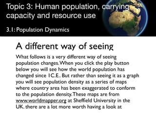
- 1. Topic 3: Human population, carrying capacity and resource use 3.1: Population Dynamics A different way of seeing What follows is a very different way of seeing population changes. When you click the play button below you will see how the world population has changed since 1C.E.. But rather than seeing it as a graph you will see population density as a series of maps where country area has been exaggerated to conform to the population density. These maps are from www.worldmapper.org at Sheffield University in the UK. there are a lot more worth having a look at
- 2. Topic 3: Human population, carrying capacity and resource use 3.1: Population Dynamics
- 3. Topic 3: Human population, carrying capacity and resource use 3.1: Population Dynamics But it is not the only way
- 4. Topic 3: Human population, carrying capacity and resource use 3.1: Population Dynamics Year 1
- 5. Topic 3: Human population, carrying capacity and resource use 3.1: Population Dynamics 1500
- 6. Topic 3: Human population, carrying capacity and resource use 3.1: Population Dynamics 1900
- 7. Topic 3: Human population, carrying capacity and resource use 3.1: Population Dynamics 1960
- 8. Topic 3: Human population, carrying capacity and resource use 3.1: Population Dynamics 2050
- 9. Topic 3: Human population, carrying capacity and resource use 3.1: Population Dynamics 2300
- 10. Topic 3: Human population, carrying capacity and resource use 3.1: Population Dynamics Create by N Gardner www.sciencebitz.com using information from www.worldmapper.org Worldmapper maps are licenced under a Creative Commons Licence. © Copyright 2006 SASI Group (University of Sheffield) and Mark Newman (University of Michigan).