
Recommandé
Contenu connexe
Tendances
Tendances (20)
Similaire à The 17 Graphic Design Tips All Non Designers Need to Know
Similaire à The 17 Graphic Design Tips All Non Designers Need to Know (20)
Plus de Ram Chary Everi
Plus de Ram Chary Everi (20)
Dernier
Dernier (20)
The 17 Graphic Design Tips All Non Designers Need to Know
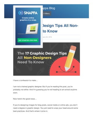
- 1. Snappa Blog ≡ Menu I have a confession to make… I am not a trained graphic designer. But if you’re reading this post, you’re probably not either. And I’m guessing you’re not heading to art school anytime soon. Now here’s the good news… If you’re designing images for blog posts, social media or online ads, you don’t need a degree in graphic design. You just need to wrap your head around some best practices. And that’s where I come in. The 17 Graphic Design Tips All Non- Designers Need to Know Christopher Gimmer Last updated: March 29, 2016
- 2. In this post, we’ve put together 17 graphic design tips that all non-designers need to know. If you follow them, you’ll be well on your way to producing awesome graphics for all of your online needs. 1. Start with a great color palette Ever notice that the best designs tend to have beautiful colors? That’s no accident. Choosing a great color palette is one of the keys to a great design. Now before you cringe at the thought of choosing your own colors, you don’t have to. Using a site like ColourLovers will give you access to millions of beautiful color palettes. Just find a hex code you like, and use it in your design. Here are some great resources for finding color palettes: Pigment by Shapefactory Coolors Adobe Color If you’re looking for more color scheme ideas, check out our detailed list of resources for color palette inspiration!
- 3. 2. Don’t get carried away with fonts Ideally, you want to limit yourself to 1 or 2 fonts. This keeps you from having to worry about tons of font combinations. If you’re going to use multiple fonts, use one for the header and another for the body. 3. Have a “Swipe File”
- 4. This term comes from the copywriting world, but it’s equally applicable here. A “Swipe File” refers to instances of good copy that copywriters see. In our case, it’ll mean instances of good design that you see. Take those examples, store them somewhere (your computer, dropbox, etc.) and then bring them back when the time’s right. Provided you don’t rip off someone else in their entirety, there’s no shame in borrowing a little design brilliance. If you’re designing images for Facebook ads, you might want to check out the AdEspresso Facebook Ad Gallery. You can also checkout design sites like Dribbble and Behance. 4. Don’t be afraid to blank out No, not blank out in the sense of spacing out. Rather, don’t be afraid to leave blank, white space in your design. Sometimes, as they say, less really is more. Often designs get so cluttered that some white space with nothing occupying it will actually enhance the design. This may call for a bit of a mental adjustment on your part. But with the right change, you can use this simple concept to jump past seemingly “expert” designers. If you want a lesson in how to utilize white space, look at any marketing image created by Apple.
- 5. 5. Align your objects This helps to keep design elements in a presentable order, regardless of their differing sizes. Proper alignment is an easy way to give your images a sophisticated and professional look. When dragging items in Snappa, grid lines will automatically appear making it super easy to line up objects. 6. Use icons to support your message
- 6. Icons are like black pepper. They can be sprinkled on top of whatever design you’re cooking up. And the icons will add extra spice to your design, ensuring that it “tastes” great. We use icons quite extensively to reinforce the content of our blog posts. And if you want to learn from the masters, check out the Helpdesk blog for some more inspiration. 7. Follow your own design rules Rules, what rules? The ones you set for yourself. These probably won’t be specific rules. But rather cases across your design where you use a particular set of colors, lines, textures, etc. If you’re set on that choice, don’t turn around and do something contrary to it. Stay consistent with your “design rules”, to ensure consistency in your image overall. 8. Rinse and repeat If you’re working with multiple designs across an ad campaign, website, or other project – it may be easiest for you to just rinse and repeat. That is, copy your design and then just swap out the elements you need changed. That ensures the format is the same, even as you change the content.
- 7. 9. Use font variants You can add plenty of variety, while still keeping things feeling consistent. The key is to use text from a single font “family”. An example of a font “family” would be Arial which has the basic Arial font, along with variants like Arial Black, Arial Narrow, and Arial Rounded MT Bold. These fonts all look different. Yet there is enough of a common thread between them that it will give a sense of consistency when used together in designs. 10. Take full advantage of contrasts Using contrasts helps to add “attitude” to your design, as well as make certain elements stand out. There are plenty of ways to generate contrasts too. You could use contrasting colors, fonts, or even contrast amounts of space between items in your design. Think about it in a real world context too and you’ll see why this makes sense. A seven foot tall person (wrestler Andre the Giant, for example, or basketball player Yao Ming) get attention because they contrast with the general population. The same holds for contrasting elements in your design. If you want to identify which colors contrast, use a color wheel like Adobe Color.
- 8. 11. Use a line (or two) to create a sense of order Lines help to anchor items in an image and create the sense that there is an overall order. Use lines in your image by putting them around blocks of text – there by anchoring the text. You can also put lines as “separators” between various elements in the image. In this latter case, the sense of elements being separated furthers the feeling of planning and coordination in the design.
- 9. 12. Plan your design We put this tip mid-way through the list of tips to mirror where planning usually falls in most people’s graphic design process. Rather than having planning as the first essential step, the average non-designer only begins to think seriously about their plans for a design AFTER they’re well into the design process. The planning stage doesn’t need to be long. In fact, it can just be a minute or two. But if you know what you want to accomplish before you start designing, you’ll get things done much quicker. 13. Add text over images by adjusting brightness levels When your design involves putting text over images, adjust the brightness level of the background image or add a color overlay. This way the background image will offset the color of the text, causing the text to be readable and the design to still look clean and clear. You can easily turn quotes into graphics with our free online quote maker!
- 10. 14. Carefully structure your body copy Whenever you have a body of text (i.e. paragraphs), each line should have no more than approximately 30-40 characters. That includes spaces too, so choose carefully. If you exceed this approximate length, you run the risk of sentences becoming hard for readers to get through. And any shorter, and your lines of text begin to resemble Tetris pieces, falling carelessly in an erratic stream. 15. Think about who you’re designing for Unless this is purely for your own personal enjoyment, you’re probably designing for a specific audience. Never forget that “who” that you’re designing for. This ensures you create something that the intended audience for your design actually wants to see and something they’ll react favorably to. Context matters here. A dark, dingy, even creepy looking design – for example – wouldn’t be the sort of thing that you’d want to have on a website for an upscale, expensive product. The same would be true for example, with a design that feels too “childish” (in its light colors, use of squiggly lines, cartoons, etc.) for a mature adult audience. 16. Let form follow function As much as you’ve heard it said, it’s still undeniably true – form follows function. So make sure you know the function of your design. Knowing that you’ll be able to more easily come to a form that works. You’ll have a better sense of what belongs in the design and what doesn’t. A splash page, for example, that’s designed to only collect emails in the run-up to a launch probably doesn’t need a carousel with images. When we had our initial sign-up period – we didn’t use items that complicated our initial website. Rather, we tailored the form of the site to its function – which was getting people’s
- 11. emails. These great design examples also utilized this rule to increase conversion rates and improve user experience. All of this comes down to knowing the “why” of your design. And thinking carefully as well. 17. Keep it simple Have you ever seen a movie – superhero movies and scifi epics come to mind – that has too many special effects. Too many explosions, speeding spaceships, giant robots, and so on. Eventually the special effects just blur together and mute out most of what’s going on elsewhere in the movie. (We’re looking at you, Transformers.) It’s the same with your design. If you overdo it with too many special effects like shadows and tint gradients, you’ll quickly move toward a bloated and aesthetically muted image. You can still use some design “special effects”. But sprinkle them by the handful onto your design, as you might with a bit of balsamic vinegar on a salad. Too much balsamic and it negates the salad. And too many special effects and it negates the rest of your design.
- 12. Conclusion As you can see, graphic design doesn’t have to be hard. Just follow these 17 tips and you’ll be well on your way to producing great images online. About the author: Christopher is the co-founder of Snappa. He writes about social media, marketing and entrepreneurship. PREVIOUS POST: RESOURCE PAGE LINK BUILDING: THE DEFINITIVE GUIDE NEXT POST: 21+ MUST-READ DIGITAL MARKETING GUIDES: GET A MARKETING MBA FOR FREE Image Sizing Guides Etsy Banner Size Facebook Ad Dimensions Facebook Cover Photo Size Facebook Event Photo Size Facebook Group Photo Size Instagram Ad Dimensions Instagram Profile Picture Size Instagram Story Dimensions SoundCloud Banner Size Twitch Banner Size Twitch Offline Banner Size Twitch Panel Size Twitter Header Size
- 13. WordPress Featured Image Size YouTube Channel Art Size YouTube Profile Picture Size YouTube Thumbnail Size Featured Articles 21 Amazing Sites With Breathtaking Free Stock Photos The 17 Graphic Design Tips All Non-Designers Need to Know How to Increase Time on Site With Custom Graphics