Good Exemplification Essay Topics. Exemplification essay ideas. 100 Best Exe...
Assignment 9-4 Interpretive Sign Designs
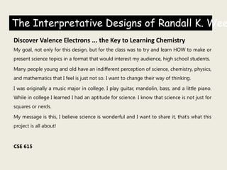
1. The Interpretative Designs of Randall K. Wee
Discover Valence Electrons ... the Key to Learning Chemistry
My goal, not only for this design, but for the class was to try and learn HOW to make or
present science topics in a format that would interest my audience, high school students.
Many people young and old have an indifferent perception of science, chemistry, physics,
and mathematics that I feel is just not so. I want to change their way of thinking.
I was originally a music major in college. I play guitar, mandolin, bass, and a little piano.
While in college I learned I had an aptitude for science. I know that science is not just for
squares or nerds.
My message is this, I believe science is wonderful and I want to share it, that’s what this
project is all about!
CSE 615
2. 1st Design – Just Electrons
I knew what I wanted to say, I just
didn’t know how to say it.
I went looking on the internet and I
really thought I had found something
special when I came up with these.
Amazing how much my thinking has
changed looking back.
I just wanted to talk about the
importance of electrons .
3. 2nd Design
Here, I used the guy with thumbs up
trying to appeal to the high school
guys.
The Cool Cat, by ‟The Name’s Bond”
was another try at appealing to the
humor of the high school student.
The little atomic guys are exchanging
electrons, not bad but kind of corny
now.
I thought the students might like the
humor overall.
4.
5. This page of designs were breakthroughs for me, especially the Earth poster. I
did several modified versions.
The poster Valence Electrons (top center) doesn’t really connect the words
and picture. I was trying the different fonts and color with photoshop, I was
just experimenting …. having fun!
The two posters one on the far right and bottom center became main ideas
for me. By now I am using photoshop and loving life.
6.
7. Finally, started getting somewhere. Using photoshop I tried to create
various posters that I had interest in, like coffee and guitars.
I think the guitar poster is my favorite project, personally, that I did this
quarter. I have an old 1950 Martin D-18 and turning the case into an
outline I even had to drawback-in some of the structure that photoshop
removed, it was FUN!
The coffee idea was rewarding. I liked learning how to put the text in,
matching the color scheme, align it correctly. It was fun putting texture
to the poster….the grainy look!
The Want to Understand Valence Electrons is one of my favorites…..so
far.
Frontier Science was my take on a poster presentation to appeal to the
interest of middle school and high school students.
8.
9. My final design is a summary of my thoughts and what I wanted to say.
I had difficulty with alignment initially so I think in that area this poster
came a long ways.
Using the right TYPE is such a challenge. I tried many, many fonts and
finally resolved to use Segoe Script. I’m sure this will get better with
time and application.
Each picture in the top two rows have nice thin white borders, I
learned that from our Design Portfolio, writing comments.
My title statement ‟Discover Valence Electrons ... the Key to Learning
Chemistry” is so true, it talks to me, that’s the name of my project.
Summarizing the poster is a quote by Albert Einstein, ̏if you can’t
explain it simply, you don’t understand it well enough.”
This poster does and says what I wanted to say.