SlideShare a Scribd company logo
1 of 1
Once is Enough- using responsive web design to fit on any screen
                                         http://once.atyourlibrary.com                                                                                                                                                                   Roy Degler, Oklahoma State University


                                                                                                                                                   !
                                                                                                                                                                                                                                                                              Just to help you understand*


                                                                                                                                                 #
                                                                                                                                                                                 Since building from scratch takes too long
   Using responsive web design to fit on any screen

                                                                                                              @
                                                                                                                                                                                 let me introduce my friend- Yeti, from                                                       and appreciate Foundation,


                                                                                                            %
                                                                                                                                                                                 Zurb.com, to tell you about FOUNDATION.                                                      I am going to show you 2 things.
                             The world was just zipping along                                                                                                                                                                                                                         Grids & Tabs
                             on the information highway.                                                                  Art by S
                                                                                                                                   ean Fortney

                                                                                                                                                                                                                                                                                        More examples:
                                                                                                                    I don’t have time
                             Libraries were building usable
                             and functional websites*                                                               to maintain all                                              Foundation is a complete
                                                                                                                    these sites ! !
                                                                                                                                                                                                                                                                                        once.atyourlibrary.com
                             for our patron’s desktops.                                                                                                                          responsive design
                                                                                                                                                                                 framework built
                                                                                                                                                                                 by the developers at
                                                                                                                                                                                 ZURB.com
                                    *Internet Explorer is whole another issue!!!      Meanwhile, great minds* were working...                                                                                                                                                 *If you have any questions just ask
                                                                                                                                                                                                                                                                              the guy with the dumb look on his face.

   Suddenly , there was                      Ok, I’ll just make a simple              “Responsive web design offers an alternative. By marrying
                                             mobile site for smartphones!             fluid, grid-based layouts and CSS3 media queries, we can                                                Since this is a comic*, I can’t show     Grid Structure
   a whole new world!                                                                 create one design, that, well, responds to the shape of the
                                                                                                                                                                                              you everything about Foundation.          Using Foundation 3 code. <div class=”row”>
                                              Tap
                                                                                                                                                                                              But I’ll tell enough to get started       Notice the use of English!!   <div class=”twelve columns”>
                                                    Tap
                                                                                                    display rendering it.”                                                                    and show how easy it is.
                                                    Tap
                                                                                                                                                 Ethan Marcotte                                                                                                                   BLUE
                                                                                                                                                                                                                                                                            </div>
                                                                                                                                                                                                                                                                        </div>
                                                                                                                                                                                                                                                                        <div class=”row”>
                                                                                                                                                                                                                                                                             <div class=”eight columns”>
                                                                                                                                                                                            First download Foundation
                                                                                                                                                                                                                                                                                  GREY (more examples)


                                                                                                                   @
                                                                                                                               Media queries                                                from Zurb.com. Just use this                                                     </div>
                                                                                                                                   allow the page to use                                    QR code**                                                                        <div class=”four columns”>
                                                          Cool I’ll just make                                                      different CSS style rules based                                                                                                                RED
                                                          another site for tablets!                                                on characteristics of the device.                                                                                                         </div>
                                                                                                                                        (e.g. smartphone vs. desktop).                                                                                                  </div>
                                              Tap
                                                    Tap

                                                    Tap


                                                                                                                               Fluid Grids using Rows and
                                                                                                                                   Columns based on percentages                                                                         Tabs
                                                                                                                                   combined with Media Queries                                                                            <dl> for tabs
                                                                                                                                   to adjust size and position for                        *He doesn’t know it is really a poster.                                        <dl class="tabs contained">
                                                                                                                                                                                                                                          <ul> for content                 <dt>Search</dt>
                                                                                                                                   the viewing device.                                   **I bet you did not know Yetis spoke QR!
                                              Crap, they keep introducing                                                                                                                                                                 Converts for mobile!             <dd class="active"><a href="#books">Books</a></dd>
                                                                                                                                                                                                                                                                           <dd ><a href="#articles">Articles</a></dd>
                                              new things and making all                                                                                                                                                                                                  </dl>
                                              kinds of changes!                                                                Scalable Images                           Special Note-
                                              Tap                                                                                 Images are resized using CSS,              There are several ways to get Foundation:                                                   <ul class="tabs-content contained">
                                                    Tap
                                                                                                                                  Javascripts, and Media Queries.               Standard CSS                                                                               <li class="active" id="booksTab">Book Search</li>
                                                    Tap
                                                                                                                                                                                Custom CSS (enter your colors)                                                             <li id="articlesTab">Article Search</li>
                                                                                                                                                                                                                                                                         </ul>
                                                                                                                                                                                SASS (for the more advanced)
                                                                                      *Check out these great books: Responsive Web Design by Ethan Marcotte                                     Foundation 4 supports IE9 and above.
*On June 29, 2007 the iPhone was released.                                                                                                                                                      Foundation 3 supports IE8 and above
                                                                                                         and Mobile First by Luke Wroblewski

More Related Content

More from Roy Degler

OSU Star Party Feb 13 2013
OSU Star Party Feb 13 2013OSU Star Party Feb 13 2013
OSU Star Party Feb 13 2013Roy Degler
 
OSU Library Resources
OSU Library ResourcesOSU Library Resources
OSU Library ResourcesRoy Degler
 
Peer Training 11-1-2012
Peer Training 11-1-2012Peer Training 11-1-2012
Peer Training 11-1-2012Roy Degler
 
D2l to LibGuides
D2l to LibGuidesD2l to LibGuides
D2l to LibGuidesRoy Degler
 
Beginning LibGuides
Beginning LibGuidesBeginning LibGuides
Beginning LibGuidesRoy Degler
 
Libguides: user perceptions, expectations and satisfaction
Libguides: user perceptions, expectations and satisfactionLibguides: user perceptions, expectations and satisfaction
Libguides: user perceptions, expectations and satisfactionRoy Degler
 
Size Doesn't Matter
Size Doesn't MatterSize Doesn't Matter
Size Doesn't MatterRoy Degler
 

More from Roy Degler (10)

Cope
CopeCope
Cope
 
My scheduler
My schedulerMy scheduler
My scheduler
 
OSU Star Party Feb 13 2013
OSU Star Party Feb 13 2013OSU Star Party Feb 13 2013
OSU Star Party Feb 13 2013
 
OSU Library Resources
OSU Library ResourcesOSU Library Resources
OSU Library Resources
 
Peer Training 11-1-2012
Peer Training 11-1-2012Peer Training 11-1-2012
Peer Training 11-1-2012
 
D2l to LibGuides
D2l to LibGuidesD2l to LibGuides
D2l to LibGuides
 
Beginning LibGuides
Beginning LibGuidesBeginning LibGuides
Beginning LibGuides
 
Libguides: user perceptions, expectations and satisfaction
Libguides: user perceptions, expectations and satisfactionLibguides: user perceptions, expectations and satisfaction
Libguides: user perceptions, expectations and satisfaction
 
Size Doesn't Matter
Size Doesn't MatterSize Doesn't Matter
Size Doesn't Matter
 
Welcome week
Welcome weekWelcome week
Welcome week
 

Once is enough

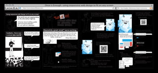
  • 1. Once is Enough- using responsive web design to fit on any screen http://once.atyourlibrary.com Roy Degler, Oklahoma State University ! Just to help you understand* # Since building from scratch takes too long Using responsive web design to fit on any screen @ let me introduce my friend- Yeti, from and appreciate Foundation, % Zurb.com, to tell you about FOUNDATION. I am going to show you 2 things. The world was just zipping along Grids & Tabs on the information highway. Art by S ean Fortney More examples: I don’t have time Libraries were building usable and functional websites* to maintain all Foundation is a complete these sites ! ! once.atyourlibrary.com for our patron’s desktops. responsive design framework built by the developers at ZURB.com *Internet Explorer is whole another issue!!! Meanwhile, great minds* were working... *If you have any questions just ask the guy with the dumb look on his face. Suddenly , there was Ok, I’ll just make a simple “Responsive web design offers an alternative. By marrying mobile site for smartphones! fluid, grid-based layouts and CSS3 media queries, we can Since this is a comic*, I can’t show Grid Structure a whole new world! create one design, that, well, responds to the shape of the you everything about Foundation. Using Foundation 3 code. <div class=”row”> Tap But I’ll tell enough to get started Notice the use of English!! <div class=”twelve columns”> Tap display rendering it.” and show how easy it is. Tap Ethan Marcotte BLUE </div> </div> <div class=”row”> <div class=”eight columns”> First download Foundation GREY (more examples) @ Media queries from Zurb.com. Just use this </div> allow the page to use QR code** <div class=”four columns”> Cool I’ll just make different CSS style rules based RED another site for tablets! on characteristics of the device. </div> (e.g. smartphone vs. desktop). </div> Tap Tap Tap Fluid Grids using Rows and Columns based on percentages Tabs combined with Media Queries <dl> for tabs to adjust size and position for *He doesn’t know it is really a poster. <dl class="tabs contained"> <ul> for content <dt>Search</dt> the viewing device. **I bet you did not know Yetis spoke QR! Crap, they keep introducing Converts for mobile! <dd class="active"><a href="#books">Books</a></dd> <dd ><a href="#articles">Articles</a></dd> new things and making all </dl> kinds of changes! Scalable Images Special Note- Tap Images are resized using CSS, There are several ways to get Foundation: <ul class="tabs-content contained"> Tap Javascripts, and Media Queries. Standard CSS <li class="active" id="booksTab">Book Search</li> Tap Custom CSS (enter your colors) <li id="articlesTab">Article Search</li> </ul> SASS (for the more advanced) *Check out these great books: Responsive Web Design by Ethan Marcotte Foundation 4 supports IE9 and above. *On June 29, 2007 the iPhone was released. Foundation 3 supports IE8 and above and Mobile First by Luke Wroblewski