
Recommended
More Related Content
What's hot
What's hot (20)
Similar to Katy perry ancillary task
Similar to Katy perry ancillary task (20)
More from rhsmediastudies
More from rhsmediastudies (20)
Recently uploaded
Recently uploaded (20)
Katy perry ancillary task
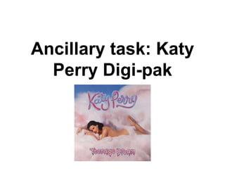
- 1. Ancillary task: Katy Perry Digi-pak
- 2. • Katy Perrys Digi-pak is for her album teenage dreams. The main frequently used images are from the music video from ‘California girls’. Throughout the album she is sexualised as she is presented as being naked, but does some innocence by her being surrounded by pink fluffy clouds in a surreal candy land. The surrealism also presents Katy as being upbeat, youthful and fun loving by the candy theme and pink clouds being consistent throughout the digi-pak and cd cover.
- 3. Front and back cover • The front cover has the name of the artist clearly printed at the top centre of the album and the name of the album just below the picture of Katy Perry. It also includes a advisory logo, this means that some songs may contain some exploit content. So this may be a way to attract a more teenage audience rather then younger audiences. • The back cover contains a track list of all her singles in capital letters so that it is easy for the viewer to read. The back cover also contains the company logo at the bottom right hand corner of the page telling us about who has produced the album and the other people involved in making it.
- 4. • The colours used throughout the Cd are house colours and are predominately pink,blue and red. This is so it correlates with he “California girls’ music video. The use of pale baby pink and blue colours, highlights the femininity and youthfulness, and this is what Katy Perry wants to come across as to her audience. The pastel colours also make the image of Katy Perry stand out, drawing the attention to her. • The design that is used throughout does reflect Katy as her pop genre is very feminine and energetic. The use if the font and design being pretty and cheerful and reflecting the idea of candy land by using red and white candy for the font, has connotations of a happy and cheerful personality, which is coming across though her digi-pak.
- 5. • The teenage dream digi-pak is very effective when promoting the artist. This is because she is prominent on the front cover so that the audience can immediately identify her wth her name above of her. She is also the main focus and is being represented in a seductive way. This can help grab the attention of males, which means she has a wider target audience. The title of the album is ‘Teenage dream” which sia also the name of one of her singles int he album. The pictures used are from the music video from her song ‘California girls’. This is a good use of synergy because it is good way to collaborate all her products and create a good brand image.
- 6. Ancillary Task: Katy Perry Website Analysis
- 7. • Before you are directed to the main website the first page that you see is completely used for promotional purposes. It mainly focuses on her advertising her new single, music video and movie DVD. This is a very effective and clever way to promote her products as it forces the viewer to notice these and have a look at this page before they can enter the main site. • There is also a direct link to the music video of her new single, making the video accessible without having the viewers have to search for it or go onto youtube, they can watch it straight from the site. • This is just an introductory page of the website, there is a clear and bold link to access the main website, where the audience are able to access all their desired information. • On the website are three very clear images of Katy Perry. Two being close ups, this isa conventional way to advertise her music. Close ups re a typical convention in pop genre, it isa wa to conch with the audience and grab the audience attention by enticing the audience to enter the full site . • The page is divided into 3 sections, the main part focusing on the movie release. This is a effective way to promote her product, they want it to be successful and get as many sales as possible, so this is a good way to promote the DVD. • The mise en scene is within he website is very interesting and colourful. There has been a lot of attention to detail, and draws viewers into the website. • The design f the website itself is very bright and colourful, which reflects and symbolises Katy Perry as an artist. Fans associate her with bright, emergent and pretty styles. So would be misleading to have the website in dull colours. It also follows the conventions of the pop genre well and encompasses the girly look as well. Ancillary task: Katy Perry website analysis
- 8. • This is the homepage of the website. It is very similar to the first page we see. It presents the same information but in a different layout. The use of this repetition, will reinforce the audience to want to purchase her products, by always having the option and by them being in your face. • Along the top of the website, clearly visible are links to er social media network sites. This gives people quick links to her Facebook, twitter, pintrest etc, if they wish to see what she does on a regular basis. It also has links which direct you to iTunes where you can listen to or purchase her songs. • The colour scheme is very similar to the first page. It includes bright/bold colours, which are used to jump out at the viewer and to make everything on the page car and send out. There is also a lot of information provided, but it presented in a very neat manner, making it easy tor had and easy for the audience to use. Audiences would not want a website which is difficult to use otherwise they would not be interested in it, so it is best to jeep it as simple yet effective as possible. • There is also an option on the page to sign up to receive Katy Perry’s new letters, if the information provided isn't enough for them. This is also an effective way for her management team to tainan insight about her fans, like what sort of things they like the they try to plan promotional strategies. • On the website there is an option for you to listen to her music for free, however you aren't able to download it for free. This is a way for her to audience to enjoy her website, but also to encourage them and is a strategic way for them to download the music onto their phones or iPods.
- 9. • Also on the website there is direct access to her twitter. This will terrier bridge the gap between Katy Perry and her fans. It also allows communication between the star and the fans to make them feel more important and significant to the artist life. • An important part when promoting the artist is trying to sell the merchandise. One of the first things on the homepage is link to her ‘store’ as well as pictures at the side showing her products sold. This would therefore be used as a way to draw potential customers in. • There is also a photo gallery on the website. This includes a variety of photos from music videos, tours and behind the scenes. This creates personal touch and allows the audience to connect with the artist, they believe that they know the star on a more personal level. Encouraging them to find out about what she is up to on a daily basis and look more into her website. • There is a use of quotes on the website, this is directly for the film, it s a effective way to persuade people to see the film as it shows off the films popularity and success. • The use of colourful decor again expresses the artists hubby nature and makes it look more appealing, especially to ‘girly girls’ who have more of a ‘sweet’ and ‘girly’ style. • Competitions are on offer with good prizes. For example meeting the the star herself. This will get more fans involved nd will therefore promote her movie more.