
Recommandé
Contenu connexe
Dernier
Dernier (20)
En vedette
En vedette (20)
3 Design takeaways for Navigating a menu while driving | AUTOUI 2013
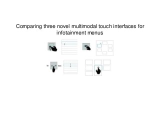
- 1. Comparing three novel multimodal touch interfaces for infotainment menus
- 3. “How can we use sound to improve the driving experience?” The “experience” is some combination of allowing the user to engage in secondary activities while always prioritizing safety.
- 5. The Goal Demonstrate a device that has the following qualities: Reduce the negative impact of secondary task on driving performance or total visual demand, At an acceptable cost for secondary navigation speed. How Compare them experimentally against common methods (i.e. direct touch) on a common task (i.e. menu navigation). The Study
- 6. 4 interfaces see them in action
- 7. Measuring.... - Driving Performance - Total Visual Demand - Speed of operating the menu see this in action While..... Selecting items which are either 1 – 3 levels deep in a hierarchical menu (same video as on previous slide)
- 8. Results
- 9. Serial Swiping had significantly better driving performance than the rest. (lowest deviation)
- 10. ...But under Direct Touch users were twice as fast to complete the menu operation task as all the others. 2 TIMES AS FAST!!!!! Best Driving Performance!!!!!
- 11. Total visual demand of the “visual based” Direct Touch screen was equal to that of the multimodal Serial Swipe. .` =
- 12. No significant differences in the distribution of glance lengths either, but definitely some longer looks
- 13. Gaze Percentage: Time Looking at the Interface / Total Task completion time.
- 14. Same total visual demand distributed over a much shorter amount of time = Worse Driving Performance
- 15. Results Part 2: Diving deeper
- 16. ~2.5 seconds ~1.25 seconds That’s an average of about 1~ second of waiting around before hitting the target. ~4 seconds ~4 seconds Users begin working immediately and in parallel to driving. Time To Complete while driving while not driving.
- 17. In the lane change task every ~10 seconds a command is sent. Often the user can execute a changing of the menu with little risk of missing a command.
- 18. but the story may change for multiple-step tasks. It is likely the results would not have been significant if multiple step tasks were not introduced.
- 19. no change in total task time between 2 and 3 step tasks! The willingness to commit such actions so speedily in succession is the real problem.
- 20. Users are either... Adding on one more step and not waiting at all between one of the steps or... waited on average less between each selection simply because they were given more work.
- 21. User’s exhibiting wonderful stair- case like sub-tasking. Compare to our winner:
- 22. Lessons Learned: 3 lessons for designing in the vehicle
- 23. Because Direct Touch is faster, the user may be tempted to fit more selections before the next command, 1. and maybe make a miss.
- 24. Lesson 1 Built in slowness may be beneficial. Afford returning eyes to the road ( a punctuated “staircase.”) winnerslosers
- 25. For direct touch, user’s eyes and hand are near the target after the first selection – making the subsequent selection easier to complete. Returning their hands and/or eyes to the wheel (i.e. the right thing to do) would result in more total effort. 2.
- 26. Don’t afford “shortcuts,” afford a “staircase.” Lesson 2 hint: slowness could accomplish this, but so could other things
- 27. For the GRUV prototypes, work is lost if you remove your hand from the touchpad. In other words, regaining your position is too difficult. It’s exactly the opposite for Serial Swipe, which does not require “starting over” when interrupted. 3.
- 28. Lesson 3 Afford interruption. Progress must not be lost if interrupted.
- 30. Discussion Question How could these principles be applied to context where safety should be considered when wearing Google Glass? 1. Built in slowness 2.Design out “shortcuts” 3. Design for interruption http://www.youtube.com/watch?v=IZdkIVS53Uw driving construction http://www.youtube.com/watch?v=yWK-Uinxn40
- 31. Discussion Question Can voice do it all? I’d argue no. In the following example, a user can choose up to 3 ways of doing the same thing. So then, how do you afford the “right mode switching” without suffering the costs of modes? http://www.youtube.com/watch?v=F-oE3ZzkqxY
- 32. Discussion Question Is the touchpad where it’s at – how can the touchpad realize its full potential ? http://www.youtube.com/watch?v=t3SpNJT88_o
Notes de l'éditeur
- As seen on google glass, siri, any
- auditorymenunav.tumblr.com/
- Auditory
- The direct touch condition was twice as fast - but had the same amount total amount of visual demand. Those in the direct touch condition participants were paying half as much attention to the road. A worse driving performance score (a higher average deviation from the ideal path) corroborated this story.
- The non-generic version of the “rabbit” (not just going to fast, but actually tryin gto fit two in before the next instruction)
- Leaving their hand in mid-air near the touchpad would also result in more total effort.
- One large target
- Clearly voice is good for when you know what you want ("play the new daft punk album," "give me directions to madison square garden") and that is completely where many different organizations are racing to monopolize in the vehicle. But….. voice can also be cumbersome or inappropriate socially when a more manual input is an option. (paginating through albums or radio station, as opposed to uttering "next…next") Also…. Sometimes information is BEST displayed visually (browsing for a good tune, choosing between routes based on traffic, etch…) In this case it may be more natural for users to finish an interaction manually/visually (as opposed to speaking "option 1") My question is then, Why Not voice? Is it important to still be able to navigate structurally through a menu? Is it fair to assume that if the first Am I wrong? How can we design stuff that gracefully has users switching between modalities without really knowing it, without having the inherent tax associated with "modes" (old school nielsen/norman stuff)? Basically, "designing around mode switching" This is really the space that interests me. I envision a black screen that trains you to most-often it stuff, and plays a specific tone to alert you to the visuals being apparent. Already it's very difficult because the visuals can't afford you to look at them immediately….