Layout manager
•Télécharger en tant que PPT, PDF•
8 j'aime•4,202 vues

In this presentation u will learn about layout manager that is used in java

Recommandé
Contenu connexe
Tendances
Tendances (20)
En vedette
Similaire à Layout manager
Similaire à Layout manager (20)
Plus de Shree M.L.Kakadiya MCA mahila college, Amreli
Plus de Shree M.L.Kakadiya MCA mahila college, Amreli (20)
Dernier
Dernier (20)
Layout manager
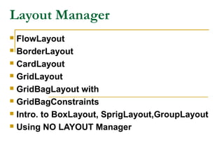
- 1. Layout Manager FlowLayout BorderLayout CardLayout GridLayout GridBagLayout with GridBagConstraints Intro. to BoxLayout, SprigLayout,GroupLayout Using NO LAYOUT Manager
- 2. Layout Manager The layout manager decides how the controls should be arranged or positioned within a container or a window. In java there is no such form designer, but you have to write the code to arrange the controls where you want them. A layout manager is an object of a class the implements the LayoutManager interface.
- 3. To set the layout following method is used: Void setLayout(LayoutManager obj) The obj is an object of the specified layout manager. If no layout manager is set by setLayout() method, the default layout manager is used which is the FlowLayout.
- 4. FlowLayout Class The FlowLayout is the default layout manager. If no layout manager is set by the setLayout() method, this layout is used to arrange the controls in a container. In FlowLayout manager, the components are arranged the from the upper-left corner to the right side edge of the container. When there is no space for the component, it is arranged from the next line. A little space is added between each component at all of the four sides.
- 5. Constructors FlowLayout() FlowLayout(int align) FlowLayout(int align,hspace, vspace) Alignment can be done by following FlowLayout.CENTER //is default FlowLayout.LEFT FlowLayout.RIGHT Hspace and vspace is the horizontal and vertical spaces between the components. The default space is 5 pixels from both horizontal and vertical.
- 6. Methods of FlowLayout public int getAlignment() Gets the alignment for this layout. Possible values are FlowLayout.LEFT, FlowLayout.RIGHT,FlowLayout.CENTER, Returns: the alignment value for this layout. public void setAlignment(int align) Sets the alignment for this layout. Possible values are FlowLayout.LEFT FlowLayout.RIGHT FlowLayout.CENTER Parameters: align - one of the alignment values shown above
- 7. public int getHgap() Gets the horizontal gap between components and between the components and the borders of the Container public void setHgap(int hgap) Sets the horizontal gap between components and between the components and the borders of the Container. public int getVgap() Gets the vertical gap between components and between the components and the borders of the Container. public void setVgap(int vgap) Sets the vertical gap between components and between the components and the borders of the Container.
- 8. Demo of FlowLayout Class
- 9. BorderLayout class A border layout lays out a container, arranging and resizing its components to fit in five regions: north, south, east, west, and center. Each region may contain more than one component, and is identified by a corresponding constant: NORTH, SOUTH, EAST, WEST, and CENTER. When adding a component to a container with a border layout, use one of these five constants.
- 10. Constructors public BorderLayout() Constructs a new border layout with no gaps between components. public BorderLayout(int hgap,int vgap) Constructs a border layout with the specified gaps between components. The horizontal gap is specified by hgap and the vertical gap is specified by vgap. hgap - the horizontal gap. vgap - the vertical gap. BorderLayout defines the following constants that specify the regions: BorderLayout.CENTER BorderLayout.SOUTH BorderLayout.EAST BorderLayout.WEST BorderLayout.NORTH
- 11. When adding components, you will use these constants with the following form of add( ), which is defined by Container: void add(Component compObj, Object region) Here, compObj is the component to be added, and region specifies where the componentwill be added.
- 12. Methods of BorderLayout public int getHgap() Returns the horizontal gap between components public void setHgap(int hgap) Sets the horizontal gap between components. public int getVgap() Returns the vertical gap between components. public void setVgap(int vgap) Sets the vertical gap between components.
- 13. Demo of BorderLayout Class
- 14. CardLayout The card layout has some special capabilities that other layout don’t have. The card layout creates a layout like the playing the cards. Assume more than one card on one another. Here, only the card on the top is visible at a time, but you shuffle the cards to see other hands. Same way, the CardLayout can switch among several panels.
- 15. The cards are typically held in an object of type Panel. This panel must have CardLayout selected as its layout manager. The cards that form the deck are also typically objects of type Panel. Thus, you must create a panel that contains the deck and a panel for each card in the deck. Next, you add to the appropriate panel the components that form each card. You then add these panels to the panel for which CardLayout is the layout manager. Finally, you add this panel to the main applet panel. Once these steps are complete, you must provide some way for the user to select between cards.
- 16. One common approach is to include one push button for each card in the deck. When card panels are added to a panel, they are usually given a name. Thus, most of the time, you will use this form of add( ) when adding cards to a panel: void add (Component panelObj, Object name); Here, name is a string that specifies the name of the card whose panel is specified by panelObj.
- 17. Constructors public CardLayout() Creates a new card layout with gaps of size zero. public CardLayout (int hgap,int vgap) Creates a new card layout with the specified horizontal and vertical gaps. The horizontal gaps are placed at the left and right edges. The vertical gaps are placed at the top and bottom edges. Parameters: hgap - the horizontal gap. vgap - the vertical gap.
- 18. Methods of CardLayout public void first (Container parent) Flips to the first card of the container. public void next (Container parent) Flips to the next card of the specified container. If the currently visible card is the last one, this method flips to the first card in the layout. public void previous (Container parent) Flips to the previous card of the specified container. If the currently visible card is the first one, this method flips to the last card in the layout. public void last (Container parent) Flips to the last card of the container. public void show (Container parent,String name) Flips to the component that was added to this layout with the specified name, using addLayoutComponent. If no such component exists, then nothing happens.
- 19. public int getHgap() Gets the horizontal gap between components. Returns: the horizontal gap between components. public void setHgap(int hgap) Sets the horizontal gap between components. Parameters: hgap - the horizontal gap between components. public int getVgap() Gets the vertical gap between components. Returns: the vertical gap between components. public void setVgap(int vgap) Sets the vertical gap between components. Parameters: vgap - the vertical gap between components.
- 20. Demo of CardLayout using JFrame Demo of CardLayout using Panel Demo of CardLayout using Panel
- 21. GridLayout The GridLayout class creates a layout which has a grid of rows and columns. The GridLayout class is a layout manager that lays out a container's components in a rectangular grid. The container is divided into equal-sized rectangles, and one component is placed in each rectangle.
- 22. Constructors public GridLayout() Creates a grid layout with a default of one column per component, in a single row. public GridLayout (int rows,int cols) Creates a grid layout with the specified number of rows and columns. All components in the layout are given equal size. One, but not both, of rows and cols can be zero, which means that any number of objects can be placed in a row or in a column. public GridLayout (int rows,int cols,int hgap,int vgap) Creates a grid layout with the specified number of rows and columns. All components in the layout are given equal size. rows - the rows, with the value zero meaning any number of rows cols - the columns, with the value zero meaning any number of columns hgap - the horizontal gap vgap - the vertical gap
- 23. Methods public int getRows() Gets the number of rows in this layout. public void setRows (int rows) Sets the number of rows in this layout to the specified value. public int getColumns() Gets the number of columns in this layout. public void setColumns (int cols) Sets the number of columns in this layout to the specified value. public int getHgap() Gets the horizontal gap between components. public void setHgap (int hgap) Sets the horizontal gap between components to the specified value. - public int getVgap () Gets the vertical gap between components. public void setVgap (int vgap) Sets the vertical gap between components to the specified value.
- 24. Demo of GridLayout with JFrame Demo of GridLayout with JApplet
- 25. GridBagLayout The GridBagLayout is very flexible layout manager. It is an extension of GridLayout that provides some more features than the GridLayout. In the GridLayout all the cells have same height and width which is not necessary in the GridBagLayout. Here, you can have cells of arbitrary width and height. This can be done by specifying constraints. To specify constraints you have to create an object of GridBagConstrains.
- 26. Position, size, and properties of components are determined by setting the GridBagConstraints of the GridBagLayout to particular values before the component is added to the container. GridBagConstraints specify: 1. Location and size of the component on the grid. 2. Position and size of the component within the rectangular region specified in 1. 3. Behavior of the component and its region when the container is resized.
- 27. Steps for Using a GridBag 1. Create a GridBagLayout object, say gbl, and set it to be the layout manager of the Container. GridBagLayout gbl = new GridBagLayout(); setLayout(gbl); 2. Create a GridBagConstraints object, say gbc, and provide values for its public instance variables for each Component, in turn, to be placed on the Container. GridBagConstraints gbc = new GridBagConstraints(); 3. Place component using gbl.setConstraints (component, gbc); add(component); or add(component, gbc);
- 28. Instance variables that you can set to GridBagConstraints gridx and gridy girdx specifies the horizontal position and gridy specifies the vertical position of the component. The left most components have the gridx=0 and the upper most components have the gridy=0. The default value is GridBagConstraints.RELATIVE which places the components just right to the previously added component for gridx and just below to the previously added component for gridy.
- 29. gridwidth and gridheight The gridwidth specify the width and gridheight specifies height of the cell in number of rows and number of columns respectively. The height and width is in number of cells and not in pixels. The default value is 1 for both. fill It specifies what to do Its valid values are:if the component’s size is larger than the size of the cell. GridBagConstraints.NONE: default value
- 30. GridBagConstraints.HORIZONTAL it changes the width of the component to fit in the cell. It does not change the height of the component. GridBagConstraints.VERTICAL it changes the height of the component to fit in the cell. It does not change the width of the component. GridBagConstraints.BOTH it changes both height and width of the component to fit in the cell.
- 31. ipadx and ipady They specifies the internal padding of the component means it specifies that how many space will remain around the component in the cell. the ipadx specifies the horizontal space and the ipady specifies the vertical space in pixels. The default value is 0 for both. weightx and weighty The weightx and weighty specify the horizontal and vertical space between the edge of the container and the cells respectively. The default value is 0.0
- 32. int anchor Tells where the component is positioned in its allocated region, one of CENTER, NORTH, EAST, SOUTH, WEST, NORTHEAST, SOUTHEAST, SOUTHWEST, or NORTHWEST. Default: CENTER
- 33. Demo of GridBagLayout
- 34. BoxLayout The BoxLayout is a general purpose layout manager which is an extension of FlowLayout. It places the components on top of each other or places them one after another in a row. Constructor public BoxLayout(Container obj, int axis) Creates a layout manager that will lay out components along the given axis. obj – is the object of a container such as panel. axis - the axis to lay out components along. BoxLayout.X_AXIS, BoxLayout.Y_AXIS, BoxLayout.LINE_AXIS or BoxLayout.PAGE_AXIS
- 35. There are four axis: public static final int X_AXIS Specifies that components should be laid out left to right. public static final int Y_AXIS Specifies that components should be laid out top to bottom. public static final int LINE_AXIS it places the components in a line, one after another public static final int PAGE_AXIS It places the components like stack. On the top of each other.
- 36. Demo of BoxLayout
- 37. Spring Layout The Spring Layout is a very flexible layout that has many features for specifying the size of the components. You can have different size rows and/or columns in a container. In Spring Layout you can define a fixed distance between the left edge of one component and right edge of another component.
- 38. public SpringLayout() Constructs a new SpringLayout. void putConstraint (string edge1,component obj1,int distance, string edge2 ,component obj2) void putConstraint (string edge1,component obj1,spring distance, string edge2 ,component obj2) In this edge value can be one of the following: SpringLayout.NORTH SpringLayout.EAST SpringLayout.WEST SpringLayout.SOUTH
- 39. Demo of SpringLayout
- 40. Group Layout GroupLayout is a LayoutManager that hierarchically groups components in order to position them in a Container. Grouping is done by instances of the Group class. GroupLayout uses two types of arrangements – sequential and parallel, combined with hierarchical composition. With sequential arrangement, the components are simply placed one after another. Just like BoxLayout or FlowLayout would do along one axis. The position of each component is defined as being relative to the preceding component.
- 41. The second way places the components in parallel, on top of each other in the same space, and aligned along a common reference point. For example, the components can be right- aligned along the horizontal axis, or baseline- aligned along the vertical axis, etc.
- 42. public GroupLayout(Container host) Creates a GroupLayout for the specified Container. Parameters: host - the Container the GroupLayout is the LayoutManager. public void setAutoCreateGaps(boolean autoCreatePadding) Sets whether a gap between components should automatically be created. public boolean getAutoCreateGaps() Returns true if gaps between components are automatically created. Returns: true if gaps between components are automatically created public GroupLayout.SequentialGroup createSequentialGroup() Creates and returns a SequentialGroup. Returns: a new SequentialGroup
- 43. public GroupLayout.ParallelGroup createParallelGroup() Creates and returns a ParallelGroup with an alignment of Alignment.LEADING. This is a cover method for the more general createParallelGroup(Alignment) method. public void replace (Component existingComponent, Component newComponent) Replaces an existing component with a new one. existingComponent - the component that should be removed and replaced with newComponent newComponent - the component to put in existingComponent's place public void addLayoutComponent(String name, Component component) Notification that a Component has been added to the parent container. You should not invoke this method directly, instead you should use one of the Group methods to add a Component.
- 44. Demo of GroupLayout