Testing tools and AI - ideas what to try with some tool examples
Calculating a correlation coefficient and scatter plot using excel
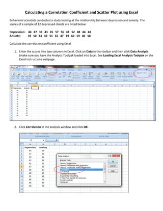
1. Calculating a Correlation Coefficient and Scatter Plot using Excel
Behavioral scientists conducted a study looking at the relationship between depression and anxiety. The
scores of a sample of 12 depressed clients are listed below:
Depression: 44 47 39 43 45 57 56 48 52 48 44 48
Anxiety: 39 50 44 49 51 65 47 49 60 59 40 58
Calculate the correlation coefficient using Excel
1. Enter the scores into two columns in Excel. Click on Data in the toolbar and then click Data Analysis
(make sure you have the Analysis Toolpak loaded into Excel. See Loading Excel Analysis Toolpak on the
Excel Instructions webpage.
2. Click Correlation in the analysis window and click OK.
2. 3. Click on the Input Range box and highlight cells A1 to B13. Make sure you have the box next to Labels
in first row clicked.
4. Click on the Output Range box and click cell B15. Click OK.
The correlation coefficient will appear. In this example the correlation between Depression and Anxiety
is .625
3. CREATING A SCATTERPLOT
1. Highlight cells A1 to B13. Click on the Insert tab in toolbar and then click Scatter.
2. Choose the first box.
4. 3. The scatterplot will appear.
4. To change the title of the graph, click on Anxiety and type Correlation between Depression and
Anxiety. Click on the Anxiety legend and hit the Delete key on your key board to remove.
5. To change the values on the horizontal and vertical axes, click on any place in the scatterplot and then
click the Layout tab on the toolbar and then click on Axis.
5. 6. Click Primary Horizontal Axis and then More Primary Horizontal Axis Options.
7. Click the Fixed button to minimize the horizontal axis values and type 35 in the box. Click Close.
6. 8. Next click Primary Vertical Axis and More Primary Vertical Axis Options.
9. Click the Fixed button to minimize the vertical axis values and type 30 in the box. Click Close.
7. 10. The minimum values on both the horizontal vertical axes have been changed. The formatting of the
scatterplot is complete. The plot shows a moderately positive relationship between depression and
anxiety.