SlideShare une entreprise Scribd logo
1  sur  12
The title uses the onomatopoeia word “Kerrang”. It sounds like the strumming on a guitar, which is the type of instrument this magazine is associated with. The main medium close up of You Me At Six shows their cool manner and reflects their rock attributes and persona and represents them a outgoing and fun.  They are all looking directly at readers but the lead singer is making a face that gives the band an edge. The title of the magazine is written at the top of the page and it has a kind of broken glass effect. This could be showing the smashing of a glass or mirror maybe by a guitar which links back to the rock theme of this magazine. In this cover the artists are placed over the title and the magazine can still be identified without the title being in full view. This shows the magazine is quite popular.  The images of whats included in the magazine on the front cover are all involving white males with an indie/rock look about them.  This suggests the magazine will be solely about these types of boy bands and music of the rock genre. The name of the artist is in capital letters across the chest areas is in a contrasting colour to the bands clothing.  This stands out to the audience and draws attention to the magazine. The price of the magazine is in tiny font right in the bottom right. This means this will be the last thing the consumer is likely to see.
The masthead of NME is placed in the top left corner of the cover page, which is known to be NMEs trademark.  The target audience for NME is male and female teenagers, we know this because there are male and female musicians on the front cover and because of the colours used. The main image on the front cover is of Lily Allen. Lily Allen may have been chosen to feature in the magazine because she is what teenagers are stereotyped as being. She looks like the stereotypical image of an ‘emo’ with her black messy hair and smoky eyes.  The text next to the image which says “Lily Allen takes on the world” represents her as being a strong female. Above the masthead  is a banner, the black stands out over the red of the masthead and the yellow font contrasts against the black. In the banner is a picture of Alex Turner, a member of Arctic Monkeys. This makes the coverline look like it’s made up of letters cut out of newspaper headlines.  NME may have done this as Lily Allen has been in the newspapers a lot recently. NME has a simple but effective colour scheme. It uses colours such as red, blacks and white. They have used a white background so that that the text and the pictures don’t become ‘lost’ in the background. This text contrtadicts the text underneath making the text underneath ‘stronger’
Use of musicians which create music of different genres which aims the magazine at a wider audience.  The use of neon orange, a dominant colour which breaks into the black banner  Long shot of Lady gaga, Jay Z and Dave Grohl  Three main cover lines in large font capital letters, standing out from the white background making it eye-catching.  Text box containing information on what else is featured in the issue at a glance. Lady Gaga is wearing a revealing outfit whilst posing confidently drawing attention to the magazine from males.
Main image of Mick Jagger and Keith Richards from the Rolling Stones.  This tells the audience that the main article will be about them. Large font used for Mick Jagger and The Rolling Stones at the bottom ontop of the image showing the main article will be based on these people. Barcode in bottom right corner.  Different from many other magazines. Issue number, price and date. Title is always the same, allows for the audience to recognise the magazine whatever may be on the cover. The word ‘ROCK’ in the title has a loud shadow effect, maybe connotes the loud music of which this magazine represents. The word ‘Classic’ in the title is written in upper and lower case letters and has a classic shadow effect connoting the classic side of rock music of which this magazine represents. Magazine mentions YouTube, The magazine will appeal to younger generations aswell.
The editors note in Kerrang  uses language that  is chatty and informal this is effective as it would appeal to the target audience of the magazine. The colours used in the contents title and font follow the house style of the magazine. This particular choice of colouring stands out because of the contrast between them. The colours are also widely associated with Kerrang magazine, so readers easily recognise it and become familiar with the style. Because the colour scheme throughout the magazine is  also  yellow, black and white, it gives us a feeling as an audience that the magazine is consistent. This page is dominated mainly by images and they give the reader an early insight as to what will be featured in the magazine because the audiences eyes are drawn to the images before the text. The text that is used is consistent, always black and yellow. This follows the house style, in doing this the audience gets consistency in the magazine. Underneath each image is a page number and insight into what the article is about, this is used for the reader to select what they want and don’t want to read.
The Q logo is right at the top of the page to establish the brand along with the issue The main image is of The Courteeners, who don't actually feature on the front cover itself. However, it still fits in with the ideology of the magazine. The Courteeners are a relatively new band and Q focuses on old and new music They have separated the features only in this month's magazine and features that are included every month. The contents page is simple and well set out.  It is easy to read and the colour scheme fits in with the magazine's iconography. Q are well-known for reviewing lots of material and this is why at the bottom of the page, there is a section dedicated just for review page references
The font, colours and house style are all the same type which gives the magazine a bold, but effective way of presenting their pieces.  The layout is also very similar which gives the magazine structure and the reader’s a clear understanding of where to find what article or piece. The use of sub-headings puts each piece of content into easier and clearer categories. This makes the magazine clearer It has specifically targeted people who enjoy rock and indie music through the use of an Oasis member and features on bands, such as, Arctic Monkeys. The subscribe today written at the bottom using contrasting colours draws the audience in to an easier way of receiving ‘NME’ magazine.
The Title of the contents page is consistent with the cover page title giving the audience consistency in what they’re reading Images all around the centre of the pages with page numbers written to inform the audience what page each article is on. Each heading is blue, consistent with the blue in the shadow of the title. Page is plain suggesting this magazine is solely about the music.
The main title is taking up most of the room. They want to make this stand out and an eye catcher. The black background behind the writing makes it stand out more, eye catching and more interesting. It is about one individual person which is different to a lot of double page spreads which usually have multiple story's and articles about bands. Unlike the title the text font below is in the magazines house style reminding readers of the magazine.
The title ‘were being the best mcr we can be'. This is very eye catching because of its colour which draws the audience in The font is very consistent through out the page and the words 'the best mcr' are in a different colour, purposely making those three words stand out more. World Exclusive, this phrase makes the reader want to know what the world exclusive is. The main image shown on the left side of the page. Kerrang magazine tends to have a main dominant image is taking up one side of the page.  The four smaller images give an insight into what the band get up and maybe implying what else maybe in the article.
The white background allows for the images and text to stand out, making it easier on the eye.  A quote from Will.I.Am, may have been picked out and made bolder than the rest of the text for readers that maybe don’t want to read the whole article.  Colours of white and gold on the clothing shows the success of the band.  Use of rhetorical question, entices the audience and encourages them to read on.  The main singer of the band is standing out more than the rest of the band, the article may also be about him explaining why he is more visible.
The photo features dull colours with with a light but slightly dirty backdrop, this could be reflecting their gritty sound. They have placed the photo so that it runs across the gutter.  The blue lines that run through the page, they are placed diagonally possibly to reflect the rough and raw image the band portray. The whole page follows the colour scheme of black, light blue and a slightly stained white (looks slightly brown) this is simple and i think it reflects the simple nature of the bands music. The name of the band is written in capital letter at the top of the article so the readers are aware of what they are reading. The blue continues throughout the article in ways of first letters of paragraphs and a quote taken from the article.

Contenu connexe

Tendances

Music Magazine Analysis
Music Magazine AnalysisMusic Magazine Analysis
Music Magazine AnalysisEmilyJayne
 
Front cover analysis
Front cover analysisFront cover analysis
Front cover analysisalexberry27
 
Analysis of Music Magazines
Analysis of Music MagazinesAnalysis of Music Magazines
Analysis of Music MagazinesSarah Green
 
Magazine analysis production
Magazine analysis productionMagazine analysis production
Magazine analysis productiongraceemilyyy
 
Textual Analysis
Textual AnalysisTextual Analysis
Textual Analysispinogo
 
Analysis of music magazines
Analysis of music magazinesAnalysis of music magazines
Analysis of music magazinesLauraASMagazine
 
Rock magazine covers
Rock magazine coversRock magazine covers
Rock magazine coversSigridsynnove
 
Front cover analysis (main task)
Front cover analysis (main task)Front cover analysis (main task)
Front cover analysis (main task)EDPRICE93
 
Magazine research info
Magazine research infoMagazine research info
Magazine research infotomhogan123
 
Hannah Wood Music Magazine Analysis
Hannah Wood Music Magazine Analysis Hannah Wood Music Magazine Analysis
Hannah Wood Music Magazine Analysis hannahwood88
 
Mojo magazine analysis
Mojo magazine analysisMojo magazine analysis
Mojo magazine analysisLittlePainter
 
Contents cover analysis
Contents cover analysisContents cover analysis
Contents cover analysisjessicahooker6
 
Media music magazine analysis
Media music magazine analysisMedia music magazine analysis
Media music magazine analysisSophieMichelle
 

Tendances (20)

Music mag analysed
Music mag analysedMusic mag analysed
Music mag analysed
 
Music mag analysed
Music mag analysedMusic mag analysed
Music mag analysed
 
Music Magazine Analysis
Music Magazine AnalysisMusic Magazine Analysis
Music Magazine Analysis
 
Front cover analysis
Front cover analysisFront cover analysis
Front cover analysis
 
Analysis of Music Magazines
Analysis of Music MagazinesAnalysis of Music Magazines
Analysis of Music Magazines
 
Magazine analysis production
Magazine analysis productionMagazine analysis production
Magazine analysis production
 
Textual Analysis
Textual AnalysisTextual Analysis
Textual Analysis
 
Analysis of music magazines
Analysis of music magazinesAnalysis of music magazines
Analysis of music magazines
 
Med
MedMed
Med
 
Rock magazine covers
Rock magazine coversRock magazine covers
Rock magazine covers
 
Radial analysis
Radial analysisRadial analysis
Radial analysis
 
Front cover analysis (main task)
Front cover analysis (main task)Front cover analysis (main task)
Front cover analysis (main task)
 
Media magaine analysis
Media magaine analysisMedia magaine analysis
Media magaine analysis
 
Music Magazine Analysis
Music Magazine AnalysisMusic Magazine Analysis
Music Magazine Analysis
 
Magazine research info
Magazine research infoMagazine research info
Magazine research info
 
Hannah Wood Music Magazine Analysis
Hannah Wood Music Magazine Analysis Hannah Wood Music Magazine Analysis
Hannah Wood Music Magazine Analysis
 
Mojo magazine analysis
Mojo magazine analysisMojo magazine analysis
Mojo magazine analysis
 
Contents cover analysis
Contents cover analysisContents cover analysis
Contents cover analysis
 
Front cover analysis
Front cover analysisFront cover analysis
Front cover analysis
 
Media music magazine analysis
Media music magazine analysisMedia music magazine analysis
Media music magazine analysis
 

En vedette

Tracks back office solution - Introduction
Tracks back office solution - IntroductionTracks back office solution - Introduction
Tracks back office solution - Introductionjwtownsendjr1
 
Magazine anaylisis
Magazine anaylisisMagazine anaylisis
Magazine anaylisissineadjen
 
Audience Research- Questionnaire
Audience Research- QuestionnaireAudience Research- Questionnaire
Audience Research- Questionnairesineadjen
 
Tracks restaurant back office solution - Introductory presentation
Tracks restaurant back office solution - Introductory presentationTracks restaurant back office solution - Introductory presentation
Tracks restaurant back office solution - Introductory presentationjwtownsendjr1
 
DiscMedia CD/DVD Ideeëngids
DiscMedia CD/DVD IdeeëngidsDiscMedia CD/DVD Ideeëngids
DiscMedia CD/DVD Ideeëngidsjurjenbousma
 

En vedette (7)

Tracks back office solution - Introduction
Tracks back office solution - IntroductionTracks back office solution - Introduction
Tracks back office solution - Introduction
 
Magazine anaylisis
Magazine anaylisisMagazine anaylisis
Magazine anaylisis
 
Audience Research- Questionnaire
Audience Research- QuestionnaireAudience Research- Questionnaire
Audience Research- Questionnaire
 
Normasclase
NormasclaseNormasclase
Normasclase
 
Tracks restaurant back office solution - Introductory presentation
Tracks restaurant back office solution - Introductory presentationTracks restaurant back office solution - Introductory presentation
Tracks restaurant back office solution - Introductory presentation
 
Pai 1
Pai 1Pai 1
Pai 1
 
DiscMedia CD/DVD Ideeëngids
DiscMedia CD/DVD IdeeëngidsDiscMedia CD/DVD Ideeëngids
DiscMedia CD/DVD Ideeëngids
 

Similaire à Magazine anaylisis

Magazine analysis
Magazine analysisMagazine analysis
Magazine analysislsuttie9
 
Deconstructions of rock magazines
Deconstructions of rock magazinesDeconstructions of rock magazines
Deconstructions of rock magazinesShahEman
 
Kerrang Magazine Front Cover Analysis
Kerrang Magazine Front Cover AnalysisKerrang Magazine Front Cover Analysis
Kerrang Magazine Front Cover Analysismaddyhowell
 
Music Magazine Analysis
Music Magazine AnalysisMusic Magazine Analysis
Music Magazine Analysisasmediag13
 
Kerrang! Cover Analysis
Kerrang! Cover AnalysisKerrang! Cover Analysis
Kerrang! Cover AnalysisLukaMedia
 
Magazine Research Analysis
Magazine Research AnalysisMagazine Research Analysis
Magazine Research AnalysisTRUDY
 
Kerrang! Cover Analysis
Kerrang! Cover AnalysisKerrang! Cover Analysis
Kerrang! Cover AnalysisLukaMedia
 
Kerrang! Cover Analysis
Kerrang! Cover AnalysisKerrang! Cover Analysis
Kerrang! Cover AnalysisLukaMedia
 
Presentgggation1
Presentgggation1Presentgggation1
Presentgggation1tjjones2
 
Magazine analysis 2
Magazine analysis 2Magazine analysis 2
Magazine analysis 2Anikayasmiin
 
Uk magazine market
Uk magazine marketUk magazine market
Uk magazine marketsara ali
 
magazine cover analysis 1
magazine cover analysis 1magazine cover analysis 1
magazine cover analysis 1Jennifermegan93
 
magazine cover, analysis 1
magazine cover, analysis 1magazine cover, analysis 1
magazine cover, analysis 1Jennifermegan93
 
magazine cover analysis 1
magazine cover  analysis 1magazine cover  analysis 1
magazine cover analysis 1Jennifermegan93
 
Deconstruction practice
Deconstruction practiceDeconstruction practice
Deconstruction practicerobynneve
 
Researching music magazines
Researching music magazinesResearching music magazines
Researching music magazinesjawgeenahh
 

Similaire à Magazine anaylisis (20)

Magazine analysis
Magazine analysisMagazine analysis
Magazine analysis
 
Deconstructions of rock magazines
Deconstructions of rock magazinesDeconstructions of rock magazines
Deconstructions of rock magazines
 
Kerrang Magazine Front Cover Analysis
Kerrang Magazine Front Cover AnalysisKerrang Magazine Front Cover Analysis
Kerrang Magazine Front Cover Analysis
 
Music Magazine Analysis
Music Magazine AnalysisMusic Magazine Analysis
Music Magazine Analysis
 
Kerrang! Cover Analysis
Kerrang! Cover AnalysisKerrang! Cover Analysis
Kerrang! Cover Analysis
 
Magazine Research Analysis
Magazine Research AnalysisMagazine Research Analysis
Magazine Research Analysis
 
Kerrang! Cover Analysis
Kerrang! Cover AnalysisKerrang! Cover Analysis
Kerrang! Cover Analysis
 
Kerrang! Cover Analysis
Kerrang! Cover AnalysisKerrang! Cover Analysis
Kerrang! Cover Analysis
 
Magazine analysis
Magazine analysisMagazine analysis
Magazine analysis
 
Rock sound
Rock soundRock sound
Rock sound
 
Presentgggation1
Presentgggation1Presentgggation1
Presentgggation1
 
Magazine analysis 2
Magazine analysis 2Magazine analysis 2
Magazine analysis 2
 
Analysing Music Magazines
Analysing Music MagazinesAnalysing Music Magazines
Analysing Music Magazines
 
Uk magazine market
Uk magazine marketUk magazine market
Uk magazine market
 
magazine cover analysis 1
magazine cover analysis 1magazine cover analysis 1
magazine cover analysis 1
 
magazine cover, analysis 1
magazine cover, analysis 1magazine cover, analysis 1
magazine cover, analysis 1
 
magazine cover analysis 1
magazine cover  analysis 1magazine cover  analysis 1
magazine cover analysis 1
 
Deconstruction practice
Deconstruction practiceDeconstruction practice
Deconstruction practice
 
Micro analysis
Micro analysisMicro analysis
Micro analysis
 
Researching music magazines
Researching music magazinesResearching music magazines
Researching music magazines
 

Dernier

Grade 9 Quarter 4 Dll Grade 9 Quarter 4 DLL.pdf
Grade 9 Quarter 4 Dll Grade 9 Quarter 4 DLL.pdfGrade 9 Quarter 4 Dll Grade 9 Quarter 4 DLL.pdf
Grade 9 Quarter 4 Dll Grade 9 Quarter 4 DLL.pdfJemuel Francisco
 
How to do quick user assign in kanban in Odoo 17 ERP
How to do quick user assign in kanban in Odoo 17 ERPHow to do quick user assign in kanban in Odoo 17 ERP
How to do quick user assign in kanban in Odoo 17 ERPCeline George
 
AUDIENCE THEORY -CULTIVATION THEORY - GERBNER.pptx
AUDIENCE THEORY -CULTIVATION THEORY -  GERBNER.pptxAUDIENCE THEORY -CULTIVATION THEORY -  GERBNER.pptx
AUDIENCE THEORY -CULTIVATION THEORY - GERBNER.pptxiammrhaywood
 
Field Attribute Index Feature in Odoo 17
Field Attribute Index Feature in Odoo 17Field Attribute Index Feature in Odoo 17
Field Attribute Index Feature in Odoo 17Celine George
 
INTRODUCTION TO CATHOLIC CHRISTOLOGY.pptx
INTRODUCTION TO CATHOLIC CHRISTOLOGY.pptxINTRODUCTION TO CATHOLIC CHRISTOLOGY.pptx
INTRODUCTION TO CATHOLIC CHRISTOLOGY.pptxHumphrey A Beña
 
Visit to a blind student's school🧑‍🦯🧑‍🦯(community medicine)
Visit to a blind student's school🧑‍🦯🧑‍🦯(community medicine)Visit to a blind student's school🧑‍🦯🧑‍🦯(community medicine)
Visit to a blind student's school🧑‍🦯🧑‍🦯(community medicine)lakshayb543
 
Activity 2-unit 2-update 2024. English translation
Activity 2-unit 2-update 2024. English translationActivity 2-unit 2-update 2024. English translation
Activity 2-unit 2-update 2024. English translationRosabel UA
 
Concurrency Control in Database Management system
Concurrency Control in Database Management systemConcurrency Control in Database Management system
Concurrency Control in Database Management systemChristalin Nelson
 
Dust Of Snow By Robert Frost Class-X English CBSE
Dust Of Snow By Robert Frost Class-X English CBSEDust Of Snow By Robert Frost Class-X English CBSE
Dust Of Snow By Robert Frost Class-X English CBSEaurabinda banchhor
 
Measures of Position DECILES for ungrouped data
Measures of Position DECILES for ungrouped dataMeasures of Position DECILES for ungrouped data
Measures of Position DECILES for ungrouped dataBabyAnnMotar
 
ICS2208 Lecture6 Notes for SL spaces.pdf
ICS2208 Lecture6 Notes for SL spaces.pdfICS2208 Lecture6 Notes for SL spaces.pdf
ICS2208 Lecture6 Notes for SL spaces.pdfVanessa Camilleri
 
Integumentary System SMP B. Pharm Sem I.ppt
Integumentary System SMP B. Pharm Sem I.pptIntegumentary System SMP B. Pharm Sem I.ppt
Integumentary System SMP B. Pharm Sem I.pptshraddhaparab530
 
4.16.24 21st Century Movements for Black Lives.pptx
4.16.24 21st Century Movements for Black Lives.pptx4.16.24 21st Century Movements for Black Lives.pptx
4.16.24 21st Century Movements for Black Lives.pptxmary850239
 
Textual Evidence in Reading and Writing of SHS
Textual Evidence in Reading and Writing of SHSTextual Evidence in Reading and Writing of SHS
Textual Evidence in Reading and Writing of SHSMae Pangan
 
Student Profile Sample - We help schools to connect the data they have, with ...
Student Profile Sample - We help schools to connect the data they have, with ...Student Profile Sample - We help schools to connect the data they have, with ...
Student Profile Sample - We help schools to connect the data they have, with ...Seán Kennedy
 
4.18.24 Movement Legacies, Reflection, and Review.pptx
4.18.24 Movement Legacies, Reflection, and Review.pptx4.18.24 Movement Legacies, Reflection, and Review.pptx
4.18.24 Movement Legacies, Reflection, and Review.pptxmary850239
 
How to Add Barcode on PDF Report in Odoo 17
How to Add Barcode on PDF Report in Odoo 17How to Add Barcode on PDF Report in Odoo 17
How to Add Barcode on PDF Report in Odoo 17Celine George
 
Active Learning Strategies (in short ALS).pdf
Active Learning Strategies (in short ALS).pdfActive Learning Strategies (in short ALS).pdf
Active Learning Strategies (in short ALS).pdfPatidar M
 

Dernier (20)

Grade 9 Quarter 4 Dll Grade 9 Quarter 4 DLL.pdf
Grade 9 Quarter 4 Dll Grade 9 Quarter 4 DLL.pdfGrade 9 Quarter 4 Dll Grade 9 Quarter 4 DLL.pdf
Grade 9 Quarter 4 Dll Grade 9 Quarter 4 DLL.pdf
 
YOUVE GOT EMAIL_FINALS_EL_DORADO_2024.pptx
YOUVE GOT EMAIL_FINALS_EL_DORADO_2024.pptxYOUVE GOT EMAIL_FINALS_EL_DORADO_2024.pptx
YOUVE GOT EMAIL_FINALS_EL_DORADO_2024.pptx
 
How to do quick user assign in kanban in Odoo 17 ERP
How to do quick user assign in kanban in Odoo 17 ERPHow to do quick user assign in kanban in Odoo 17 ERP
How to do quick user assign in kanban in Odoo 17 ERP
 
AUDIENCE THEORY -CULTIVATION THEORY - GERBNER.pptx
AUDIENCE THEORY -CULTIVATION THEORY -  GERBNER.pptxAUDIENCE THEORY -CULTIVATION THEORY -  GERBNER.pptx
AUDIENCE THEORY -CULTIVATION THEORY - GERBNER.pptx
 
Field Attribute Index Feature in Odoo 17
Field Attribute Index Feature in Odoo 17Field Attribute Index Feature in Odoo 17
Field Attribute Index Feature in Odoo 17
 
INTRODUCTION TO CATHOLIC CHRISTOLOGY.pptx
INTRODUCTION TO CATHOLIC CHRISTOLOGY.pptxINTRODUCTION TO CATHOLIC CHRISTOLOGY.pptx
INTRODUCTION TO CATHOLIC CHRISTOLOGY.pptx
 
Visit to a blind student's school🧑‍🦯🧑‍🦯(community medicine)
Visit to a blind student's school🧑‍🦯🧑‍🦯(community medicine)Visit to a blind student's school🧑‍🦯🧑‍🦯(community medicine)
Visit to a blind student's school🧑‍🦯🧑‍🦯(community medicine)
 
Activity 2-unit 2-update 2024. English translation
Activity 2-unit 2-update 2024. English translationActivity 2-unit 2-update 2024. English translation
Activity 2-unit 2-update 2024. English translation
 
Concurrency Control in Database Management system
Concurrency Control in Database Management systemConcurrency Control in Database Management system
Concurrency Control in Database Management system
 
Dust Of Snow By Robert Frost Class-X English CBSE
Dust Of Snow By Robert Frost Class-X English CBSEDust Of Snow By Robert Frost Class-X English CBSE
Dust Of Snow By Robert Frost Class-X English CBSE
 
Measures of Position DECILES for ungrouped data
Measures of Position DECILES for ungrouped dataMeasures of Position DECILES for ungrouped data
Measures of Position DECILES for ungrouped data
 
ICS2208 Lecture6 Notes for SL spaces.pdf
ICS2208 Lecture6 Notes for SL spaces.pdfICS2208 Lecture6 Notes for SL spaces.pdf
ICS2208 Lecture6 Notes for SL spaces.pdf
 
Integumentary System SMP B. Pharm Sem I.ppt
Integumentary System SMP B. Pharm Sem I.pptIntegumentary System SMP B. Pharm Sem I.ppt
Integumentary System SMP B. Pharm Sem I.ppt
 
4.16.24 21st Century Movements for Black Lives.pptx
4.16.24 21st Century Movements for Black Lives.pptx4.16.24 21st Century Movements for Black Lives.pptx
4.16.24 21st Century Movements for Black Lives.pptx
 
Textual Evidence in Reading and Writing of SHS
Textual Evidence in Reading and Writing of SHSTextual Evidence in Reading and Writing of SHS
Textual Evidence in Reading and Writing of SHS
 
Student Profile Sample - We help schools to connect the data they have, with ...
Student Profile Sample - We help schools to connect the data they have, with ...Student Profile Sample - We help schools to connect the data they have, with ...
Student Profile Sample - We help schools to connect the data they have, with ...
 
4.18.24 Movement Legacies, Reflection, and Review.pptx
4.18.24 Movement Legacies, Reflection, and Review.pptx4.18.24 Movement Legacies, Reflection, and Review.pptx
4.18.24 Movement Legacies, Reflection, and Review.pptx
 
LEFT_ON_C'N_ PRELIMS_EL_DORADO_2024.pptx
LEFT_ON_C'N_ PRELIMS_EL_DORADO_2024.pptxLEFT_ON_C'N_ PRELIMS_EL_DORADO_2024.pptx
LEFT_ON_C'N_ PRELIMS_EL_DORADO_2024.pptx
 
How to Add Barcode on PDF Report in Odoo 17
How to Add Barcode on PDF Report in Odoo 17How to Add Barcode on PDF Report in Odoo 17
How to Add Barcode on PDF Report in Odoo 17
 
Active Learning Strategies (in short ALS).pdf
Active Learning Strategies (in short ALS).pdfActive Learning Strategies (in short ALS).pdf
Active Learning Strategies (in short ALS).pdf
 

Magazine anaylisis

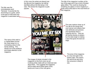
  • 1. The title uses the onomatopoeia word “Kerrang”. It sounds like the strumming on a guitar, which is the type of instrument this magazine is associated with. The main medium close up of You Me At Six shows their cool manner and reflects their rock attributes and persona and represents them a outgoing and fun. They are all looking directly at readers but the lead singer is making a face that gives the band an edge. The title of the magazine is written at the top of the page and it has a kind of broken glass effect. This could be showing the smashing of a glass or mirror maybe by a guitar which links back to the rock theme of this magazine. In this cover the artists are placed over the title and the magazine can still be identified without the title being in full view. This shows the magazine is quite popular. The images of whats included in the magazine on the front cover are all involving white males with an indie/rock look about them. This suggests the magazine will be solely about these types of boy bands and music of the rock genre. The name of the artist is in capital letters across the chest areas is in a contrasting colour to the bands clothing. This stands out to the audience and draws attention to the magazine. The price of the magazine is in tiny font right in the bottom right. This means this will be the last thing the consumer is likely to see.
  • 2. The masthead of NME is placed in the top left corner of the cover page, which is known to be NMEs trademark. The target audience for NME is male and female teenagers, we know this because there are male and female musicians on the front cover and because of the colours used. The main image on the front cover is of Lily Allen. Lily Allen may have been chosen to feature in the magazine because she is what teenagers are stereotyped as being. She looks like the stereotypical image of an ‘emo’ with her black messy hair and smoky eyes. The text next to the image which says “Lily Allen takes on the world” represents her as being a strong female. Above the masthead is a banner, the black stands out over the red of the masthead and the yellow font contrasts against the black. In the banner is a picture of Alex Turner, a member of Arctic Monkeys. This makes the coverline look like it’s made up of letters cut out of newspaper headlines. NME may have done this as Lily Allen has been in the newspapers a lot recently. NME has a simple but effective colour scheme. It uses colours such as red, blacks and white. They have used a white background so that that the text and the pictures don’t become ‘lost’ in the background. This text contrtadicts the text underneath making the text underneath ‘stronger’
  • 3. Use of musicians which create music of different genres which aims the magazine at a wider audience. The use of neon orange, a dominant colour which breaks into the black banner Long shot of Lady gaga, Jay Z and Dave Grohl Three main cover lines in large font capital letters, standing out from the white background making it eye-catching. Text box containing information on what else is featured in the issue at a glance. Lady Gaga is wearing a revealing outfit whilst posing confidently drawing attention to the magazine from males.
  • 4. Main image of Mick Jagger and Keith Richards from the Rolling Stones. This tells the audience that the main article will be about them. Large font used for Mick Jagger and The Rolling Stones at the bottom ontop of the image showing the main article will be based on these people. Barcode in bottom right corner. Different from many other magazines. Issue number, price and date. Title is always the same, allows for the audience to recognise the magazine whatever may be on the cover. The word ‘ROCK’ in the title has a loud shadow effect, maybe connotes the loud music of which this magazine represents. The word ‘Classic’ in the title is written in upper and lower case letters and has a classic shadow effect connoting the classic side of rock music of which this magazine represents. Magazine mentions YouTube, The magazine will appeal to younger generations aswell.
  • 5. The editors note in Kerrang uses language that is chatty and informal this is effective as it would appeal to the target audience of the magazine. The colours used in the contents title and font follow the house style of the magazine. This particular choice of colouring stands out because of the contrast between them. The colours are also widely associated with Kerrang magazine, so readers easily recognise it and become familiar with the style. Because the colour scheme throughout the magazine is also yellow, black and white, it gives us a feeling as an audience that the magazine is consistent. This page is dominated mainly by images and they give the reader an early insight as to what will be featured in the magazine because the audiences eyes are drawn to the images before the text. The text that is used is consistent, always black and yellow. This follows the house style, in doing this the audience gets consistency in the magazine. Underneath each image is a page number and insight into what the article is about, this is used for the reader to select what they want and don’t want to read.
  • 6. The Q logo is right at the top of the page to establish the brand along with the issue The main image is of The Courteeners, who don't actually feature on the front cover itself. However, it still fits in with the ideology of the magazine. The Courteeners are a relatively new band and Q focuses on old and new music They have separated the features only in this month's magazine and features that are included every month. The contents page is simple and well set out. It is easy to read and the colour scheme fits in with the magazine's iconography. Q are well-known for reviewing lots of material and this is why at the bottom of the page, there is a section dedicated just for review page references
  • 7. The font, colours and house style are all the same type which gives the magazine a bold, but effective way of presenting their pieces. The layout is also very similar which gives the magazine structure and the reader’s a clear understanding of where to find what article or piece. The use of sub-headings puts each piece of content into easier and clearer categories. This makes the magazine clearer It has specifically targeted people who enjoy rock and indie music through the use of an Oasis member and features on bands, such as, Arctic Monkeys. The subscribe today written at the bottom using contrasting colours draws the audience in to an easier way of receiving ‘NME’ magazine.
  • 8. The Title of the contents page is consistent with the cover page title giving the audience consistency in what they’re reading Images all around the centre of the pages with page numbers written to inform the audience what page each article is on. Each heading is blue, consistent with the blue in the shadow of the title. Page is plain suggesting this magazine is solely about the music.
  • 9. The main title is taking up most of the room. They want to make this stand out and an eye catcher. The black background behind the writing makes it stand out more, eye catching and more interesting. It is about one individual person which is different to a lot of double page spreads which usually have multiple story's and articles about bands. Unlike the title the text font below is in the magazines house style reminding readers of the magazine.
  • 10. The title ‘were being the best mcr we can be'. This is very eye catching because of its colour which draws the audience in The font is very consistent through out the page and the words 'the best mcr' are in a different colour, purposely making those three words stand out more. World Exclusive, this phrase makes the reader want to know what the world exclusive is. The main image shown on the left side of the page. Kerrang magazine tends to have a main dominant image is taking up one side of the page. The four smaller images give an insight into what the band get up and maybe implying what else maybe in the article.
  • 11. The white background allows for the images and text to stand out, making it easier on the eye. A quote from Will.I.Am, may have been picked out and made bolder than the rest of the text for readers that maybe don’t want to read the whole article. Colours of white and gold on the clothing shows the success of the band. Use of rhetorical question, entices the audience and encourages them to read on. The main singer of the band is standing out more than the rest of the band, the article may also be about him explaining why he is more visible.
  • 12. The photo features dull colours with with a light but slightly dirty backdrop, this could be reflecting their gritty sound. They have placed the photo so that it runs across the gutter. The blue lines that run through the page, they are placed diagonally possibly to reflect the rough and raw image the band portray. The whole page follows the colour scheme of black, light blue and a slightly stained white (looks slightly brown) this is simple and i think it reflects the simple nature of the bands music. The name of the band is written in capital letter at the top of the article so the readers are aware of what they are reading. The blue continues throughout the article in ways of first letters of paragraphs and a quote taken from the article.