Call Girls Bhavnagar - 📞 8617370543 Our call girls are sure to provide you wi...
Production process 3 fc
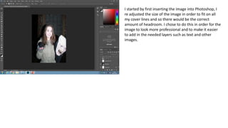
1. I started by first inserting the image into Photoshop, I
re adjusted the size of the image in order to fit on all
my cover lines and so there would be the correct
amount of headroom. I chose to do this in order for the
image to look more professional and to make it easier
to add in the needed layers such as text and other
images.
2. I then inserted the title of my magazine ‘through the
lens’, to accompany this I added the outer glow effect
to make the text stand out more and make it more
noticeable and eye-catching. I chose to use red font
colour in order to fit in line with the theme of this front
cover which was Halloween, I also thought that the red
fitted in well with the dark background and the props
used in the image.
3. I then chose to add in the image of the lens and
insert it behind my heading, this makes the title
more interesting and stand out more. I tried to
keep the image in the centre of the text and the
page in order to make the front cover look
professional and aesthetically pleasing. I also
added the date which I also decided to make red
so it would stand out on the dark background,
this is also the reason I added the outer glow
effect to this piece of text.
4. I then added a red rectangle which I would use to
make the my main cover line stand out, this works
as the font cover for this cover line is black and the
rectangle makes the detail of the font used stand
out and also the writing itself as attention is
instantly drawn to the red box and therefore the
writing in it. I chose to use the same font as I did
for the title for the main cover line as it conveys
the theme of the magazine well.
5. I then added two cover lines, both of which I
chose to add the outer glow effect onto in order
to make them more visible on the dark
background. I chose to position them on either
side of my model in order to make the front
cover interesting and have something in every
part of the cover. I chose a black font in order to
create a colour scheme and create a contrast. By
using black or dark colours it makes the lighter
colours stand out more.
6. I then added another cover line, this time I
decided to place it in the centre of the cover so
that it is placed on the models coat. I chose to
place the cover line where I did in order to make
the text more notice able and easy to read. I
added the outer glow effect again in order to
make the writing bold and more eye catching, I
also felt that this outer glow fitted into the theme
of my magazine which is film and television, the
outer glow effect makes the writing appear like an
old film title.
7. I then added another cover line again making use
of black font colour and an outer glow. The outer
glow makes the writing stand out more and
making it appear more bold. I placed this cover
line on the model’s coat, this is because this cover
line is important to the theme of the magazine
8. I then added the barcode image, I did this by
downloading the image from the internet then
dragging and dropping the file into Photoshop.
I chose to place the barcode in the bottom
right corner to be conventional and so my
cover appears realistic.
9. I then added a red rectangle in order to make
the price of the magazine stand out, I then
added the price of the magazine. I chose to have
the rectangle to be red in order to fit with the
Halloween theme of this front cover, it also helps
the black font colour stand out more.
10. After some advice from my teacher I chose to
adjust the colour levels in order for the bright
flash lighting to not show up so much on the
model’s skin. It also makes the colours of the
mask and the rat stand out more. I also resized
my image so more focus is on the model and
the props. I adjusted the brightness and
contrast as well as the vibrance settings to
create my desired effect
11. Finally I aligned my cover lines (except the main
one) to the left or right in order to make my
front cover appear more conventional. I also
shrunk the cover lines, this draws more
attention to the main cover line and makes the
image more of a focus of the cover.