
Recommended
More Related Content
What's hot
What's hot (20)
Viewers also liked
Similar to Horror Poster
Similar to Horror Poster (20)
More from sophiepottermedia
Recently uploaded
Recently uploaded (20)
Horror Poster
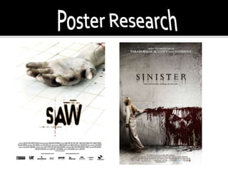
- 1. The main colour used on the poster is white. The colour white suggests which from previous knowledge from watching the film is what the main character aims to create through the acts of torture he emits.
- 3. The main colour used on the poster is white. The colour white suggests which from previous knowledge from watching the film is what the main character aims to create through the acts of torture he emits. Alongside the main colour of the poster everything else that isn't white in the poster is dark. The colour black suggests a variety of things such as sadness and death, which are both factors within the horror film Saw. However using the colour black on a poster is a convention of horrors which hints at the genre of the film.
- 4. The hand in the poster is at the main focus of the audience. By placing the hand in the focal point of the poster the audience’s attention is immediately drawn to it as it gives away part of the plot. Alongside it being in the focal point in the poster it is also positioned at the top of the poster showing that it is important. The colour of the hand itself gives the audience an idea that the film is going to be a torture film as the shadowing on the hand suggests bruising which could show torture. However the black shadowing that is on the hand could also show that the victim within the film is hiding something, this makes the audience more interested in the film
- 5. The title of the film is in the middle of the poster which shows it is important as it is the first thing people will look at. The font that has been used is of a dark colour but doesn’t however appear to be black. The edges of the font are also blurred which could suggest there is a blurring of boundaries within the film. The font used for the title is also warped. This may suggest that the film itself is not straight forward which in turn suggests a complicated plot. The actual title of the film itself suggests pain and torture which also gives away the genre of the film which is a horror mystery.
- 6. The background in the poster behind everything else is what appears to be a tiled floor. The use of the tiled floor makes the poster seem more realistic as some people can recognise it as a piece of their home which makes the fear of the film being real more than if the background was just plain. The background also allows the audience an insight into the plot of the film as it gives away a small amount of the setting of the film which allows the audience to wonder where the tiled floor is from.
- 7. The credits at the bottom of the poster are in a black consistent font which shows their importance. All additional companies and logos are at the bottom of the poster which could help when advertising the film as people may recognise a logo from a previous film on the bottom of the poster which will make them want to see this film.
- 9. At the top of the poster films that have been pr0duced by the same producer are shown. By doing this the creators of Sinister grab the attention of people who have watched these films. The text is also in white making it stand out against the background. The titles of the previous films are also in a larger font than the rest of the statement making them stand out.
- 10. The background of the poster is dim and gloomy which then causes contrast with what appears to be blood. By creating this contrast the attention of the viewer is immediately drawn to the blood on the poster, this in turn hints at the genre of the film which is psychological horror. Alongside this there is a face / pair of eyes in the blood which paired with the tagline ‘once you see him nothing can save you’ creates a sense of fear for the viewer and also gives an insight into the plot. There are also a variety of cracks in the background which also hints at the plot of the film. The cracks can represent a variety of things such as the break down of the characters mind as the demon makes the thoughts of the character seem real.
- 11. The title of the film is positioned in the middle of the poster immediately grabbing the attention of the viewer. The font used for the title appears to be fading which could be hinting to the blurring of boundaries within the film. Alongside this the title is written in a black font making it stand out against the background. Straight below the title the tagline is shown in a smaller font, by positioning it right below the title the attention of the viewer is drawn to it straight after they read the title. The tagline used also creates an immediate sense of fear and makes the viewer wonder who ‘him’ is.
- 12. At the bottom of the poster the credits are printed. By printing the credits on the poster the viewers are given the opportunity to see who is in the film, who produced it amongst a variety of other things. By giving the viewers the opportunity the creators of sinister allow the audience to identify any people they already know which may cause them to take more interest in the film Amongst the credits is the phrase ‘coming soon’ making the release date t0 the film unknown. By using ‘coming soon’ instead of an actual date the creators of sinister create a buzz. Below this there is a website think to HaveYouSeenHim.com which suggests the film revolves around the unknown character.