1. !
Ender’s Game Book Cover Comparison
!
Back Flap
QuotesPositive
endorsement
Author
Image
(Biogra
phy)
Splash
Award
Author Info
(Biography)
Barcode
space
Publisher
Author Info
(Biography)
Blurb- short
synopsis of
story outline
Book
Title
(Spine)
Publisher
Barcode
Back Cover
cover
Spine
Front cover
Front Flap
Spine
Author
Author
Book Title
(Front cover)
Blurb- short
synopsis of
story outline
Book
Title
(Spine)
Spine
Author
Tagline
Book Title
(Front cover)
QuotesPositive
endorsement
Qualifier
Author
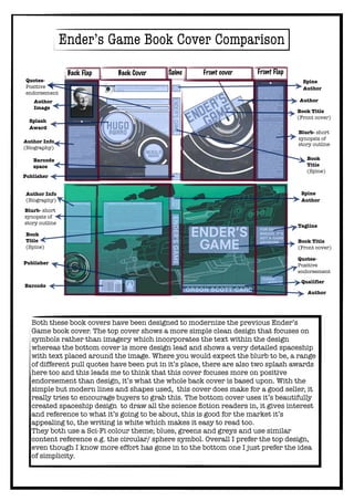
Both these book covers have been designed to modernize the previous Ender’s
Game book cover. The top cover shows a more simple clean design that focuses on
symbols rather than imagery which incorporates the text within the design
whereas the bottom cover is more design lead and shows a very detailed spaceship
with text placed around the image. Where you would expect the blurb to be, a range
of different pull quotes have been put in it’s place, there are also two splash awards
here too and this leads me to think that this cover focuses more on positive
endorsement than design, it’s what the whole back cover is based upon. With the
simple but modern lines and shapes used, this cover does make for a good seller, it
really tries to encourage buyers to grab this. The bottom cover uses it’s beautifully
created spaceship design to draw all the science fiction readers in, it gives interest
and reference to what it’s going to be about, this is good for the market it’s
appealing to, the writing is white which makes it easy to read too.
They both use a Sci-Fi colour theme; blues, greens and greys and use similar
content reference e.g. the circular/ sphere symbol. Overall I prefer the top design,
even though I know more effort has gone in to the bottom one I just prefer the idea
of simplicity.