Illustrating Project Challenges with Visuals
•
3 j'aime•914 vues

This document discusses using visuals to illustrate project challenges. It provides examples of using charts and graphs to show how scope is growing rapidly on a medical records project, risking a delay in the planned release date. The visuals show scope additions over iterations, a trend of increasing scope growth, and inputs from the team about features driving most scope changes and unexpectedly high UI effort. The visual examples are meant to help stakeholders understand issues compellingly and discuss available trade-offs to get the project back on schedule.

Recommandé
Recommandé
Contenu connexe
Tendances
Tendances (16)
Similaire à Illustrating Project Challenges with Visuals
Similaire à Illustrating Project Challenges with Visuals (20)
Dernier
Dernier (20)
Illustrating Project Challenges with Visuals
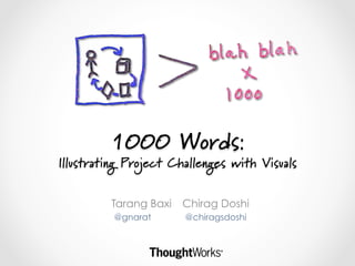
- 1. 1000 Words: Illustrating Project Challenges with Visuals Tarang Baxi Chirag Doshi @gnarat @chiragsdoshi
- 2. Inspiration
- 3. Quick Poll What type of Pen are you?
- 4. The Visual Thinking Process
- 5. Let’s get our feet wet!
- 6. Story # Estimated Size (points) Cycle Time (days) US003 1 1 US006 1 6.5 US010 1 2 US015 1 2.5 US016 1 1.5 US020 1 3 US004 2 2.5 US005 2 3 US009 2 1.5 US012 2 3 US014 2 3 US017 2 2 US002 3 3.5 US008 3 8 US013 3 3 US018 3 5.5 US001 5 12 US007 5 15 US011 5 9 US019 5 6
- 7. Size v/s Avg Cycle Time
- 8. Size v/s Cycle Time
- 9. Lets practice some drawing
- 10. The 6 Ways to See The 6 Ways to Show
- 12. Now we really get our hands dirty!
- 13. The Project • Building a new product for an early-stage startup in the medical sciences field • Product expected to be redefine the patient health record space with its visually rich UX • Will be launched 8 months after project start at the industry’s biggest trade show
- 14. Trade-off Sliders Most Negotiable Least Negotiable Extensibility 5 UX Richness 2 Time 1 Cost 3 Scope – Internal users 6 Scope – External users 4
- 15. The Situation • 3 months since project start – things not going well • Scope is growing rapidly o Most of the scope allowance built into the plan is already used up • Release date likely to slip by 6-8 weeks
- 16. Your Task • Create a set of compelling visuals that you can take to a critical discussion with client stakeholders • Highlight: o Reasons for the risk to the release date o Available trade-offs to bring the project back on track
- 17. Exercise 1 Iteration Scope Added (points) It-1 0 It-2 1 It-3 3 It-4 4 It-5 6 It-6 3 It-7 8
- 19. Additional inputs from the team • A couple of high value features are undergoing most scope churn as the CEO and CMO see working versions of those features • On several features, the effort needed to implement a rich UI is turning out to be much higher than expected. • Also some new features are being added to release backlog on a weekly basis, as thinking about the product evolves