Making the Case for Mobile

See this presentation as part of our free webinar: "How to Market Your Small Business in 2014" at http://www.prescriptionsforonlinesuccess.com/register-small-business-recorded-webinar/ Did you know that 44% of email is opened on a mobile device? Are you designing your communications to be read on a cell phone or tablet? Just think of the impact mobile devices have on: What you say, How you say it, Where you place your calls to action, and What is likely invisible to your readers on a mobile device. In this webinar, we discuss how your audiences are using mobile devices to find what they need, to assess their options, to make decisions, and to make purchases and donations. Small businesses and nonprofits that start embracing mobile now, will be the ones best able to compete tomorrow and into the future. Get great ideas for how to adapt your online marketing efforts to include mobile.

Recommandé
Recommandé
Contenu connexe
En vedette
Similaire à Making the Case for Mobile
Similaire à Making the Case for Mobile (20)
Plus de The URL Dr.
Plus de The URL Dr. (15)
Making the Case for Mobile
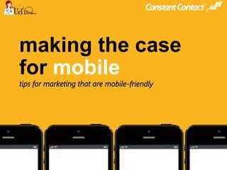
- 1. © 2013 @constantcontact #ccmobile © 2014 making the case for mobile tips for marketing that are mobile-friendly
- 2. © 2013 @constantcontact #ccmobile © 2014 129,000,000 # of smartphones owned in U.S. in 2012 comscore.com 29% of Americans use only mobile devices to access the internet. ondeviceresearch.com 91%of U.S. adults own a cellphone theatlantic.com 56%own a smartphone Pewinternet.org
- 3. © 2013 @constantcontact #ccmobile © 2014 83%of the audience for this webinar use mobile devices to manage their personal lives 80%of adults 18-44 have their smartphones with them 22 hours a day mediabistro.com
- 4. © 2013 @constantcontact #ccmobile © 2014 mobile responsive vs. mobile friendly mobile friendly
- 6. © 2013 @constantcontact #ccmobile © 2014 US smartphone subscriptions expected to grow +28% in 2013 Mary Meeker
- 7. © 2013 @constantcontact #ccmobile © 2014 people look at mobile devices 150xper day people look at smartphones 200xper day Alan Moore, No Straight Lines
- 8. © 2013 @constantcontact #ccmobile © 2014 of Americans under 35 used a mobile device to make a donation. 40% used a mobile device to browse non-profit websites and emails. 50%
- 9. © 2013 @constantcontact #ccmobile © 2014 75% used phone to get real-time, location-based information 70% who ran a local search via mobile acted within one hour 90% of mobile searches lead to an action local search PewInternet.org searchengineland.com CMO Council
- 10. © 2013 @constantcontact #ccmobile © 2014 Litmus.com 44%of email is opened on a mobile device.
- 11. © 2013 @constantcontact #ccmobile © 2014 Blue Hornet 80%of users delete mobile email that doesn’t look good. Blue Hornet of users unsubscribe from email lists after receiving mobile email that doesn’t look good. 30%
- 13. © 2013 @constantcontact #ccmobile © 2014 66% of small businesses are using mobile for their business. 34% aren’t. small business use of mobile Constant Contact customer research
- 14. © 2013 @constantcontact #ccmobile © 2014 34% aren’t. • have no plans to adopt mobile in the future 65% • lack of customer demand 56% • “mobile isn’t relevant to my industry or business” 28% Constant Contact customer research
- 15. © 2013 @constantcontact #ccmobile © 2014 Dorothy S. Jones April 1, 1947 – April 5, 2013 Services Dorothy S. Jones, age 66, passed away on Friday, April 5, 2013. She was at home and surrounded by her family.
- 16. © 2013 @constantcontact #ccmobile © 2014 why not? we’re a nonprofit… not best for my products… cost is too high… we’re regulated by the government…
- 17. © 2013 @constantcontact #ccmobile © 2014 mobile for operations 82% calendar or time management 74% customer communications 52% GPS / mapping 44% accounting or invoicing
- 19. © 2013 @constantcontact #ccmobile © 2014 YOU DON'T GET TO DECIDE WHICH DEVICE PEOPLE USE TO ACCESS YOUR CONTENT. THEY DO. Karen McGrane, author of Content Strategy for Mobile @karenmcgrane
- 20. © 2013 @constantcontact #ccmobile © 2014 at the end of the day, it’s about success
- 22. © 2013 @constantcontact #ccmobile © 2014 tip #1 avoid using too much text
- 24. © 2013 @constantcontact #ccmobile © 2014 tip #3 clear and easy calls to action
- 25. © 2013 @constantcontact #ccmobile © 2014 avoid tiny fonts tip #4 9-point font, headlines don’t stand out Minimum: 22-point headlines, 11-point body text, improved contrast
- 26. © 2013 @constantcontact #ccmobile © 2014 avoid tiny fonts tip #4 Better: 22-point headlines, 16-point body text
- 29. © 2013 @constantcontact #ccmobile © 2014 don’t ask customers or supporters to turn their phones off! bonus #2
- 30. © 2013 @constantcontact #ccmobile © 2014 camera on the phone to take shots in-store or with customers, social posts from businesses featuring images, etc. don’t ignore mobile tech bonus #3 youtube.com 100 hours of video uploaded per minute 1.4 billion images taken on mobile per day Nokia’s Vesa Jutila, at DigitalK 2012
- 33. © 2013 @constantcontact #ccmobile © 2014 less is more. focus – use less text use a single column clear and easy calls to action no small fonts (test, test, test!) use images carefully (don’t rely on them) claim your listings: be found on local search! let your customers use their phones don’t ignore your phone (pics, video, social)
- 34. © 2013 @constantcontact #ccmobile © 2014 next steps have more questions? check out our answers to 10 of the most popular at the blog… (http://blogs.constantcontact.com/fresh-insights/10-mobile-marketing-questions) if you’re ready to review your email template for mobile, call a coach today: 855-816-6508 want to learn more? try other live local seminars near you… constantcontact.com/local-learning/seminars.jsp
- 35. © 2013 @constantcontact #ccmobile © 2014 making the case for mobile beyond text messages
Notes de l'éditeur
- Tip #1: avoid using too much text Think about it – do you want to read long and complex messages on your phone? When you’re on the go? No. Which means neither do your customers or supporters. Do you want to read a message like the one here? [click to build] Probably not… What you want is to see something more like [click to build] this…the result of some basic considerations as you build your message: Start to re-think your content. Long-form content (think newsletters that have more than a couple of short, to-the-point paragraphs) doesn’t work for mobile readers. So look at the content you’re building and start to re-think it: could it be condensed? Can a picture tell the story better? Can you turn one newsletter into a series by cutting it into pieces? If you have longer, or more complex content or assets you want to share (like a product guide, or new regulations for your clients or a research report that supporters of your non-profit would be interested in), send an email with a clear call-to-action that directs people to where that asset lives (on your website, blog, etc. [click to next slide]
- Tip #2: avoid using multiple columns Prior to the rise of mobile and mobile communication, emails had started to take on an almost website-like feel – with multiple columns and navigation elements similar to what you find on websites. But with mobile communications driving content to be more focused, and also just to fit a more physically condensed space, multiple columns cause problems. Here are two examples of what can happen: [click to build] In this first one, you can see how the mobile email client has tried to figure out what to do with the multiple columns…and it has [click to build] squished them together in a less than optimal way. [click to build] in this example, the email has been forced into a single column [click to build], but clearly that process has also created an ungainly single column that will make the email practically unreadable. [click to next slide]
- Tip #3: clear and easy calls to action You want to make it easy for your readers to take an action, to do something that keeps them connected to you – come to your website or event registration page, click through to a white paper you wrote, learn more about your services. You can increase the odds of them taking that action by carefully thinking through the design of your emails. Let’s look at two examples of how not to do it, and one way to make it easier. [click to build] in this example, there are calls to action, but they’re [click to build] hard to see, and would be even harder to get a finger or thumb to hit them easily. [click to build] in this one, the calls to action are probably easier to get clicked on, but because they’re [click to build] bunched together, the likelihood that the reader will be able to click on the one they want is lower. [click to build] here’s one that works…notice how the call to action is [click to build] a button that is clearly separated from the rest of the content, both visually and spatially? This will make it easier for the reader to click on it. You should also consider making your images clickable…they’re ready-made buttons waiting to be clicked! A note here on buttons versus text links. What you really want to do is make it easy for your readers to take the action you suggest. Whether you give them large text links (with clear separation from surrounding text) or easy to tap buttons, make sure that there is no confusion about what action you want your reader to take: learn more? Register for an event? Make a donation? Make it incredibly easy… You should also be thinking about where that button or link takes them – will they be dumped into a screen that is hard to see on a mobile device? That could derail the entire experience for them… [click to next slide]
- Tip #4: avoid using tiny fonts This one would seem to be pretty self-explanatory…but is no less important. [click to build] here’s a sample with 9-point font. Yes, a lot of text fits on the screen, but who can read it? People will need to pinch-to-zoom the text, and then have to scroll around. They’re more likely to delete the message, as well as unsubscribe from future small-fonted emails. [click to build] this one is a bit better, as the font starts to reach a minimum size that we’d recommend (11 points for body text and 22 points for headlines), and starts to bring greater contrast between the text and the background. But it’s still hard to read. [click to next slide]