
Recommandé
Contenu connexe
En vedette
En vedette (18)
Similaire à UltraVirgo Creative Portfolio Highlights Health Industry Design
Similaire à UltraVirgo Creative Portfolio Highlights Health Industry Design (20)
Dernier
Dernier (20)
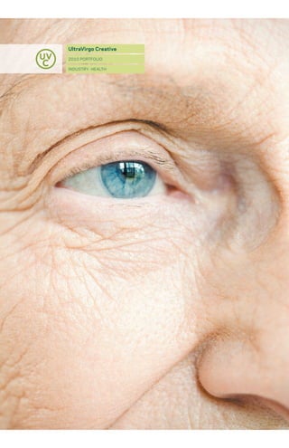
UltraVirgo Creative Portfolio Highlights Health Industry Design
- 3. We believe that health is the most valuable thing you can have.
- 5. We believe in the power of information to improve health.
- 7. We believe that smart design can improve access to and comprehension of vital health information.
- 8. We believe that smart design can improve health through: cl a r i t y edu cat ion Customers are interested in Customers also need to learn their options, and they have where the information comes access to more information from, which information is than ever before about their trustworthy, and why. Exper- care. But most of the infor- tise from professionals in the mation is complex, technical, field and advice from others seemingly contradictory, who have been in the same or difficult to understand. situation are crucial to making smart choices, but serve very Great design created with different purposes. Likewise, the customer in mind can employees must be up to date provide clear, accurate on health information and able information. It cuts through to communicate it to custom- the cacophony of voices ers, patients, and families. and offers accurate, specific information. The ideal design solution will teach customers and For examples of UltraVirgo’s employees what they need ability to develop clarity, to know. It will differentiate see our case studies for between different audiences BlueCross BlueShield and to offer them information that Regeneron Pharmaceuticals. is not too technical nor too simplistic for their needs. For examples of UltraVirgo’s expertise in educating customers and employees, see our case studies for Virgil Skilled Nursing Center and BlueCross BlueShield.
- 9. personal aut he nti c i ty co n n e ct i o n Health companies often The medium may not be have a range of in-house and the message, but applying outsourced design personnel, techniques that work in one which can dilute the corporate medium to another medium brand. Compounding this can cause confusion. problem, there can be The same message can differing views of the overall be sent through social media mission when viewed through or an annual report, but the lenses of different each requires an entirely departments or audiences. different approach. Excellent design expresses Great communication a brand that is true to the solutions are custom-tailored company and unique and to meet the needs of each relevant to the marketplace. customer through a specific Design standards can help medium. They fit the amount carry that brand through of time the reader has everything the company available when using a produces, from employee specific medium, and the training materials to amount of information sales brochures. wanted at a given time. For examples of UltraVirgo’s For examples of UltraVirgo’s ability to provide authentic ability to make personal designs true to a company’s connections to different brand, see our case studies audiences, see our case for Pfizer Pharmaceuticals studies for the New Aging and EmblemHealth. Conference and Venice Family Clinic.
- 10. We believe that designs that are clear, educational, authentic, and strengthen personal connections can improve lives.
- 11. Examples: virgil skilled nursing center Reinventing elder care b luecross blueshield Communicating complex information through simple graphics emblemhealth Introducing a brand new healthcare company pfizer Creating authentic identities for internal divisions new aging conference Inspiring a young audience to reinvision aging regeneron pharmaceuticals Measuring progress and defining opportunities v enice family clinic Energizing donors, employees and users
- 12. virgil skilled nursing center branding web site design print marketing collateral information design Reinventing elder care In this comprehensive branding program, UltraVirgo created web and print materials for an innovative nursing home in Los Angeles. Virgil is working to create a new model for elder care, from the structure of the facility to the admissions forms. All communications materials were reinvented with the resident in mind. We updated the image of elder care to show positive images of aging, rich with activity and focused on healing. We positioned Virgil around a community lifestyle that focuses on quality of life, not just attending to disease. PHoToGRAPHy: SToCk WRITING: E. RICH PRINTING: STATIoNERy – BURDGE, SHoRT-RUN BRoCHURES – INFLUENCE GRAPHICS WEB DEVELoPMENT: ANALoG METHoD
- 14. We developed a Family Education Brochure, that provides valuable health information and reference material about aging, for families with loved ones who are growing old. Small quantities are printed using a digital print process, allowing frequent updates of facility-specific information.
- 16. UltraVirgo developed a robust web site to show the active lifestyle of the residents and make facility and health resource information easily available. A blog and custom Content Management System were included to allow management to quickly update web site content. An employee intranet provides all employees with quick access to manuals, forms, and training review materials. www.VirgilRehab.com
- 17. The site includes an online pre-application form, allowing potential residents to easily apply, while custom-developed software aids the admissions department by automatically scoring each applicant for financial and care suitability – a first in the industry.
- 18. Approximately 50% of the residents are korean, so key materials were translated into korean as well, including the web site, which can be accessed in korean, Spanish and English.
- 19. We created a standardized style for all administrative forms and manuals, with a focus on usability and clarity.
- 20. bluecross blueshield identity design presentation design infographic design Communicating complex information through simple graphics UltraVirgo was the Agency of Record for the Safety and Risk Management division of HCSC – BlueCross Blue Shield of Illinois, Texas, oklahoma, and New Mexico. We created identities for internal initiatives and developed informational graphics that made complex IT security concepts understandable and intuitive to internal and external audiences. PHoToGRAPHy: SToCk WRITING: RoBERT MAURIELLo PRESENTATIoN PRoDUCTIoN AND ANIMATIoN: SHADoWWoRkS
- 22. We distilled complex security concepts and process into graphics, diagrams, and icons to clarify them for internal and external audiences.
- 24. EmblemHealth annual RepoRt Design Introducing a brand new healthcare company hiP and ghi, the two largest health insurers in new york, merged to create a new powerhouse in healthcare, emblemhealth. this annual report introduced the new entity, directly expressing and extending the new brand. it served as a transitional book and was developed in conjunction with the annual reports for hiP (which we also designed) and ghi to provide a complete story to all stakeholders. PhotograPhy: alan Shoemake, Stock writing: Seth margoliS Strategy: DeSantiS BreinDel
- 27. The spreads in the annual report focused on the combined strategic power the new company would have, based on the complementary strengths of GHI and HIP.
- 28. The overlapping arcs of the logo were used as a supergraphic to symbolize the harmonious joining of the two companies.
- 30. Pfizer iDentity visual bRanD system Creating authentic identities for internal divisions For Pfizer, UltraVirgo developed strong visual brands for two internal divisions, to define their positions and highlight their strengths. throughout the product devel- opment cycle, clear positioning for these divisions aids the flow of information and encourages cooperation between departments. individual brands were created for the worldwide regulatory affairs & Quality assurance (wraQa) and Safety & risk management (Srm) divisions. this helped explain their positions to other internal divisions and to external agencies. PhotograPhy: Stock writing: Seth margoliS BranD Strategy: DeSantiS BreinDel
- 32. The visual style for WRAQA emphasizes their ability to connect to various entities and streamline internal processes that ensure the best possible product gets to market in the most efficient manner possible.
- 33. The identity for the SRM division is based on a Venn diagram showing cooperation between various departments that work together as a whole.
- 34. New Aging Conference identity visual brand system print collateral web site design Inspiring a young audience to reinvision aging new aging is an international conference on aging and architecture that aims to inspire young leaders and visionaries to imagine how we can transform and better accommodate aging. to inspire a younger audience to rethink its own future now, we focused the marketing materials around the phrase “how do you want to live when you are old?” coupled with a photoillustration that imagines a multitude of answers in varied handwriting. options ranging from “in a nursing home” to “on the moon” illuminate the frustration of current options as well as the hopeful aspect of limitless possibilities. the conference hopes to take the collective vision of attendees, speakers, and supporters to develop a manifesto that reinvigorates innovation in architecture for aging. PhotograPhy: stock, UPenn stUdents Printing: sUPerior resoUrce web develoPment: analog method
- 36. the logo draws attention to new approaches to aging by positioning the aging process as “new & improved!”
- 37. the web site offers maximum information in a lightweight, modular format. inviting read- ers to fill in the blank “when i am old, i will live in a _______.” and tweet their responses, the site provokes younger audiences to share their vision of the future. we invited UPenn architecture students students to submit collages envisioning their own environments in 50 years, which are used as customizable backgrounds for the site. www.new-aging.com
- 38. Regeneron Pharmaceuticals annual RepoRt Design Measuring progress and defining opportunities the pharmaceutical product development cycle is a long and involved process that takes years. the challenge of developing an annual report for a pharmaceutical company is compounded in a year with no products coming to market. For a successful report, UltraVirgo explained the progress results the company had made in clinical trials, and showed the potential for new opportunities in the year ahead. writing: Seth margoliS Strategy: DeSantiS BreinDel
- 40. Spreads in the annual report focused on progress throughout the company, including updates on clinical trials.
- 42. Featured updates also include partnerships and business milestones, giving a complete picture of progress made.
- 44. venice family clinic annual report design Energizing donors, employees and volunteers Venice Family Clinic provides free healthcare to individuals and families, centered around thousands of volunteer doctors and administrators. In this annual report, we showcased both the amazing impact of this non-profit organization, and the strategies they use to accomplish it. Their annual report serves as a promotional piece – energizing the donors, volunteers and employees who serve the organization’s critical mission. PHoToGRAPHy: MARGARET MALLoy PRINTING: INLAND LITHo IN PARTNERSHIP WITH: DMD
- 47. The clinic’s impact is explained at both local and national levels.
- 49. Specific strategies are highlighted in the narrative section, coupled with quotes from, and case studies of, specific people providing or receiving the services.
- 50. He who has health has hope. He who has hope has everything. –arabic proverb
- 52. 131 Varick Street, Suite 911 New York, New York 10013 212-242-6089 creative@ultravirgo.com