SlideShare une entreprise Scribd logo
1  sur  6
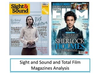
Sight and Sound and Total Film
      Magazines Analysis
The two magazines
                                                                   on the left clearly
                                                                   show that it is aimed
                                                                   at different
                                                                   audiences. The target
                                                                   audience for Sight
                                                                   and Sound would be
                                                                   a older audience 40+,
                                                                   where as Total film
                                                                   would be aged 19-35.
                                                                   The way the audience
                                                                   are separated is by
                                                                   the use of certain
                                                                   typefaces and the
                                                                   main image.

Both magazine have used magazine   Conventions have also been challenged by both
conventions which includes:        magazines. The layout for Total film and Sound and
-Masthead                          sight don’t follow the three conventional layouts
-Barcode                           which are “C”, “Z” and “T” shaped. By doing this both
-Cover lines to anchor the image   magazines are showing the audience that they are a
-Main image positioned in the      well established magazine who don’t need to follow
middle.                            all the conventions to attract the audience.
Typeface – Sound and sight magazine typeface is more casual as it looks like someone has written the
text, this is not usually seen on a magazine cover as is become difficult to read the cover lies which i
think has happened here; whereas the typeface for Total film is clear and simple to read. The typeface
for Sound and sight magazine may have worked if it was appealed at a more younger audience as they
like things which are different and edgy. The magazine has used 3 different fonts which helps to
differentiate the text and image, this will make it easier for the audience to navigate around the
magazine. For both magazines the fonts are in different colours, this will help to break down the text
which will again make it easy for the audience to navigate around the magazine. c
The colours used for Sight and sound magazine are yellow, white, grey, black, brown and red. All these colours go well
with each other as they help the text to contrast and more visually appealing. The colours yellow, black and red have
been used more the masthead as the audience will be directly attracted to the name of the magazine. The colours for
the cover lines are gentle, this allows the main focus of the magazine to be the main image, also the niche audience
for the magazine are older who prefer calmer colours. “Wes Anderson” is anchoring the main image is in larger text, in
this case this has been done so that the audience know who the man on the cover is.


                                                                     Similarities:
                                                                     -Both magazines have text on each side of
                                                                     the main image

                                                                     -Masthead is big and bold

                                                                     -The text anchoring the main image is
                                                                     larger than other text

                                                                     -Different colours have been used to break
                                                                     up the text.


The colours used for Total film magazine are blue, black and white. The background of the magazine has a blue tone
and the masthead is white this creates a contrast, allowing the masthead to be more noticeable. Some of the fonts
are in bold e.g. “10 coolest movies” by doing this it highlights the main features of the magazine. Also for each cover
line certain words are in bold and blue, “Extra”, this word implies that the magazine have included more content then
usual which makes the audience feel that they are getting their value of money. The cover line anchoring the image is
larger than the other cover lines which allows the audience to establish what the main feature of the magazine will
be, also the text will help the audience to understand the image.
The main image of Sight and sound is of a man wearing a pink shirt and brown trousers with his hands held
 together, he is looking directly at the camera. The model is dressed in a casual way which will make it easier for the
 audience to relate to him as they will feel he is just like them, also this can also imply that he may not be a movie
 star who are normally seen on film magazines dressed as their character.


                                                                           Both magazines have positioned the
                                                                           models in the centre of the
                                                                           magazine and have made it the main
                                                                           focus. They both have the models
                                                                           looking directly towards the camera
                                                                           which shows they are engaging with
                                                                           the audience, this will make the
                                                                           audience think that the models on
                                                                           the cover are paying attention to
                                                                           them as well as the audience are to
                                                                           them.


The main image for Total film is from the film Sherlock Holmes and is of the main character, the benefit of this is
that the audience will instantly recognise the film without even looking at the anchoring cover line; also the model
is dressed exactly like the character does in the film (mise-en-scene) which again grabs the audience attention. The
model is looking directly at the camera with his hands in his pockets representing that he is relaxed. The main
image covers parts of the masthead which may have been done as the magazine is already well established
symbolizes that the audience will recognise the magazine with the usual conventions. The magazine also has three
other images which are off characters from different film, by doing this the magazine is showing the variety of films
which are featured just in one addition.
Rule of thirds :                                       Rule of thirds :

Left third                                             Left third
-Masthead                                              -Two cover lines  gives the audience a small glimpse
-A large amount of the cover lines                     of the context of the magazine.
                                                       -Small section of the masthead and another cover line
The models eyes are within one of the lines, this is
done as these areas the audience look at first when    Like Sight and sound magazine the models eyes are
looking at a magazine cover.                           positioned on one of the lines.

Contenu connexe

Tendances

Magazine cover research
Magazine cover research Magazine cover research
Magazine cover research Janet Lunkusé
 
Carve front cover, 16 1-12
Carve front cover, 16 1-12Carve front cover, 16 1-12
Carve front cover, 16 1-12rbeavis
 
Front Cover Research
Front Cover ResearchFront Cover Research
Front Cover Researchjessheap
 
Analysing nme dizzee cover prep for blog ppt [autosaved]
Analysing  nme dizzee cover prep for blog ppt [autosaved]Analysing  nme dizzee cover prep for blog ppt [autosaved]
Analysing nme dizzee cover prep for blog ppt [autosaved]asmediag12
 
Double page spread deconstructions
Double page spread deconstructionsDouble page spread deconstructions
Double page spread deconstructionsjamesrobinson4696
 
Production log for my front cover
Production log for my  front cover Production log for my  front cover
Production log for my front cover twinklez
 
Contents Page Draft
Contents Page DraftContents Page Draft
Contents Page Draftasmediac12
 
The generic conventions of magazines cover
The generic conventions of magazines   coverThe generic conventions of magazines   cover
The generic conventions of magazines coverJenny McNulty
 
Evaluation question 1 final
Evaluation question 1 finalEvaluation question 1 final
Evaluation question 1 finalJay-Dan-Lamb
 
Analysis of professional magazine covers
Analysis of professional magazine coversAnalysis of professional magazine covers
Analysis of professional magazine coversJessikahBaard
 
Front Cover Analysis
Front Cover AnalysisFront Cover Analysis
Front Cover Analysisjeevstar
 
Musicmagazineanalysis
MusicmagazineanalysisMusicmagazineanalysis
Musicmagazineanalysisbethfrancis
 
Analysis of front cover
Analysis of front coverAnalysis of front cover
Analysis of front covertaylerday
 
Analysing nme dizzee cover prep for blog done.
Analysing  nme dizzee cover prep for blog done.Analysing  nme dizzee cover prep for blog done.
Analysing nme dizzee cover prep for blog done.asmediac12
 
Magazine cover analysis nme
Magazine cover analysis   nmeMagazine cover analysis   nme
Magazine cover analysis nmeamybrackenridge
 
Billboard Research
Billboard ResearchBillboard Research
Billboard ResearchAmy_Walker93
 

Tendances (20)

Smash hits
Smash hitsSmash hits
Smash hits
 
Magazine cover research
Magazine cover research Magazine cover research
Magazine cover research
 
Carve front cover, 16 1-12
Carve front cover, 16 1-12Carve front cover, 16 1-12
Carve front cover, 16 1-12
 
Front Cover Research
Front Cover ResearchFront Cover Research
Front Cover Research
 
Analysing nme dizzee cover prep for blog ppt [autosaved]
Analysing  nme dizzee cover prep for blog ppt [autosaved]Analysing  nme dizzee cover prep for blog ppt [autosaved]
Analysing nme dizzee cover prep for blog ppt [autosaved]
 
Evaluation part1
Evaluation part1Evaluation part1
Evaluation part1
 
Music mag analysed
Music mag analysedMusic mag analysed
Music mag analysed
 
Double page spread deconstructions
Double page spread deconstructionsDouble page spread deconstructions
Double page spread deconstructions
 
Production log for my front cover
Production log for my  front cover Production log for my  front cover
Production log for my front cover
 
Contents Page Draft
Contents Page DraftContents Page Draft
Contents Page Draft
 
The generic conventions of magazines cover
The generic conventions of magazines   coverThe generic conventions of magazines   cover
The generic conventions of magazines cover
 
Evaluation question 1 final
Evaluation question 1 finalEvaluation question 1 final
Evaluation question 1 final
 
Analysis of professional magazine covers
Analysis of professional magazine coversAnalysis of professional magazine covers
Analysis of professional magazine covers
 
Front Cover Analysis
Front Cover AnalysisFront Cover Analysis
Front Cover Analysis
 
Musicmagazineanalysis
MusicmagazineanalysisMusicmagazineanalysis
Musicmagazineanalysis
 
Analysis of front cover
Analysis of front coverAnalysis of front cover
Analysis of front cover
 
Analysing nme dizzee cover prep for blog done.
Analysing  nme dizzee cover prep for blog done.Analysing  nme dizzee cover prep for blog done.
Analysing nme dizzee cover prep for blog done.
 
Magazine cover analysis nme
Magazine cover analysis   nmeMagazine cover analysis   nme
Magazine cover analysis nme
 
Media
MediaMedia
Media
 
Billboard Research
Billboard ResearchBillboard Research
Billboard Research
 

En vedette (8)

audience feedback
audience feedbackaudience feedback
audience feedback
 
Presentacion
PresentacionPresentacion
Presentacion
 
My favorite animal
My favorite animalMy favorite animal
My favorite animal
 
Evaluation
EvaluationEvaluation
Evaluation
 
Presentacion
PresentacionPresentacion
Presentacion
 
Presentacion
PresentacionPresentacion
Presentacion
 
Drag me to hell
Drag me to hellDrag me to hell
Drag me to hell
 
Audience research
Audience researchAudience research
Audience research
 

Similaire à Magazine comparision

Magazine cover analysis
Magazine cover analysisMagazine cover analysis
Magazine cover analysismrcaptainpanda
 
Evaluation
EvaluationEvaluation
Evaluationbenhope
 
Magazine cover analysis
Magazine cover analysisMagazine cover analysis
Magazine cover analysisMatthew Cooper
 
Media final evaluation
Media final evaluationMedia final evaluation
Media final evaluationFardowsa
 
Analysis of magazine
Analysis of magazineAnalysis of magazine
Analysis of magazinesanchiaa
 
Textual Analysis 1
Textual Analysis 1Textual Analysis 1
Textual Analysis 1mnoficzer
 
Film magazine analysis
Film magazine analysisFilm magazine analysis
Film magazine analysisshakelamayxo
 
Textual analysis
Textual analysisTextual analysis
Textual analysistashaay27
 
Evaluation question 1
Evaluation question 1Evaluation question 1
Evaluation question 1Jay-Dan-Lamb
 
Movie Magazine Cover & Poster analysis
Movie Magazine Cover & Poster analysis Movie Magazine Cover & Poster analysis
Movie Magazine Cover & Poster analysis Naomi Collins
 
Analysis of music magazines front covers
Analysis of music magazines front coversAnalysis of music magazines front covers
Analysis of music magazines front coversmarwasaroya
 
Evaluation
EvaluationEvaluation
EvaluationAmy Moss
 
Digital media production
Digital media production Digital media production
Digital media production 19001069
 
Magazine Front Cover Analysis
Magazine Front Cover AnalysisMagazine Front Cover Analysis
Magazine Front Cover Analysisjamiedawsonvyners
 
The girl with the dragon tattoo magazine cover analysis
The girl with the dragon tattoo magazine cover analysisThe girl with the dragon tattoo magazine cover analysis
The girl with the dragon tattoo magazine cover analysisGussssssy1
 
Case studies and comparable products
Case studies and comparable productsCase studies and comparable products
Case studies and comparable productsameliaskill9
 

Similaire à Magazine comparision (20)

Empire magazine
Empire magazineEmpire magazine
Empire magazine
 
Magazine cover analysis
Magazine cover analysisMagazine cover analysis
Magazine cover analysis
 
Evaluation
EvaluationEvaluation
Evaluation
 
Magazine cover analysis
Magazine cover analysisMagazine cover analysis
Magazine cover analysis
 
Media final evaluation
Media final evaluationMedia final evaluation
Media final evaluation
 
Assignment 9 part b
Assignment 9 part bAssignment 9 part b
Assignment 9 part b
 
Cheryl Cole
Cheryl ColeCheryl Cole
Cheryl Cole
 
Analysis of magazine
Analysis of magazineAnalysis of magazine
Analysis of magazine
 
Textual Analysis 1
Textual Analysis 1Textual Analysis 1
Textual Analysis 1
 
Film magazine analysis
Film magazine analysisFilm magazine analysis
Film magazine analysis
 
Textual analysis
Textual analysisTextual analysis
Textual analysis
 
Evaluation question 1
Evaluation question 1Evaluation question 1
Evaluation question 1
 
Movie Magazine Cover & Poster analysis
Movie Magazine Cover & Poster analysis Movie Magazine Cover & Poster analysis
Movie Magazine Cover & Poster analysis
 
Analysis of music magazines front covers
Analysis of music magazines front coversAnalysis of music magazines front covers
Analysis of music magazines front covers
 
Evaluation
EvaluationEvaluation
Evaluation
 
Digital media production
Digital media production Digital media production
Digital media production
 
Magazine Front Cover Analysis
Magazine Front Cover AnalysisMagazine Front Cover Analysis
Magazine Front Cover Analysis
 
My media evaluation
My media evaluationMy media evaluation
My media evaluation
 
The girl with the dragon tattoo magazine cover analysis
The girl with the dragon tattoo magazine cover analysisThe girl with the dragon tattoo magazine cover analysis
The girl with the dragon tattoo magazine cover analysis
 
Case studies and comparable products
Case studies and comparable productsCase studies and comparable products
Case studies and comparable products
 

Plus de Vaishali Patel (20)

Question 3
Question 3Question 3
Question 3
 
The eye
The eyeThe eye
The eye
 
the uninvited
the uninvitedthe uninvited
the uninvited
 
Typefaces
TypefacesTypefaces
Typefaces
 
Typefaces
TypefacesTypefaces
Typefaces
 
Production logo design
Production logo designProduction logo design
Production logo design
 
Audience research
Audience researchAudience research
Audience research
 
Audience research
Audience researchAudience research
Audience research
 
Production logo design
Production logo designProduction logo design
Production logo design
 
Characters
CharactersCharacters
Characters
 
Evaluation
EvaluationEvaluation
Evaluation
 
Rolling stones front cover
Rolling stones front coverRolling stones front cover
Rolling stones front cover
 
Billboard front cover
Billboard front coverBillboard front cover
Billboard front cover
 
Billboard contents page
Billboard contents pageBillboard contents page
Billboard contents page
 
Rolling stones contents page
Rolling stones contents pageRolling stones contents page
Rolling stones contents page
 
Evaluation
EvaluationEvaluation
Evaluation
 
Sound
SoundSound
Sound
 
Narrative structure
Narrative structureNarrative structure
Narrative structure
 
Functions and features of trailers
Functions and features of trailersFunctions and features of trailers
Functions and features of trailers
 
The purpose of a trailer
The purpose of a trailerThe purpose of a trailer
The purpose of a trailer
 

Dernier

Rohan Jaitley: Central Gov't Standing Counsel for Justice
Rohan Jaitley: Central Gov't Standing Counsel for JusticeRohan Jaitley: Central Gov't Standing Counsel for Justice
Rohan Jaitley: Central Gov't Standing Counsel for JusticeAbdulGhani778830
 
Global Terrorism and its types and prevention ppt.
Global Terrorism and its types and prevention ppt.Global Terrorism and its types and prevention ppt.
Global Terrorism and its types and prevention ppt.NaveedKhaskheli1
 
57 Bidens Annihilation Nation Policy.pdf
57 Bidens Annihilation Nation Policy.pdf57 Bidens Annihilation Nation Policy.pdf
57 Bidens Annihilation Nation Policy.pdfGerald Furnkranz
 
Quiz for Heritage Indian including all the rounds
Quiz for Heritage Indian including all the roundsQuiz for Heritage Indian including all the rounds
Quiz for Heritage Indian including all the roundsnaxymaxyy
 
16042024_First India Newspaper Jaipur.pdf
16042024_First India Newspaper Jaipur.pdf16042024_First India Newspaper Jaipur.pdf
16042024_First India Newspaper Jaipur.pdfFIRST INDIA
 
VIP Girls Available Call or WhatsApp 9711199012
VIP Girls Available Call or WhatsApp 9711199012VIP Girls Available Call or WhatsApp 9711199012
VIP Girls Available Call or WhatsApp 9711199012ankitnayak356677
 
IndiaWest: Your Trusted Source for Today's Global News
IndiaWest: Your Trusted Source for Today's Global NewsIndiaWest: Your Trusted Source for Today's Global News
IndiaWest: Your Trusted Source for Today's Global NewsIndiaWest2
 
complaint-ECI-PM-media-1-Chandru.pdfra;;prfk
complaint-ECI-PM-media-1-Chandru.pdfra;;prfkcomplaint-ECI-PM-media-1-Chandru.pdfra;;prfk
complaint-ECI-PM-media-1-Chandru.pdfra;;prfkbhavenpr
 
Experience the Future of the Web3 Gaming Trend
Experience the Future of the Web3 Gaming TrendExperience the Future of the Web3 Gaming Trend
Experience the Future of the Web3 Gaming TrendFabwelt
 
Manipur-Book-Final-2-compressed.pdfsal'rpk
Manipur-Book-Final-2-compressed.pdfsal'rpkManipur-Book-Final-2-compressed.pdfsal'rpk
Manipur-Book-Final-2-compressed.pdfsal'rpkbhavenpr
 

Dernier (10)

Rohan Jaitley: Central Gov't Standing Counsel for Justice
Rohan Jaitley: Central Gov't Standing Counsel for JusticeRohan Jaitley: Central Gov't Standing Counsel for Justice
Rohan Jaitley: Central Gov't Standing Counsel for Justice
 
Global Terrorism and its types and prevention ppt.
Global Terrorism and its types and prevention ppt.Global Terrorism and its types and prevention ppt.
Global Terrorism and its types and prevention ppt.
 
57 Bidens Annihilation Nation Policy.pdf
57 Bidens Annihilation Nation Policy.pdf57 Bidens Annihilation Nation Policy.pdf
57 Bidens Annihilation Nation Policy.pdf
 
Quiz for Heritage Indian including all the rounds
Quiz for Heritage Indian including all the roundsQuiz for Heritage Indian including all the rounds
Quiz for Heritage Indian including all the rounds
 
16042024_First India Newspaper Jaipur.pdf
16042024_First India Newspaper Jaipur.pdf16042024_First India Newspaper Jaipur.pdf
16042024_First India Newspaper Jaipur.pdf
 
VIP Girls Available Call or WhatsApp 9711199012
VIP Girls Available Call or WhatsApp 9711199012VIP Girls Available Call or WhatsApp 9711199012
VIP Girls Available Call or WhatsApp 9711199012
 
IndiaWest: Your Trusted Source for Today's Global News
IndiaWest: Your Trusted Source for Today's Global NewsIndiaWest: Your Trusted Source for Today's Global News
IndiaWest: Your Trusted Source for Today's Global News
 
complaint-ECI-PM-media-1-Chandru.pdfra;;prfk
complaint-ECI-PM-media-1-Chandru.pdfra;;prfkcomplaint-ECI-PM-media-1-Chandru.pdfra;;prfk
complaint-ECI-PM-media-1-Chandru.pdfra;;prfk
 
Experience the Future of the Web3 Gaming Trend
Experience the Future of the Web3 Gaming TrendExperience the Future of the Web3 Gaming Trend
Experience the Future of the Web3 Gaming Trend
 
Manipur-Book-Final-2-compressed.pdfsal'rpk
Manipur-Book-Final-2-compressed.pdfsal'rpkManipur-Book-Final-2-compressed.pdfsal'rpk
Manipur-Book-Final-2-compressed.pdfsal'rpk
 

Magazine comparision

  • 1. Sight and Sound and Total Film Magazines Analysis
  • 2. The two magazines on the left clearly show that it is aimed at different audiences. The target audience for Sight and Sound would be a older audience 40+, where as Total film would be aged 19-35. The way the audience are separated is by the use of certain typefaces and the main image. Both magazine have used magazine Conventions have also been challenged by both conventions which includes: magazines. The layout for Total film and Sound and -Masthead sight don’t follow the three conventional layouts -Barcode which are “C”, “Z” and “T” shaped. By doing this both -Cover lines to anchor the image magazines are showing the audience that they are a -Main image positioned in the well established magazine who don’t need to follow middle. all the conventions to attract the audience.
  • 3. Typeface – Sound and sight magazine typeface is more casual as it looks like someone has written the text, this is not usually seen on a magazine cover as is become difficult to read the cover lies which i think has happened here; whereas the typeface for Total film is clear and simple to read. The typeface for Sound and sight magazine may have worked if it was appealed at a more younger audience as they like things which are different and edgy. The magazine has used 3 different fonts which helps to differentiate the text and image, this will make it easier for the audience to navigate around the magazine. For both magazines the fonts are in different colours, this will help to break down the text which will again make it easy for the audience to navigate around the magazine. c
  • 4. The colours used for Sight and sound magazine are yellow, white, grey, black, brown and red. All these colours go well with each other as they help the text to contrast and more visually appealing. The colours yellow, black and red have been used more the masthead as the audience will be directly attracted to the name of the magazine. The colours for the cover lines are gentle, this allows the main focus of the magazine to be the main image, also the niche audience for the magazine are older who prefer calmer colours. “Wes Anderson” is anchoring the main image is in larger text, in this case this has been done so that the audience know who the man on the cover is. Similarities: -Both magazines have text on each side of the main image -Masthead is big and bold -The text anchoring the main image is larger than other text -Different colours have been used to break up the text. The colours used for Total film magazine are blue, black and white. The background of the magazine has a blue tone and the masthead is white this creates a contrast, allowing the masthead to be more noticeable. Some of the fonts are in bold e.g. “10 coolest movies” by doing this it highlights the main features of the magazine. Also for each cover line certain words are in bold and blue, “Extra”, this word implies that the magazine have included more content then usual which makes the audience feel that they are getting their value of money. The cover line anchoring the image is larger than the other cover lines which allows the audience to establish what the main feature of the magazine will be, also the text will help the audience to understand the image.
  • 5. The main image of Sight and sound is of a man wearing a pink shirt and brown trousers with his hands held together, he is looking directly at the camera. The model is dressed in a casual way which will make it easier for the audience to relate to him as they will feel he is just like them, also this can also imply that he may not be a movie star who are normally seen on film magazines dressed as their character. Both magazines have positioned the models in the centre of the magazine and have made it the main focus. They both have the models looking directly towards the camera which shows they are engaging with the audience, this will make the audience think that the models on the cover are paying attention to them as well as the audience are to them. The main image for Total film is from the film Sherlock Holmes and is of the main character, the benefit of this is that the audience will instantly recognise the film without even looking at the anchoring cover line; also the model is dressed exactly like the character does in the film (mise-en-scene) which again grabs the audience attention. The model is looking directly at the camera with his hands in his pockets representing that he is relaxed. The main image covers parts of the masthead which may have been done as the magazine is already well established symbolizes that the audience will recognise the magazine with the usual conventions. The magazine also has three other images which are off characters from different film, by doing this the magazine is showing the variety of films which are featured just in one addition.
  • 6. Rule of thirds : Rule of thirds : Left third Left third -Masthead -Two cover lines  gives the audience a small glimpse -A large amount of the cover lines of the context of the magazine. -Small section of the masthead and another cover line The models eyes are within one of the lines, this is done as these areas the audience look at first when Like Sight and sound magazine the models eyes are looking at a magazine cover. positioned on one of the lines.