BIME Analytics Maps: Efficiently visualize data on beautiful maps

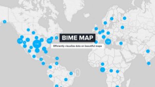
BIME Analytics Maps: Efficiently visualize data on beautiful maps We believe the new improved BIME Map visualization is both the easiest and most beautiful way to do spatial analysis available today. The cloud makes it easy. Here is why… Ease and speed of geocode data coming from very different data sources An important part of spatial analysis is extracting the location from text value. Most of the geographic information is not available in perfect longitude and latitude form but in text columns in databases, online services or Excel files. BIME will take care of converting text value to longitude and latitude and if the data point is something BIME has already seen it will return the position at an incredible speed. Light maps: High contrast with default colors. Contains minimal informations in terms of streets, road names. This tile really leaves room for your data to shine. Street maps Beautiful colors. Street and city names detailed. Dark maps: A black theme of the light version. If your dashboard leans toward the dark side. Pencil maps A very beautiful theme that retains high contrast with data points. It works extremely well when you zoom in on an area with a high density of population. Satellite maps: Very precise topographic and road information. Clustering A lot of data maps out there suffer from occlusion of points. With the new BIME, map points that are too close are automatically merged. Have a look below by sliding the separation between the old way and new way. This approach offers a lot of advantages VISUALIZATION Much nicer and cleaner picture of data with fewer data points. PERFORMANCE Better performance as the rendering doesn't have to draw thousands of points on the map. LEVEL OF DETAILS Details on demand. Zooming is very easy by clicking on zones of interest. Multivariate spatial analysis You can encode several numeric values through text, color and size encoding. The new BIME map also gives you the ability to analyze several categories at once via pie chart representation. Heatmap A heatmap is a visualization used to depict the intensity of data at geographical points. When the Heatmap Layer is enabled, a colored overlay will appear on top of the map. By default, areas of higher intensity will be colored yellow, and areas of lower intensity will appear purple. Maps are another fundamental visualization as they maximise the cognitive ability of the analyst to understand data through space. They are both very easy to use as thanks to default settings such as clustering, and a wealth of customization options allow you to create beautiful custom maps. About BIME: BIME delivers a simple-to-use yet powerful data analysis and dashboarding cloud platform accessible everywhere that enables modern organizations to explore, understand and communicate data with style. Its UI combines the visual simplicity and elegance of the best consumer apps with powerful features