How Fathead Conquered Responsive Design and Increased Revenue

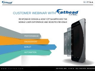
Listen to the full webinar recording here: http://pages.yottaa.com/FatheadWebinar.html Retailers know that responsive web design (RWD) is a must-have in the age of the omni-channel consumer. But companies are still struggling to implement RWD for optimal performance and engagement, especially for mobile consumers. This was true for Fathead, the industry leader of graphics products for large & small spaces, which experienced slow mobile load times following an RWD initiative. new-fathead-customer-logoIn this webinar, recorded on April 16 2015, Jennifer Rademacher, CIO, Fathead and Michael Layne, Director of Internet Marketing, Fathead, discuss: - How companies can implement a successful RWD initiative - How Fathead developed an RWD strategy in conjunction with an adaptive CDN - Fathead’s experience implementing and utilizing optimization technology to improve mobile user engagement - Steps they took to increase revenue-per-visitor and time-to-interact, and reduce page load time and page weight - How Fathead’s experience with RWD and adaptive CDN has changed its thinking as it develops a 2nd generation RWD site for 2015

Recommended
Recommended
More Related Content
More from Yottaa
More from Yottaa (12)
Recently uploaded
Recently uploaded (20)
How Fathead Conquered Responsive Design and Increased Revenue
- 1. Y O T T A A , I N C , © 2 0 1 5 A L L R I G H T S R E S E R V E CUSTOMER WEBINAR WITH RESPONSIVE DESIGN & HOW YOTTAA IMPROVED THE MOBILE USER EXPERIENCE AND BOOSTED REVENUE PERFORMANCE ENGAGEMENT IMPACT AUTOMATION
- 2. Y O T T A A , I N C , © 2 0 1 5 A L L R I G H T S R E S E R V E MICHAEL LAYNE DIR. INTERNET MARKETING michaellayne@fathead.com @md_layne YOUR SPEAKERS JEN RADEMACHER CHIEF INFORMATION OFFICER jenniferrademacher@fathead.com @jenrademacher ARI WEIL VP PRODUCT MARKETING aweil@yottaa.com @aweil
- 3. Y O T T A A , I N C , © 2 0 1 5 A L L R I G H T S R E S E R V E RESPONSIVE DESIGN: The Year-One Lessons That Build an Even Better Year Two ©2015, Fathead, LLC. All rights reserved.
- 4. Y O T T A A , I N C , © 2 0 1 5 A L L R I G H T S R E S E R V E 71.6%
- 5. Y O T T A A , I N C , © 2 0 1 5 A L L R I G H T S R E S E R V E DECEMBER 2011 – 19.6% DECEMBER 2012 – 44.1% DECEMBER 2013 – 55.0% DECEMBER 2014 – 64.6%
- 6. Y O T T A A , I N C , © 2 0 1 5 A L L R I G H T S R E S E R V E QUESTION: If you knew that most of your visitors came to your site on phones and tablets, would you spend most your time designing for desktop monitors?
- 7. Y O T T A A , I N C , © 2 0 1 5 A L L R I G H T S R E S E R V E ANSWER: That’s up to you… …but, we asked ourselves that question as we set out to create a 2nd generation responsive web site…
- 8. Y O T T A A , I N C , © 2 0 1 5 A L L R I G H T S R E S E R V E …and these are the guiding principles that we came up with… • MOBILE FIRST • MOBILE FAST • COMPREHENSIVELY RESPONSIVE • BRAND FORWARD
- 9. Y O T T A A , I N C , © 2 0 1 5 A L L R I G H T S R E S E R V E Fathead – what’s behind that catchy name? We are: a graphic design company a partner to over 700 licensed brands a Detroit based US manufacturer a B2C online retailer a wholesaler to online and brick & mortar retailers a B2B provider of creative design solutions 100+ highly motivated, creative people in the business of selling fun
- 10. Y O T T A A , I N C , © 2 0 1 5 A L L R I G H T S R E S E R V E Here are some samples of what we do: The original and still most popular Fathead REAL.BIG. Wall Decal
- 11. Y O T T A A , I N C , © 2 0 1 5 A L L R I G H T S R E S E R V E The smaller Fathead Jr… …and a Custom Creation of a personal photo that we turned into one of our products
- 12. Y O T T A A , I N C , © 2 0 1 5 A L L R I G H T S R E S E R V E We have solutions for businesses and educational institutions as well as events
- 13. Y O T T A A , I N C , © 2 0 1 5 A L L R I G H T S R E S E R V E The arguments in favor of responsive design A great solution for a talented but resource-limited team A handy solution for delivering screen-specific content An efficient solution due to the single code base A measurable solution for both web analytics and testing As we deployed it, a largely marketing driven front end that is nimble and powerful
- 14. Y O T T A A , I N C , © 2 0 1 5 A L L R I G H T S R E S E R V E The arguments against responsive design It’s SO slow We already built an app for that, so what’s the point? We’re going to have to rebuild everything, right?
- 15. Y O T T A A , I N C , © 2 0 1 5 A L L R I G H T S R E S E R V E What we learned and what we changed Design for mobile first Load it as you need it – it’s SO MUCH FASTER! Use fewer break points Scale the images
- 16. Y O T T A A , I N C , © 2 0 1 5 A L L R I G H T S R E S E R V E What we learned and what we changed Take and use feedback Never stop testing The front end is only as good as the management of it See your site in every way your customers do Managing multiple views can make testing tough
- 17. Y O T T A A , I N C , © 2 0 1 5 A L L R I G H T S R E S E R V E Obsessed with finding a better way Creating a 2nd generation responsive site
- 18. Y O T T A A , I N C , © 2 0 1 5 A L L R I G H T S R E S E R V E Strategic Principles: MOBILE FIRST Change mindset and approach: design every aspect of the site for mobile phones first. Make the site easy to use and fully functional on a phone. Let the larger screens flow from a mobile foundation, adding to the experience and making each view an enhanced version of the site.
- 19. Y O T T A A , I N C , © 2 0 1 5 A L L R I G H T S R E S E R V E Strategic Principles: MOBILE FAST Every Second Counts. Do what it takes to speed up page load times. Take advantage of third party services. They’re experts and can quickly improve performance. Don’t rely on third party services. Build for speed independently of those services.
- 20. Y O T T A A , I N C , © 2 0 1 5 A L L R I G H T S R E S E R V E Strategic Principles: COMPREHENSIVE RESPONSIVENESS Move beyond responsive web design into responsive web experience. Let responsive design be the means for meeting and responding to the needs of online customers, not the end for designers and developers. Make Happiness Happen.
- 21. Y O T T A A , I N C , © 2 0 1 5 A L L R I G H T S R E S E R V E Strategic Principles: BRAND FORWARD What they see is who and what you are. (especially for a graphics company). Every pixel matters. Harness responsive design to the intent of the brand, not the other way around.
- 22. Y O T T A A , I N C , © 2 0 1 5 A L L R I G H T S R E S E R V E Cultural Guide Posts: You’ll See It When You Believe It Creating a responsive web site is no small task. If you begin by asking how, you may never get to what. Start with what can be. Start with a vision.
- 23. Y O T T A A , I N C , © 2 0 1 5 A L L R I G H T S R E S E R V E Cultural Guide Posts: Simplicity is Genius Marketers, designers and developers, take a step back. Customers, take a step forward.
- 24. Y O T T A A , I N C , © 2 0 1 5 A L L R I G H T S R E S E R V E Cultural Guide Posts: Innovation is Rewarded… (it’s fun to create something cool)
- 25. Y O T T A A , I N C , © 2 0 1 5 A L L R I G H T S R E S E R V E Cultural Guide Posts: …Execution is Worshipped (it’s even better to succeed)
- 26. Y O T T A A , I N C , © 2 0 1 5 A L L R I G H T S R E S E R V E So, is it worth it? 25% increase in overall direct web revenue year one. 300% increase in mobile revenue year one. Mobile revenue outpaced mobile traffic year two. Customer satisfaction scores nearing best-in-class.
- 27. Y O T T A A , I N C , © 2 0 1 5 A L L R I G H T S R E S E R V E To recap, here’s what we are currently focused on as we create a 2nd generation responsive website: • DESIGN FOR MOBILE FIRST • FOCUS ON A FAST MOBILE EXPERIENCE • THINK OF “RESPONSIVE” AS MORE THAN DESIGN • DON’T SACRIFICE BRAND FOR TECHNOLOGY
- 28. Y O T T A A , I N C , © 2 0 1 5 A L L R I G H T S R E S E R V E PERFORMANCE ENGAGEMENT IMPACT AUTOMATION Online-only retailer speeds up its responsive design site and realizes increased revenue CASE STUDY: +37% Time to Display -4.6% Bounce Rate +16% Revenue per Visitor +14% Time on Site This technology attacks the fundamental flaw in responsive design, which is sending everything and then hiding a bunch of stuff. It looks at the viewport first and says, ‘Tell me what you need.’ Michael Layne, Dir. Of Internet Marketing, Fathead “ “
- 29. Y O T T A A , I N C , © 2 0 1 5 A L L R I G H T S R E S E R V E AppSequencingTM Omni-Engagement Optimize RWD User Experience and Mobile Performance PERSONALIZED EXPERIENCE OPTIMIZATION WITH YOTTAA, WHAT YOU SEE IS WHAT YOU GET ON-DEMAND IMAGES & SOCIAL WIDGETS
- 30. Y O T T A A , I N C , © 2 0 1 5 A L L R I G H T S R E S E R V E Q&A
- 31. Y O T T A A , I N C , © 2 0 1 5 A L L R I G H T S R E S E R V E HOW DID YOU DETERMINE THAT MOBILE WAS A CRITICAL COMPONENT?
- 32. Y O T T A A , I N C , © 2 0 1 5 A L L R I G H T S R E S E R V E HOW DID YOU EVOLVE FROM A DESKTOP WEBSITE TO MOBILE-FIRST & RWD?
- 33. Y O T T A A , I N C , © 2 0 1 5 A L L R I G H T S R E S E R V E WHAT UNIQUE CHALLENGES HAVE YOU FOUND WITH REGARD TO TABLETS?
- 34. Y O T T A A , I N C , © 2 0 1 5 A L L R I G H T S R E S E R V E WHAT WERE SOME OF THE OTHER ASSUMPTIONS FATHEAD WORKED THROUGH?
- 35. Y O T T A A , I N C , © 2 0 1 5 A L L R I G H T S R E S E R V E HOW DID YOU FACE TRADE-OFFS BETWEEN SPEED, USER EXPERIENCE AND CONVERSIONS?
- 36. Y O T T A A , I N C , © 2 0 1 5 A L L R I G H T S R E S E R V E YOU SPOKE ABOUT RWD & AWD, BUT HOW ABOUT RESS? (RESPONSIVE WITH SERVER-SIDE COMPONENTS)
- 37. Y O T T A A , I N C , © 2 0 1 5 A L L R I G H T S R E S E R V E MICHAEL LAYNE DIR. INTERNET MARKETING michaellayne@fathead.com @md_layne THANK YOU! A LINK TO THE RECORDING WILL BE SENT TO ALL ATTENDEES JEN RADEMACHER CHIEF INFORMATION OFFICER jenniferrademacher@fathead.com @jenrademacher ARI WEIL VP PRODUCT MARKETING aweil@yottaa.com @aweil
Editor's Notes
- YOTTAA is a SaaS solution to manage, optimize and secure B2B, B2C and B2E applications. Our cloud-based service drives business results by accelerating online and mobile performance, maximizing end-user engagement, and delivering instant, actionable insights via an intelligent, automated cloud platform.
- WHAT I’D LIKE TO SHARE WITH YOU TODAY IS WHAT WE, AT FATHEAD, HAVE LEARNED 2½ YEARS AFTER LAUNCHING OUR FIRST GEN RWD AND THE STRATEGIC PRINCIPLES AND CULTURAL GUIDE POSTS THAT WE’RE USING TO CREATE A 2ND GEN SITE. I’D LIKE TO START BY ASKING YOU 3 QUESTIONS, AND GET A RAISE OF HANDS TO EACH ONE IF YOU CAN ANSWER YES: HOW MANY OF YOU USE SOME FORM OF RESPONSIVE WEB DESIGN FOR YOUR WEBSITE? HOW MANY OF YOU DESIGN YOUR WEBSITE PRIMARILY WITH DESKTOP MONITORS IN MIND? HOW MANY OF YOU KNOW WHAT PERCENT OF YOUR TRAFFIC COMES TO YOUR WEBSITE ON MOBILE PHONES AND TABLETS?
- 4
- 5
- 6
- 7
- 8
- LICENSES: 8 years ago we had just three licenses MANUFACTURING: We manufacture through printers most of whom are located in Michigan or the Midwest. CHANGING BUSINESS MODEL: We started as an internet pure play but quickly began selling into brick and mortar retailers like Dicks Sporting Goods and Walmart as well as online resellers like Amazon, Kohls and Art.com.
- We’d love to learn what we can do to make where you work as cool as where we work. We can also do this in your home if you’re so inclined.
- Just to recap, responsive web design is a way deliver your web site to any device using a single code base that alters the content and layout depending on the screen size of the device. As a result, we no longer operate an m. or t. site. We look at all of our KPI’s based on the break points in the media query that detects the screen size. We currently have five break points that we refer to as column views. 1 column view is nearly 100% mobile phones. 2 column view is largely portrait tablets. 3 column view is more varied in terms of device. 4 and 5 column views are nearly always laptop and desktop monitors. Probably one the smartest moves we made when we launched our 1st generations RWD was to rebuild our content management system to allow marketing to easily manage the site, build new pages, etc. The other smart things we did was to set up the tracking by break point so we could make decisions targeted at specific layouts.
- Internet Retailer has published strong exposés on how RWD can lead to very slow page load times on mobile devices. I will not argue with that. It is in the very nature of RWD as it is generally practiced to send the whole site and then hide what’s not appropriate for mobile. For a year or so after we launched, the financial benefits of RWD on mobile compared to our previous m. dot site were such that we simply worked on our own code to make it better for mobile. We got to the point where we just couldn’t make it fast enough so we called in help. We selected Yottaa as our partner and saw immediate improvement. The A/B test presented a clear cut case in favor of their service. By delivering only what can immediately fill the screen, or view port, along with other accelerations services, they got us to a much more acceptable performance level. Apps: I’ve got nothing against them. Some of them are great. If you have one that does what you need it to do, by all means keep on that path. If you’re redesigning your site and have limited resources, having one code base and no apps may be a great choice. Rebuilding: We pretty much rebuild every 2-3 years, so we went ahead and did it. You don’t really have to rebuild everything. We didn’t rebuild our data base.
- When we built our 1st generations RWD, we started with the widest screens where we could show the most content and then selected down from there. We didn’t even include a 1-column view in our working documents. We figured we’d just hide what we didn’t need. In hindsight, that was a big mistake. Start with your smallest screen and work up. Like I said, you really want to take the approach of loading just what’s in front of the user’s eyes. We get a lot of feedback and we use it. Team members, customers, surveys, usability studies. ForeSee has given us valuable customer feedback, best practices and benchmarking. Sometimes your gut tells you what to do. Generally speaking though, a test will tell you more. We believe in the value and power of real-time multivariate testing and HiConversion has been a great partner in helping us create a better user experience. It’s hard to remember when you’re in front of your pair of wide screen monitors at work that you’re in the extreme minority when it comes to viewing your site.
- When we built our 1st generations RWD, we started with the widest screens where we could show the most content and then selected down from there. We didn’t even include a 1-column view in our working documents. We figured we’d just hide what we didn’t need. In hindsight, that was a big mistake. Start with your smallest screen and work up. Like I said, you really want to take the approach of loading just what’s in front of the user’s eyes. We get a lot of feedback and we use it. Team members, customers, surveys, usability studies. ForeSee has given us valuable customer feedback, best practices and benchmarking. Sometimes your gut tells you what to do. Generally speaking though, a test will tell you more. We believe in the value and power of real-time multivariate testing and HiConversion has been a great partner in helping us create a better user experience. It’s hard to remember when you’re in front of your pair of wide screen monitors at work that you’re in the extreme minority when it comes to viewing your site.
- We are currently designing the look and feel of our 2nd gen RWD and we’re using some pretty cool prototyping tools to get a real sense of flow, usability and interactivity. We know that we have to design for different screen sizes, but all of our initial designs are for mobile phones. Very taking a more is more approach rather than the less is less approach we took the first time.
- It’s going to sound like I’m speaking out of both sides of my mouth here, but what I want to emphasize is that you need to take responsibility to producing a fast mobile experience.
- We no longer see RWD as a way to design and a way to display content. We now understand the concept of being RESPONSIVE as a strategic principle. It has led us to change our price match and return policy. Those have nothing to do with RWD but they have everything to do with being responsive when it comes to customers and competitors. I mentioned that we sell to other online stores. Some of those take inventory and can set their price. We now always match that price is someone contacts us. We also take returns with no questions asked. We call this SHOP FATHEAD. BE HAPPY. We of our cultural statements that we set as a standard for ourselves is MAKE HAPPINESS HAPPEN. As we’ve lived in the world of responsive design, we’ve recognized as a foundation of our culture that being responsive is essential to what we do. If a basic tenant of RWD is responding to the user’s device and presenting the most appropriate experience on that device, then being responsive to the customer in every online and offline interaction flows naturally from that approach.
- When we were desperately looking to speed up load times we made some decisions that potentially hurt our brand – we reduced the file weight and quality of our smaller catalog images. Often, you couldn’t tell, but when you could, you really could. Finding other ways of speeding up load times allowed us to remain more brand true.
- There are 27 cultural guide posts or ISMs that we embrace at Fathead. 19 of those we share with 100 other companies that are part of our greater family of companies, the flag ship of which is Quicken Loans. Another 8 ISM’s are unique to us. MAKE HAPPINESS HAPPEN is one of those. In the slides that follow, I’ll take you through just a few of the common ISM’s that we’re using to guide us through our current redesign. The first, and the one that sets the tone right off the bat for us is YOU’LL SEE IT WHEN YOU BELIEVE IT. Let me repeat that. I’m not saying that you’ll believe it when you see it. I’m saying that you’ll see it when you believe it.
- The second ISM that we try to keep in mind as we’re looking at designs and judging how well they work on various screens is SIMPLICITY IS GENIUS. When you’re redesigning and you’re caught up in all the cool things you can do with RWD you may tend to over do it. Just because you can show it, doesn’t mean you should. Remember, customers want it to be easy.
- The third ISM is where the rubber meets the road, and it comes in two parts: INNOVATION IS REWARDED. Razzle dazzle gets everyone excited. It’s great to brainstorm and think of all the possibilities. It comes with believing what can be.
- EXECUTION IS WORSHIPPED. At the end of the day, it’s the play on the field that wins the game.
- So, if you’re considering using RWD, I want to just say that results may vary. I can only tell you what it’s meant for us. But we believe strongly that it works for us and our customers. Does it mean we have it all figured out. Absolutely not. Hey, this is the internet. This is ecommerce. Fifteen years I’ve been doing this and every day is a new day, with new challenges and new opportunities. Year one we also did a rebranding, so the overall increase is not just RWD, though when it comes to mobile, it was mostly RWD. We spent even more time on mobile RWD in year two and it paid off. We were already ahead of benchmarking for satisfaction before RWD, we’re now nearing best in class.
- 27
- 35% improved display time 68% increased scalability 80% higher capacity 62% faster start render time
- Optimize RWD with server-side logic Only serve visible content for device Real-time HTML transformation Client-Cloud rules engine Responsive, right-sized images On-demand, delay or defer-load Prioritize and sequence any app content Neutralize JavaScript bottlenecks