Visual Rhetoric, Feb 3rd, Late Show (with snow day make-up)
•Télécharger en tant que PPT, PDF•
1 j'aime•399 vues


Recommandé
Contenu connexe
Tendances
Tendances (12)
En vedette
En vedette (9)
Similaire à Visual Rhetoric, Feb 3rd, Late Show (with snow day make-up)
Similaire à Visual Rhetoric, Feb 3rd, Late Show (with snow day make-up) (20)
Plus de Miami University
Plus de Miami University (20)
Dernier
Dernier (20)
Visual Rhetoric, Feb 3rd, Late Show (with snow day make-up)
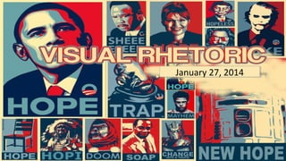
- 1. January 27, 2014 January 27, 2014
- 6. TODAY 1) 2) 3) 4) 5) 6) 7) Icebreaker Basics Let’s talk Logo assignment Overview of some material from the readings Your turn Reminders For Wednesday!
- 7. Icebreaker To start today, I want you to complete what is likely to be a familiar sort of icebreaker activity. You will pair up with someone you don’t already know, and over the course of a few minutes you will interview that person. The info you need to get is on the next slide.
- 8. Find out… 1) The person’s name (obviously) 2) What he/she goes by (if it’s different) 3) His/her major and progress in the program. 4) Why he/she decided to take Visual Rhetoric 5) His/her favorite color 6) One piece of information that will help all of us to remember him/her.
- 9. Now, then… …let’s talk more specifically about what we will be doing as a class. At this point, please either focus on the screen or open the website at http://www.phillalexander.com/visual That course website, btw, will serve as our activity hub and your syllabus. Let’s talk about class.
- 10. And now, Tumblr I will show you how to start a Tumblr, so follow along if you’re not familiar with the site. Please go to http://www.tumblr.com Once you create your site, please email the URL to me at alexanp3@miamioh.edu
- 11. Your First Tumblr For your first Tumblr post, I want you to give me a skills overview. On the next slide you will find a series of questions. Please answer them as completely and accurately as you can.
- 12. Skills Overview How much experience do you have with: 1)Adobe InDesign? Adobe Photoshop? Dreamweaver? 2)Desktop publishing? 3)Document design– working on a magazine, newspaper, website, or designing any sort of paperwork? 4)Creating art? If so, what kind? 5)Taking photographs? 6)Any visual rhetoric-ish skills you want me to know you have?
- 13. Some quick Visual fun Take a look at the next few slides and tell me what’s going on here. Look carefully. Sometimes you might need to squint.
- 16. These illusions depend on intricate line work, very specific color and contrast choices, the mind’s desire to complete shapes and patterns and the fact that our eyes jitter a bit normally. If you squint hard and look at each of these images, they WILL become still. But not for long.
- 17. Visual Fun This doesn’t pulse like the last one, but I wanted to give you another cool visual design trick here. On the next slide, you’ll see two dots (and a weird image, and a white space). Stare at the dot in the middle of the image for 30 seconds, then shift your gaze to the other dot.
- 20. And now that logo assignment As you know, on February 24th, you will be turning in your first major assignment for class: a new mascot and logo design for the Washington Redskins football team. I want to give you some time today to think about that assignment. But first… here’s the actual task, laid out in front of you.
- 21. The task For the final submission, you should send me a completed, colored logo with a written memo of approximately 500 words explaining your choices. You will also submit with this project a shorter, 200 word or less, cover letter to the team “selling” your new logo and mascot.
- 22. One element… …you really want to think about is why the current logo is problematic. So here are a few looks at the main logo, the logo in action, and some of the Redskins secondary logos.
- 25. And a reminder…
- 27. A consideration… I am sure some of you might not find the Redskins logo, or the old Miami Redskins logo, all that problematic. What I would urge you to do in this situation is to submerge yourself in the rhetorical nature of the occasion. Some people will not be offended, of course. This is almost universally true of anything you might do; there will be some who don’t think it’s a big deal. But when designing a mascot and logo, it’s important to think about the ENTIRE audience. Why, then, is the Redskin a problem?
- 28. A word on methods… There are a number of ways to make your own logo. If you have the artistic skills, your best bet will be to draw or otherwise generate your own. We will talk a bit more about that as class moves along. But another thing you might do is collect elements from elsewhere and sort of “kitbash” them, in the DIY sense, or “Voltron” it, so to speak.
- 30. And then…
- 31. NEXT!
- 32. AND NOW SOME C.R.A.P.
- 33. As funny as it is… … making CRAP jokes, it really is a foundational premise of design, and it’s deeply important (and thanks to our sense of humor usually quite memorable). The letters, of course, stand for: Contrast Repetition Alignment Proximity
- 34. You read about it So I’m going to give these to you in my words, along with a few quick examples, so you can get a good sense of how it works.
- 35. Contrast Basically stated, contrast means that things that are similar look similar but things that are different look clearly different. This keeps your reader from becoming confused and creating relationships that aren’t present. It comes, of course, from literal contrast, the light-to-dark or black-to-white of an image. In design it often ends up being about color values.
- 36. This image is a great example, and it is also a hyperlink to a great blog entry on contrast, if you want to learn
- 37. Repetition Maybe the easiest of these four concepts to define, repetition is, just as you’d guess, repeating something– a color, a logo, a typeface, a type style. It unifies and organizes.
- 39. Alignment Alignment is about positioning on a page. Nothing should be put on haphazardly. There should be a reason and a measurement that guides where things are placed in relation to each other.
- 40. The image to the right links to a post that has some cool reflection on alignment. And there’s all kinds of alignment going on with the new Windows 8 start page.
- 41. Proximity Proximity is very similar in theory to alignment, but it’s more about grouping and use of white space. Basically: similar things are grouped together, different things require space.
- 43. NEXT!
- 44. … I want us to engage the readings and really sort of grapple with them, but as you might guess, if we tried to grapple with every part of all five of those readings we’d end up sitting here a long, long time grappling with a big ol’ bunch of ideas. So I’m going to suggest a strategy– pull key ideas and illustrate how they work/see if we can convert them to a sort of tool, or a roadmap, if you will, to understanding visual rhetoric. Something like this:
- 45. Barthes challenges us thusly: “Now even– and above all if– the image is in a certain manner the limit of meaning, it permits the consideration of a veritable ontology of the process of signification. How does meaning get into the image? Where does it end? And if it ends, what is there beyond?” Roland Barthes
- 46. What?
- 50. So…. .. Images carry meaning. But how’d the meaning GET there, Barthes asks us to consider.
- 51. Gunther Kress Kress tells us: “The approach from Social Semiotics not only draws attention to the many kinds of meanings which are at issue in design, but the “social” in “Social Semiotics” draws attention to the fact that meanings always relate to specific societies and their cultures, and to the meanings of the members of those cultures.”
- 52. Like…
- 55. These images have meaning… …because we know them. They emerge from our culture and are reinforced by our culture. Recognize this? That isn’t this, is it? = Or is it? S
- 56. Walter Benjamin Benjamin, who I promise is not the bad guy from Apt Pupil even if he looks like him, reminds us: “In principle a work of art has always been reproducible. Manmade artifacts could always be imitated by men. Replicas were made by pupils in practice of their craft, by masters for diffusing their works, and, finally, by third parties in the pursuit of gain.”
- 58. What is the Aura of This?
- 60. What is the Aura of This?
- 62. Wysocki reminds us: “Because we have all grown up in densely visually constructed environments, usually with little overt instruction or awareness of how the construction takes place, it is easy to think of the visual elements of texts as simply happening or appearing…as though… television sitcoms were the result of a camera crew following a typical family through their day.” Anne Wysocki
- 63. Single, nerdy college professor on TV
- 64. IRL
- 65. This remind you of your friends sitting around?
- 67. And these are just normal people enjoying normal products
- 68. What Wysocki would ask us to do is… ..ask why. Think about why those images are chosen. And maybe more importantly… why don’t people think about it/why isn’t it sort of a big deal to most Americans?
- 69. Now it’s your turn Break into five groups. That should mean 5 per group. Once you’re grouped, from my podium going clockwise around the room: Group 1: Kress Group 2: Barthes Group 3: Wysocki, Eyes Group 4: Benjamin Group 5: Wysocki, Meaning of Texts Pick between no less than 1 and no more than 3 main ideas, support them with source quotes, and find examples for discussion. As you finish, email me your materials: alexanp3@miamioh.edu
- 70. But today… I want us to use our new-found knowledge of C.R.A.P.– which you will read a bit more of– to do a little really basic Photoshop work. What I need you to do is gather the following, quickly– let’s take no more than 4 minutes to do this. 1. A photo of yourself 2. A movie poster you like
- 71. The task Is to put yourself into the movie poster. I will walk you through one way to do it, on the overhead, but if you’re an advanced Photoshop user, you will realize there are more elegant alternative ways to do this. When you finish, post whatever you managed to put together to your Tumblr. That will require you saving as a png or jpg. I can show you how to do that if you’re not familiar.
- 72. As you think about next week… DO NOT FORGET THE IN-DESIGN TUTORIAL! DON’T FORGET IT! I’m serious!
- 73. Homework For next week, read: Read for class: Golombisky & Hagen chapters 1-6 and Norman “Why Designers Go Astray” from The Design of Everyday Things (on Niihka)