
Recommandé
Contenu connexe
Plus de BrettMooreG321
Plus de BrettMooreG321 (20)
Dernier
Dernier (20)
Film Poster Analysis: Grudge Match & Mrs Brown's Boys' D'Movie
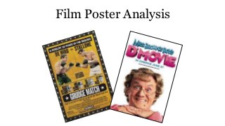
- 3. Purpose: The purpose of this poster is to advertise this particular film and to make the genre and storyline of the film apparent to viewers without actually having to watch the film. Colour: The background colour of this poster is yellow to coincide with traditional boxing posters within the United States. The masthead of the poster is however written in big bold white writing on a black background to make it stand out to the rest of the poster. Key Image: The main image featured is of the two main actors and protagonists in the film, both of which are synonymous with 1980’s boxing movie hits, Raging Bull (De Niro) & Rocky Balboa (Stallone). The image depicts the two actors sparring as if fighting, showing the audience what they can expect from this film. Realism: This poster incorporates the best features of a period, boxing poster, enticing the target audience, thus adding authenticity however sue to the A list actors presented some realism is lost due to their public popularity. Text: The text is evenly spread across the page, with the most important and most profitable bits of text written more clearly and boldly (such as ‘DE NIRO –vs- STALLONE) than other, less important aspects, such as the co-stars and production details. Slogan: This poster has the slogan or tagline stating, ‘A RIVALRY 30 YEARS IN THE MAKING’ leading many of the target audience to draw reference to Rocky Balboa and Raging Bull, to films that depict two heavyweight boxing world champions who triumph over adversity, leading many (at the time) craving for the two fictional heroes to contest each other. The ultimate blockbuster.
- 4. Lay Out: The layout of this film poster is very unique and ties in perfectly with the theme of the film itself. This layout represents that of an early 20th century American boxing poster, with the fighters names written directly above their photographs, preventing any misunderstanding between the images and the text. The layout includes exactly the same style as said boxing posters, which is particularly clever as it appeals directly to the target audience. Furthermore the layout shows the image as the main feature of this poster drawing the audience to draw reference to the popular Raging Bull and Rocky Balboa films respectively (As previously stated. Furthermore the co-stars have been presented in a manor that relates.
- 6. Purpose: The purpose of this poster is to not only advertise the film but also to set the genre and mood of the film before the audience even looks at a trailer, with the elderly ‘woman’ presented posing in a juvenile but humorous manner. Colour: There is quite a basic colour scheme depicted in this poster, much contrast to the bigger budgeted, Grudge Match. The simplicity of the colour scheme is effective particularly to the target audience because no further additives are needed because it is already a well known and popular franchise, helpful giving the financial backing of said movie. Key Image: As previously stated the key image is that of the main protagonist of this franchise ‘Mrs Brown’ with the target audience already well aware of the characters matriarchal mannerisms, this image is particularly effective at appealing to its intended audience, incorporating everything the target audience already loves about the character following the television series. Text: The simplicity of this poster is further accentuated in the use of minimalistic text. This maybe due to the films budget, however by just including the title of the movie, it provides the target audience with enough to recognise the item, but provides them with enough of a unique selling point, to want to buy into what is being presented. The USP of this is the ‘D’MOVIE’ heading that gives the audience a taste of the franchises’ progression and entices them to become apart of this. Slogan: In a way the ‘D’MOVIE’ is essentially the slogan of this poster, incorporating the synonymous Irish dialect whilst also being the films USP differentiating it from the television series in which it found fame.
- 7. Layout: Overall this (as previously mentioned) is a simplistic design for a film poster. It depicts a close up of the films protagonist sporting a juvenile pose, adding to the posters humour, of which is also accentuated by the heading that depicts the synonymous dialect with this protagonist. Connotations of the poser simplicity may well draw reference to the films budget, as the bigger budgeted ‘Grudge Match’ was able to incorporate many unique themes and ways to present their movie to further help differentiate their film in their target market, however the simplistic design is all that is really as the title, and close up entail all of the information the target audience needs and expects too see from this particular franchise, whilst importantly including, what is vital to any film marketing, it’s USP.