SlideShare une entreprise Scribd logo
1  sur  5
House Style Layout The colour scheme of red and white is a familiar  theme for Q magazine readers. The same colours are always used and it appeals to the audiences frame of reference for the magazine. It also makes it easily recognisable to those who don't read it as frequently. The layout is set out very plainly making it look more minimalistic. The description of the contents are all set out down the left hand column and split neatly into different sections appropriate to the pages content. The simplicity follows codes and conventions of the magazine making it easier for the reader to know what the different pages feature and where to find it. Subscription Frame Of Reference Following codes and conventions of other magazine, Q offers a magazine subscription to its readers. The contents page highlights many of the regular articles featured in the magazine that appeal to its regular fan base. The every month section outlines the permanent features, whilst they also have a caption with an overview of what is being reviewed that week.
Layout House Style The layout is fairly simple with the headlined features of the magazine being displayed under other subheadings. This helps indicate to the reader/potential buyer where to find the proposed feature. It also follows codes and conventions of usual magazines by having a column with the page references next to a main image(s) of the featured articles. The contents page features the yellow and grey colours often found in “Tilt” magazine. As with the pictures outlining the featured articles in the magazine are always present in the contents page. Subscription Lure The option of a subscription to the magazine is featured in the bottom right hand corner, quite predominantly. This is a common feature in most magazines, following codes and conventions. The use of  artists and band names used in the headlines of the pages are used as a lure enticing the reader to look at that page.
Layout Term Of Address The contents page of this magazine differ substantially from the general codes and conventions of an average magazine. The page references are spread out rather erratically across the entire page instead of being in a chronological order in a single column. However pictures of what is features on the page are present which follows most codes and conventions Whilst no informal language is used the setup of the headings such as Contents, and Kate Nash are displayed separately breaking up the words, whilst being used to catch attention it also creates more of an informal feel as it is no longer displayed in an easily read position.  Lure The featured artists names are in bold and highlighted, it also features an article on Reading Festival appealing to another audience.
Layout Headings The layout follows codes and conventions of most magazines with its articles listed chronologically down the left hand column of the page. Page references are also portrayed in the form of pictures of bands features within the magazine. The name of the magazine is once again featured boldly as a headline above the page references. There is also another heading entitled “Regulars” to outline the page references for the permanent features in the magazine. Term Of Address Layout The term of address is moderately informer with a fair amount of slang language and terms being used, also by talking to the reader it gives a lower tone and more friendly, less formal feel. By displaying pictures as picture references they are able to showcase the bands featured in the magazine and  act as a lure for the reader(s).
Tone Of Address Layout The layout breaks the main codes and conventions of a magazine’s contents page. The page references are located in the top right-hand corner as opposed to the usual placing in a column. The tone is fairly formal with little slang used and the fonts of the headlines looking classy. However the main heading “CONTENTS” conflicts with this, the way in which it is set out is quite formal and more difficult to read than if it was on the same row like in most magazines. Lure The original photo shoot of the featured artists within the issue is a hook for the reader and helps attract them to read on, a preview of which is shown as the background of the contents page.

Contenu connexe

Tendances

Analysis of Contents Pages
Analysis of Contents PagesAnalysis of Contents Pages
Analysis of Contents Pages
lenny001h
 
Contents page analysis
Contents page analysisContents page analysis
Contents page analysis
meganbreary
 
Task 8 tabloid
Task 8  tabloidTask 8  tabloid
Task 8 tabloid
chamahan
 

Tendances (20)

Contents Page Analysis
Contents Page Analysis Contents Page Analysis
Contents Page Analysis
 
Contents Page Analysis
Contents Page AnalysisContents Page Analysis
Contents Page Analysis
 
Analyses of contents pages
Analyses of contents pagesAnalyses of contents pages
Analyses of contents pages
 
NME contents page analysis
NME contents page  analysisNME contents page  analysis
NME contents page analysis
 
Music Magazine Analysis
Music Magazine AnalysisMusic Magazine Analysis
Music Magazine Analysis
 
A2 contents page code and conventions
A2 contents page code and conventionsA2 contents page code and conventions
A2 contents page code and conventions
 
Codes and Conventions - front covers main task
Codes and Conventions - front covers main taskCodes and Conventions - front covers main task
Codes and Conventions - front covers main task
 
Analyses of contents pages
Analyses of contents pagesAnalyses of contents pages
Analyses of contents pages
 
codes and conventions - editorial page
codes and conventions - editorial pagecodes and conventions - editorial page
codes and conventions - editorial page
 
Flat Plans
Flat PlansFlat Plans
Flat Plans
 
Analysis of Contents Pages
Analysis of Contents PagesAnalysis of Contents Pages
Analysis of Contents Pages
 
Contents page analysis
Contents page analysisContents page analysis
Contents page analysis
 
Kerrang cover deconstruction
Kerrang cover deconstructionKerrang cover deconstruction
Kerrang cover deconstruction
 
Magazine analysis
Magazine analysisMagazine analysis
Magazine analysis
 
Font analysis
Font analysisFont analysis
Font analysis
 
Content Page Analysis
Content Page AnalysisContent Page Analysis
Content Page Analysis
 
Contents page analysis
Contents page analysisContents page analysis
Contents page analysis
 
Evaluation question one abbey
Evaluation question one abbeyEvaluation question one abbey
Evaluation question one abbey
 
Task 8 tabloid
Task 8  tabloidTask 8  tabloid
Task 8 tabloid
 
Contents, cover and double page analysis
Contents, cover and double page analysisContents, cover and double page analysis
Contents, cover and double page analysis
 

En vedette (11)

Terza Di
Terza  DiTerza  Di
Terza Di
 
Qv
QvQv
Qv
 
Evanescence call-me-when-you-re-sober
Evanescence call-me-when-you-re-soberEvanescence call-me-when-you-re-sober
Evanescence call-me-when-you-re-sober
 
Bon jovi-its-my-life
Bon jovi-its-my-lifeBon jovi-its-my-life
Bon jovi-its-my-life
 
Brandon & Calista
Brandon &  CalistaBrandon &  Calista
Brandon & Calista
 
Forgó sándor
Forgó sándorForgó sándor
Forgó sándor
 
TelBill Product Overview
TelBill Product OverviewTelBill Product Overview
TelBill Product Overview
 
Methodology de recherche
Methodology de rechercheMethodology de recherche
Methodology de recherche
 
Travail tog 18 apr
Travail tog 18 aprTravail tog 18 apr
Travail tog 18 apr
 
Evaluation des besoins renforcement capacites
Evaluation des besoins renforcement capacitesEvaluation des besoins renforcement capacites
Evaluation des besoins renforcement capacites
 
Madison Consulting & Investments Llc
Madison Consulting & Investments LlcMadison Consulting & Investments Llc
Madison Consulting & Investments Llc
 

Similaire à Magazine analysationnnn

Analysis of Contents Pages
Analysis of Contents PagesAnalysis of Contents Pages
Analysis of Contents Pages
Lterry95
 
Analysis of Contents Page
Analysis of Contents PageAnalysis of Contents Page
Analysis of Contents Page
Lterry95
 
Analysis of Contents Pages
Analysis of Contents PagesAnalysis of Contents Pages
Analysis of Contents Pages
Lterry95
 
Presentation of music magazines contents page
Presentation of music magazines contents pagePresentation of music magazines contents page
Presentation of music magazines contents page
maddybrown
 
Contents Page Analysis
Contents Page AnalysisContents Page Analysis
Contents Page Analysis
ct04929306
 
Codes and conventions of a double page spread
Codes and conventions of a double page spreadCodes and conventions of a double page spread
Codes and conventions of a double page spread
Laurengibney
 

Similaire à Magazine analysationnnn (20)

Codes and conventions of a double page spread
Codes and conventions of a double page spreadCodes and conventions of a double page spread
Codes and conventions of a double page spread
 
Codes and conventions of contents page
Codes and conventions of contents pageCodes and conventions of contents page
Codes and conventions of contents page
 
Codes and conventions regional front covers
Codes and conventions regional front coversCodes and conventions regional front covers
Codes and conventions regional front covers
 
Analysis of Contents Pages
Analysis of Contents PagesAnalysis of Contents Pages
Analysis of Contents Pages
 
Analysis of Contents Page
Analysis of Contents PageAnalysis of Contents Page
Analysis of Contents Page
 
Analysis of Contents Pages
Analysis of Contents PagesAnalysis of Contents Pages
Analysis of Contents Pages
 
Presentation of music magazines contents page
Presentation of music magazines contents pagePresentation of music magazines contents page
Presentation of music magazines contents page
 
Contents 3
Contents 3Contents 3
Contents 3
 
The codes and conventions
The codes and conventionsThe codes and conventions
The codes and conventions
 
Codes and Conventions of Music Magazines
Codes and Conventions of Music MagazinesCodes and Conventions of Music Magazines
Codes and Conventions of Music Magazines
 
Contents Page Analysis
Contents Page AnalysisContents Page Analysis
Contents Page Analysis
 
Contents analysis
Contents analysisContents analysis
Contents analysis
 
Question one
Question oneQuestion one
Question one
 
Contents Page Analysis
Contents Page AnalysisContents Page Analysis
Contents Page Analysis
 
Front Cover Analysis.
Front Cover Analysis. Front Cover Analysis.
Front Cover Analysis.
 
NME Music magazine analysis
NME Music magazine analysisNME Music magazine analysis
NME Music magazine analysis
 
Evaluation
EvaluationEvaluation
Evaluation
 
1b
1b1b
1b
 
Codes and conventions of a double page spread
Codes and conventions of a double page spreadCodes and conventions of a double page spread
Codes and conventions of a double page spread
 
Analysis of professional magazine covers
Analysis of professional magazine coversAnalysis of professional magazine covers
Analysis of professional magazine covers
 

Plus de JoeRobert

Object costume arrangement
Object costume arrangementObject costume arrangement
Object costume arrangement
JoeRobert
 
Unfinished double page spread
Unfinished double page spreadUnfinished double page spread
Unfinished double page spread
JoeRobert
 
Find your tribe
Find your tribeFind your tribe
Find your tribe
JoeRobert
 
Model organisation
Model organisationModel organisation
Model organisation
JoeRobert
 
Questionaire
QuestionaireQuestionaire
Questionaire
JoeRobert
 
Magazine analysationnnn 2
Magazine analysationnnn 2Magazine analysationnnn 2
Magazine analysationnnn 2
JoeRobert
 
Magazine analysationnnn
Magazine analysationnnnMagazine analysationnnn
Magazine analysationnnn
JoeRobert
 
Evaluation pp
Evaluation ppEvaluation pp
Evaluation pp
JoeRobert
 
Joe production log
Joe production logJoe production log
Joe production log
JoeRobert
 
Joe production log
Joe production logJoe production log
Joe production log
JoeRobert
 

Plus de JoeRobert (20)

Object costume arrangement
Object costume arrangementObject costume arrangement
Object costume arrangement
 
Unfinished double page spread
Unfinished double page spreadUnfinished double page spread
Unfinished double page spread
 
Find your tribe
Find your tribeFind your tribe
Find your tribe
 
Flat plan
Flat planFlat plan
Flat plan
 
Media pack
Media packMedia pack
Media pack
 
Model organisation
Model organisationModel organisation
Model organisation
 
Flat plan
Flat planFlat plan
Flat plan
 
Brain storm
Brain stormBrain storm
Brain storm
 
Logo
LogoLogo
Logo
 
Questionaire
QuestionaireQuestionaire
Questionaire
 
Magazine analysationnnn 2
Magazine analysationnnn 2Magazine analysationnnn 2
Magazine analysationnnn 2
 
Magazine analysationnnn
Magazine analysationnnnMagazine analysationnnn
Magazine analysationnnn
 
Decades
DecadesDecades
Decades
 
Reflection
ReflectionReflection
Reflection
 
Analysis pp
Analysis ppAnalysis pp
Analysis pp
 
Evaluation pp
Evaluation ppEvaluation pp
Evaluation pp
 
Joe production log
Joe production logJoe production log
Joe production log
 
Joe production log
Joe production logJoe production log
Joe production log
 
Day 1
Day 1Day 1
Day 1
 
Day 1
Day 1Day 1
Day 1
 

Magazine analysationnnn

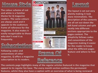
  • 1. House Style Layout The colour scheme of red and white is a familiar theme for Q magazine readers. The same colours are always used and it appeals to the audiences frame of reference for the magazine. It also makes it easily recognisable to those who don't read it as frequently. The layout is set out very plainly making it look more minimalistic. The description of the contents are all set out down the left hand column and split neatly into different sections appropriate to the pages content. The simplicity follows codes and conventions of the magazine making it easier for the reader to know what the different pages feature and where to find it. Subscription Frame Of Reference Following codes and conventions of other magazine, Q offers a magazine subscription to its readers. The contents page highlights many of the regular articles featured in the magazine that appeal to its regular fan base. The every month section outlines the permanent features, whilst they also have a caption with an overview of what is being reviewed that week.
  • 2. Layout House Style The layout is fairly simple with the headlined features of the magazine being displayed under other subheadings. This helps indicate to the reader/potential buyer where to find the proposed feature. It also follows codes and conventions of usual magazines by having a column with the page references next to a main image(s) of the featured articles. The contents page features the yellow and grey colours often found in “Tilt” magazine. As with the pictures outlining the featured articles in the magazine are always present in the contents page. Subscription Lure The option of a subscription to the magazine is featured in the bottom right hand corner, quite predominantly. This is a common feature in most magazines, following codes and conventions. The use of artists and band names used in the headlines of the pages are used as a lure enticing the reader to look at that page.
  • 3. Layout Term Of Address The contents page of this magazine differ substantially from the general codes and conventions of an average magazine. The page references are spread out rather erratically across the entire page instead of being in a chronological order in a single column. However pictures of what is features on the page are present which follows most codes and conventions Whilst no informal language is used the setup of the headings such as Contents, and Kate Nash are displayed separately breaking up the words, whilst being used to catch attention it also creates more of an informal feel as it is no longer displayed in an easily read position. Lure The featured artists names are in bold and highlighted, it also features an article on Reading Festival appealing to another audience.
  • 4. Layout Headings The layout follows codes and conventions of most magazines with its articles listed chronologically down the left hand column of the page. Page references are also portrayed in the form of pictures of bands features within the magazine. The name of the magazine is once again featured boldly as a headline above the page references. There is also another heading entitled “Regulars” to outline the page references for the permanent features in the magazine. Term Of Address Layout The term of address is moderately informer with a fair amount of slang language and terms being used, also by talking to the reader it gives a lower tone and more friendly, less formal feel. By displaying pictures as picture references they are able to showcase the bands featured in the magazine and act as a lure for the reader(s).
  • 5. Tone Of Address Layout The layout breaks the main codes and conventions of a magazine’s contents page. The page references are located in the top right-hand corner as opposed to the usual placing in a column. The tone is fairly formal with little slang used and the fonts of the headlines looking classy. However the main heading “CONTENTS” conflicts with this, the way in which it is set out is quite formal and more difficult to read than if it was on the same row like in most magazines. Lure The original photo shoot of the featured artists within the issue is a hook for the reader and helps attract them to read on, a preview of which is shown as the background of the contents page.