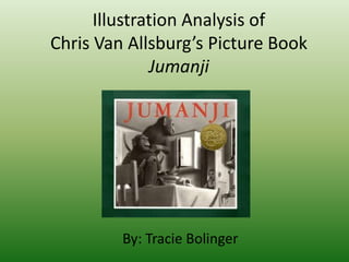
2. • Jumanji is both written and illustrated by Chris
Van Allsburg
– Published by the Houghton Mifflin Company
• It is the 1982 Caldecott Medal winner
• The story is about young Judy and Peter when
bored one day come across what seemed like
an ordinary game. After just one dice roll, they
realize there is more to the game than what
meets the eye. Nothing could prepare them
for the dangers that come out of playing the
game.
Background Information
3. Style and Media
• The illustrations are of a surrealistic style.
They appear to be almost real with touches of
make believe added in
– The Van Allsburg tends to give more detail to
some objects making them appear very
realistic, while neglecting detail in other objects
making them look almost fake.
• The medium that was used to draw all the
illustrations was graphite (pencil).
4. The objects in the room appear realistic while the man on the
dollhouse appears somewhat fake. Notice how his back has
little curve in it while the bowling pins do.
5. Line
• Chris Van Allsburg used lots of straight lines in
his illustrations that give off a feeling of stern
hardness. He uses some curves to help make
objects seem real. This use of curves is most
evident in the children and the objects that
come out of the game.
• Van Allsburg also used line to draw our eyes to
certain parts in the illustration as well as give
the reader a certain perspective.
6. The toys and objects in the
room have sharp, hard edges
while Judy and Peter have
soft, round edges.
7. One of the first things that pop out at you are the monkeys on the table. However, when
you look below the table you see the tail of a monkey sloping up to draw your eye to Judy.
The monkeys are also looking at Judy to help draw your eyes to her.
8. The perspective of the two boys is interesting because
it appears that the reader is above peering down on
them, when in reality they are level with the boys. The
height of the trees and the angle of the road gives the
reader a tricked perspective.
9. Shape
• The shapes used in the illustrations help to
create a realistic feel. The objects in the
picture are easily recognizable.
• The man made objects in the illustration have
very sharp angular lines, while the people and
animals tend to have more soft curved lines.
10. The objects are rigid, while the rhinos are soft.
The shapes used blend well together to make
realistic objects and animals.
11. Color
• All of Chris Van Allsburg’s illustrations in his
book Jumanji are achromatic.
• He uses various shades of black, white, and
gray to create tension. The darker the shading
the more ominous feeling the picture gives off,
to the reader. The lighter the shading the
more the reader feels at ease.
12. Color Continued
• The illustrations begin with light shading to give
readers a sense of calm. The further along into
the game the children go the darker the shading
becomes, creating a feeling of dread and
excitement for the children. After the game has
ended, the shading goes back to light when the
children are with their parents. When the reader
turns the page one more time the shading gets
darker, giving a sense of anxiousness because the
reader can see the two Budwing brothers running
off with the game.
13. In the beginning the shading is bright
and airy. No feeling of tension or
dread is felt by the reader.
Towards the middle of the
game/story the shades get
darker and darker instilling
feelings of dread and fear into
the reader.
14. When the children are done
playing the game and the
parents return home the
shading is lighter again.
When the reader turns the page
however, the shading begins to turn dark
again foreshadowing bad things to happen to
the Budwing boys. (The Budwing Brothers
show up again in Chris Van Allsburg’s picture
book Zathura.)
15. Texture
• Van Allsburg gave careful detailed attention
and texture to those objects that appear to be
the focal point.
• The children’s and animals hair are finely
detailed given a sense of realism, while most
of the household objects are flat and dull.
16. Take a look at the attention to detail in the
snakes skin compared to the chairs fabric.
The skin on the snake looks unbelievably
realistic while the chair appears flat with
no texture to the fabric.
17. Composition
• The composition used in Jumanji is interesting.
The house tends to feel very hotel like and nicely
spaced making it easy for the reader to notice
when something is out of place.
• The balance used between the text and
illustrations are also intriguing. On every page the
text is placed on the left hand side while the
pictures are placed on the right. This help the
reader focus on each picture that is being given
to them one at a time.
18. Composition Continued
• The pictures are all framed in a white border.
Depending on how the illustration is drawn
this allows the reader to feel a part of the
story or a viewer looking into the story.
• The text and pictures are also nicely balanced
so that whatever is being told in the text is
also being illustrated in the pictures.
19. The text is on the right and the illustration on the left. The
words match the illustration and the illustration is framed
nicely by white. In this illustration the reader gets the sense
that they are an outsider looking in. Some of the other
illustrations tend to make you feel apart of the story.