
Recommandé
Contenu connexe
Tendances
Tendances (20)
En vedette
Similaire à Layout analysis
Similaire à Layout analysis (20)
Layout analysis
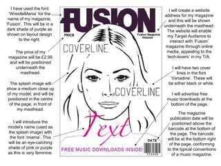
- 1. I have used the font ‘WrestleMania’ for the name of my magazine, ‘Fusion’. This will be in a dark shade of purple as shown on layout design to the right. The price of my magazine will be £2.99 and will be positioned underneath the masthead. The splash image will show a medium close up of my model, and will be positioned in the centre of the page, in front of my masthead. I will introduce the model’s name (used as the splash image) with the font ‘miama’. This will be an eye-catching shade of pink or purple as this is very feminine. I will create a website address for my magazine and this will be shown underneath the masthead. The website will enable my Target Audience to interact with ‘Fusion’ magazine through online media, appealing to the ‘tech-lovers’ in my T/A. I will have two cover lines in the font ‘Vanadine’. These will be either black or white. I will advertise free music downloads at the bottom of the page. The magazine publication date will be positioned above the barcode at the bottom of the page. The barcode will be at the bottom right of the page, conforming to the typical conventions of a music magazine.
- 2. ‘Contents’ will be displayed at the top of the contents page in the font ‘Vanadine’. The issue number of the magazine will be positioned under ‘contents’. There will be three different categories listed on my contents page: News/Gossip, Interviews and Reviews. These will be shown in different shades of purple. The text will be article headlines and page numbers. It will be written in ‘Californian’ font. I will include a QR code and several social networking icons at the bottom of my contents page. This is to attract my Target Audience as it will provide interactive opportunities. The brand name ‘Fusion’ will be positioned at the top right hand side of the page. I will use four images on the right hand side of the page. These will be edited to look like Polaroid snapshots and will show different facial expressions of the same female model. Written on the snapshots will be page numbers to free posters or merchandise. There will be an advertisement for a 70% discount on a subscription to ‘Fusion’ magazine positioned at the bottom of the page. This will encourage my Target Audience to subscribe for issues annually, as decided in the planning stage. It will be written in the ‘I’m fashonista’ font which will be used on my double page spread to continue the house style.
- 3. The headline will be separated into two different shades of purple and will be written in the ‘I’m fashonista’ font. It will be positioned at the top of the left hand side of the page. The brand name ‘Fusion’ will be The full right hand side page will be an image relating to my splash image (same positioned at the top right hand model). This will show the model holding a side of the image, as following the typical conventions of a guitar with a New York skyline in the music magazine. background. There will be a sub-header underneath the header which will summarise the article. This will be written in the ‘Vanadine’ font, continuing the house style from the front cover and contents page. There will be a smaller image in the centre of the article. This will be another image of the model from the front cover. The page number will be written in lilac at the bottom right hand side of the page. This will be in the ‘I’m fashonista ’ font. The written article will be divided into three columns. The ‘text’ will be an interview conducted with the artist shown on the cover. This will be written in the ‘Californian’ font and will be printed in black. There will be an advertisement for a free poster at the bottom of the article. This will be written in the ‘I’m fashonista’ font in purple. The interview questions will be written in purple in the ‘Vanadine’ font.