Key conventions international
•
5 j'aime•2,346 vues

Geoff Harris, key conventions, international

Recommandé
Contenu connexe
Tendances
Tendances (20)
En vedette
En vedette (20)
Similaire à Key conventions international
Similaire à Key conventions international (20)
Plus de Bev Towns
Plus de Bev Towns (20)
Dernier
Dernier (20)
Key conventions international
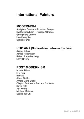
- 1. International Painters MODERNISM Analytical Cubism – Picasso / Braque Synthetic Cubism – Picasso / Braque Georgio De Chirico Henri Magritte Salvador Dali POP ART (Somewhere between the two) Jasper Johns James Rosenquist Robert Rauschenberg Larry Rivers POST MODERNISM Imants Tillers R B Kitaj Banksy Albert Oehlen Arnold Mario Dall’o Clayton Brothers – Rob and Christian David sale Jeff Koons Michael Majerus Seung Yul Oh Geoff Harris, 2008
- 2. Post-Modernism Modernism Post-Modernism Time 1860s-1970s 1980s-today Artists Picasso, Matisse, Dali, Pollock etc Majerus, Tillers, Koons, Salle Style Series of movements that’s follow on Series of individuals doing whatever from each other – sometimes they like – no single unified style but building ideas and others times consistent in the inconsistency rejecting them Aim Searching for a single truth about Revealing truths that are specific to reality. this time/place but not universal in A picture is flat rather than an any way. Dichotomy where two illusionary space (Cubism, conflicting ideas can be held to be Minimalism) true at the same time. Revealing the inner truth about the human state (Surrealism, Expressionism) Serious Serious intent Playful, irreverent, humour Playful Unified Seeking to create a unified Fragmented, incomplete, random fragmented statement Accepting that the world is Creating meaning out of human life meaningless Singular Singular – highest ideal – founded in Pluralism – accepting that no single Plural Classical western philosophy of the way is better than any other = rise of Platonic ideal form (art, values, indigenous cultural practices and society) alternative beliefs / medicines Construct Constructivist – trying to create Deconstructive – Its all a load of crap Destruct something real, new, significant – Universal evolutionism which universally recognised, accepted – justified colonial oppression was and common unifying language founded on a lie – everything is random and accidental Post Modern Characteristics Appropriation Taking images from different places and using them in new ways. Unexpected juxtaposition of images/objects to create new meanings/insights Past, present, high art, low art – all equally valid and nothing is sacred Authorship Defining who owns what is open for debate – In the 21st century the digital age has made the issue very complex Originality Nothing is original – everything has happened before – OR – Everything is original because “you can’t step into the same river twice” Signification Images meaning something other than just themselves – symbolism – mass media have the power to influence what we believe to be real Geoff Harris, 2008
- 3. Analytical Cubism Picasso, Braque and Gris Still life with Chair caning Bottles and Knife Picasso, 1909 Juan Gris, 1910 Key Features Feature Significance Still life and Landscape no longer a motif. Most work done in the studio as artists more portraiture interested in style than subject matter. Flattened picture Planes are increasingly arranged parallel to the picture surface. – Eliminating plane depth, no perspective devices used – illusionistic depth is a lie as the honesty in painting means acknowledging that the canvas is FLAT Decorative Lighting of planes is used for decorative purpose. – Light and darks used to differentiate one area from another rather than to describe form or volume. Clues Introduction of words, letters, numbers to give clues to meaning of painting. Sometimes the facets so small that this is the only way to identify what the image is (was) – Transparent Use of transparent planes – another variations to keep things interesting – Fact planes is that P and B were painting themselves into a corner Hermetic HERMETIC PHASE (1911 - 1912) the works become almost totally abstract. Mondrian said that the cubists didn’t accept the consequences of their own discovery – should have gone totally abstract. Flat picture plane Volume is limited. Up until 1909 it is created by interlocking cubes (eg Houses at L ' Estaque) rather than lines, modelling or foreshortening. After 1909 volume is reduced and shown by transparent and interpenetrating planes. Monochromatic The palette is reduced to a minimum. Colour variation, or even natural colour, would have destroyed the "form" and pictorial unity of the composition. Unified picture Even uniform treatment of the whole canvas – Every part of the picture is of surface equal importance – not like old paintings with a central focus or dominant feature. All parts have same detail and focus. Brushwork Broken brushwork to differentiate between planes and add tactile interest. . Words Braque "The Portuguese (1911) - first use of 'words' to distinguish between two dimensional lettering and 'real" objects existing in space By 1912 Picasso and Braque came to realise that they had reached a decade end. The logical developments of Analytic Cubism had resulted in the inability of the viewer to restructure. The motif and not in the greater realism they were seeking, They then began to explore different techniques, in particular papier colle and collage. Which led to the emergence of a new for of Cubism Geoff Harris, 2008
- 4. Geoff Harris, 2008
- 5. Synthetic Cubism - Picasso, Braque Br 1912 Picasso and Braque had realised that the techniques of ANALYTIC CUBISM that they had developed since 1907 were leading them to abstraction and not to a greater expression of reality as ther had intended. They, along with Gris, then began to explore a new range of ideas and techniques which led to the emergence of a new form of Cubism; SYNTHETIC CUBISM Key Features Feature Significance LETTERS First used in the Analytic Cubist works which represent the transitional phase towards Synthetic Cubism e.g. Braque 'The Portuguese' These letters had a number of functions. 1. Another means of communication, being by their nature specialised visual symbols. 2. They emphasise the difference between the painting and reality - words are a symbol of the object just as the picture is. 3.They emphasise the picture surface~ words are two dimensional, just as the painting is. 4. They are more ‘real’ than painting, because they are an integral part of everyday life, and therefore qualify as a subject for 'Art'. 5. They may be used as a purely decorative element in the work. 6. They may be used for compositional purposes to reinforce the basic geometry of the work. COLLAGE Incorporation of ready made objects - tickets, illustrations from magazines, newspapers etc. printed wallpapers -into the composition of the painting. Papier colle (pasted paper) collage. - Allowed artists to question the nature of Art, by using materials not normally associated with "Fine Art". Can a work of Art be made out of rubbish? Can an artist use materials created by someone else or br a machine? Picasso's response was that reality is not imitated but INTEGRATED Collage shapes are not just used to represent the contours of an object but are also used as abstract compositional elements in relation to each other. A piece of the real object can be included in the Painting which can then represent the whole object e.g. chair caning a chair a piece of a newspapers name JOU represents the whole paper. This is what is meant br the integration of reality. Collage elements can be used in a non-representational (decorative) manner & convey information. SPACE - There is a complete denial of illusionary space - papier colle is inherently flat. - overlapping collages and shadowing of edges create spatial relatonships but these are PICTORIAL. not DESCRIPTIVE relationships. - objects possess NO VOLUME, have no substance and have flat (honest) appearance - there is a complete abandonment of chiaroscuro and the Renaissance conception of painting. Works are built up from the surface, not illusionalistically shown in depth. COLOUR Picasso and Braque felt colour had been neglected in the Analytic phase and thought it was necessary to reintroduce it but did not want to be bound by the conventions of traditional reality e.g. local colour. lighting - colour becomes separated from representational duties and becomes an element of composition and decoration in its own right SUBJECT - is suggested through a number of SEPARATE devices e.g Geoff Harris, 2008
- 6. shape is indicated by the contour line - colour texture is indicated by papier colle - the surface and the shape of the object no longer NEEDED to be united. - Visual puns are introduced - subject analogies are introduced a musical instrument may be shown in place of a head - this leads on to Dada and Surrealism - an element of incongruity is introduced, the used of ripped newspaper for the shape of a bottle. NON-TRADITIONAL Braque as a trained house painter decorator used a decorators comb to produce a TECHNIQUES woodgrain effect. - Picasso, the innovator, used the comb to reproduce hair. - paint is thickened with sand - sawdust to reproduce textures = create visual interest to draw attention to the SURFACE of the picture emphasising the two dimensional nature of the work - to show the complete break from the slick brushwork and facility of Academy art. FINISH -the works are not finished in the terms of the 19th Century Academy ideas of Art. The REASONS for this - some are experimental works - the works are deliberately opposed to the revered "set apart from real life" precious things in art CHARACTERISTICS build up subjects from formal shapes. - built up from surfaces - greater clarity of form, fewer viewpoints, planes larger. - landscape returns as a subject - no longer use transparent or interpenetrating planes - introduction of new form of sculpture – ASSEMBLAGE Geoff Harris, 2008
- 7. Georgio de Chirico (Italian) Surrealism The uncertainty of the Poet La Piazza di Talia – 1913 Key Features Feature Significance Unexpected Strange collection of objects that don't go together Juxtapositions Distorted Perspective is distorted to make you feel that something is "not right" – perspective uncomfortable but not so obvious that you notice at first. Reminiscent of dream/nightmare perspectives Twilight Lighting is from twilight - Dramatic with strong contrast and long shadows = nightmare uncomfortable – Time between day and night, between conscious and unconscious – magic time Lots of shadow areas where bad things can hide ready to jump out Stories Narrative - All the props to a play but the people are gone = tension - you don't know what is going on – Feels like something dramatic has happened or is about to happen Stage Light Strong contrasts give a added drama – like artificial lighting Colour Warm colours dominate but a cold blue-grey is used for the shadow areas (Simultaneous contrast) Form Simplified forms give an innocence to the style – which make the prevailing menace even more scary – ordinary objects can be sinister and delicate objects are vulnerable Symbolism Objects are imbued with meaning but its never clear exactly what things mean =ambiguity. Eg the train could symbolise – escape, death, journey, opportunity missed, time passing, arrivals and departures, etc Metaphysical Object and themes often relate to spiritual or unearthly powers, influences, etc. Classical Uses Greek, Roman and renaissance objects and imagery. Nostalgia for the time References when Italy was a world power. Also a time of gods and great moral / philosophical advances Geoff Harris, 2008
- 8. Geoff Harris, 2008
- 9. Salvador Dali Born 1904 “The difference between me and the surrealists is that I am a surrealist” 1940 “I have often imagined the monster of sleep as a heavy giant head with the spindly body supported by the crutches of reality. When these crutches break we have the illusion of falling.” Key Features Feature Significance Content Explored his dreams and nightmares as the Surrealist did. Most of his paintings we based on his own deep neurosis and unconscious desires. Based on his visions and hallucinations. “Dali was prepared to paint so that the world could see his phobias or his most perverse sexuality” Subject matter Generally distorted figures and forms. The observed worlds of disintegrating shapes and decomposing matter. Forms were wildly misshapen and distorted such as melting clocks and human figures as bureau drawers. Gala was his wife, lover, protector and model. She was his muse and appears in many paintings Colour During his first surrealist period he used brilliant colour with blue light playing over the scenes. Naturalistic classically influenced colour although pushed up to extra vibrancy Composition Most of his compositions were traditionally composed with formal elements. Use of atmospheric perspective to create a sense of depth. Often used a double or repeated image/figure change the scale and placing them on different planes e.g. Foreground and mid ground. Scale Looking at his reproductions of his work in books may be deceiving for the viewer as they are often very large works that take up the field of vision if you were to stand before them. The very scale of the canvas would make these nightmares even more frightening. Media Predominantly oil paint applied thinly to canvas. Also a sculptor, photographer and filmmaker. Technique His painting technique was to apply thin glazes of oil paint to create beautifully realistic tonally modelled forms. Anamorphic was a technique used to describe the twisting and morphing of the figure. Style Surrealism. Combined elements of cubism and abstraction with pure classicism. Combination of surrealist content of forms derived from classical art. Influences Leonardo da Vinci, Goya, Bosch, Velazquez, Raphael, Vermeer. Geoff Harris, 2008
- 10. Geoff Harris, 2008
- 11. Rene Magritte Born 1898 – Died 1967 “Thought rendered visible” “The site of a felled tree simultaneously causes pleasure and gives rise to sadness” The Flavour of Tears Golconda The Voice of the Winds 1948 1953 1928 Key Features Feature Significance Colour Realistic colours as they appear in real life. Variety of tones moving from dark to light. Lots of blue Media Acrylic and oil on canvas. During WW2 when canvas was hard to come by he painted on bottles and other found objects Techniques Thin application of paint. Not painterly. Lots of tonal modelling to show form and depth. Incorporates text. Composition Formal composition – adhering to traditional devices such as foreground, mid ground, background. Repoussior often with a curtain. Symmetry, lots of figures as central focal point. Atmospheric perspective to create space in landscape. Cut-outs as framing device. Enlarged objects to distort the scale e.g. An oversized rose that fills the room. Scale of objects is significant. Subjects Figures in the landscape, birds, houses, interiors, bowler hats, the nude, draping cloth folds, windows. Takes known objects and places them in impossible situations by changing the scale. Iconography Man in the bowler hat whose face is always obscured. Birds. Cloudy and night skies. Windows. representing the mind to the realms of the unconscious Style Surrealism - Dealing with figures in the land and distortion of reality. Tapping the unconscious mind, real vs. the unreal. Things aren’t quite as the first appear. Automatism. Juxtaposition of unrelated objects. Naming common objects with text. Explores the tension between reality and illusion. The text makes us aware that this not a pipe in fact it is a painting of a pipe. The real objects vs. its representation. Try’s to force the viewer to be able to understand that the painted representation is only an illusion of reality. “Last night I dreamt I was a butterfly, how do I know today that I am man and not a butterfly dreaming that I am a man” Chuang Tzu Further Information Magritte. (1994). Germany, Benedikt Taschen Geoff Harris, 2008
- 12. Geoff Harris, 2008
- 13. Jasper Johns Born: 1930 “At every point in nature there is something to see .My work contains similar possibilities for the changing focus of the eye…Generally, I am opposed to painting which is concerned with conceptions of simplicity. Everything looks very busy to me” – Jasper Johns (Sixteen Americans: The museum of modern art, New York, 1959) According to what.1964.Oil on canvas Racing thoughts.1983.Encaustic and collage on canvas. Target with plaster casts. with objects. 1995. Encaustic on canvas. Key Features Feature Significance Imagery. Strong use of motifs and symbols. Flags, Targets, Numbers, Maps, Light bulbs, Ale cans, Words Tantric motifs. Objects that are common place in American culture” Things that the mind already knows.” Familiar cultural symbols. Chooses subjects that imply a broad range of meanings that can be taken to be both personal and cultural. Techniques. Uses a variety of ways of handling paint. Paint is applied gesturally as well as strong, tight brush marks that build up areas of colour. Paint is allowed to run and drip. Encaustic (wax mixed with oil) is used to build up thick layers. Surfaces are reworked and built up. Crosshatching of paint. Collaged images and newspaper is added and applied to the painted surface. Letters, words and numbers are stencilled onto the paint. Sculptural three dimensional objects such as chairs and plaster casts are added to the two dimensional surface. Media Oil on canvas, Encaustic (Wax, resin mixed with pigment) Enamel. Collage, newspapers, images, Print, Lithograph, Assemblage, Found objects, Sculpture. Colour Schematic colour - Red / yellow / blue primary colours. Neutral monochromatic colours usually white or grey. Solid planes and blocks of colour. Areas of full colour and inserts of monochromatic colour. Style Combination of Pop, Minimalist, Conceptual and Process art. Was not emotionally involved in his art – was disconnected from the objects and symbols although for the viewer they serve as emotive. “he played an important if unconscious role in going beyond abstract expressionism, action painting was not enough for him and he can be considered one the initiators of pop art. Influences. Paul Cezanne (Cubism) Marcel Duchamp, Leonardo da Vinci, Asian art and philosophy. Further Information Boudaille G (1989) Jasper Johns) Ediciones Poligrafa,S.A Geoff Harris, 2008
- 14. Geoff Harris, 2008
- 15. James Rosenquist – Pop Art – USA 1960s Pop Culture Imagery Taken from ordinary (not fine art) culture = food, advertising, cars, celebrities, fashion, technology, commercial products, TV, comics, magazines, newspapers Scale Huge – two to three meters high. Rosenquist was a bill board painter before he became an artist. Giant scale to reflect the huge scale of American landscape and culture. Giant scale to show these are important paintings dealing with major social issues. Giant scale taking little subjects out of context (life size comics) to symbolise that they are important social influences in modern America. Colour Three main types of colour used in sections next to each other to create variety and unify compositions: Black and White – From newspaper and old photographs Monochrome – Single colour blended from light to dark Polychromatic – Full range of colours used Colours are very intense (saturated) as is the case in mass market advertising. Fragments Only parts of the image depicted and the viewer has to reconstruct the rest of the object = the way we see the fast paced ever changing world = Fragments of imagery piled up on top of each other. Grid Composition Compositions divided into grids with a different object in each section. Sometimes an object will break through into the next section. The placement of different objects next to each other (juxtaposition) creates meaning. E.g. Nuclear Bomb + Umbrella + US Military Arms Build-up Geoff Harris, 2008
- 16. Geoff Harris, 2008
- 17. Robert Rauschenberg (USA - Pop Art) "I think a painting is more like the real world if it's made out of the real world." "You begin with the possibilities of the material." "I work in the gap between art and life." Retroactive Monogram Key Features Feature Significance Consumer culture Objects and images are derived from the real world of advertising, newspapers, television = more relevant than abstract esoteric art Rauschenberg's oft-repeated quote that he wanted to work "in the gap between art and life" suggested a questioning of the distinction between art objects and everyday objects Sampling Influenced by John Cage musical sampling = more real and relevant because its Assemblage closer to the real world. Influenced by synthetic cubism collage experiments – “reality integrated rather than imitated” Fragmented Images overlap and obscure each other – sometime only part of an image is visible = metaphor for modern society where everything overlaps on top of everything else – modern city life = fast, crowded, multifaceted Impersonal Collage, acetone transfers, assemblage – using what other people have made to reflect society back at society. = more universal than personal statement. Banal Ordinary everyday objects raised to the status of “art”. Appreciating the ordinary which is more relevant, accessible, useful, and real than “great’ art in museums Mixed media Variety of different medias used, drawing, paint, collage etc – whatever comes to hand to suit the purpose rather than being ‘pure’ or ‘correct’ about how to do stuff – thought that the old purest approach was elitist and excluded ordinary people. Variety also makes them more visually interesting Juxtaposition of careful and expressive marks = visual contrast / interest Anti academic Challenged the minimalist abstract esoteric art of abstract expressionism which no one understood – reintroduced things that people could recognise and understand = more relevant to real people == art more accessible. Challenges the traditional “high Art” ideas of what art should be – marble sculptures and oil paintings are no better than a can of beer. Influenced by Marcel Duchamp’s “Fountain” (which was a urinal signed ‘R Mutt’) – Sometimes referred to as “Neo-Dada” Challenges Challenges the traditional boundary between painting and sculpture by introduced traditional real 3D objects into wall mounted paintings. – Uses printmaking transfer methods definitions with painting and drawing methods. Political, social Rauschenberg uses modern culture images to comment on the nature of modern agenda society – sometimes critical of commercialism, sexual exploitation, political ambition, capitalist values – and sometimes celebrates these Geoff Harris, 2008
- 18. Geoff Harris, 2008
- 19. Geoff Harris, 2008
- 20. Larry Rivers - USA “The mixture of grand art and absurdity was with me from the beginning.” Rivers is considered by many scholars a "Grandfather" of Pop art, because he was one of the first artists to really merge non-objective, non-narrative art with narrative and objective abstraction. Key Features Feature Significance Jazz Fanatic Jazz music is free form, anti-establishment, often appear unstructured, improvised, and chaotic – which are attributes Rivers applied to his visual language Mixture of Styles Uses linear drawing, blended areas, stencil letters. Uses multiple media – ink, paint, pencil, charcoal, airbrush = Symbolises multifaceted nature of modern life = Fusion between painting and drawing (challenges what is acceptable practice and normal definitions of art genres) Banal Subject Matter Challenging was is acceptable or appropriate as a subject for art – cigarette packets, talking on the telephone etc Accurate Drawing Very accurate drawing that is undermined by rough, gestural, expressive applications of media – balance between control and chaos Fragmentary Multiple Metaphor for modern society – where multiple influences and desires Views are all conflicting with each other, we are always trying to do many things at once and never do anything properly or with single minded exclusivity (like in the simple past) Negative Space Areas left empty – to balance or contrast against the busy layered areas History Paintings Looked at American civil war as recurring theme. Homage too and undermining the great history paintings. Treats the very important (core value of USA) with rough unfinished style that minimises its importance (but celebrate it as well) – Very human personal treatment also humanises the history = more personal / individual Multiple narratives Like post-modern literature. Different narrative that may or may not connect at some point in the picture/book. Each may inform the other without intending to. Geoff Harris, 2008
- 21. Geoff Harris, 2008
- 22. Geoff Harris, 2008
- 23. Geoff Harris, 2008
- 24. Imants Tillers (Australian – Post Modern) Local Knowledge Key Features Feature Significance Appropriation / Takes images form lots of different artistic and cultural sources, times, Cultural cultures, and styles. Mixes them all together in a kind of cultural melting pot. References EG Puts a Colin McCahon next to cubist painting next to an Easter island head. Doesn’t give priority to any particular culture all time = They are all equally valid Canvas Boards Sometimes dozens of small canvas boards are assembled together to make giant mural sized images. Some boards will link together to make one image within the larger assemblage and some will be complete individual images on there own. Could be a reference to fragmented society in that many different voices make up a single culture. Could be a reference to the partitioned nature of contemporary life where things work together without quite fitting properly. Public vrs private - Each board is small and personal but the result is huge and public Massive scale The assembled works are metres long echoing the giant scale of the Australian outback Cultural Interested in aboriginal and Maori cultures and wanting to bring them into the periphery mainstream. Tillers is a child of Latvian immigrants and grew up being on the outside of the mainstream culture. Chance Likes the way accidental juxtapositions (when boards are placed next to each meetings other) can create interesting and unexpected dialogues – metaphor for the randomness of real life. Diaspora The four paintings collectively represent an epic statement relating to the dislocation of people from their original homelands, including within their own lands due to colonisation, and the coming together of disparate cultures that is so much a part of the stories of the twentieth and twenty-first centuries. Into the new millennium when nature prevails Landscape Late 1990s Tillers moved out into the country. Began looking at the Environmental landscape and being impressed not just by its natural beauty but also the cultural residue of previous historical occupations. Like the many smaller works in the Nature speaks series 1998 – 2006, these are not literal depictions of landscape but rather evocations of place through layered images and text references.- Names, Maps, Stories, rock paintings Colour Often uses a limited palette to unify all the very different images and styles. Geoff Harris, 2008
- 25. Geoff Harris, 2008
- 26. Geoff Harris, 2008
- 27. R B Kitaj (American but worked mostly in Britain) To glimpse homages and icons in Kitaj's paintings, ghosts of others who went before, is to see what may be the only beauty vouchsafed us on our doomed journey through an alien countryside. Isaac Babel riding to If Not, Not The Ohio Gang Budyonny - 1962 1975-76 Key Features Feature Significance Modern life Layering of imagery to produce crowded composition – symbolises modern society with multiple conflicting pressures, interest, distractions, values, desires, etc. We are always doing many things at once, and never focusing on just one activity. This is reflected stylistically with things overlapping, incomplete, partially obscured etc. Referred to as 'agitational usage' = fragmented, deceptive Variety of types Flat colour, blended areas, realistic painting, outlines, textured areas, patterns – All of painting reflect different influences and levels of importance – someone or something that is less important, or a distant memory, may be depicted as an outline without form or detail. Diorama Like a stage set – tableau. Everything arranged exactly so that the entire narrative can be seen in one view – what happened before and after is present in this pivotal moment. Symbolism Highly symbolic objects for Kitaj – water can symbolise “renewed life” – but the symbols are not always obvious – sometimes personal experiences references rather than universal meanings – almost a secret symbolism. Drawing Combine very accurate drawing with generalised stylised forms = Contrast = symbolises internal conflicts / dichotomy of modern life Also a big variation is pressure from heavy aggressive marks to light feathery touches = variety and visual/tactile interest – symbol for multifaceted personality, love hate relationship with the world Narratives Often taken from poetry – Ezra Pound, T S Eliot – Some themes historical, some contemporary and some imaginary - Story is suggested and all the objects include - BUT - you can't read the story or really tell what is going on = ambiguity For him, a Jew come late to a contemplation of the meaning of his Jewishness, the Holocaust represents the major event of European history in this century. And in grappling with this legacy of violence, Kitaj asserts that the Holocaust, like so many other tragedies throughout history, was enacted not by nations and armies but by individuals who bear responsibility for their acts. Kitaj sees their motives as often charged with a cruel sexuality. Geoff Harris, 2008
- 28. Geoff Harris, 2008
- 29. Banksy – British Graffiti artist “I want to be original, just like everyone else” “Some people are prepared to suffer for their art, but why are so few prepared to learn to draw” – Banksy criticised graffiti artists Key Features Feature Significance Anonymous Bankys’ real name is not public knowledge – a lot of what he does is illegal so he could end up in jail Politically Banksy takes well established recognisable images – these are Subversive powerful icons (signifiers) of established conventions (little girl = innocence, policeman = respectable, terrorist = evil) and subverts these with pictorial devices so they mean the opposite (Little girls loves the bomb, policeman urinates in public, terrorist throws flowers) Stencil technique Creates large stencils of images which can be quickly applied in public spaces, before authorities can come and stop him Site specific Placing altered versions of famous paintings in the national gallery subversive Painting happy scenes on the Palestine wall Humour Often funny humorous images entertain and engage the audience – which then means they end up thinking about their own stereotyped view of issues Colour Stencils are usually black lines and areas that then have small quickly applied areas of colour. – Similar to cartoons, graphic novels, - carefully considered to get maximum aesthetic and impact return with the least (quickest) application Geoff Harris, 2008
- 30. Geoff Harris, 2008
- 31. Albert Oehlen Ursprung collage 8, 2003, Untitled, 2004, collage Untitled, 2004, collage Key Features Feature Significance Technique Collage – Oehlen selects imagery form many varied sources and cuts and pastes to create strange and often disturbing relationships between his characters, their settings and each other. He combines collage with areas that have been either carefully modelled, washes or painted very expressively. He sometimes attempts to fuse the collaged image with the painted image but deliberately lets the join appear coarse and obvious. Also combines drawn areas. Media Collages - cut-outs form all over the place; photographs, diagrams form scientific journals, home décor magazines, children’s books, school biology books. Paintings - uses various kinds of paint from acrylic and oil to watercolour and ink. Subject matter A massive variety of images from many different sources. Diagrams, fashion models, historic artefacts, people in various situations going about their business, sculptures, famous and easily recognisable paintings. The source of his ideas and materials remains a gray area like that offered by the internet Composition Wildly crowded and layered vs. simply composed with few images. Places imagery to create a focal point of interest for the viewer. Bizarre scale relationships. Content Pictures are compelling yet inexplicable, they defy clear analysis. “The speed at which the outlines, paint and structure seem to be flung into the picture matches the restlessness of the content as it spreads changes and disperses”…”the fact that the artist is forever rethinking and reshaping his own position and output is what makes an encounter with his work so exciting. Colour Combines black and white with full colour. Graphic black and white images such as diagrams with full colour from photographs. “…unbounded pleasure in making pictures, a calm carefreeness in dealing with the conventions of art – and an ability to expand these conventions, to bend and break them. Geoff Harris, 2008
- 32. Geoff Harris, 2008
- 33. Arnold Mario Dall’o Breakfast by Hildegun Orient Hotel 2005 2005 Oil and acrylic, varnish, Oil and acrylic colour, ink, wallpaper, paper silkscreen, wax and paper Key Features Feature Significance Technique Collage, layering images, thin transparent washes of paint, line drawings, linear overlays, cut outs and solid shape silhouettes, stencil and screen-print, repetition, mirroring, floating objects, inserts, distortion of scale, torn edges, pieces of images. Subject matter Imagery – animals, figures, body organs, sexual reproductive organs, text and signs, repeated patterns with varied scale. Shots of surgical operations. Explicit sex. Dog silhouettes repeated over and over. Media Collage of old prints, photos, signs, symbols and documents, text and letters, wall paper, maps. Paint and pen, pencil, ceramic, ink, printing ink, wax, varnish, resin, silk screen. Content Words and pictures are put together to form new meanings and associations. Juxtaposed images reveal the unexpected. Words, labels and captions put together to create a new language. Sense of archive and cataloguing. Images are layered together to trigger and also subvert memory. Interested in pornographic image. Metaphors. Interested in the functioning of society. The darkness underneath. Negates direct association by covering figures eyes or leaving out limbs etc. By presenting us with the disparate symbols and visual contents ranging from religious to erotic imagery or architectural motifs, Dall’o takes us into the dimension of cultural anthropology where the meaning we grasp outstrips the factors we have before us. Composition Both composed and arranged with both regularity and an apparent jumble. Sometimes adheres to a regular grid like structure created by the repetition of images. Sometimes images seem to float randomly. “Hierarchy carries no respect, the filing system organises nothing whatsoever. Thus; horns sprout from babies, horses invade a prairie land of phalluses, the words written fail to tie up with the objects juxtaposed” Further Information The Republic of Welcome, (2006), Italy, Damarni. Geoff Harris, 2008
- 34. Geoff Harris, 2008
- 35. Geoff Harris, 2008
- 36. Clayton Brothers – Rob and Christian “As collaborators we find ourselves resorting to pure instinct and trust giving and taking visual elements like two authors of the same book each writing every other word.” c. 2000 c. 2000 Key Features Feature Significance Media Paint – enamel, oil acrylic, spray paint. Collage. Drawing media – pencil, pen. They are also sculptors – use found objects Technique Collaboration – they collaborate by taking turns to work on an area, editing, reinterpreting, redirecting. They do not begin a painting with any preconceived ideas about what it’s going to look like. Using paint, they use stencils for image and text. Collage with found imagery and other small works on paper using layering and overlapping. They draw with the paint. They work up their painted surfaces to create a worn, grungy, distressed feeling. Composition Rambling, full, crowded compositions. Decorative - just as people find spaces on their bodies for tattoo illustrations, they fill every space. Images float in and out with no fixed focal point. Viewers’ eye is made to move around the canvas. Inserts. Floating objects. Scale is distorted. Landscapes do not adhere to formal perspective rules Colour Bright vibrant colours. Not naturalistic colour. Contrasting blocks of colours. May use miss-tinted house paints straight from the can resulting in colours that are a little sickly or too intense for the figure e.g. yellow skin. Subject matter Figures of people and animals, text, flowers, landscapes, story book characters, religious iconography. Influences Comic books, tattoos, childhood stories and memories, folk lore, mythology and urban legend, suburban signage and labelling font styles of medical, food and clothing. Content Autobiographical, strong narrative qualities. Fascinated by the narrative possibilities of painting, telling stories with the occasional word serving as clues. Telling visual stories. Geoff Harris, 2008
- 37. Further Information - www.claytonbrothers.com Geoff Harris, 2008
- 38. David Salle – American Born 1952 Canfield Hatfield 1 - red square yellow square Canfield Hatfield IV 1/2 Brown 1/2 Orange-Yellow Schooner Rips in the Mirror Key Features Feature Significance Grid Composition Picture divided into grid section with each section being treated differently in terms of colour, painting style, and subject matter. Inserts Little inserted squares which add alternate views or different imagery Sideways Some images and inserts deliberately placed on their side to create visual discomfort Appropriate art Famous paintings have been copied into areas and inserts. imagery Sometimes the whole painting and sometimes just a segment. Sometimes the painting is faithfully rendered but often these are simplified or transformed in some stylistic way Monochrome vs. Used to organise the picture and control where the viewer looks polychrome Linear overlay Used to create complexity and layered meanings. Drips Uses drips and splashes as well as rough gestural painting Formal vs. informal techniques to act as a foil to the carefully drawn areas and meticulously painted parts. Geoff Harris, 2008
- 39. Geoff Harris, 2008
- 40. Jeff Koons - Born 1955, York (PA), lives and works in New York (NY), USA. Cut Out, 2000 Lips, 2000 Popeye, 2003 Key Features Feature Significance Easyfun – Koons Eerie, outlandish, hybrid, zero gravity, surreal, psychedelic, provocative POP ART – large recent works format canvas’s painted in a studio by a team of apprentices. Pop Imagery Advertising images and references to popular culture – glossy fashion magazines, comic books, and popular, kitsch and everyday products – he works from computer-scanned reproductions taken from the media and personal photographs. Surrealism Reference to the bizarre, hallucinatory dream images painted in a precise realist style of the Surrealist artists of the 1920’s to 1940’s. Appropriated Recognisable images from popular comic characters, and monumental tourist sites to imagery familiar food packaging. Cut-outs He cuts out pieces from certain motifs and underlays them with other images to create an unsettling effect. Colour Bright, glossy, eye-catching, attractive colours used in advertising. Crowded / Layered Impressive and exuberant swirling collages of cut-outs, fragments and pieces. E.g. breakfast Compositions cereal swirling in a waterfall of milk. Layers of images create strange visual deceptions. E.g. Vast landscapes glimpsed through crowds of cut-outs floating and almost climbing out of the foreground. Compresses imagery into the foreground. Painterly Effects Painted with oil paints. Flat outlined images which reference comic book illustrations vs. hyper realistic objects painted with the photographic quality of a magazine spread. Artistic Intention To communicate with the masses - draws from the visual language of advertising, marketing, and the entertainment industry - food, fashion, and fun. Imagery Familiar yet unrelated imagery creates collage-like paintings rendered in photorealist combinations perfection - …enormous chocolate swirls, happy-face deli sandwiches, moist lips covered in lipstick, rich hues of hair colour, spiralling roller coaster rides, playful Halloween costumes, children's cereals and toys, ice cream, hair, alpine landscapes, donuts, fruit, sweet corn and fruit juice float about. With their luscious whipped cream toppings his imagery emphasizes complete and total self- gratification, celebrating adult sexual desire and allure, as well as an ever-wanting child's consumption of popular culture. Koons’ draws upon imagery from our everyday lives—advertising, the media, food, sex, fashion—always taking the spectator on an unsuspecting journey. Dehumanisation As we see only fragments of people, we may argue that a dehumanisation takes place in Koons' art. E.g. disembodied succulent lips, drifting lush-lashed singular eye, Beneath the seemingly innocent and ecstatic cartoon surface, the paintings are psychologically charged with aspects of need, desire, and sexuality. Grosenick, U. & Riemschneider, B. (2002).Art Now - Artists at the rise of the New Millennium. Taschen: London Geoff Harris, 2008
- 41. Jeff Koons – Pancakes, 2000 Geoff Harris, 2008
- 42. Michel Majerus Born 1967 Luxembourg Í am not interested in talking about working method and what tools and paints I use. Painting exactly what you set out to paint, that’s the most exciting thing there is. Because the result is always something that no one else could have done for you”. Key Features Feature Significance High Key Colour Colours are very intense yellow, red, blue, green etc as used in contemporary marketing and advertising. Reflect contemporary culture and opposite to restrained intellectual art. Pop Culture imagery Real world advertising, cartoons, graphics, computer imagery – responding to the real world around us – embracing mass market low art rather than intellectual conceptual art that people don’t relate to or understand. Majerus embraces and celebrate popular culture rather than trying to educate viewers to conceptual irrelevant ideas Confused Compositions Objects and imagery all jumbled together in a chaos that reflects the contemporary world. As we move around streets and buildings we are bombarded with thousands of images all jumbled together. Fragmented Imagery Images overlaid on top of each other, unfinished images, cropped, fragmented etc all reflecting how we seldom have time to properly absorb an entire image but just see bits and pieces getting the general feel of a giant jumble Stylistic Contradiction Some elements of paintings are sharp and clean like commercial graphics while others are painterly and messy like graffiti art. This reflects the human vs. mechanical nature of our world. Mass produced vs. hand made, formal vs. expressive, control vs. accidental Symbolising the opposing forces in the universe of order/chaos Huge Scale One work was a skate board half-pipe 10 metres wide by 40 metres long. Majerus recreates our world in the gallery and visitors enter into the art work and become part of it. Multi-media Different types of media used all together. Transfer, oil, enamel, collage etc to reflect the “pluralistic” nature of our environment. Whatever is appropriate to the image and/or idea. Not bound by puritanical ideas of oil on canvas to make expensive artwork for rich clients to decorate their walls. Political Challenges what is appropriate subject matter and techniques for art galleries. Rejects intellectual conceptual minimal art approaches. Wants art to be exciting and relevant rather than serious and boring. Geoff Harris, 2008
- 43. Geoff Harris, 2008
- 44. Geoff Harris, 2008
- 45. Seung Yul Oh Born 1982 in Seoul, Korea and moved to New Zealand when he was 15 “I like to see art as entertainment, it has to have a sense of the unexpected….I’m working on a level just below the rational part of the brain that wants everything to make sense…I’m very open to accidents and things changing along the way.” Giant stencil chicken with golden egg – Construction site, Detail – smoking bunnies on found Karangahape Road, Auckland, c.2004 construction site hoardings, detail c.2002 Key Features Feature Significance Colour Strong contrasting colours, pure colours, vibrant and bold, acid colours, natural earth colours juxtaposed with colours out of this world Painter/sculptor - Spray-paint on ply wood and found objects, street walls, acrylic on media canvas, expanding foam, found objects, glue, wood, doors, silicone, house paint…also makes sculptures that move with in built machines and noises on timers, some move without electricity – kinetic movement. Once made a giant log suit out of cardboard and paint for someone to wear for him throughout an exhibition opening. He also works collaboratively – Jelly Meat Soup – collaborative show with fellow artist Misery Technique Wide variety of techniques – calligraphy style line drawing using thin fine brushes for detail and line. Thin oil and turps washes allowing the paint to drip and run. Thick enamel paint that is pored and allowed to dry in blobs and globs. Stencils and spray. Careful drawings cartoon like style Composition Variety of compositional devices - using symmetry and asymmetry. Empty spaces vs. crowded composition. Crawling, sprawling, and meandering. Morphing, spilling over the edges. Subject Cartoon like figures, squelchy organic forms, internal body organs that have a life of their own, otherworldly creatures. Influences Street art, international street art, cartoon, popular culture, Asian pop culture Concerns plays with the gallery context issue of high art vs. low art – exhibits in fine art galleries and works on the street Scale Huge works vs. intimate work both on the street and in the gallery – sculpture and paintings beg for viewer interaction. Some works blur the boundaries between sculpture and painting slipping off the wall and onto the floor Geoff Harris, 2008
- 46. Further Information - Art News New Zealand, winter 2006 Geoff Harris, 2008