Soumettre la recherche
Mettre en ligne
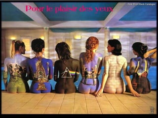
P body art
•
0 j'aime
•
356 vues
bunbohue
Suivre
Divertissement et humour
Signaler
Partager
Signaler
Partager
1 sur 16
Recommandé
Comment utiliser l'application face time de apple avec le ipad2 diapos webi...
Comment utiliser l'application face time de apple avec le ipad2 diapos webi...
QRpro
La test
La test
domdebellis
www.businessmarches.com
Netlinking : optimisation et réseaux sociaux
Netlinking : optimisation et réseaux sociaux
businessmarches
UNIVERSIDAD CENTRAL DEL ECUADOR - VIVIANA AREVALO - EGIPTE
UNIVERSIDAD CENTRAL DEL ECUADOR - VIVIANA AREVALO - EGIPTE
vivianaarevalo
Safran Sailing Team - Voiles
Safran Sailing Team - Voiles
SafranSailingTeam
This was a talk Isha Hartono and I did for the Wellington Meetup about our experience of using Microsoft SketchFlow for an internal project.
Using Sketchflow
Using Sketchflow
Emma Pittar
This was a talk I did for the 5th Wellington NZ Pecha Kucha. It related creating desire paths in snowboarding to finding them in the information architecture of large websites.
Pecha Kucha Talk
Pecha Kucha Talk
Emma Pittar
It’s 2013. The shift to mobile is well and truly upon us, we’re at the transition point where Mobile Internet overtakes Desktop Internet usage and there is no going back. If you’re not designing responsively now then you better get cracking because what comes next is a big change to the way we design and build web experiences for humans. The shift to mobile started making us think about devices, however almost all of our discussion is around what devices we support and where do we set our breakpoints. Could this focus on device capability be masking something bigger happening in the way humans are starting to behave with the web? What if the fragmentation we’re seeing on Android is merely a glimpse into the device fragmentation of the future? What happens when a users’ experience can range from the interface of a watch to that of a building? How do we communicate with someone when they are walking down the street trying to locate something compared to kicking back on the sofa? How do we even know when they are doing one and not the other? Contextually Responsive Design is quickly going to become a necessity - but this isn’t personalisation 2.0 or Content First under a different name. To truly design engaging experiences we need to consider how context shapes our behaviour. As Web Designers and Developers we’ve traditionally worked with people “sitting down to compute”. What happens when someone no longer wants to sit down at a computer to do something; ever? This talk will start from the point of late 2013 and look forward six years. How do we expect people to behave? How will we design systems to cope, and what are the contexts in which people will use the web during its next age? Given at Melbourne Be Responsive on 10 September 2013.
Designing a Moving Experience
Designing a Moving Experience
Andrew Fisher
Almorexant
Almorexant
Pauline Flipo
Gauthier, Joshua 2011 Hr Resume[1]
Gauthier, Joshua 2011 Hr Resume[1]
joshg30
Présentation utilisation de flickr
Partage de photos sur internet
Partage de photos sur internet
guillaumeboue
Anchor Point is a top-rated university because of its excellent online educational system and competent faculty, which consists of world- class scholars and industry experts. Our faculty members come from all corners of the world, bringing with them valuable knowledge and expertise.
Anchor Point University- Preparing students from around the world for a bette...
Anchor Point University- Preparing students from around the world for a bette...
AnchorPointUniversity
Presented at Melbourne Mobile on 19 March, 2013. Responsive Design is primarily focussing on our interaction with devices however this is only part of the picture. By focussing on content and user context first, we can create more engaging experiences that work for our users. This talk focuses on the move to content and context as the starting points for experiences and looks at methods of making content responsive.
Responsive content and user context
Responsive content and user context
Andrew Fisher
Never forget
Never forget
Nils Sanborn
The current trend surrounding responsive web design is one part of an overall move towards responsive experiences. A responsive experience may take place in part in the browser, but it extends well beyond media queries and image sets. This isn’t a talk about media queries or “big data” analysis. Rather, we’ll focus on how data as a material and data as tooling in the design process - Datatium - can shape deeply engaging and responsive experiences, that even go offline. There won’t be any hard maths, instead there will be plenty of guidance and examples showing how aspects of data science is changing design, and how you can start working with Datatium too.
Datatium - radiation free responsive experiences
Datatium - radiation free responsive experiences
Andrew Fisher
2008 02-16 161905-shift_interlock
2008 02-16 161905-shift_interlock
นายกันชะดาร วงศ์แก้ว
Microeconomics
Microeconomics
OG_Rishbags
Immobiliare
Immobiliare
BasilioRusso
Oh marie avec les paroles de Johnny Hallyday
Johnny hallyday oh marie
Johnny hallyday oh marie
cat02500
Contenu connexe
En vedette
Almorexant
Almorexant
Pauline Flipo
Gauthier, Joshua 2011 Hr Resume[1]
Gauthier, Joshua 2011 Hr Resume[1]
joshg30
Présentation utilisation de flickr
Partage de photos sur internet
Partage de photos sur internet
guillaumeboue
Anchor Point is a top-rated university because of its excellent online educational system and competent faculty, which consists of world- class scholars and industry experts. Our faculty members come from all corners of the world, bringing with them valuable knowledge and expertise.
Anchor Point University- Preparing students from around the world for a bette...
Anchor Point University- Preparing students from around the world for a bette...
AnchorPointUniversity
Presented at Melbourne Mobile on 19 March, 2013. Responsive Design is primarily focussing on our interaction with devices however this is only part of the picture. By focussing on content and user context first, we can create more engaging experiences that work for our users. This talk focuses on the move to content and context as the starting points for experiences and looks at methods of making content responsive.
Responsive content and user context
Responsive content and user context
Andrew Fisher
Never forget
Never forget
Nils Sanborn
The current trend surrounding responsive web design is one part of an overall move towards responsive experiences. A responsive experience may take place in part in the browser, but it extends well beyond media queries and image sets. This isn’t a talk about media queries or “big data” analysis. Rather, we’ll focus on how data as a material and data as tooling in the design process - Datatium - can shape deeply engaging and responsive experiences, that even go offline. There won’t be any hard maths, instead there will be plenty of guidance and examples showing how aspects of data science is changing design, and how you can start working with Datatium too.
Datatium - radiation free responsive experiences
Datatium - radiation free responsive experiences
Andrew Fisher
2008 02-16 161905-shift_interlock
2008 02-16 161905-shift_interlock
นายกันชะดาร วงศ์แก้ว
Microeconomics
Microeconomics
OG_Rishbags
Immobiliare
Immobiliare
BasilioRusso
Oh marie avec les paroles de Johnny Hallyday
Johnny hallyday oh marie
Johnny hallyday oh marie
cat02500
En vedette
(11)
Almorexant
Almorexant
Gauthier, Joshua 2011 Hr Resume[1]
Gauthier, Joshua 2011 Hr Resume[1]
Partage de photos sur internet
Partage de photos sur internet
Anchor Point University- Preparing students from around the world for a bette...
Anchor Point University- Preparing students from around the world for a bette...
Responsive content and user context
Responsive content and user context
Never forget
Never forget
Datatium - radiation free responsive experiences
Datatium - radiation free responsive experiences
2008 02-16 161905-shift_interlock
2008 02-16 161905-shift_interlock
Microeconomics
Microeconomics
Immobiliare
Immobiliare
Johnny hallyday oh marie
Johnny hallyday oh marie
P body art
1.
08.11.11
03:44 PM Pour le plaisir des yeux
2.
3.
4.
5.
6.
7.
8.
9.
10.
11.
12.
13.
14.
15.
16.
FIN