
Recommandé
Contenu connexe
Tendances
Tendances (19)
En vedette
Similaire à IRN BRU CAN DESIGN PROCESS
Similaire à IRN BRU CAN DESIGN PROCESS (20)
Plus de chamahan
Plus de chamahan (20)
Dernier
Dernier (20)
IRN BRU CAN DESIGN PROCESS
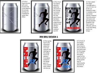
- 1. 1) Firstly I experimented with sutal touches that could added to the already existing can. Creating this spider web effect. 2) Then from my original sketches I added the silhouette of the running man which catered to the new sporty ideas a had taken from there original brand identity. And adding a shadow making it look 3D. 3) I then added the slogan ‘recharge with a can of irn-bru’ on to the can helping to make it relatable to the new brand identity. However from discussions with peers and gaining valuable feedback I felt that it wasn’t effective, with to much text taking up the can design. IRN BRU DESIGN 1 4) Then going back to the silhouette I added the main text required the title/logo to the design. And so by adding a inner glow/ shadow to the design gave it a more realistic look, sunken into the can. 5) To finish of this design I then added the arrows to the can which I feel works well for this design. As it reflects the sporty aspect to this idea. As well as being a great way of attracting the attention of the viewer.
- 2. 1) From my developed ideas and the sketches that I created. I looked at putting this design into practise. Using the striking colour contrast between blue and pink. Lowering the opacity of the coloured background helped to give it a more metallic look and making it look more realistic on the can. 3) From this I felt the design was to basis, and needed more pattern and design to it. Which Is when I added the stamp effect to the middle of the packaging which helps to centralize the whole idea. As well as the arrows added for extra impact. 2) From this I added the basic text. The name/logo to the irn-bru, and then started to developed my ideas from there. IRN BRU DESIGN 2 4) When I was happy with the overall look of the can design I added the ‘barr’ logo making it look more realistic. And the banner across the can also helps to do so. 5) I then also experimented with adding more text to the packaging, which I am still undecided about, whether I feel it is necessary or not. Using font stereotypical of that gender; choosing a more masculine and feminine font.
- 3. IRN BRU DESIGN 3 For this design I looked at creating something a lot different and is a stark contrast to what can already be found on the market for irn-bru. Which I felt was very important in the rebranding of the company. As this idea is suited more to the female market using the fashion models as a background to base the can around. In terms of developing and moving on from this, I could look to create one for the male demographic. As it will fit with the boys vs. girls theme previously looked at. Using complementary colors brought out by the tones in the background. The font chosen is also something different to what I had previously looked at, creating this tiered flag effect. Which Is bold and eye-catching for the viewer. Making sure that the words ‘32’ were of most importance. Another feature to look at is the lowered opacity to the background which helps to create this metallic look as well as achieving a more 3d effect. I have also looked at a number of different color combinations, to create a different impact. If I were looking to incorporate into my already existing designs that I have achieved for the boys vs. girls idea. I feel that the pink color scheme would work best, complementing the other can produced and fits with the stereotypical color of femininity.
- 4. IRN BRU DESIGN 3 cont. From the can created to be targeted more at the female market, incorporating fashion models into the design and the pink colour scheme to appeal to them, and then to complement this I have looked into creating a range of products dedicated to this idea of boys vs. girls, by creating something for the male market using the same house style and proportions but changing the background images and the colour of the text. From this I could move on to looking at other ways of presenting this. Whether this be changing the layout, either the direction of the text or the type face used.
- 5. So from my original designs created on Photoshop I have experiment from the very extreme differences in designs and layout, to then creating something of a similar nature, such as the colour scheme to the font using oranges and blues, from the same palette. As well as the layout to this the words ‘IrnBru’ found to the centre of the can presented vertically. Helping to appeal to the original target market of irn-bru. As well as using a chunky font similar to there existing brand.
- 6. Then to compare I created another product for irn-bru, with a lot more simplistic design to it. To focus more on the name of the brand. This minimalistic tone will also complement the current colour scheme of irn-bru still running with the blue and orange colours. However giving them an update to match the new modern feel of the brand. I have also developed my skills in using clipping masks, and changing the opacity levels to get different effects. That are a lot more suitable working with the original design. Such as the added silhouette of the athletes, which creates a new more sporty brand identity for the energy drink company. As well as the paint splatters to complement this helping to appeal to the younger, creative audience. I also used a black outline to the copy which also helped to make to font look bolder and stronger, therefore adding impact. I have also added a 3D effect on Photoshop adding bevel and emboss which also helps to make it look more high quality and professional.
- 7. Back Of The Can. After completing my design for the front of my cans. I then moved onto designing the back of my cans. Creating a variety of different ones to suit each theme I was creating. For the most part I felt it was important to keep the back of the can very simplistic, as the main focus is to the front of the can, and so to get an understanding of what needed to be included on the back of the can. I did some research into this managing to get the ingredients and nutritional information that can be incorporated. I also wanted to make it look as realistic as possible including a bar code and the production company logo. So then it was my job to incorporate all these elements on to back of the can in a more interesting and attractive way. Making sure that the same house style continues throughout the whole design of the can, colour schemes, images and text and font choices. I found the magic wand tool very useful when it came to incorporating logo and images sourced from the internet, especially then they had a white background, this tool worked well at getting rid of this making it look more professional. In some cases such as the boys vs girls theme I have incorporated the same images and shapes, such as the boy and girl and the male and female symbol showing continuity throughout. And so as shown below you can see some of the designs I created to reflect the front of the can, using the same backgrounds, colours and fonts. With this same content I created for one I then used the same template for my other cans. From the few I created I feel happy with the content created , and like each design in there own way . However between them all I like the fashion and football design for the back of the can as I feel that they are the most simplistic yet the most effective targeting that younger audience. To move on from this I could look at experimenting with different font choices, both serif and sans serif fonts. As well as the layout and how this is presented.