
Recommandé
Contenu connexe
Tendances
Tendances (19)
Similaire à Media evaluation
Similaire à Media evaluation (20)
Dernier
Dernier (20)
Media evaluation
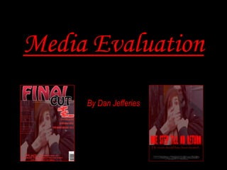
- 1. Media Evaluation By Dan Jefferies
- 2. Question 1 In what ways does your media product use, develop or challenge forms and conventions of real media products? 2
- 3. There are a lot of conventions that are used in a psychological thriller. The best way to create a psychological thriller is by following these conventions and adjusting them so they have there own twist on the work. There is no rules in following a genre when producing a film and therefore the conventions must have been analysed and followed in a way that the producer sees fit. The conventions can be analysed by looking at these important areas; • Camera Shots, Camera Angles and Camera Movements • Mise-En-Scene • Editing • Lighting • Sound These categories must be thoroughly analysed. For example when producers analysed camera shots they will need to analyse the type of the shot (i.e. a mid-shot, a close up etc.) the length of the shot, the transition into the shot and the transition from the shot. 3
- 4. My media product is a psychological thriller and therefore has followed the conventions of the genre. However this doesn’t mean that I have stuck to these. I have also chosen to develop and take these conventions further. In this evaluation I will be review what I found out whilst doing research and planning and how this was taken into consideration when working on the construction of the film trailer, poster and magazine cover. My film trailer is called “Trapped Like a Rat”. 4
- 5. The first convention in the trailer that I followed was that there were short camera shots within the trailer. This is found in such film trailers as Mary Harron’s “American Psycho”. This can be seen below. This was developed so that I have longer shots at the start and eventually very short shots at the end. This will increase the tension and the audience will feel the danger that the protagonist is going through. The one thing that was a bit of a problem with my trailer was that I did not have a lot of time and didn’t manage my time as well as I could of therefore there wasn’t as many short, sharp shots as to what was planned. There were various film trailers that I saw these in and as stated before one this can be found in various trailers such as “Shutter Island” and can be seen in “American Psycho” shown here. 5
- 6. Another convention for psychological thrillers is to target the audience’s emotions and aims to scare them with the characters within the plot of the film and this will be done by having characters that create intense and scary moments. This sort of thing can be seen in such films as the character Dr Hannibal Lecter from “Silence of the Lambs”. This character is known for being a psychiatrist and a cannibalistic serial killer. He is famous for his saying and the noise he makes. In my film I don’t necessarily have a person like this but the unknown figures who trap the protagonists in the house create a similar sort of personality of that of Dr Hannibal Lecter and is aiming to scare the audience. This follows the convention well. 6
- 7. The third convention for psychological thrillers is that they use low key lighting to help them convey the plot of the film when the film is at a scary point or wants to build tension for the target audience. This is shown in various film trailers as “Shutter Island” where the trailer is reaching its final moments and the audience see the protagonist being jumped on by an unknown antagonist. This is shown below. I have used low key lighting throughout the majority of the trailer and this would have improved the quality of the film and made the film trailer a lot more conventional. The trailer has scenes which are filmed at night and therefore this instantly makes the film look more conventional. If the trailer was to have been shot in the day then the film would have lost its conventions that it contains and would be almost unrecognisable as a psychological thriller. Psychological thrillers are so successful because of this one convention because it tends to play on the humans primal fears. As a species, humans are all genetically fearful and find the dark unnerving. 7
- 8. The final trope I identified is that editing in psychological thrillers is fast paced and depending on the film situation then the editing will be done to match the occasion. For example in “Silent House” as the film trailer becomes more scary and frightful to the audience then the titles, camera shots and sound speed up in pace. This can be seen below. The editing will be fast paced if there is something scary and the film is trying to create tension. This would have been very effective for my trailer however the problem that the group had was that I had not allowed enough time for the editing and this was down to my poor time managing and this would have to be assessed and adjusted for another project like this. 8 My poor time management skills have now led to trailer losing some of the conventions however there are still some fast pace short shots in the editing such as when the protagonist sees the blood and the shots would be almost parallel with his heartbeat so as it increase the shots become shorter. In the actual film itself there would be the same sort of thing happening throughout.
- 9. I used the above posters to analyse what I needed to included in mine as the conventions of this genre. I concluded that they all use the Barthes theory of Enigma codes and Action codes on the basis that they all use the images to have the audience asking the two questions and that is “Who are these characters?” and “Are they okay?”. In the case of “The Others” I believe that audience I made to feel interpolated into hoping that Nicole Kidman’s character will be okay and that is just from looking at this poster. I feel that this crosses over into Morley’s Theory of Cultural Competence because she is a woman many will see her as “vulnerable” because of the dark background. This is likely to be the male audience that will see this more than the females because of stereotypical views of men seeing themselves wanting to look after females on their own in the dark. This sort of theory can also be seen in “The Ring” poster. Where as when the audience see Di Caprio’s character in the “Shutter Island" poster they would view him as being frightening and strong despite also being on a strong background. The “vulnerability” of a female protagonist is what I have used in my posters in the attempt to drag in my audience. I felt that this made my poster look more professional. 9
- 10. I analysed the two magazine covers shown above and one thing that I noticed that I had the same was that even though they were showing two different film genres the type of font that went with it goes well with both. They both have a similar font and this can be seen if you compare the “M” in both magazines. They use a sans serif font which would if replicated would mean that I am following the conventions. The rule of thirds is followed in both magazines and this is something that I needed to achieve follow the conventions of the genre. By looking at these two magazines it is clear that I could do a professional standard of magazine myself by making sure that I had a good masthead to attract the audience and this would be helped by designing it with the rule of thirds being followed and avoiding the magazine being “cluttered”. Another clear convention I have needed to follow was by making sure that I had a hierarchy to my text so that the readers would view the important parts of my magazine first. It is clear by looking at these two magazines that there is no clear guidelines for how to have the hierarchy on a magazine but to make sure that it looks tidy, professional. Therefore when I created my magazine I made sure that I had a hierarchy but took time in organising it to reach that professional standard. 10
- 11. Question 2 How effective is combination of your main product and ancillary texts? 11
- 12. This is a very difficult question to answer because of the fact that my promotion package has parts that do not relate to each other. This is because of a constant on-going battle with my illness called Emery Dreifuss Muscular Dystrophy I was unable to contribute as much as I was hoping to creating the trailer with my group and therefore once I managed to get back on track with controlling my illness then I was able to create my own trailer. This means that I have had to do my poster and magazine on my original group’s film trailer called “One Step Till No Return”. However I have had to do my trailer as a film produced by myself individually called “Trapped Like A Rat”. Therefore my ancillary texts (my magazine and poster) will not be able to relate to my film itself. However they do follow in the same genre (Psychological thriller) so when I mention that my magazine and poster refer to the film well then this will be my original film “One Step Till No Return” and not “Trapped Like A Rat”. 12
- 13. 13
- 14. My magazine has a clear message about the film and shows that this is not a “rom-com” film. It gives the representation of a psychological thriller straight from this image. It clearly portrays a “masked man” coming up behind this girl. The image that is being shown to the audience on this magazine has a red tint to it and has been modified to signify blood. Psychological thrillers are renowned for a lot blood and therefore throughout these three items there would be a lot of red in the tem to make sure it followed conventions of the genre. The fonts used elsewhere on the magazine match this and show a similar sort of colour. However on the red tinted image the text still stands out to the audience but at the same time does not drag the attention away from the image. The logo on the right hand side of the magazine is the official film logo and is the one that would be seen in the film and the trailer. 14
- 15. In my poster I have used the same image as in the magazine and this will create a brand identity throughout my promotion package. However I have got a different masthead for the poster to the one that is seen on the magazine. I felt that this one worked better with the image itself. This masthead is still the same in colour and is red in font. This is because I want the audience to see the name of the film immediately. This is my main reference to the film and then once the audience have seen the image matching with the masthead then this will reference to the film as this image is part of a scene from the film. I have included the credit block at the bottom of the poster and this shows the roles of the team making this film and then finally the tagline references to the film and creating a sort of enigma with the audience. This will help the audience into interpolating with the protagonist and feeling sorry for her. By using this tagline I have created a brand identity in the sense that it hints immediately at the fact that it is a film about abduction. All of these references will appeal to the audience and will want them to see the film itself. 15
- 16. MAGAZINE On the magazine I have use the large image on the front cover to draw in my audiences attention. Once they had been drawn in I then hoped they would be excited to watch the film by all of the short snappy captions on the front cover. The image of the magazine signifies to the audience that this film will be about abduction and therefore will be likely to be rated at a minimum of a 15. This is because the audience tend to find high amounts of blood in abduction films. It is clear that as it falls neatly into a category it is likely to attract “Mainstreamers and Aspirers” (Young and Rubicam) with the majority of the audience being teenagers. As it is a clear teenager protagonist and an unknown age of the antagonist it is going to be easier for either teenagers to relate to or parents with teenagers. As these are unknown actors in the image then its clear that this would not have a high production value and therefore as tis is the case the film is likely to be a lot more relatable for teenagers and therefore this will be the main audience. POSTER My poster’s most iconic feature is the image which is the same image as the magazine and therefore creates a large brand identity for the film itself. This should be the way to entice the audience to watch. With any tagline its important that the entice the audience further and I feel that I am achieving this with this tagline. As both the magazine and the poster have the same image and use this to attract the audience the most then it is likely that the poster will have a very similar effect in enticing the audience to watch the film and should attract the same audience. 16 The use of unknown actors will appeal more to audiences of the same age as they can relate to this more.
- 17. In my promotion package it is obvious that Barthes theory of Enigma codes and Action codes can be applied to this work. I know this because on the magazine and the poster I have made a clear point to the audience to ask “Who is this masked antagonist?” and “What does he want with this female?” This will make the audience want to watch the film because they will be wanting to see what this film is about. Which is the crux of the enigma code. The theory of the action codes can also be applied to this because there is look of fright and vulnerability in the female protagonists eye therefore will signify to the audience that something bad will happen in a later event. I feel that the use of enigmas are important for both my magazine and poster because this is the main way to engage with the audiences feelings as there is no audio or movements. As for the trailer I can also apply this theory to it. It was easier to create an enigma with this because I can combine the use of sound and camera shots/movements. The main enigma to my trailer is that the audience will be asking “What has happened to the female protagonist?” and “How much danger are the characters in?” This will attract the audience to watch this film at the cinema as they will feel interpolated with the characters and will emphasise with them to make sure that they come through this. The main example is when the male protagonist goes to the shed and returns with all the blood on the wall. Once he opens the door this creates the action code for the film as it signifies to the audience that he could be about to go on a quest/hunt. 17 The immediate moment where the action code is created in the trailer.
- 19. As I had a big problem with my time management I have not been very consistent when producing my poster and magazine. This has now created the problem that could have been easily fixed had I given myself enough time in advance. All of my differences are clear for the audience to see and there is no clear similarities for the audience other than they have the same name and image. This meant that the there was not a big of brand image as I was hoping to have and therefore if I have allowed myself more time then I would be able to have improved this and made it clear that these belong together. Obviously both the poster and magazine refer to the film trailer before I had to split from the group and therefore if I had a matching trailer I could carry on this brand identity across to the trailer too. The first difference was that I was using two different film logos. The official one was on the magazine. This clearly worked on there but I felt that it didn’t look correct on the film poster. For these reasons I have had to sacrifice my brand identity slightly to make sure that my poster was professional and presentable. 19 Different fonts used on the magazine and the poster. If I had used the same on both then this would have improved brand identity.
- 20. The third thing which did not follow a “housestyle” from one slide to the next is that I did not use the same font for both the magazine and the poster. I had this problem because I created my magazine on Microsoft Publisher and I created my poster on Adobe Fireworks. Therefore they do not have the same fonts available for use. In conclusion, it is now clear that I have no housestyles to my work and the audience may not be able to associate the products with one another. 20 If I had created my magazine and poster on the same piece of software then I could have increased my brand identity.
- 21. Question 3 What have you learned from your audience feedback? 21
- 22. Over the whole process of this project I have used various forms of audience feedback to improve my work or when the audience feedback was taken at the start I used this information to plan well for what I was doing. I used feedback such as polls on my blog and focus groups once my project was concluded. A good form of feedback that I have used was by asking for peer feedback. The reason that I have used these types of feedback is because they are easy to use and easily accessible for me. The results that I got back from these was helpful as I knew what I either needed to do, what I needed to improve and even what I needed to change. By using the feedback to improve my project and the work involved in it I have been able to make my products to the best of my ability with the time I had. I had used various polls on my blog in an attempt to have my poll taken by a wide range of people as my blog is online it is accessible by anyone. A question that I asked was regarding my magazine masthead and that was “What would make a better name for a magazine?” This gave me instant feedback to help me with my ancillary texts. This helped me decide on the name of my magazine and gave me a good basis to work off of. 22An example of my polls on my blog.
- 23. Also I had included a poll with the question of “Do you think my trailer has met the conventions of a psychological thriller?” and “How do you feel I could have improved my poster?” Both of these polls had answers that would help me to improve my work and make my work look more professional in terms of producing a poster and a trailer to the highest of quality. When my promotion package were finished I got together a focus group to discuss how they felt that my work had met the needs of my audience and how it also met the needs of the genre. This focus group was able to give me feedback on how they felt the trailer made them feel firstly as an audience and secondly as an peer assessor. Finally we moved onto how the ancillary texts were effective in promoting both the trailer and the “film” itself. Throughout this project I took on as much peer feedback as possible and asked them for there opinions on my work . This was vital as they were able to tell me what looked better in my ancillary texts and they were also able to tell me how to improve it in there opinion. 23
- 24. For my polls I have now been able to gather the results of them and alter what has needed altering and to perfect what has needed perfecting. I have been able to decide on a name for my magazine by following my audience feedback. One of my aims from the start of creating this promotion package was to make sure that I followed the conventions of the genre and made it look as professional as possible. Therefore by asking my second poll on the blogs I have been able to evaluate whether I did or not by my audience looking at the whole promotion package. I felt that from the results received that I had done this despite a proportion of my audience feedback saying there was “room for improvement.” Finally on my last poll the audience felt that I could have a more clear image to make the poster more effective as a whole. I felt that this was a very valid point from my audience however I felt that it was not necessary to do this. I felt that I could have this image as it was still maintaining the enigma (Barthes) in the poster. 24
- 25. For the questions I used closed answer options on my polls to make my results easy to evaluate however they will not be able to give me the best answers to my questions as these came from the focus groups in my opinion. My focus group felt that there was no real brand identity to my texts. They felt that the magazine, poster and trailer were good as individual pieces however as a promotion package they felt that it didn’t have a clear brand identity to the package. If I had managed my time management a lot better then I would have been able to alter my ancillary texts to make the whole package have a clear brand identity. Overall, my focus group made the decision that they felt the promotion package was good as a psychological thriller package but they felt it lacked brand identity. They felt that the trailer was a clear psychological thriller and that it was frightening with the extreme sound volume changes. They felt that had I managed my time management better then I would have a much more professional trailer. 25
- 26. Question 4 How did you use media technologies in the construction and research, planning and evaluation stages? 26
- 27. I used various technologies when creating my promotion package. Firstly in the planning and research stage I used Microsoft Word, Internet Explorer Websites (such as IMDB), Blogger and YouTube to help me research for example I needed this technology for researching my conventions of genre. This was a good combination of software to use for this as I was able to research my genre conventions and then assess these and evaluate these in Microsoft Word. This technology made my research and planning easier to show because I had an easy bit of software which allowed me to compare and say how I will apply it to my own work. By using these pieces of software I have been able to allow my research to be more thorough because I am using software that I am very confident in using it. When using the software to research there was one very big problem I encountered and this was that I was not able to use the Internet Explorer once the Internet went down and therefore I wasn’t able to use this to do any research and therefore caused me real problems. 27
- 28. I found this software really useful to use with the resources available as it was to collect my findings, then assess the findings, evaluate them and then decide what to include in my final promotion package. This software was the best I had available at the time to do my research and planning. In the construction stage I used a higher variety of software to help me with my promotion package. I used a camera, Microsoft Publisher, Adobe Fireworks, Pixlr.com, an iMac, iMovie, Internet, Blogger and YouTube. I felt that this software that I used was of a much higher standard than my research and planning stage. However I felt that I was still a little restricted with what I could do when creating my work. Firstly though my work was easy to create but wasn’t of a poor standard but there was definitely room for improvement. 28
- 29. The camera I used was a decent handheld camcorder that was good for shooting the trailer that I wanted. This allowed me to shoot my work without any problems. The only thing that could have been improved was by using a higher-quality of camera which would allowed me to shoot in higher quality. However as the trailer was designed to be shot in a “home video” format then this was better to use this type of camera. Microsoft Publisher was the best software to be using to create a magazine. This is because I was able to cut, copy and paste (i.e. I was able to move the masthead around to have it in the exact position that I wanted and make sure that with my layout I was following the rule of thirds) as well as drag and drop text and images with ease. By using this software I have been able to create the best magazine I could with the software available. The other option of software that I could use was Adobe Fireworks. However I felt that for designing a magazine cover then this was more of an appropriate piece of software to use. 29
- 30. For creating a poster I have used the software Adobe Fireworks as this was a stronger piece of software to give a clearer and more prominent poster. This is because I was able to edit the image in this software (i.e. I could alter the brightness of the image and make it even darker than before) and then add my masthead, credit blocks and tagline to this after. This was very appropriate piece of software to use because I was able to use because the fonts available were a lot more professional then you would find on other software such as Microsoft Publisher. Whilst creating my promotion package I was always looking to optimize and improve any images that I would be using. This gives my promotion package the chance of the look of the most professional standard with the software available to me. I used Pixlr.com to help me with this editing because it is a free, easy to use, online image editor. This software only had one downfall and that was that I needed the internet to be able to access it and therefore there was times when I was not able to use this piece of software. 30
- 31. To edit my film trailers raw footage I used an iMac with iMovie to help me to create my trailer. This was also the best film software available and gave me a professional looking film trailer. Another piece of software that I could have used would have been Windows Movie Maker but this would have looked awful and would have given my film trailer the effect of being created by a “GCSE student”. Using this I was able to add effects to the footage such as changing the lighting, the speed and adding in transition slides. The final pieces of technology I used in the construction stage was Blogger and YouTube. These were good to use because I was able to exhibit it in a couple of forms. By using blogger I was able to engage with my audience in the form of polls and adding comments to the blog. I felt that it was very important for my audiences to be able to see my construction work as well as my evaluation and research and planning. I felt that there was nothing better that would allow me to show my whole promotion package to my audience. I felt that YouTube was a great way to exhibit my trailer to the audience I was able to share it on the worlds largest video sharing website. As my target audience are likely to be “Mainstreamers and Aspirers” (Young and Rubicam) then by using one of the most “in trend” websites to exhibit my promotion package then I am directly engaging with my audience. 31
- 32. Finally, in the evaluation stage I was using only a few technologies to help produce and exhibit. I used Microsoft PowerPoint to do this evaluation. This was good software to use as I can make it so it has multimedia text in it and that I can make lots of comparisons in the promotion package and assess how I have done and how I could have improved it. As for other software I could have used then I could have produced all of this on iMovie but not as easily accessible for as doing it on Microsoft PowerPoint. Within my evaluation I have been able to record videos from YouTube using CamStudio. The only problem that I encountered was that the quality of the video was pixelated at times and that it would not allow me to record sound. This meant that I wasn’t able to show examples as easily as I wanted to in my evaluation. When I finished this I used a site called Slide Share to make it so I can transfer my evaluation PowerPoint to my blog. This enabled me to engage with my audience as they could see how I felt I did with my promotion package and they could comment on this on the blog itself. For it to be Slide Share it was easy to use as all I had to do was download the file onto the site itself. As far as I know this was the only easily accessible way to do this. To copy it onto my blog I needed to copy the embedded code to my blog using HTML option when creating a page. I was using Blogger still and the same blog for this as I just added it to a new page. Overall, the blog was the most beneficial piece of technology to myself as I was able to exhibit the whole of my promotion package to the “world” as anyone can now access it and view what they want. 32
- 33. Links to Videos Used http://www.youtube.com/watch?v=2GIsExb5jJU – American Psycho Trailer http://www.youtube.com/watch?v=t3woSuuzQuc – Silence of the Lambs scene http://www.youtube.com/watch?v=5iaYLCiq5RM – Shutter Island Trailer http://www.youtube.com/watch?v=Zo3fyTbyft8 – Silent House Trailer http://www.youtube.com/watch?v=EMw_vobZsRc My Trailer: Trapped Like A Rat 33